By tksajeev
1. As a graphic editor of The New York Times who is looking after foreign affairs how you view Asia as a whole? Is it a gold mine for graphic specialists?
Asia is fascinating, diverse, complex. In the next few years, it will be interesting to see how Asian countries will deal with the effects of economic growth, especially in relation to workers rights, political participation and sustainability. There are many graphics waiting to be done.
A study published last year by the London School of Economics said that the center of the world’s economic activity was shifting eastward. In the 1980s, the average location of economic activity was in the mid Atlantic.
But by 2050 the study projected the center to be right between India and China.
And the economy is just one aspect of what will be news in Asia in the next few years. There’s, of course, the political issues. The hotspots of Afghanistan and Pakistan, the nuclear dispute between Iran and the West, the long-lasting disputes in the Middle East and so forth.
The New York Times launched, in June, a Chinese version of its website: http://cn.nytimes.com/
2.Without seeing the nameplate one can easily spot that it is the graphics of The New York Times. How it is made possible? Can you tell about the evolution and the history of graphics in NY Times.?
I am afraid I am not the most qualified person to talk about the history of our graphics department: I’ve only been working here since 2008, and The Times has been a reference since much before I started doing graphics.
But I think that part of what makes The Times’ graphics recognizable is the paper’s long-term commitment to graphics. The Times has been doing graphics consistently at least since the 1990s (actually, our graphics history goes way before that. For example, we did a breaking news graphic when the Titanic sunk.)
Many things contribute to the formation of the “visual personality” of a graphics department. When you read an important story at the Times, you expect to have a graphic that will help to tell it — that is consistency. You also expect it to be clear, clean and elegantly designed — this is aesthetic consistency.
The design project of the paper is also simple, strong and doesn’t change very often. For example, we changed our graphics typeface last year. Did you notice? Probably not. Because the goal of that change wasn’t to reinvent our graphics look, but just to give it an update and make our graphics even cleaner. Simplicity helps a lot.
3. Your graphic on Osama Bill Laden hunt was undoubtedly the best on that subject. Can you describe how it was made possible? What are studies behind that wonderful effort?
That graphic was an incredible team effort. It was almost midnight when President Obama announced that Bin Laden had been killed. We knew that the graphic would be essential to help tell the story. At 6h30 a.m. there were about 18 people of the graphics department in the newsroom, working to find out details about the raid: when, how, where…
At first we were all working to find information — nobody was drawing
anything. At one point I contacted an Associated Press photographer in
Pakistan who had been near Bin Laden’s house. That was the first hint of the location. Other people were talking to our reporters in Pakistan, getting in touch with government agencies, trying to find bits and pieces on social media.
We started with a locator map of Abbottabad, and posted that online. Then we located the general area where the house was. In the afternoon, the U.S. government released a diagram of the house. At that time, Graham Roberts started to work on a 3D rendering.
In a story like this, the photography options were limited, and if we did a good job, there was a good chance that the graphic would run on page 1.
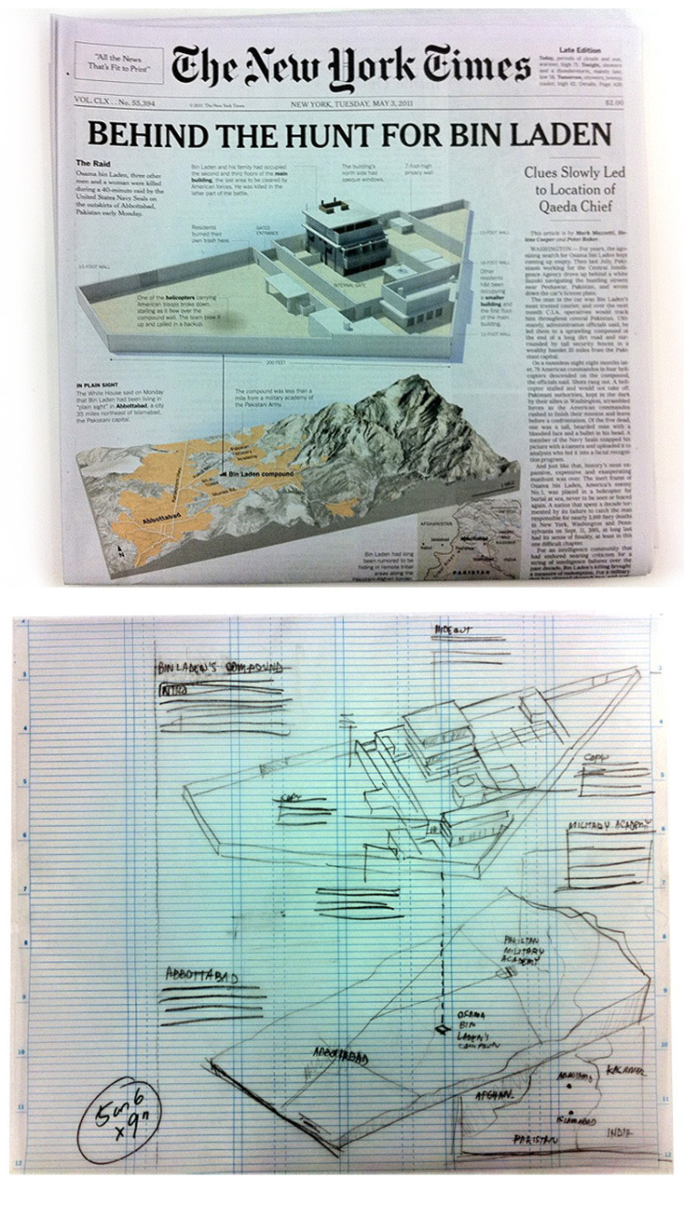
Steve Duenes, the Times’ graphics director, told me to make a sketch for him to present at the page 1 meeting. He said: “When you are doing this sketch, keep in mind that the managing editor of the New York Times will be looking at it.” I knew that the sketch needed to be good.
With the sketch, we had a plan and divided the tasks. Some people would be working on gathering and confirming more details, some would be writing copy for the graphic. I was the person who put the pieces together in the end. It was a long day, but exciting.
Sergio’s sketch, below, was used to sell the idea to the managing editor.
But the entire team made it happen in a day. We spent 18 hours in the newsroom

4.Going through your graphics I feel that you like simplicity or is it
NYTimes pattern? Why?
Both are true. Actually, I take that as a compliment, because I strive for simplicity. For me it’s essential to make the graphic accessible to as many readers as possible. It’s equally important that the graphic is accurate and informative. I love visual splash and that things look appealing. I try to include that in my work as often as I can, but if I have to choose between visual candy and clarity, I’ll choose clarity. After all, we’re on the business of informing.
5.Tell me about your evolution as graphic editor?
I studied journalism, but have been doing graphics since my first
internship, in 1998, at a newspaper called Jornal do Brasil, in Rio, that is now closed. Then I worked for O Globo and Globo.com, also in Rio. During my time at Globo.com I won my first awards in Malofiej. The economy in Brazil was bad at that time, and I had the impression that I could lose my job anytime, despite the good work. So I put on my first online portfolio and started to apply for jobs in the U.S. and in Spain. In 2003, Globo.com decided to end the graphics department, and I was laid off.
At the same time, I was talking to The Dallas Morning News. I was offered a job in Dallas and took it. It was wonderful, I spent five years there. I started as a graphic artist and later became the graphics director. In 2008 I came to the New York Times
6 I find that a lot of good graphic artists comes from Brazil and Mexico. Any long cultural tradition?*
I guess you are right, but I’m not sure why. Latin America, in general, has a very visual culture. But I think India has a fantastic visual culture too. For example, the nameplate of the Malayala Manorama is a work of art. I loved the paintings on the trucks that are traditional there, and the Bollywood movie posters, and the beautiful alphabets, and the watercolor paintings, and the way Indians use colors. Maybe news graphics are fairly new to India. But aren’t the Kama Sutra illustrations information graphics? That’s about 2,000 years
of infographics history.
If I were Indian, I would not be shy on drinking on that source. Make it colorful, make it visual, but also make it accurate and easy to understand and you will have a hit.
7 Another graphic of yours that stand out was I feel that is of Japanese tsunami.Can you describe about the effort and the research behind that work?
The tsunami was difficult to cover. A lot of the information was in
Japanese, and you’d be amazed how difficult it was to get someone in Japan able to speak English. So we had to use Google Translate all the time and sort through the maze of websites of the Japanese government. They were issuing reports in PDF, but that were essentially like Xerox copies. So when Google Translate wouldn’t help, we brought in Japanese translator to spend a couple of days with us in the newsroom.
I emphasize the information collection process because everything we do is focused on the information. First we find the information and then figure out the best visual format to accommodate that content. No information, no graphic. It’s important that graphics people around the world do their part as researchers too, and work in partnership with reporters and editors. The best graphics come out of this partnership.
So, a tip for graphics people: know the editors, meet the reporters, talk to them, make them know who you are. Go drink beer with them (or chai). Help them help you. When there’s breaking news, call them on their cell phones, ask them to gather the details that you need to make a good graphic. If you can, of course, go to the scene yourself, gather the information yourself. Don’t be shy to act as a journalist. It may be difficult in the beginning, but eventually the respect for your work will grow as the results emerge.
8 Did you work on a template or approach every graphics independently?
We start from zero every time. Of course, there are recurrent elements,
like a pre-determined color palette and typefaces, on print. On the web, we have a couple of schemes that we use for simpler graphics. But in general, we approach every graphic as a new challenge, and we let the design be shaped by the content.
9 In Asia, Middle East newspaper’s are exploring graphics a
lot. What is your feeling on that? Is it on the right direction? Some feel that middle east graphics were more glamorous so that the readers were tend to distracted from the subject?
News graphics in the Arabian Peninsula are a fairly recent phenomena, and I think they are trying to find their identity. For now, they seem to be shaped a lot by the style of Latin American graphics, since many people working there come from places like Mexico, Peru, Honduras and Brazil. It’s hard to generalize, since there are several papers investing in graphics and each has a style. I don’t see much problem in being visual. I find it more problematic to have graphics that are not news-worthy, after all, we’re in the news business. I think any style can be good, as long as it’s understandable and it helps to inform the reader.
10 What is the future of print information graphics?
I think the future is online. If I were beginning today, I would dedicate myself completely to web, interactive and mobile design. And for people like me, who have been around for a few years, but who are decades away from retiring, I’d say the same. Will print die tomorrow? I don’t know. But the new hires have already shifted for digital.
![]()


