BEST FRONT PAGES
Judges: Michael Dizon and Alan Formby-Jackson
FIRST PLACE
“Enough Already”
Daniel Dulhunty – The Border Mail, Albury-Wodonga, Australia
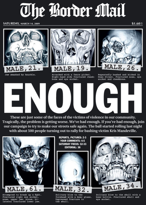
Alan Formby-Jackson writes: “Great 3D X-ray pictures really give this page impact. I like the simple black and white treatment of what is a serious issue for this paper. Straight to the point facts with a bid to get the readers to join a campaign makes for an effective package.”
Michael Dizon writes: “Made me sit up and look for the inside pages to continue reading.”
SECOND PLACE
“Yes, I’m guilty, now punish me”
Mahesh Vaishnav – Daily News & Analysis, Bangalore, India
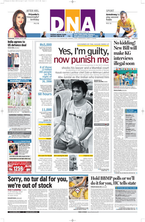
Michael Dizon writes: “Great use of font and colour (and lack of it), attention-grabbing (and imaginative) headlines. You don’t wander off after reading a paragraph or two, and even if you are in a hurry, tidbits of information are available instantly. The main photo’s lack of colour does not scream ‘look at me, look at me!’ but it totally stands out and is appropriate for the story.”
THIRD PLACE
“‘Voto Blanco’ sí cuenta; pierden partidos chicos” ((The ‘white vote’ counted; small parties lose))
Noé García Gutiérrez – La Razón de México
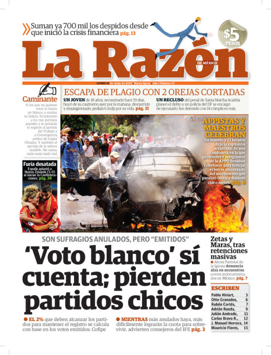
Alan Formby-Jackson writes: “Lots of information on this page but it is presented well with a fabulously engaging picture and a nice use of a graphic on the masthead. This paper has passion and is not afraid to show it.”
BEST OF INFOGRAPHICS
Judges: Salomé Nourse and Michael Dizon
FIRST PLACE
“Grand Mosque”
Douglas Okasaki – Gulf News, Dubai, UAE
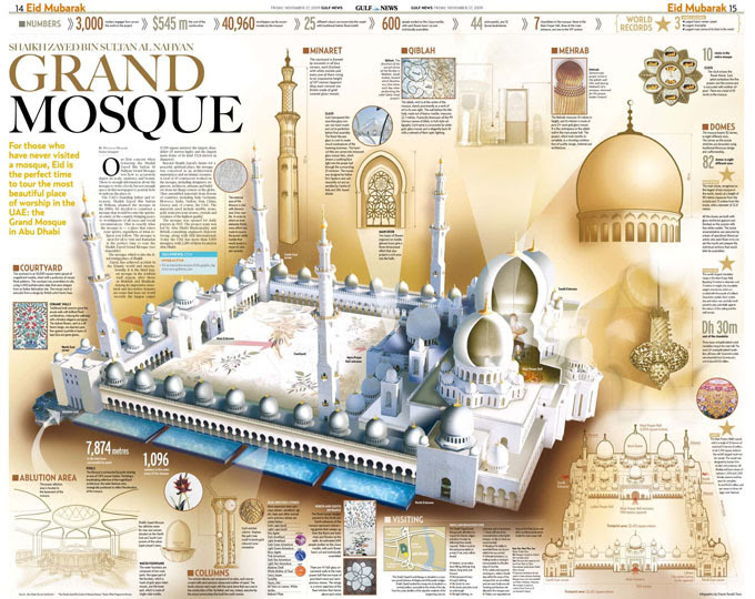
Michael Dizon writes: “The level of detail is astounding. It will take a while to take it all in. And that’s a good thing.”
Salomé Nourse writes: “The use of colour on this piece has captured the beauty and serenity of the mosque. The execution of layout displays the page and its information in an easy to follow manner that it not confusing and easily understood. This is a small jewel to have when visiting this particular mosque as it features details and descriptions one would not necessarily have noticed.”
SECOND PLACE
“Goodbye, Lenin”
Krzysztof Szczygielski – Newsweek (Poland)
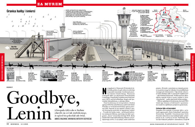
Salomé Nourse writes: “The way in which the timeline has been done is extremely innovative. The use of color coincides well within the timeframe with; the birth of the Berlin Wall and a time where the use of black, white and red was considered modern. I especially appreciate the time put in to the 3D-artwork, rather than reusing or adjusting graphics obtained from a known agency. Furthermore the graphic is beautifully clean cut and everything serves a purpose.”
THIRD PLACE
“Budzet jak pompa” (The budget as a pump)
Lech Mazurczyk – Newsweek (Poland)
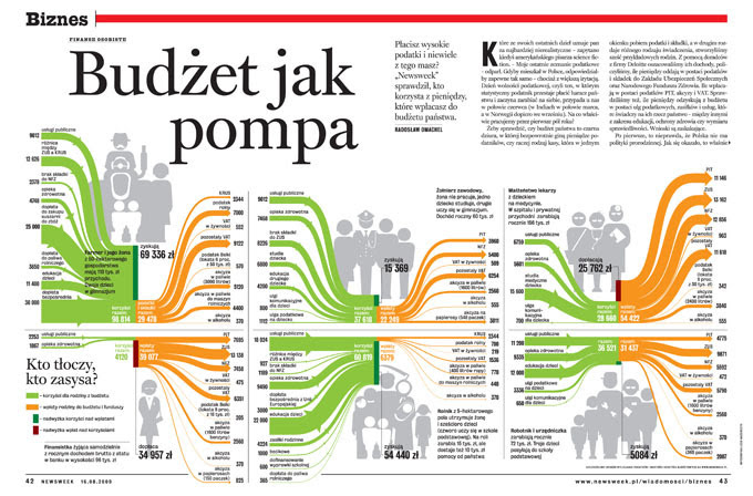
Salomé Nourse writes: “This is an extremely innovative way of showing information that could have simply gone into a bar chart or column grid with value numbers. The clean look of the page made something that is usually difficult to grasp simple and attractive.”
BEST OF SPORTS PAGES
Judges: Alan Formby-Jackson and Charles Apple
FIRST PLACE
“Bolt Statement”
Ramachandra Babu – Gulf News, Dubai, UAE
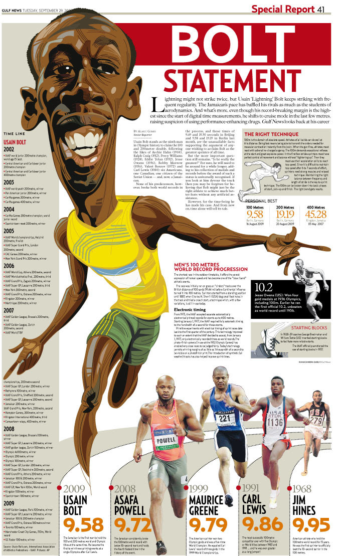
Alan Formby-Jackson writes: “A great, huge graphic of the fastest man on earth easily demands the reader’s attention. Interesting sidebars make the whole package a pleasure to read.”
Charles Apple writes: “One of my favourite pieces in the entire competition, this takes me back to those great old Washington Star book pages from 20 years ago. It’s a great read, first. But it’s also great art: that caricature is outstanding. Every time I open the file, my eyes just dance all over it. Bravo.”
SECOND PLACE
“MLB ’09”
Sam Manchester – Journal Sentinel, Milwaukee, Wis., USA
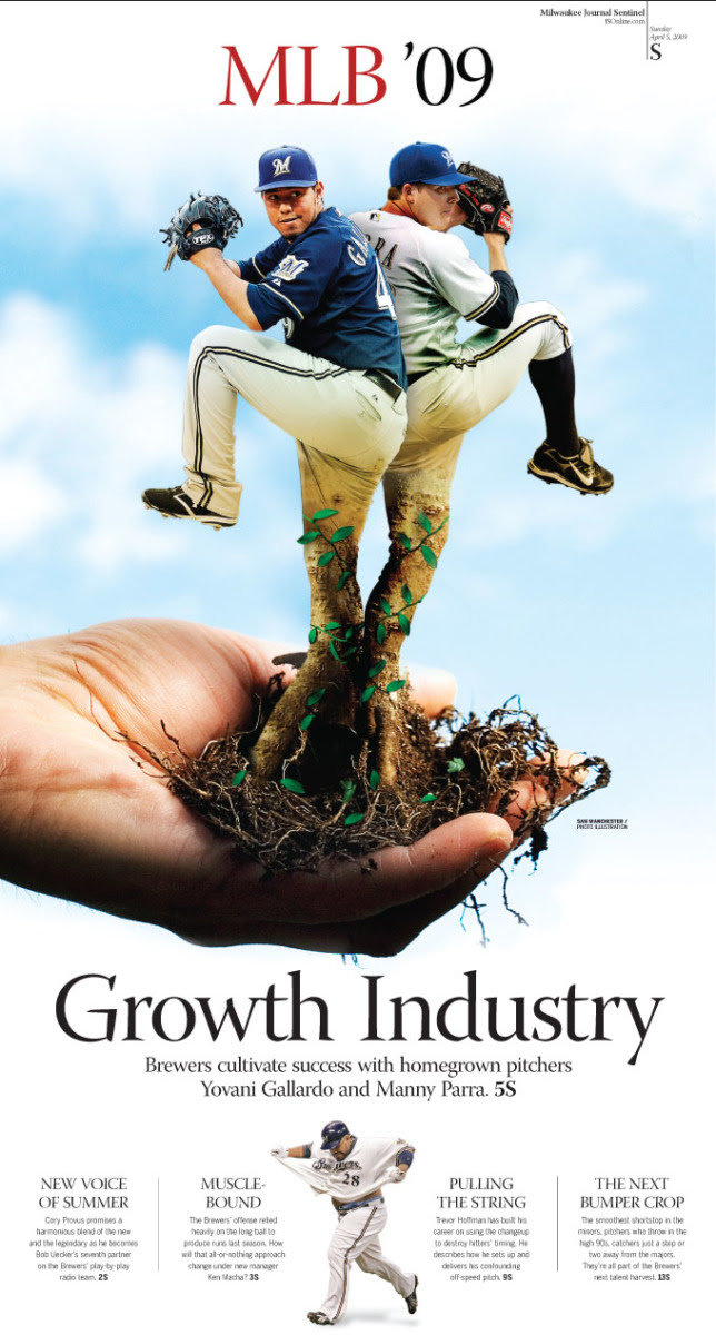
Alan Formby-Jackson writes: “Well executed illustration with an elegant layout, this page really stood out from the crowd. Solid headlines also added to the overall package.”
Charles Apple writes: “Wonderfully clean design and an arrestingly different illustration. You can’t ask for more than this out of a sports special section cover.”
THIRD PLACE
“Speed Kings”
Douglas Okasaki – Gulf News, Dubai, UAE
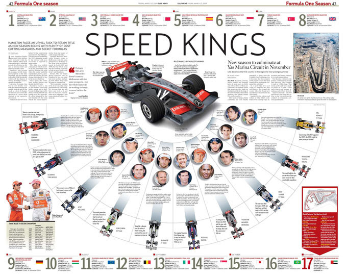
Alan Formby-Jackson writes: “Plenty of information on this spread gives full value for money. The page grabs your attention and along with the interesting content makes for a great page.”
Charles Apple writes: “Wonderfully informative and incredibly clean. Thanks much for entering it into this category so I could vote for it. I think it would have done well in the infographic category as well.”
BEST OF CENTERSPREAD
Judges: Marin Devine and Charles Apple
FIRST PLACE
“Camina hacia la luna” (Walk to the moon: Michael Jackson)
Noé García Gutiérrez – La Razón de México
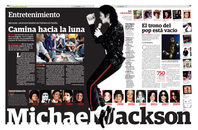
Marin Devine writes: “Lots of extra pull-out information to this page that could have become overwhelming, but is sized well, uses a grid across the entirety of the spread and still manages to work in some nice white space to give you a breather.”
Charles Apple writes: “Y’know, the very last thing I want to see right now is more Michael Jackson. It’s almost as if he’s bigger now than he was when he was alive. I’m getting sick and tired of seeing stories and tributes to… Oh, WOW. This is GOOD…”
SECOND PLACE
“Barack Hussein Obama”
Staff, The Sun Sentinel – Ft. Lauderdale, Fla., USA
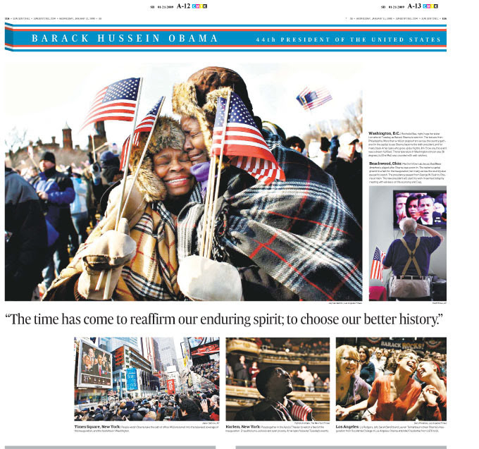
Marin Devine writes: “The main image grabbed me immediately. What a great moment and it’s great to see it played so large. The rest of the page works well together with the reflecting white space and the variation of images. It’s simple and beautiful.”
Charles Apple writes: “For Marin, it was the emotional main image. Yeah, that’s wonderfully shot and wonderfully played. But what did it for ME was the old man with a walker, saluting his new Commander-in-Chief. Yeah, these are all wire shots but this is a masterful job of photo editing and design.”
THIRD PLACE
“El paso más famoso de la humanidad” (Humanity’s most famous journey)
Noé García Gutiérrez – La Razón de México
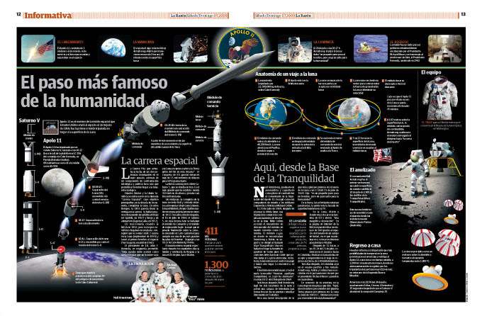
Charles Apple writes: I searched high and low for the best Apollo presentations to post in my blog this summer. For the most part, I came away disappointed. Where was this one? Most Apollo graphics make the mistake of stuffing in way too much information. That’s not the case here. The main image of the Saturn V rocket pulling apart as it rises, is one of the best space illustrations I’ve seen in a long time. Wonderful stuff.”
BEST OF FEATURED PAGES
Judges: Marin Devine and Salomé Nourse
FIRST PLACE
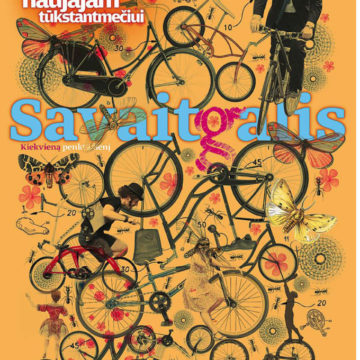
“Savaitgalis” (Weekend)
Vilmo Narečionio – Verslo žinios, Lithuania
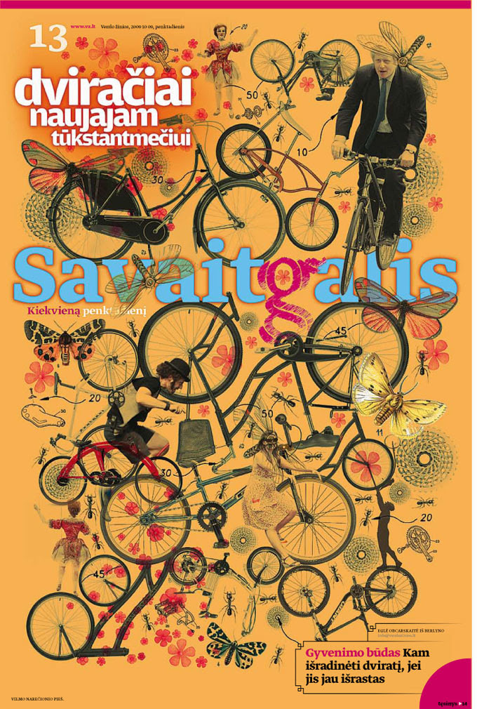
Marin Devine writes: “Fantastic illustration work from this paper – there is some incredible detail in each of the pages. But this one stood out to me because there was a clear theme to the illustration, there was just enough ‘play’ between the images and the nameplate, there was a limited colour palette and it was treated as more of a cover. Normally I like getting some text of the story out front, but with most of these illustrations, there really isn’t room for the start of a story. The one or two paragraphs on other pages felt crammed in there, so it was nice to see that left off on this page.”
SECOND PLACE
“Klimato svečiai” (Climate guests)
Vilmo Narečionio – Verslo žinios, Lithuania
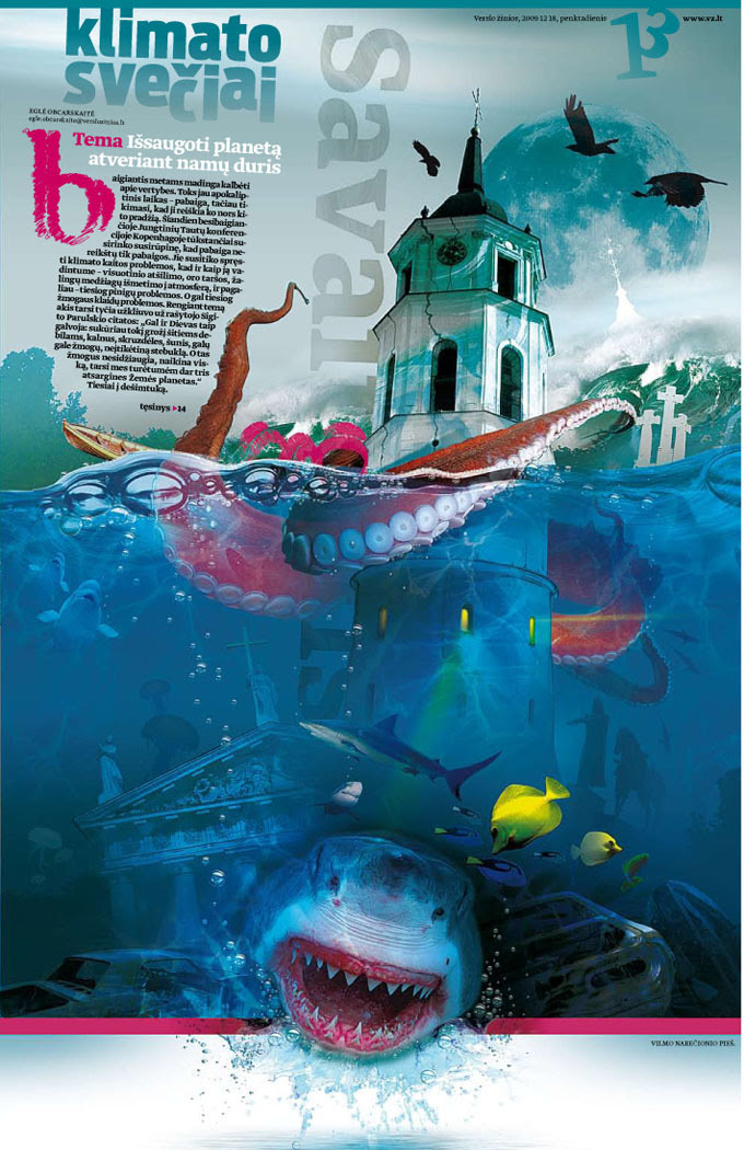
Salomé Nourse writes: “This page speaks of climate change and effects of global warming. The illustration alone doesn’t make it an amazing page. The copy clearly suggests unrest and things being unstable. (I love the way the ’13’ (page number) has been changed.) To me, this page is a work of art due to the illustration and copy working together as one. The one isn’t drawing attention away from the other. It simply makes you hunger for more.”
THIRD PLACE (TIE)
“Pushing the limits”
Douglas Okasaki – Gulf News, Dubai, UAE
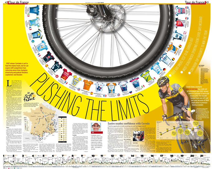
Salomé Nourse writes: “All the information is extremely well presented and easily understood. The copy, images and info graphics have been put together in a very unique way. It’s terribly elegant. The great use of color pushes the page high above standard. It reflects a pure genius idea and fantastic execution.”
“Florida fun”
Chris Mihal, The Sun Sentinel – Ft. Lauderdale, Fla., USA
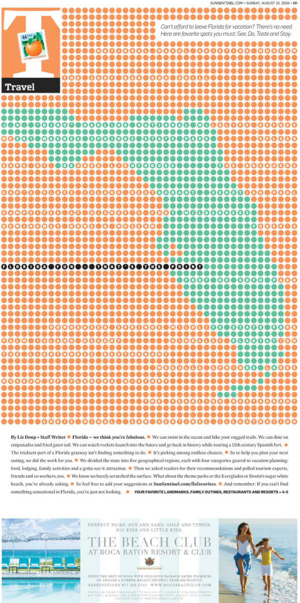
Marin Devine writes: “This is a smart solution to a story that I’m sure has a lot of images to go with it but no single photo can illustrate the whole idea. It’s fun, yet sophisticated. And it’s a rare occasion in which you don’t need a big headline.”
HEAD OF THE JURY

Charles Apple is a free-lance visual journalist and instructor. Formerly the graphics editor of the Virginian-Pilot and the Des Moines Register, he worked as a news artist and graphics reporter for the Chicago Tribune and the News & Observer of Raleigh, N.C. He teaches design and graphics workshops in the U.S. and around the world.
Other Jury Members
Marin Devine has been living and working in Abu Dhabi, the capital of the United Arab Emirates, for the past year. When she’s not hiding from the boiling heat of the desert, she designs for The National newspaper – dabbling a little bit in all of the sections. She’s originally from the northern middle of America (almost Canada) and previously worked as a designer and copy editor at a couple different papers around the country.

Mike M. Dizon is an executive infographics journalist for Singapore’s largest newspaper, The Straits Times. Born and raised in the Philippines, Mike has worked for the Times since 1998 as a graphic artist and designer. He also illustrates and draws 3D graphics. His awards include a bronze in the Asia Media Awards and an Award of Excellence in the Society for News Design’s 27th edition.

Alan Formby-Jackson is a multimedia desk editor at Gazette Media Company, Middlesbrough, England. He has been in the industry for 16 years, starting out as a graphic artist for the Evening Chronicle newspaper in Newcastle, England. Alan is also the Society for News Design’s region 15 director, Europe, a post he has held since 2007. He has an MA in design and blogs for SND region 15 at www.visualeditors.com/jackson.

Salomé Nourse holds a degree in graphic design and has seven years of experience in the newspaper design industry. She works as a visual journalist for Johannesburg’s Beeld, one of South Africa’s biggest newspapers. Her philosophy, she says: “Every pixel has a name, give it a pretty face.”
![]()

