The response was tremendous.Miguel Gomez.Design Director of Gulf News and Adonis Durado, Design Editor of Times of Oman judged the entries.
BEST OF PAGE ONE
1. La Razón de México: Juan Carlos de Jesus Ramirez Gonzalez
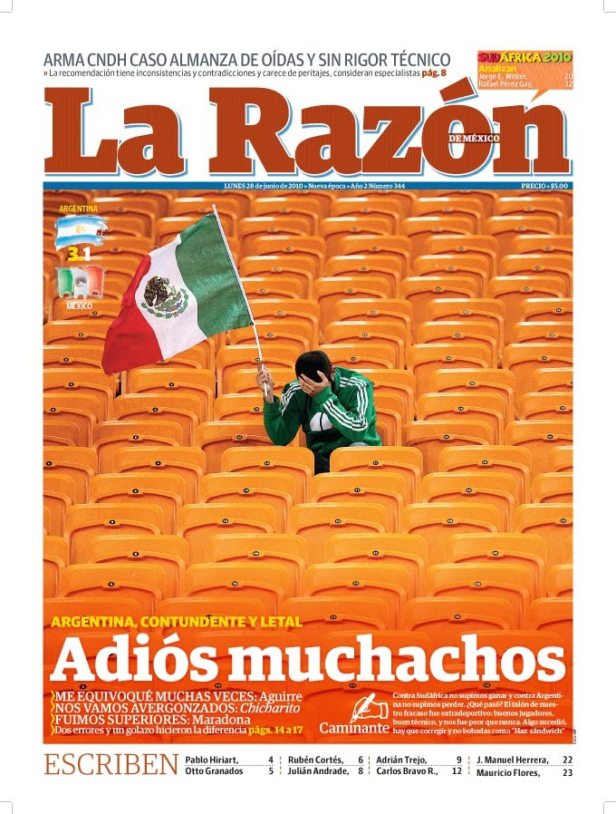
Miguel Gomez: You can see that there is planning behind this simple but effective front page, and this is a key ingredient for success. The contrast between the subject and the background add effect.
Adonis Durado: The impeccable recipe for a prize-winning page: a great photo and a great headline. Gold, please!
2. New Indian Express – Design Editor:Deepak Harichandan(He has now moved to Times of India)
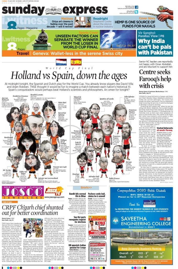
Miguel Gomez: A good example of out of the box thinking to get an exclusive angle for a common story, the style of illustration works enhances the concept.
Adonis Durado: A1 page should not be too serious at all. The quirky graphic that goes with the banner story shows you that sport should entertain and engage.
3. DNA India -Mahesh Vaishnav
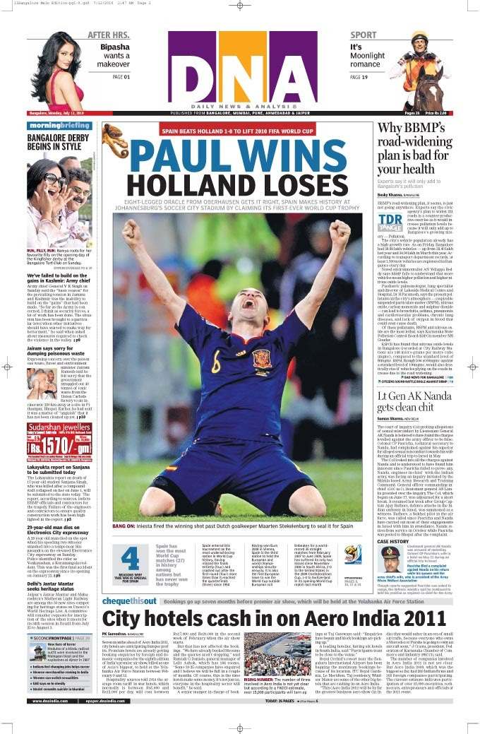
Miguel Gomez: In this page, less is more, the power of the image and a creative headline that avoids the obvious made the magic.
Adonis Durado: Epigrammatic and effortless in execution. — Spain won the World Cup and four reasons why it matters – imagines: declaring an epic into four briefs. And the headline shuns in stating the obvious – which is commendable.
BEST OF INFOGRAPHICS
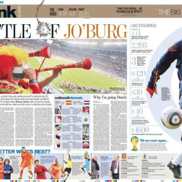
1. La Razón de México. Designer: Iván Robles Jaime Infographics: Oscar Chávez
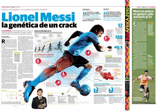
Miguel Gomez: This graphic is balanced and organized, with different layers of content; your eyes easily know where to go. The information goes smoothly from generic to specific data.
Adonis Durado: Very interesting, very informative, and well executed — three key ingredients why this page clearly deserves a gold.
2. Hindustan Times Shital Verma
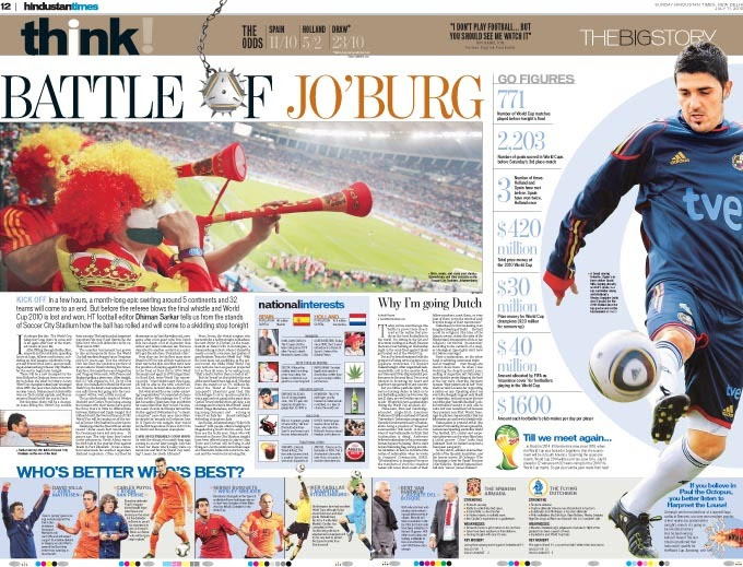
Miguel Gomez: The compilation of data is interesting, good research job; the use of vertical and horizontal shapes creates an effective layout, and touches of colour are used with intention.
Adonis Durado: Understated graphical presentation, yet let’s be reminded that in information graphic, we are interested more in the content. Here you’ll find interesting facts and stats that never bore. Visually accessible!
3. Rockford Register Star Kelley Simms
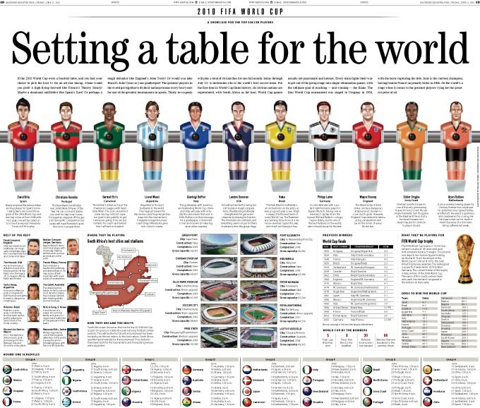
Miguel Gomez: Maybe the idea of the table football figurines is not that creative, but the good part is that it is used to add information and not only to decorate. Good information package.
Adonis Durado: This World Cup preview spread gives the readers what they need to know while drumming up their expectations. The pieces of information here are well chosen and the layout is neatly crafted.
BEST OF SPORTS PAGE
1. New Indian Express -K S Gunasekar
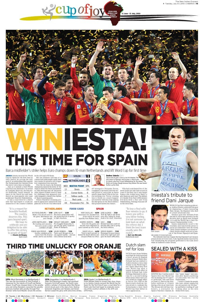
Miguel Gomez: A complete package with everything you need to know about the game and more, facts, background, side stories, all toped with a good image and a creative headline.
Adonis Durado: This page is full of goodies – excellent photos, playful headline, interesting and quirky secondary stories, never-to-miss sound bites, and interesting stats. What a joy to read!
2. Hindustan TImes Shital Verma
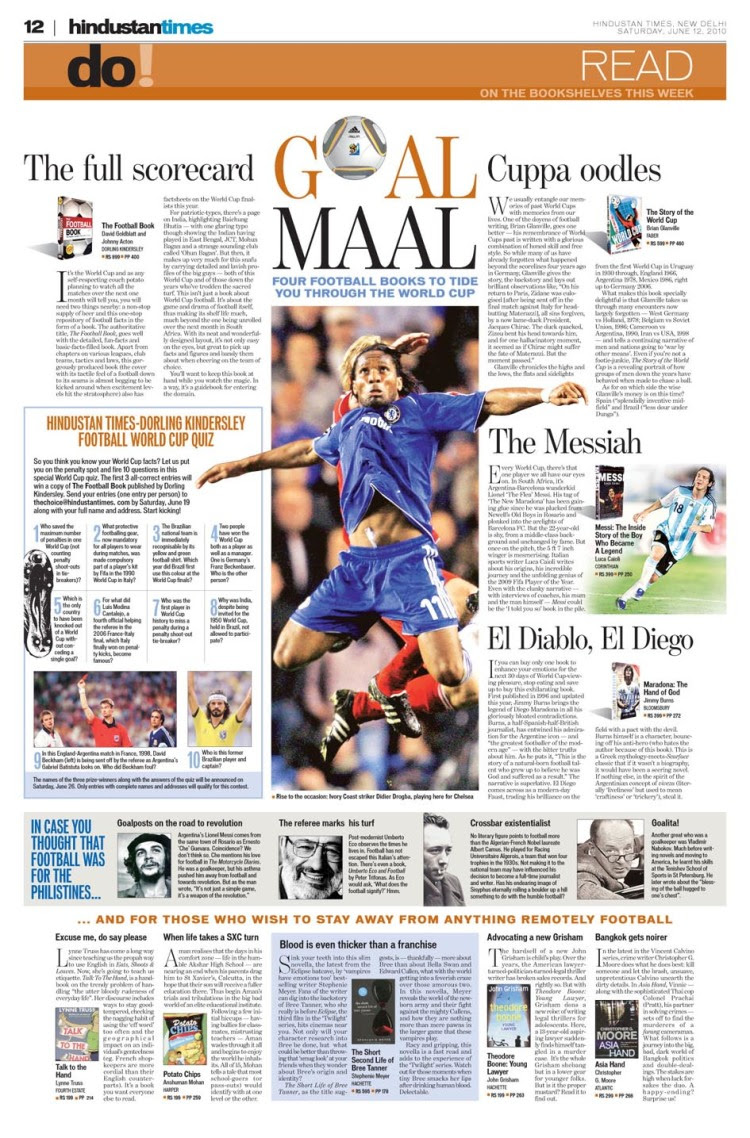
Miguel Gomez: Another good example of how basic principles like a consistent grid, space between columns and elements and one main element can create a simple and easy to read page.
Adonis Durado: How do you organize a sea of information into a spread while still upholding the principle of good design? This page shows you how – through hierarchy and better navigation.
3. Koran Tempo ehwan kurniawan
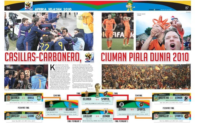
Miguel Gomez: Good use of images and colour to work with a very organized layout that transmits the euphoria of the worldcup.
Adonis Durado: Elegant design and excellent choice of images.
![]()

