 Gulf News Design Director
Miguel Gomez on
design doubts raised
by the members
Lay-out Structure
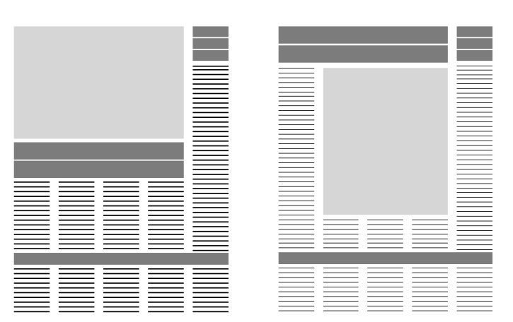
Q) Can the design be repeated after 6 pages, but of course with different headline, different picture and different content. Means the page structure will be same after 6 page.
Arindam Biswas,India
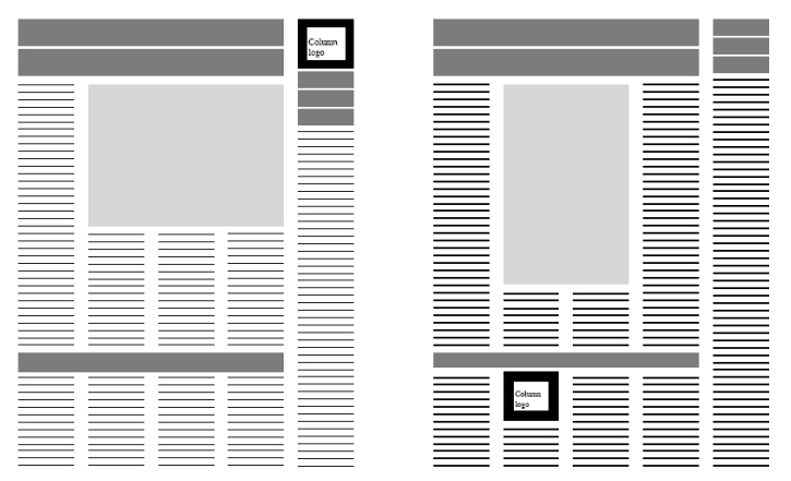
Miguel: If your publication have the same content for each page every week,there is nothing wrong in having a fix layout, specially if you don’t have a big operation and want to save time. What I recommend, if you are going in this direction, is to create some variations for each page and integrate them to your library of templates You can prepare one layout for vertical and one for horizontal main picture, and if there is a column, you can have an option with the column on the side and other with the column at the bottom. This can give you some variety without investing more time.
Award Winning Pages
Q)Many foreign designers has the opinion that Indian newsdesign is very poor.But when I have gone through the Snd awards I saw many winning pages has one or maximum three stories.I think in a big canvas its easy to design and have more options.Foreign newspapers has enough pages for this luxury.But in India we have a maximum of 24 pages for english dailies and maximum of 16 page for vernacular dailies.So we have to include maximum story in each page.In a normal page one we have atleast five stories and few single columns to inco-operate.In this situation how can we make a good award winning page?
Vijitha,designer,India
Miguel:In terms of editorial design, there are some basics that cannot be ignored, like readability, hierarchy, balance, contrast, consistency, etc. But the rest is an open space where each country and culture ads their own flavor, I believe that if a newspaper meets all the basic requirements, informs interacts and serves their readers with a layout that is appealing to them, is a successful design and must be respected.
One of the problems of global contest is that the jury is not always aware of the diverse backgrounds of the participant publications and don’t have enough tools to judge a design that may work in the place of origin. This is why SND always tries to have judges from different backgrounds.
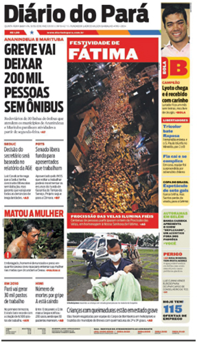
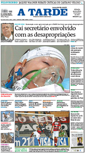

looks clean and organized

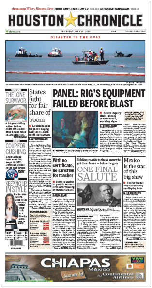
But I think that a better option is to have regional contest like the one organized by this Tksajeev in this blog, or the ones that regionals chapter of the SND, like Spain and Russia are doing, this work because the people judging belongs or is familiar with the background of the participants, but lets go to your question:
a) Before, same as in many other countries, nobody was really concerned about newspaper design in India, but now things are changing fast and that is why we are here now talking. Newspapers are looking for a modern visual identity and more aware of the importance of a good storytelling and presentation, I can said that same thing happened in the Arab region less than 10 years ago, and no, at least in the UAE, we have a very competitive environment.
b) Obviously a big open canvas helps a lot when you have something great to put there, but if your content is bad space cannot do anything, at least for long time. I don’t believe that having more space will save bad design and content, creativity and hard work, attention to details, out of the box thinking and teamwork will.
You don’t need a big space, you need good ideas, that are presented with excellence.
Try to promote visual thinking and creativity within your newsroom, look for good samples made by other papers and share them, you can start with a showcase wall where you exhibit good samples from local and foreign publication and spend some time talking about them everyday, If you find an interesting idea for a specific section, take that printout to the editor and talk about it.
c) Some foreign papers have enough pages to showcase their content, but most of them fight for space, prioritize and decide which stories word the space and go brief and simple with the rest. If you don’t have space, propose the creation of a fix space (maybe half page every week) where you can go visual with a story. (Please go to question 2, On story board for details on brainstorming and planing)
ON INFOGRAPHICS
Q) Do you follow any specific guidelines/templates for sports infographics?
What is your opinion on the use of photographs & illustration side-by-side in one infographic? ?-
In a single day, when there is requirement for infographic from various sections of a newspaper, how do you prioritise? What is the criteria?- Who would be the best person for an infographics department? An artist with a journalistic perspective or a journalist with artistic capabilities.
Dwijith,Designer
Having specific guidelines/templates for your publication and nor only for sports infographics is you want to keep the consistency and help your readers to navigate thru the content, the way you present your elements becomes familiar to the readers and they get use to it, if you keep changing it, readers get lost.
Ideally, you must have a compete and accurate library with all your templates, and a style guide that explains how to use them, with this in place you can guarantee consistency no matter who use the templates.
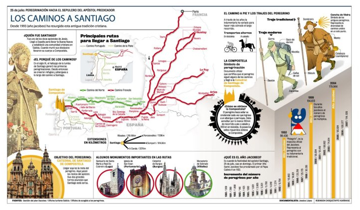
Regarding the use of photographs and illustrations side-by-side on infographic, It depends, nothing wrong in using a picture to illustrate a business graphic, but if you are doing a step by step graphic it is better to use only pictures or only illustrations, if you are using a picture and want to use an illustration to show a detail of the process, it works too.
When there are requirements of infographics from various sections of the newspaper, it is not your responsibility to prioritize, this is a newsroom decision on the benefit of the paper and not only one section. When this occurs, I can see three options:
•To decide which graphic is more important for the newspaper and focus on this one and use something else for the other one.
• To go simple with both or if there is time to focus on one and go simple with the other. (by going simple, I am talking about having just a simple graphic that makes the point and can be done quickly instead of a complicated and time consuming one)
• If it’s possible to focus in one and postpone the other for another day.
To administrate an infographic department, a journalist with illustration capabilities is the best, but to produce the graphics, you may want to have a great illustrator with interest in journalism, I believe that its easier to learn journalism than illustration, for me, illustration is a gift.
ON MODULAR LAYOUT
Q) Gulf News has been following the non-modular layout in page one.Especially above the fold. Did the middle east readers accept this ?
Razi.freelance designer
I think that modular design is a most accepted practice, but a dog-legs system is used in many publications, adopting one or the other depends on your particular needs.
Use modular design if you want:
• Page that looks organized.
• Regulate the use of space and facilitate the differentiation between stories.
• Been able to easily swap between stories.
Use dog-legs if you want:
• Avoid clashing headlines when you don’t have enough pictures to separate them.
• Avoid editing stories to do copy fit, because you have a fix module to fill. (This works specially for text driven papers)
• Accommodate more text and less visuals.
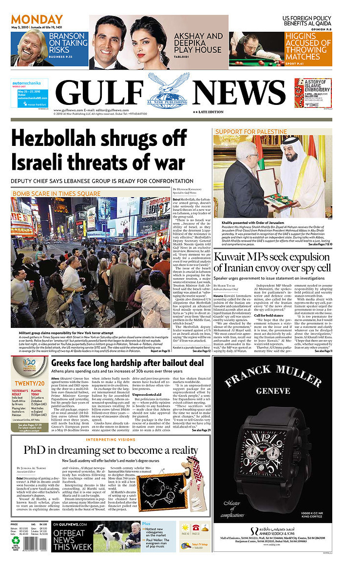
In Gulf News, we use dog-legs only on the front page to accommodate two visual elements above the fold, one related to news and other related to protocol (the activities of the Sheik), no matter if we don’t have one for the main story; for the rest of the paper we use a modular system.
ON EXPERIMENT
Q)Most of the designers in India are from non-design background. What should the new designers in this field must learn, experiment and gain experience?
Karthikeyan, Deccan Herald,India
Miguel:For me experience is as important as a formal career, but same as you have good and bad education, you can have good and bad experience.
My recommendations to grow as a visual journalist if you don have the possibility of a formal education are:
• Think like a reader. If you want to design for readers you must be a reader, when design pages read the story an try to represent it visually, Design is not about beautiful pages, is about pages that communicate, and this is beautiful.
• Look at what others are doing and develop a critic eye. dedicate at least 30 minutes every day just to review any publication available and analyze it, If it works, why works? If it not, why not? learn from this.
• Find good role models / mentors. If you like someone style, follow him, review his job and try to understand his way of thinking.
• Set high standards for your job. Every time you do something, put your best, do it with excellence, dedication and attention to detail, Don worry if nobody notice it, remember that this is for your own benefit.
• Every week, produce something that makes you feel proud. Choose a story with potential and do your best, after a year you are going to have more than 50 reasons to be proud.
• Look for challenges. If there is something you don’t dominate, take is as a challenge, investigate about the topic, try different options, look for help, but learn how to do it, this will increase your skills.
• Learn from your mistakes. There is nothing wrong about making mistakes if you learn from them, always push the boundaries, who knows, you may discover something new and amazing during the process.
• Be curious and keep you surprise capacity. If something calls your attention, follow it and try to understand it, enjoy simple things.
• READ, READ, READ and if you have extra time READ. Consciously learn something new every day, from a book, blog or article, but keep learning.
• Take advantage of all the training available for free. The web is plenty of resources, now is more about making right choices.
Few useful links (I am sure you know more):
www.newsu.org
This is a website sponsored by The Poynter Institute for Media Studies, register to have access to a lot of self-directed courses in many journalism topics, most of them for free.
www.ted.org
TED is a small nonprofit devoted to Ideas Worth Spreading, there you can find conferences with innovative concepts from game changers.
www.snd.org
The Society of News Design, they have some nice interviews and articles.
www.newseum.org
Here you can see and compare hundreds of front pages from newspapers of the world
Some Useful Blogs:
www.garciamedia.com/blog/
www.infographicsnews.blogspot.com/
www.visualeditors.ning.com/
Create the habit of buying good design books. Do it based on your possibilities, other option. These are some books to start with, you can find them at www.amazon.com
– Pure Design by Mario Garcia, I think Mario was giving this book for free at his blog, maybe still there
– Art Direction and Editorial Design by Yolanda Zappaterra
– The Education of a graphic Designer by Steven Heller
– The Education of an e-graphic designer by Steven Heller
– You can also buy the SND Best of News Design books at www.snd.org
ON REDESIGN
Q)Many Foreign design consultants had done redesign work in India recently.For example Mario Garcia had done redesign work on The Hindu,Hindustan Times.But most of the redesign work is not successful from the readers point of view.Whats your opinion of hiring a foreign designer for redesign when he has no idea about the cultural background.Mean while the inhouse redesign of the New Indian Express is a big success
Ajay,Designer,India
For me, there is nothing wrong about hiring a design consultant to redesign your publication, I have very good friends that are design consultants and I participated in more than 50 redesigns while was working as one.
Some of the benefits of having a design consultant on your redesign project are:
• Consultants are recognized specialist on their field, When you hire them, all this knowledge and experience is at your service.
• He knows all the workflow and stages of this kind of projects.
• A consultant brings fresh ideas to the table and is aware of the latest design and communication trends.
• He can suggest “out of the box” approaches and solutions for problems that are similar in other projects.
• Because he is not part of the company structure, his advice is impartial and with no agenda apart from the success of the project.
• People within the publication is busy on the daily process and can’t devote enough time to a redesign project, Consultants can.
• If other expert are required for an specific problem, Consultants can find him.
In order to be successful on a redesign project, between other aspects you must consider:
• A successful redesign comes from the join work of the team on the paper who knows all about the dynamics in the publication and all the values and culture of the country and a consultant that applies his expertise on global trends, basics of design and innovation.
• A redesign is not a cosmetic change, it is a great opportunity to review the way we do things.
• Ideally any redesign process must start with a focus group and survey to detect:
– What our readers like in our publication and we must keep.
– What they don’t read and we can eliminate to save resources.
– What our non-readers like from our competitors that we need to incorporate to make them our readers.
• Create a Committee for the redesign project, a diverse team from all the areas of the paper and discuss the expected results of the project, this Committee must have a speaker that must be the authorized point of contact with the consultant and must be accountable to make decisions.
• With all this information, you must prepare a comprehensive brief on what your expectation on the redesign are, and discuss this with the consultant to hear what he suggests.
• When you hire a Consultant, look for someone with experience on the region, and brief him with all the information you consider relevant, including books, movies and interviews with people that can help him to understand the country and the publication.
• Another option is to hire a Consultant that will live in the country and work in the newsroom during the redesign process to understand the culture and stay there until the project is working. This takes between nine months and a year; this is a good practice that can guarantee a change in the culture of the newsroom.
Other option is to assign someone from the consultant team to stay during this time to follow up the project.
If after all, you decide to do the redesign in-house consider:
• To do the focus groups, create a team and define the expectations of the project.
• Prepare a calendar that includes all the milestones and specific revisions, don’t want to spend all your time doing changes.
• Remember that you must have just one point of contact for the project, the Committee can discuss as much as it is required but after coming with a decision, your point of contact must communicate the agreements.
• Dedicate a fix amount of time to the project every day, work in a private place, consider that is really easy to be distracted by the daily duties and been force to postpone the project.
• Keep a printed record of al the progress and decisions, people tend to forget what they approved and change their mind across the project.
• At certain point of the project will be good to have new focus groups to evaluate the reaction of the readers and do adjustments if they are required, this is a good chance to test some innovative ideas, some times we are more conservative that our readers. Take all the feedback into consideration, but do only the adjustments that add value to the product.
• Implementation and follow-up is a crucial part of the project, before launching the new design have all the templates ready and train all the newsroom in the new way to do things, produce at least a week of test issues to practice and to be sure that everything works, try to print at least one of this issues to test the colors and typography and do any required tweak.
• After the launching, work hard to maintain the new design and don’t allow people to go back to the old habits. After a couple of weeks do a new focus group to evaluate the readers response, Do adjustments only if something really strong is not working.
ON STORY BOARD
Q) Could you please explain the importance of “story board”? Who all join together to put it up and how much time normally it takes?
I heard that some especially Americans follow Tim Harrower’s maestro planning sheet for that.We have no structure. Please advice on this
Haq,Pakistan
Miguel: Having any kind of “story board” is a good idea, but this tool without proper planning is useless.
I believe that the planning process must start with a idea, from there, a team that involves anyone who can add value to the project, start a brainstorming session ( check this link for some brainstorming techniques:http://www.unc.edu/depts/wcweb/handouts/brainstorming.html#3 ).
Ones you are clear on the scope of the project, use your “story board” (you can create your own or use one that already exists) The Maestro Planning sheet proposed by Tim Harrower you suggested, is a good one.

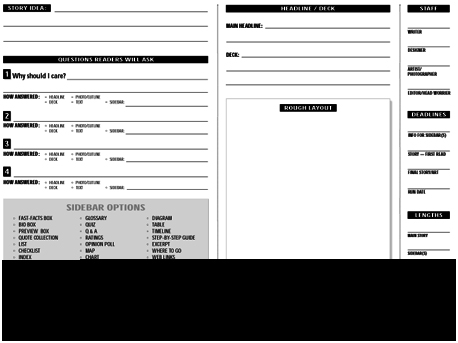
The time required to plan a story may be long at the beginning and people may feel that is a waste of time, but with continuos practice the time will reduces considerably and for sure will make your life easier and help you to produce better pages..
The main advantages are:
1. It “Brings the future to the present” giving a clear idea of how the page and all it elements are going to look.
– The layout works?
– Reflects the spirit of the story?
– Are we covering all the angles?
2. Keeps a record of the Who, What and When (Who is doing What and When it must be raeady) of all the elements within the coverage.
– This means that all the team agrees on the content and compromises on getting all in time.
3. Defines the exact length of all the stories and support elements like boxes, figures quotes, etc.
– This avoids stress when all the elements are placed on the page and stories don’t fit.
4. Defines in detail the visuals (pictures, illustrations and graphics) required for the coverage.
– This avoids stress when all the elements are placed on the page and they don’t match with the content.
5. Allows all the team to work at the same time on their own.
– This saves lot of time and reduces the risk of having elements that don’t work together.
– Because everything is defined in detail, is just matter of placing elements on the page as they are ready and there is no need to rework stories o redo graphics and illustrators.
STRUCTURE OF DESIGN TEAM
1.What is the ideal structure of a design team in a newspaper?
Benob-Artist,Kerala,India
Miguel: I can tell you about the pattern I consider ideal, it is not written in stone and other may differ.
An ideal design department must have these expertise represented:
Designers (visual journalists)
![]()

