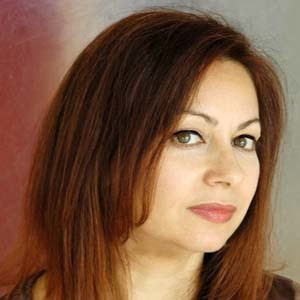
 Lucie Lacava broke conventions and blazed the trail in newspaper design. She has proven that a newspaper can be elegantly designed using only two colours for Le Devoir. Lucie was the first to use the “L” format in newspaper design when she adopted the concept for La Presse newspaper (Montreal) in 2003. The concept had inspired many publications to do the same. Lucie is a very discreet person; she lets her work speak for herself.
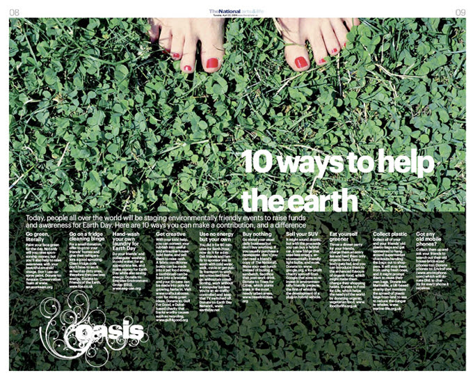
Her design acumen was recognized when The National was one of the top 10 newspapers to win more awards in The Best of News Design competition in the very same year it was launched.
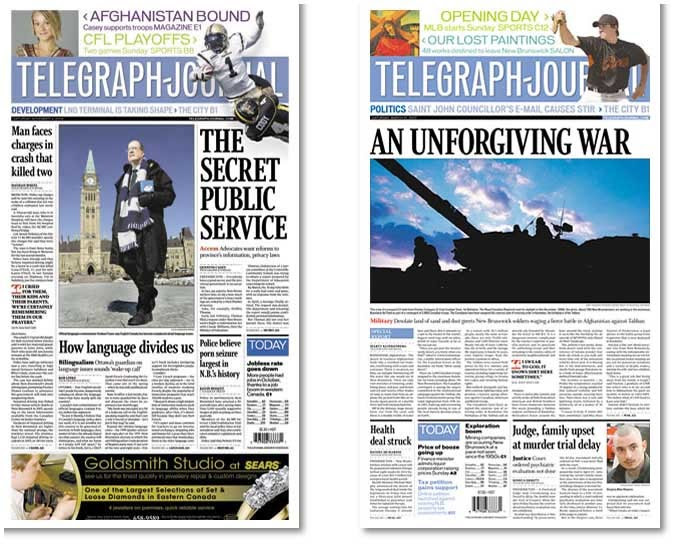
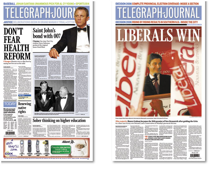
What do you think about the future of printed newspapers?
Quality newspapers will survive and continue to deliver a print edition in the future. If they do not revise their business model they will end up with fewer readers, mostly from the business, political, and intellectual elite.
As for the local papers, they will have to be relevant, entertaining, well written, and FREE in order to survive.
I think it is great that in the latest Harry Potter and the Half-Blood Prince, Harry likes to read the morning paper the “Daily Prophet”, which is somewhat magic and interactive but still on paper. This sends a strong message to young audiences all over the world.
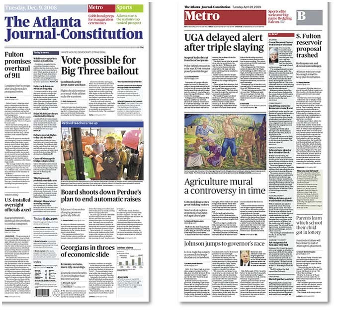
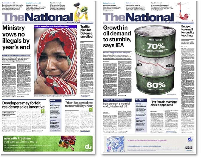
Do you have a preference of newspaper format that you feel more comfortable to work with for a graphic project?
I have worked on broadsheets, tabloids and compactor mini-tab, but I have never worked on the Berliner, this is my favourite format.
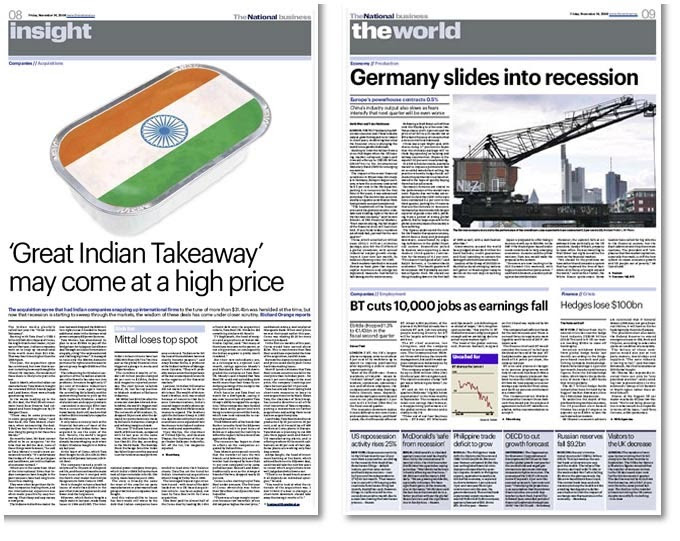
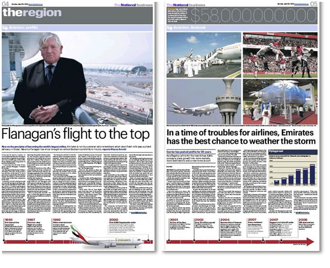
What newspaper in the world you would like to redesign and why?
The New York Times, because it is the most prestigious newspaper in the world. I imagine this would be a dream project, an intensely typographic project, where tradition and innovation could merge.
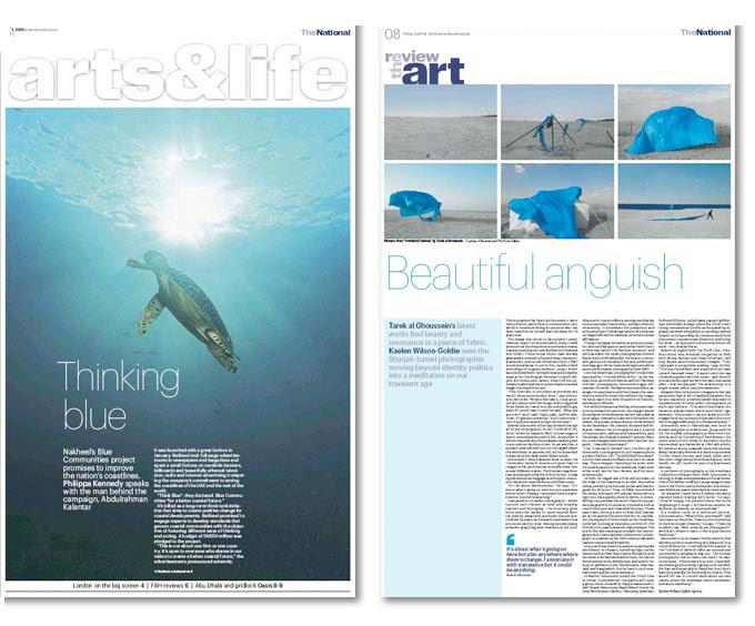
What’s your advice for someone who is beginning in newspaper design?
Read the story first, design later. Work on text-heavy inside pages, opinion pages, or even classifieds. Develop an appreciation for micro-typography and grids. It is always fun and relatively easy to work with white space and make a feature page look good, but as the saying goes, “God is in the details.”
What’s your dream in your life? Or do you already have everything you want?
If I look back at my early years I must say that I have exceeded my own expectations. Now I have everything. I want but more of it would be better! I have many dreams. I would love to own a little chateau in the south of Europe where I would live, but also own and publish my own quality newspaper, and I would love to also design fashion, furniture and buildings.
![]()

