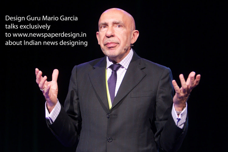
Mario Garcia: A newspaper’s design must accommodate the environment and culture in which it exists. Obviously,, it is up to the designer to create a colour palette that, while adapting to the environs, does not appear to be over the top.

2.What is your rating on the Indian news designing compared to other parts of the world?
Mario Garcia: Like everywhere else, there are well-designed newspapers in India and others that could be improved. In general, Indian newspapers tend to be busy, a bit congested and trying to do too much which may cause a bit of chaos on a page.
3. Indian readers have a liking towards reading more. So the designers in India may not have enough space to show their brilliance, compared to European or American designers. In your opinion how can Indian designers tackle this situation ?
Mario Garcia: By creating the hierarchy. By establishing a strong and clear Center of Visual Impact on each page, and by not trying to push so much into a page that it turns into the window of a hardware store. But, most important, priority, hierarchy. Let the reader’s eye come into the page comfortably.
4. These days many language newspapers in India are spending very less amount on designing with the thought that print will not survive digital revolution…
Mario Garcia: This is a worldwide situation, but it has nothing to do with the quality of the design. As long as the print is here, we must do print happily, efficiently and remember that people bring a digital mentality to print.
5. Many of the Idon’tewspapers doesn’t follow design style guide or design basics. But still, the circulation grows. This has created a thought among newspaper groups that design has nothing to do with circulation. What is your comment?
Mario Garcia: I agree. Content has everything to do with circulation. The design is there to package the content, to make it accessible, to make it easy to read. If the content is not there, NO award-winning design will push it down the throat of the reader. The design does not guarantee commercial success, content and newspapers that become essential in the lives of their readers DO.
6. Do you think news designing has become stagnant these days ; all over the world?
Mario Garcia: Not really. Not at all. There is design experimentation for digital and mobile. There are wonderful things been done for print, especially with the treatment of breaking news in print, where one does not break news.
7. Can a designer do wonders without a good story?
Mario Garcia: Sure, but it is pure decoration.
8. Can an editor be a good designer too?
Mario Garcia: Yes, there are many who do, as did Raju Narisetti when we designed Mint, or Abdul Hamid of the Gulf News of Dubai, Espen Egil Hansen of Aftenposten (Norway). I have been lucky to work with very visually gifted editors. They are the best.
9. Do you think there is not much innovation in web design these days?
Mario Garcia: Let’s not generalize. There is innovation going on everywhere and with mobile, tons of innovation.
10. What are the good qualities of a print and web designer ?
Mario Garcia: Respect content and lets it drive the visual presentation; emphasizes storytelling design across platforms; realizes that each platform affords different possibilities. Works well with Editors and Photographers. Respects typography and its importance.Does not get involve in pure decoration, but emphasizes functional design.
![]()


