by tksajeev
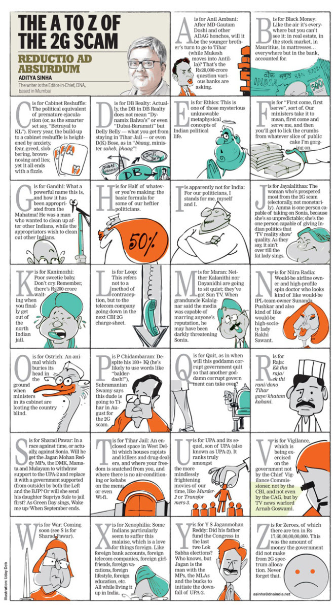
The idea of this discussion on STORYTELLING came to my mind when I first saw the write up of DNA* Editor Aditya Sinha “The A to Z of the 2G scam”.
*DNA (daily news analysis) is one of the leading newspapers in India

Here I present before you the thoughts of Well-known International designers on STORYTELLLING
It is, indeed, all about storytelling…
Mario Garcia
 We must concentrate on better stories, then craft them to the specific platforms. The story comes first, then a discussion of how the story can best be told in print as opposed to online as opposed to the tablet. There was never a better chance to be a storyteller with the best possibilities to give those stories longer legs on the new platforms that we now have available. But one thing that remains top for journalists and designers: getting the best story and seducing the audience with the way we present it.
Storytelling and design – it is a unity..
Hans Peter Janisch
 Storytelling and design should not be devided. One belongs to the other, simply because there are so many ways to tell a story. It is the same question as with the hen and the egg: what was first? If I have a great story to tell, I have to design it no matter where it will be published. Even a book with no pictures needs design in many aspects. Typography for example, that makes it readable. Or the important design of the book jacket.
I Storytelling must come before design
Lucie Lacava
 Wikipedia defines storytelling as the art of narrating events in words, images and sounds, a definition more appropriate to describe multimedia storytelling. If, however, we describe the deep-rooted tradition in journalism, the narrative as a means to capture the reader’s attention on an emotional level, then storytelling must come before design. The narrative is the beating heart and soul, while design defines its shape and form. Design’s primary function is to attract attention but only good storytelling has the power to retain it.
Storytelling should come first
Charles Apple
 I think storytelling SHOULD come first. Absolutely. The reason: As visual journalists, we sometimes get wrapped up in our fonts, our color palettes and our design. But our REAL job is to tell the story. We have to tell a great story and we have to tell it in a compelling way. Readers don’t buy the paper to see our designs. They buy the paper to read the news. Good news design works hard to tell those stories, tell them in a compelling way and do it with efficiency in mind. The reader never has as much time to read our publications as we’d hope he does.
Now, REALLY good news design isn’t just illustrating and presenting these stories. REALLY good news design takes into account the architecture of the publication. It guides the reader through the paper or the magazine and the reader’s eyes around the page. To paraphrase Apple’s Steve Jobs: Design isn’t about how it looks. Design is about how it WORKS.
Nearly every class I teach, I explain to folks that if a reader picks up my graphic and says, “Wow, what a graphic!,” then I think I’ve failed. That’s not what I aim to do. I want the reader to pick up my graphic and say: “Wow! I didn’t know that’s how this worked!” Or, “Wow! I had no idea we spent that much tax money on this!” Or, “Wow! I never knew that’s how something happened!” Good news visuals should be about the content. About the storytelling.
Storytelling is the essence of design
Adonis Durado
 Storytelling is the essence of design. You don’t split storytelling and design — each one can’t live without the other. Doing so will result to a hu-hom effect (page devoid of visual vigor) or a cosmetic effect (design serving as mere decorations). Designer should always remember that content is king. We design to tell a story.
![]()


