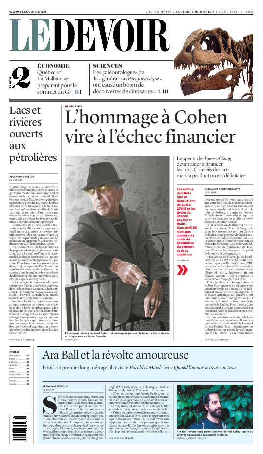
Well-known news design consultant Lucie Lacava talks about her redesign of Le Devoir newspaper
Interview by Marie-Andrée Chouinard
Where did you get this passion for visual journalism and design of newspapers?
After finishing a degree in visual arts and a specialization in graphic design at Concordia University, I started working at The Montreal Gazette in the early 1980s. I first worked in advertising but soon a position opened up to do infographics in the editorial department at the newspaper. It was at the time where USA Today had just launched. Everyone was talking about it. I started designing graphics but also section fronts and eventually, I was asked to work on a project to design the Sunday edition for The Gazette. And then another, and another. A few years later I left to join LeDevoir to help them implement the historic redesign in 1993. It was at the time when Lise Bissonnette was the publisher at Le Devoir.
And here we are again, several newspapers and many redesigns later. When Brian Myles and Luce Julien asked you to go back to your first love, also to work on a reorganization project. During the first meetings with you, we discussed presenting the content in our two sections according to the strength of the news, and no longer according to a predetermined order. That’s how you had the idea of naming the second section #2 by the way.
I really liked this idea when it was presented because it involved two very important principles : content first and foremost, but also flexibility. The reader looks at the newspaper as a whole, and not necessarily at this or that section. By the way, we already do this, on the front page of a newspaper, we vary the menu every day. We adopted this principle to the second section as well, by placing that which seems to us the most important, no matter the topic. So we’re now applying this logic to all content. A little more business and international one day because that’s where the content is the most impactful, but on the other hand, the next day, it can be totally different.
What guided you in your redesign of this model, this time?
When we think about re-design we must think of the reader first. Who is the typical reader of Le Devoir ? Someone informed, curious, who expects to find in the newspaper a certain depth, not superficial content. For me, the content must therefore prevail in the design. The graphics and the design part are in the background. They are there to support the information and must not cause visual noise. I also wanted to maintain a link with the tradition from the past, sobriety, some elegance, but looks forward to the future. Every newspaper has its history and it must be taken into account and even draw inspiration from it. This layout that you propose is more “refined”, less dense. We know newspapers, the New York Times to name one, which make the density of page One their signature. Is lightness in the grid equal lightness in the content? I taught editorial design at the university for four years, and young people often asked me, “Why are newspapers so dense? ” readers, therefore, do not want to see overloaded content. Which does not mean, however that we can’t offer them with long texts, or several texts on the same subject. We want to offer different angles, long texts, but also the summary of essential news in the form of briefs. You have to create a rhythm in the reading of the newspaper between texts indeed long and others more summarized. All this while keeping the sense of the hierarchy, which is really important.
Here is some prototypes
What place does the photo occupy in this grid?
Why did you suggest to replace the jumps from page one on the inside pages and no longer on the back of the first section, knowing that it would upset the habits of our readers?
Why did you propose a different design for the Saturday front, with the vertical logo?
![]()


