10 creative directors tell us what struck them the most about their favorite covers of the year.
 Just as editors have adjusted to hybrid print-and-digital strategies, so too have designers, who in 2018 unleashed a succession of stunning magazine covers aimed at capturing the attention of newsstand passersby and Instagram scrollers alike. But seismic shifts in the ways magazines deliver their content to readers have done little to diminish the gravity of an impactful magazine cover—as evidenced by the growing number of online magazines who continue to produce digital “covers” long after forgoing their print editions.
One of our many annual traditions at Folio: is to reach out to a handful of designers and creative directors from around the magazine industry, hope that they respond to us, and ask them to pick their favorite magazine cover of the year and tell us why.
If magazine covers are a reflection of the current climate, then Time creative director D.W. Pine—who had three covers selected among this year’s critics’ picks—has certainly tapped into the zeitgeist. The New York Times Magazine, a regular presence on these lists under design director Gail Bichler, also shows up multiple times.
Click any of the covers below to view them full-size.
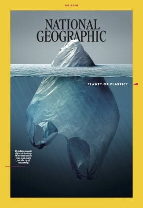 National Geographic
June, 2018
Artist: Jorge Gamboa
Creative Director: Emmet Smith
Editor-in-Chief: Susan Goldberg
Published shortly after National Geographic’s beautiful redesign in collaboration with Godfrey Dadich Partners, this cover immediately felt iconic to me. With a concept as crystal clear as Arctic water, the design beautifully speaks to the story’s suggestion that plastic pollution may just be the tip of the iceberg.
The minimal typography and delicate design elements, such as the arrow pointing at the cover line, help us focus on a bold and striking image of an iceberg which, upon second take, is recognized as a plastic bag floating in the ocean. The photo-illustration, created by Jorge Gamboa, did cause a fair amount of copyright controversy, though. This is why the major takeaway for me is that a beautiful and well-designed cover is great, but a bit of controversy can go a long way in making a cover even more memorable and truly one for the ages.
— Rami Moghadan, Art Director, ESPN The Magazine
Civilization
Vol. 1, Issue 2 (October, 2018)
Co-founders: Richard Turley, Lucas Mascatello and Mia Kerin
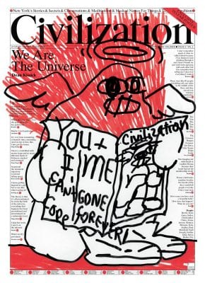
Civilization is the broadsheet-sized publication created by former Bloomberg Businessweek/MTV/Weiden & Kennedy creative force Richard Turley and a couple of his pals, with the mission of being “a future history of New York.”
The cover for issue number two reminds me so much of the best of the underground press of the late ’60s/early ’70s. It’s original, passionate, provocative and cool, and it flies in the face of contemporary modes of publication cover design and art direction. Yet it’s totally on brand, and works brilliantly when shrunk down to Instagram size. This is a very exciting and inspiring next-generation cover.
— Robert Newman, Creative Director, This Old House
TIME
November 26, 2018
Photo-Illustration: Hank Willis Thomas and Emily Shur
Creative Director: D.W. Pine
Editor-in-Chief: Edward Felsenthal
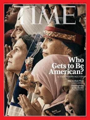
Titled “Who Gets to Be American?” this cover hits at the core of who is and wants to be an American, without flag-waving and hysterics.
The text, art direction, photo retouching and attention to detail (in reference to the original Rockwell illustration) are spot-on. The powerful image works, whether one is aware of Rockwell’s “Freedom of Worship” poster or not. The cover also cuts across political lines and forces viewers to focus on the underlying issue: treating all people equally. A great, harmonic work borne from a strong editorial and art team.
— Mark Montgomery, Senior Art Director, IEEE Spectrum
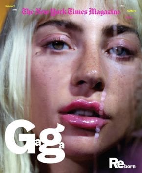 The New York Times Magazine
October 7, 2018
Photographer: Marilyn Minter
Design Director: Gail Bichler
Editor-in-Chief: Jake Silverstein
If 2017 was the year the #MeToo movement created some of the most memorable magazine covers, then 2018 seems to the be year women took control over their images on magazine covers. Some of the best this year were Beyonce’s Vogue cover—she handpicked Tyler Mitchell to “give a step up” to an emerging African American photographer—and collaborations between female fine art photographers. Collier Schorr’s shoot with Michelle Williams for Vanity Fair and my favorite cover of the year, Marilyn Minter’s New York Times Magazine cover with Lady Gaga, both signaled that this was not the same old celebrity cover.
Like Minter’s fine art work, this image exhibits her signature tight crop—creating an intimacy that is arresting and highlights beautiful “flaws” so often retouched out in other photographs, like freckles and errant hairs. Then Minter layers on voluptous color, saturated pinks, glossy sheen and drips of liquid. Gaga has transformed herself before, but it often felt like costume. This new incarnation manages to feel surprising but real.
The visual tension of the main coverlines, Gaga with it’s zaftig g’s and small a’s, Reborn, a concise wordplay on her movie debut, add another layer of visual depth. The New York Times Magazine doesn’t have the same hard-sell demand for coverlines, but the struggles of the newsstand environment seem to have opened doors for publishers to take more risks in type and image resulting in stunning posters for their brand.
— Dave McKenna, Art Director, 5280 Magazine
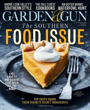 Garden & Gun
October/November, 2018
Photographer: Johnny Autry
Creative Director: Marshall McKinney
Editor-in-Chief: David DiBenedetto
Garden & Gun knows its readership well and doesn’t shy away from their true Southern star. Issue after issue, this brand keeps the aesthetic bar held high with their rich cultural storytelling, thoughtful design and beautiful photography. Whether it’s people, places, sport or food, there is heart and soul in every page. Staying true to their roots is what makes this brand one of the best in the nation.
I am consistently amazed with their stellar covers and how they hit home runs each issue. The Southern Food Issue cover is no different. A delicious, in-your-face hero slice of bourbon-cream-topped sweet potato pie is front and center. The dessert alone has one salivating. But the fork, placed just so, tempts you to pick it up and have a first big bite. Add a dash of alternating colors to the headline, a complementary steel blue table, plate and fork, and that orange wedge of yum just jumps right off the cover. Simple. Elegant. Understated. Delicious. I’ll have seconds, please.
— Steven Banks, Design Director, Los Angeles Magazine
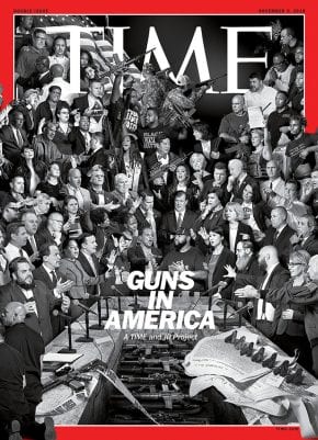
TIME
November 5, 2018
Artist: JR
Creative Director: D.W. Pine
Editor-in-Chief: Edward Felsenthal
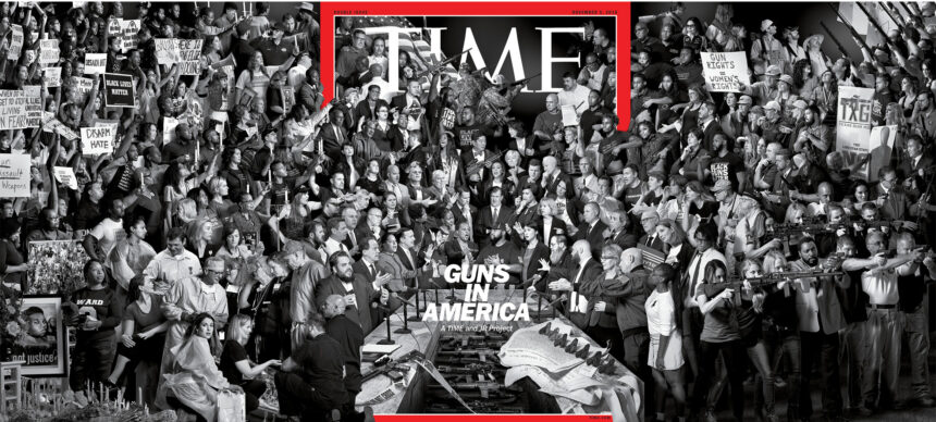
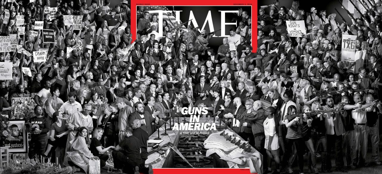
The artist JR’s “Guns in America” Time cover was the first cover in a very long while to bring me to a complete stop. ( I also said “S—!” ) The scale, ambition and execution is awe-inspiring. I was struck at once by its message, but also understood that I was looking at art. Cover gatefolds are regularly mere stunts that conveniently accommodate advertising. Here, a depiction of the two sides of the gun debate, unfolds over covers at left and right. The eye of the storm and the politics at the center of the debate seems almost calm until we unfold the crush of the other two sides.
The “cast of thousands” approach is the opposite of what a cover traditionally requires, since there’s no single focus, but I admire the deep storytelling, the meticulous composition and gorgeous vision it took to assemble this image.
— Bruce Ramsay, Creative Director, Winsight Media
Eye on Design
Issue #2 (August, 2018)
Designer: Shira Inbar
Art Director: Tala Safié
Founder/Director: Perrin Drumm
Managing Editor: Liz Stinson
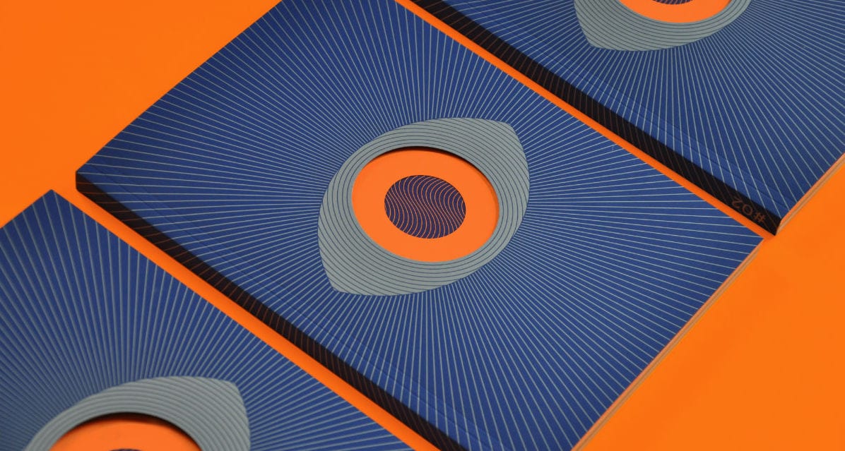
The rebirth of the magazine cover continues apace thanks to Instagram, where tiled jpegs fight for attention just as their paper versions always have on the newsstand. Selecting a single example is tough, but this second cover of AIGA’s Eye on Design magazine was remarkable for two reasons.
Firstly, it looks great—a sharp piece of design that combines the title’s established double-cover die-cut ‘eye’ identity with the ‘Psych’ theme of the issue. The colors are strong, warm and engaging with simple pattern-making, making the most of the three special inks. It is an iconic cover, compellingly simple, but that simplicity is put to great use. Nothing is redundant.
I know some will look at it and think ‘oh that’s too easy – there are no cover lines…’ etc. Which is nonsense. The second reason for selecting it as cover of the year is that it was one of our best-selling titles this year, both at our shop and at various pop-ups, away from our natural audience. The intensity of the staring eye drew everyone to it, super-focused proof of the need for eye contact on a cover.
It worked as a piece of design and as a commercial object. What more can you ask of a cover?
— Jeremy Leslie, Founder and Creative Director, magCulture
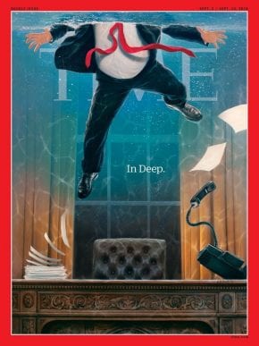
TIME
September 3, 2018
Artist: Tim O’Brien
Creative Director: D.W. Pine
Editor-in-Chief: Edward Felsenthal
Although this is my favorite cover for 2018, it is the most recent of a series of progressive covers.
Although the topic of Trump is a fertile ground, Time creative director D.W. Pine and illustrator Tim O’Brien have created a cover of grandiose subtlety. With its highly rendered painting of Trump literally afloat in the problems of his own making, O’Brien speaks volumes about the nature of this presidency. Art Director D.W. Pine has used understated typography for all the covers in the series, and that proved to be a master stroke.
— Matt Strelecki, Creative Director, Meredith AgriMedia
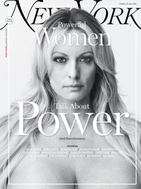
New York
October 15–28, 2018
Photographer: Amanda Demme
Design Director: Tom Alberty
Editor-in-Chief: Adam Moss
This New York cover of Stormy Daniels, in regard to a series about powerful women in 2018, is my favorite of the year.
The image is extremely powerful to me because instead of focusing on what most people, including the president, knew Stormy Daniels for, it forces the audience to face a woman who has very effectively stood up to a president who constantly degrades and insults women from behind the safety of television and social media. It’s a very confrontational portrait that pairs so well with the headline because Stormy Daniels decided to take control of her story this year and make sure that all of us, including the president, know it.
— Justin Armburger, Art Director, GIE Media
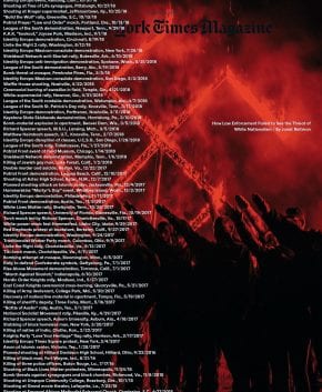 The New York Times Magazine
November 11, 2018
Photographer: Mark Peterson
Design Director: Gail Bichler
Editor-in-Chief: Jake Silverstein
I always get drawn to covers that evoke an emotional reaction from me. Time Out London’s “The Green Issue” Pantone cover made me smile, a rare thing these days for any cover. Record Magazine’s simple but charming “man with a record for a head” also. But on the other end of the emotional scale, New York Times Magazine‘s brilliant and provocative “Rise of the Far Right” cover was the most impactful I saw. It’s striking, disturbing and is smart enough to realize the name of the magazine is secondary in importance to the subject matter, hence it being barely visible. A brave and graphically arresting cover.
— Chris Deacon, Former Creative Director, Playboy and Time Out New York
Editor’s Pick
 ESPN The Magazine
September 10, 2018
Photographer: Randall Slavin
Creative Director: Chin Wang
Editor-in-Chief: Alison Overholt
Picking my favorite cover at the end of the year for Face Up has been something I’ve done now since 2014. I look forward to it and usually have a list of frontrunners, making this a tough decision. But finding my pick this time around was hard for a different reason. While there was a ton of great work done in 2018, I think a lot of terrific covers were overlooked due of some rather obvious distractions in and around media. So I could go in two directions this year: pick one of the many provocative and well done political covers, or choose to celebrate near-flawless design and execution that also syncs up seamlessly with its respective brand.
I went with the second option. ESPN The Magazine’s September 10, Odell Beckham Jr. cover is a case study in composition. Seriously, it’s not only a captivating photograph, but it’s also an incredible work in grayscale. It’s somehow both linear and totally chaotic. And your eyes can’t help but wander all over the page. There are also wonderful nuanced elements, such as the signature OBJ catches in clipart-like silhouettes and the reflections of his massive hands in his sunglasses. This is truly poster-like art that is consistent with work that creative director Chin Wang and her team have been producing at ESPN over the the past few years (biweekly!).
![]()

