Well-known information graphic expert Charles Apple describes how he conceived this THE LONGEST DAY chart exclusively to www.newspaperdesign.org
This past Friday was the summer solstice — the longest day of the year in the Northern Hemisphere and, here in the U.S., the official start of summer.
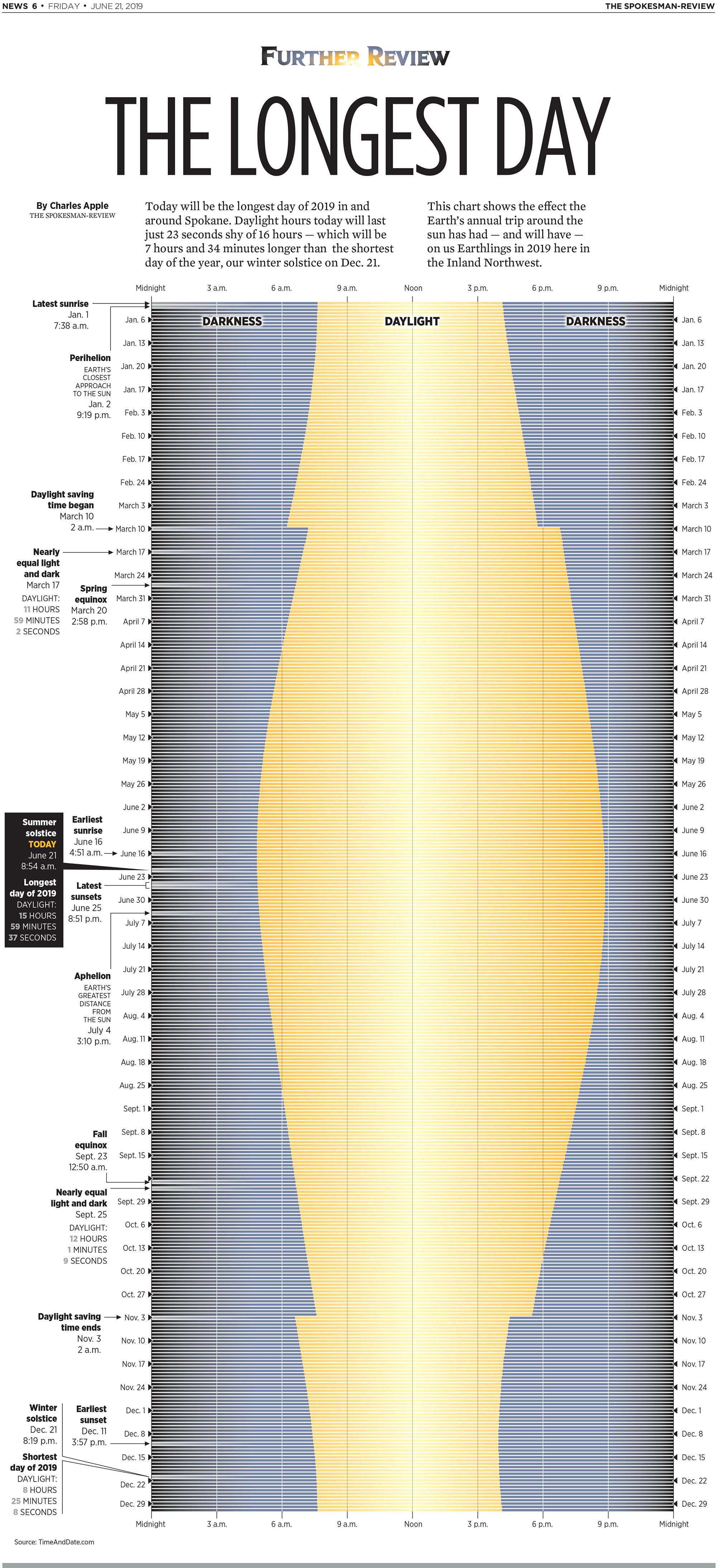
I celebrated this by drawing a graphic that shows the amount of sunlight and darkness the city of Spokane, Wash., gets every day of the year.
The higher the latitude of your location, the more sunlight you get in the summer. I live in Atlanta, Ga., down in the southeastern part of the United States. But the newspaper I work for, the Spokesman-Review, is located in Washington state, in the far northwestern corner of the U.S. Today was the longest day of the year for each of our cities. But Spokane got more sunlight than we did.
And near the North Pole, it never really got dark. But near the South Pole, it never really got light Friday.
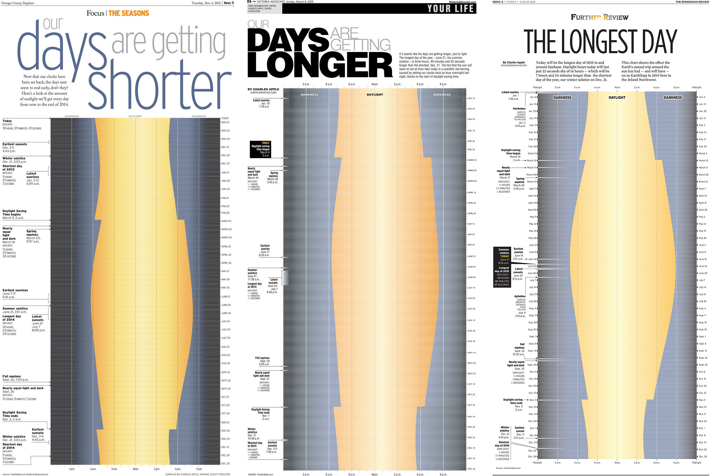
This was the third time I’ve done this graphic. You can see how the shape of the curve changes for each of the newspaper cities I’ve worked for recently: California, Texas and Spokane:
Note how the shape of the curve is different in each of those charts. This is because of two reasons:
1) I’ve done this chart at different times of the year (the fall equinox in California, left; the spring equinox in Texas, center; and the summer solstice for Spokane, right).
And 2) the difference between the longest day in summer and the shortest day in winter changes depending on your latitude. The greater the difference, the “curvier” your resulting chart will be.
And the closer you live to the equator, the less that difference is. So that curve will practically go away. More about that in a moment.
Because the data changes — slightly from year to year, but significantly depending on where you’re located — I’ve had to research this project from scratch each time.
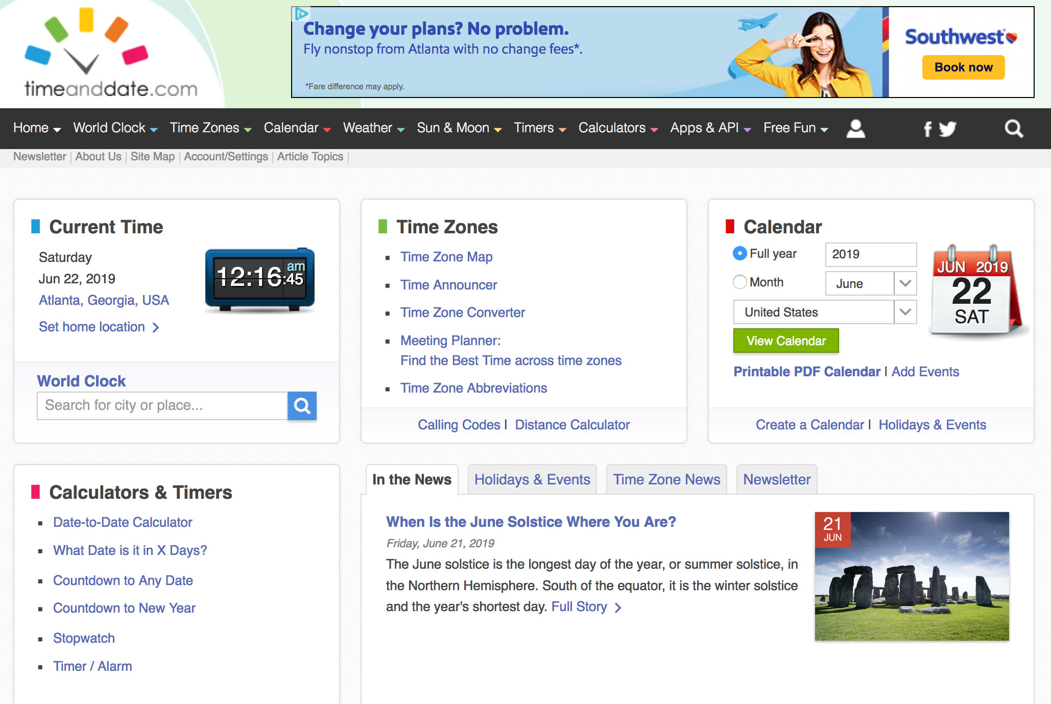
That’s become a lot easier because of the web site TimeAndDate.com.
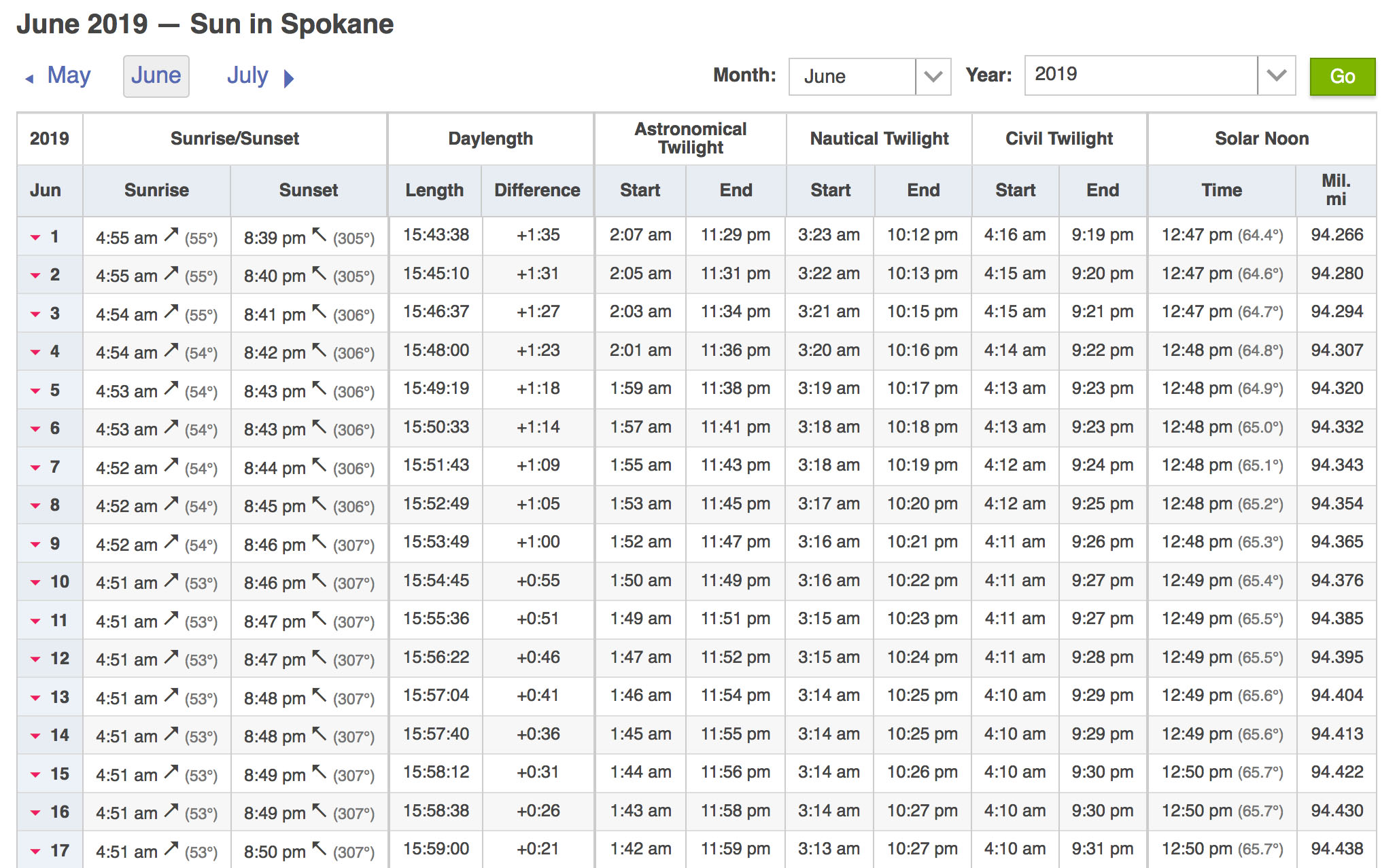
You plug in your location, click on sunrise/sunset and you can pull up the exact time of astronomical events for each day of the year. You could even chart various twilight’s — astronomical, civil, nautical.
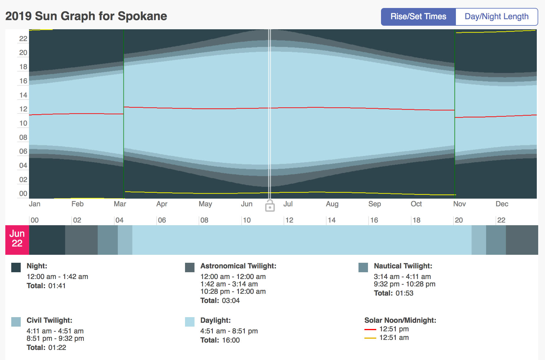
Note the site even draws you a chart, just like mine. It didn’t use to do that. That’s relatively new. If you scroll down the page, you can see the raw data that generates that chart.
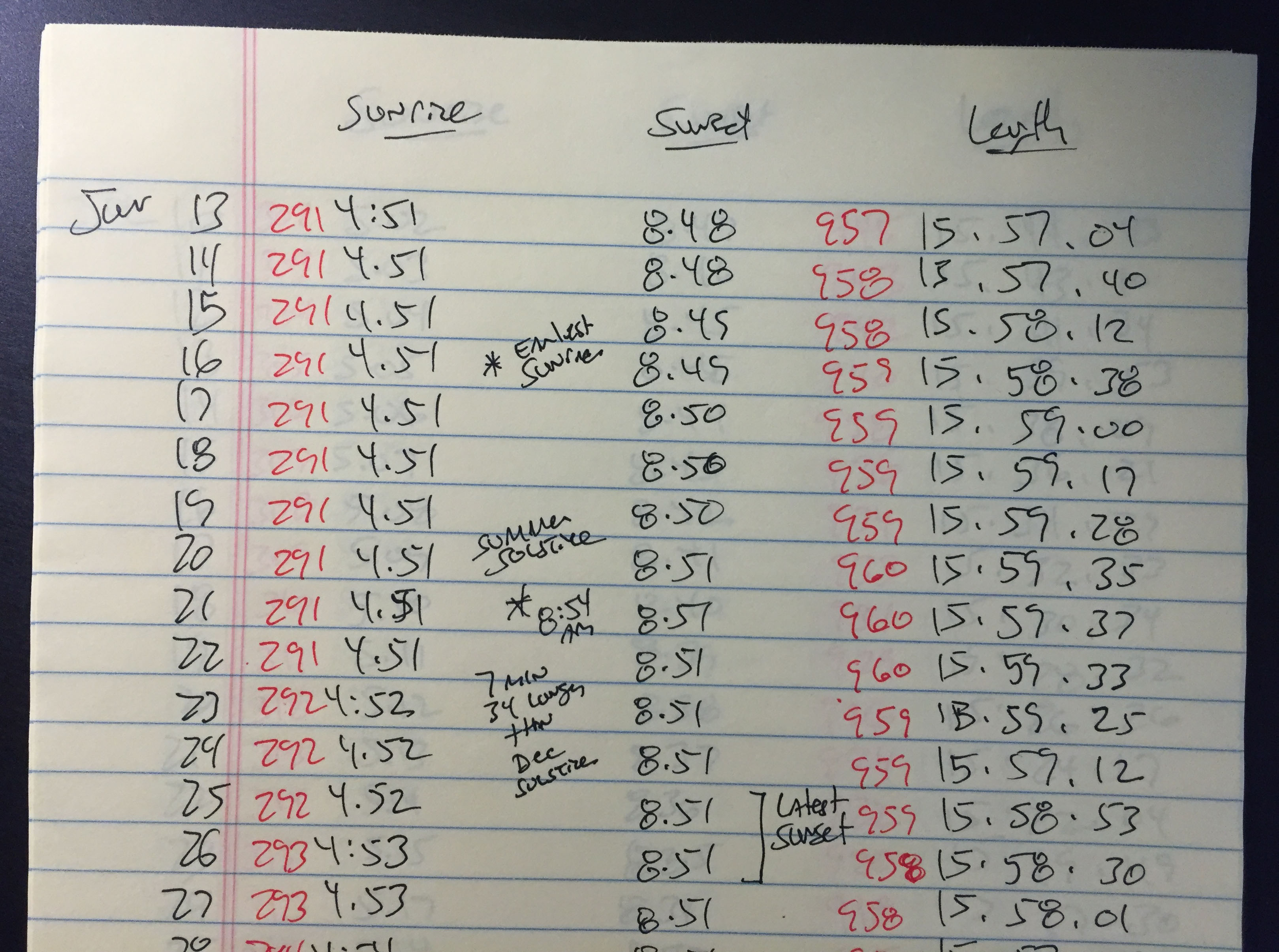
The catch: The site gives you the time for these events in hours and minutes, such as “3:27 am.” Which you really can’t plug into a graphing program like Adobe Illustrator. So I take careful notes — of sunrise and length of the day for all 365 days of the year — and then I convert each one into minutes.
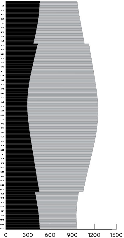
That way, my graphing program can do its thing to generate a “stacked bar” chart:
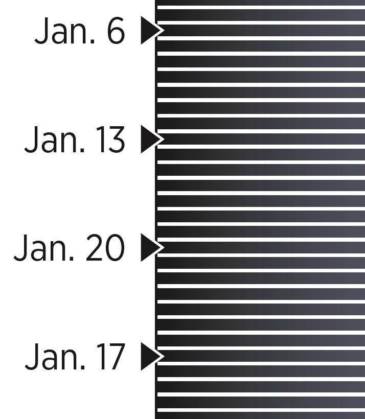
Yes, that’s a bar chart drawn with Adobe Illustrator that contains 730 bars! Notice there isn’t a bar that shows the time from sundown to midnight. It’s really not necessary. I find it easier to simply add that bar by hand. Otherwise, this chart would consist of 1,095 data points!
I add the time labels to the top and bottom and date labels to the sides. Even at full broadsheet newspaper size, you really won’t have room for every date. So I just go with what Americans consider the start of their week: Sunday.
And then, in the space along the margins, I pull out pointer boxes to show major events: The shortest day of the year. The days when light and dark are nearly equal. The day the Earth is closest and furthest from the sun. The longest day of the year — which I highlighted in black, so it would stand out more.
Also, here in the U.S., we have a thing called “Daylight Saving Time.” The idea is to chop off an hour at the start of our day and add it to the end of our day, which gives us more sunlight on summer evenings. Some states are taking steps to do away with this. But for now, most still have it. You can see the little stair step it makes in the chart, twice a year.
It’s a fairly simple chart to do — assuming you can find data for your city. And you probably can: DateAndTime.com seems to have a lot of cities in its database.
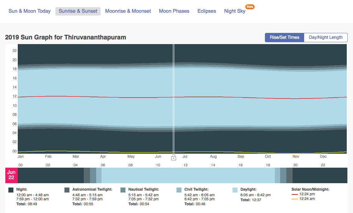
Just for fun, Sajeev, I looked up the data for your city, Thiruvananthapuram, India. You’re much, much closer to the equator than I am — therefore, the difference in daylight and dark hours in your location is much less than here in the U.S.
Because of that, I don’t think this sort of data would be useful to your readers. But the further away your city from the equator, the more interesting that curve would be. And the more useful the chart would be to your readers.
There seems to be a lot more data on this website now, however, than there was the last two times I built this graphic (2013 and 2015). So go look for your city. Or your nearest larger city. I’d love to see versions from cities around the world. That would be fascinating!
As with everything we do at the Spokesman-Review, we like to build a digital version for our online readers. We usually have to modify the page quite a bit so it’ll fit on things like smartphones. Here’s the digital version of this graphic:
http://www.spokesman.com/stories/2019/jun/21/further-review-longest-day-year/
That’s my data and my art, carefully re-constructed by our talented intern, Colleen Bell.
![]()


