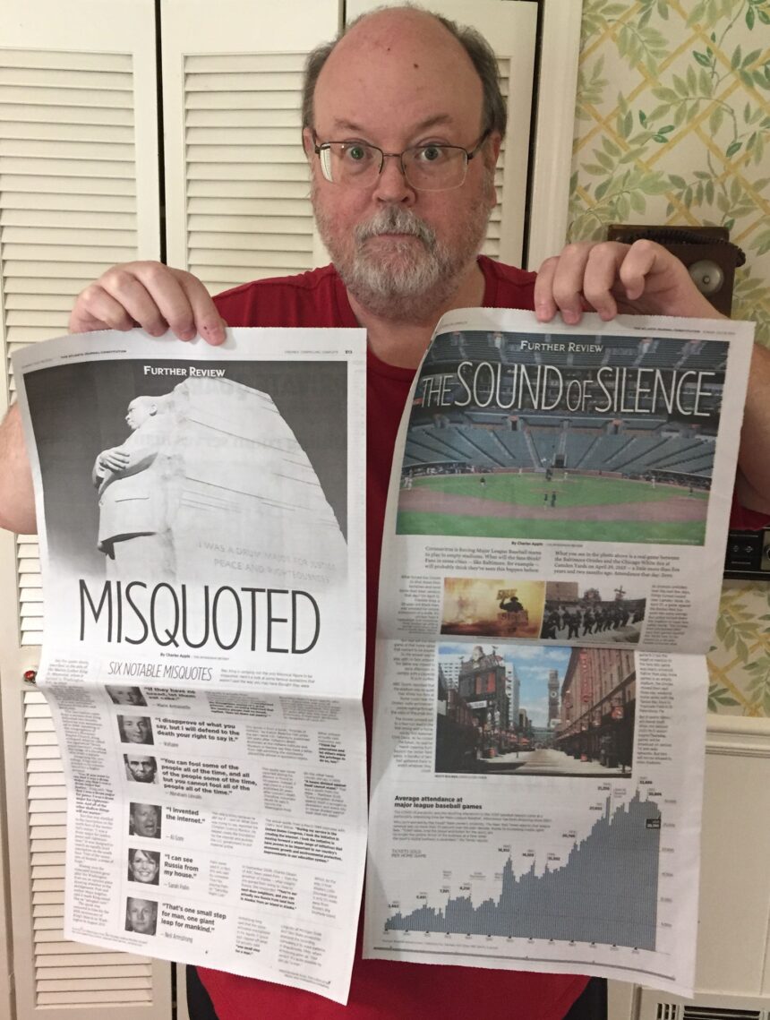
Seeing your work in print never gets old. For graphic designer Charles Apple, he’s getting that thrill several editions over.
For four months, he’s shared his full-page Further Review designs at no cost to any news organization that asks. In all, about 30 have published them, including Apple’s hometown paper.
“It was a matter of ‘pass it forward,’” Apple said. “The hope is that papers will find readers love these pages.”
And they have: Pop culture and historic event pages are particularly popular.
We reached out to Apple for an update on the project, which we originally covered in March.
How have news organizations responded to the pages you’ve made available? What has their reach been — that is, where are some of the places you’ve seen them published?
Apple: About 30 papers in all, give or take, have requested [Spokesman-Review’s] Further Review pages. But only four or five have used them regularly over the four months we’ve been offering them.
One is the Victoria (Texas) Advocate, where I briefly served as managing editor, five years ago. Another is the Walton Tribune, in Walton County, Ga. — less than an hour from here. A friend in Hampton Roads is using them in a paper aimed at military families. And my friends at the Beaumont (Texas) Enterprise have used a few.
But my most frequent “client” has been the Atlanta Journal-Constitution — which happens to be the paper we get here at our house. Since I don’t get printed copies of my own paper in Spokane, this is about the only time I get to see my work in print. And that never gets old.
Why did you and your editor decide to keep your full-page designs available for other publications after your initial offering at the start of the pandemic?
Apple: In the beginning, we made a couple of coronavirus pages available. My friend Karl Gude — former art director of the Associated Press and Newsweek magazine — had drawn a very helpful pandemic graphic and had offered it to everyone for free. I used it as the centerpiece of a Thursday Health section one week. So we were inspired by that with those first couple of pieces. It was a matter of “pass it forward.”
But then my [Spokesman-Review] editor, Rob Curley, suggested we take this a step further. We’ve talked about how great it would be to syndicate my work one day. So Rob’s idea: With all the layoffs and furloughs and cutbacks, newspapers are hurting for great content. And we have that content. So why not give it away for free?
The hope is that papers will find readers love these pages and papers will discover how easy it is to deal with us. So when the time comes to charge for Further Review pages, papers will give us a try.
I’m not sure when we’ll begin charging or how much we’ll charge. It’ll happen one day. But as I’ve been saying: Today is not that day.
How do you select what topics you’ll research and design in this format?
Apple: Some are based on the news or on news topics that are percolating beneath page one. One of my specialties is politics, so I’ve done a number of pages on elections, polls, historical control of Congress and so on.
And I have a huge interest in history. So I love finding historical anniversaries and then telling readers the story behind the story. Or putting events into perspective with numbers or a timeline.
I’ve been getting the most feedback, however, on Further Review pages that I’ll call “pop culture” — basically “features” topics. Just last week, for example, all four of my pages were “pop culture” pages: The 60th anniversary of the release of Dr. Seuss’ “Green Eggs and Ham,” the first appearance of Betty Boop 90 years ago, Vampire movies (which tied into the release of the new Stephanie Meyer book) and a look at the highest-charting novelty songs.
Of course, the visual angle is important. I try to aim for topics that have a visual “hook” of some sort: Some numbers I can build around, or a timeline or a list. Or a big photo that can run down the side of my page. For that “Green Eggs and Ham” page, I took the list of the 50 words Theodor Geisel used and build a giant chart, running down the side of the page, that showed how often he used each one. I made that bar chart green and then used the orange book cover. That gave me a striking look for that page.
Rob once called my story selection “wonderfully random.” I consider that a compliment, but there’s nothing random about it. Since I went full-time on these pages back in March, I’ve been planning about six weeks out.
I’ve had to cut back this week — we have so many folks on vacation that I’m having to design the fronts and insides of all our features sections. But even so, I’m doing what I can. In addition to building an eight-page Food section today, I managed to write and design a page for next week about the Tooth Fairy.
View and request the pages Apple has made available at no cost to news organizations.
![]()


