Well-Known Design Consultant Mario Garcia talks exclusively to tksajeev about the Hindustan Times redesign
1 What is the philosophy behind newly redesigned Hindustan Times?
The idea has been to create a real transformation for the Hindustan Times, NOT just a cosmetic one, but one that affects how stories move in a multi platform world. We have had workshops with editors, reporters, designers to create an overall philosophy for how a modern newsroom operates in the mobile era.
2.No teasers in page one. Why that so?
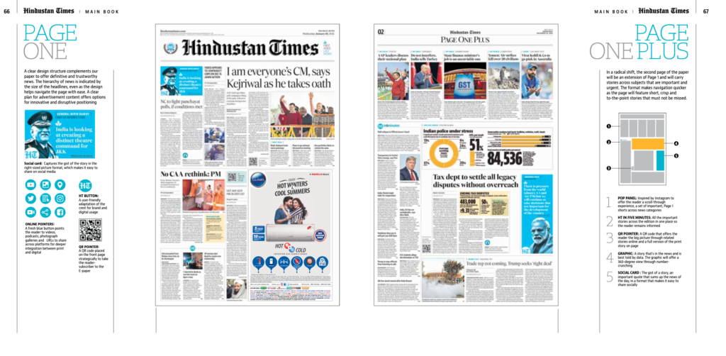
Page 2 offers a window to the inside. In a modern print edition newspaper, you want a newsy front page which as you will see in the new HT could have as many as 13 different stories. Page 2 offers more of a window, but print readers want to leisurely move thru their newspaper. Remember, we lean forward into mobile devices, we lean back for print. These are the concepts that I explain in my book, The Story, a trilogy about Transformation, Storytelling and Design, available from amazon.com
3.Did you focus more on typography rather than other elements?
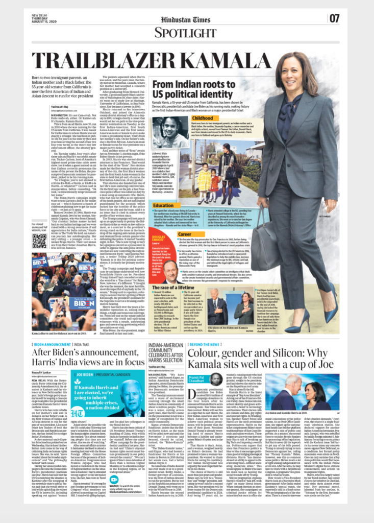
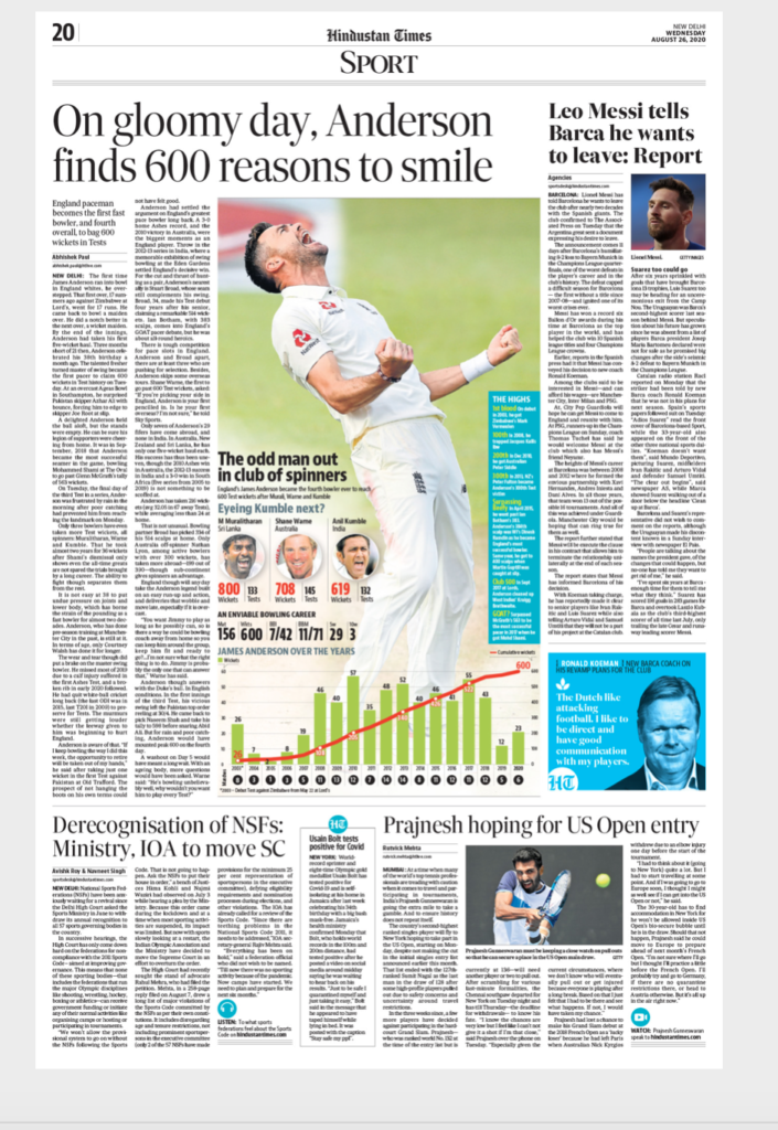
The design of a newspaper involves 4 centerpieces: story structures, typography, architecture and color. We dwelled on all four of these areas equally, but perhaps the greatest emphasis was the journalistic one, how to tell stories across platforms, and how to differentiate among different types of stories.
4 While designing HT did you focus on Print and digital similar?
Of course, a modern newspaper transformation deals with the brand and how it extends itself across different platforms. We did this in this project, perhaps the most extensive transformation of digital/print processes of an Indian newspaper title.
5 In the new design there is too many long running stories and visual elements.Will it distract the readers especially youngsters?
The young ones are not coming to print much. In a modern printed newspaper people want longer stories, and no briefs. Briefs are the terrain of mobile. Remember, lean back for print.
Our philosophy here follow the concept of I.N.K—information, news and knowledge and their interplay. No newspaper in today’s day and age can complete with the news pushes, hence it makes little sense to keep following the age old practice of packing stories on a page only for them to get outdated by the time paper arrives at the doorstep. We, therefore ,while providing clarity through longer pieces also do acknowledge the need to document important happenings through the HT bullet box that carries shorter stories. The reader actually does not lose anything, rather they gain from the clarity we provide and then for the latest update while reading the paper use the digital link – the QR code, to get an update.
6 You always talk about CVI but here in this new design many visual elements were competing each other. Why that so?
It depends on the page. You still will see dominant elements . Give the design a chance, this is only 3 days.
7 As you know print media is going through a tough time because of Covid 19.Most of the Indian media is focusing more on digital version and epaper. Why looking into it, how challenging was HT redesign ?
We always looked at this project not as a redesign but a transformation, before Covid19. That is still the spirit. But we want to make the print edition accessible, attractive and a great experience for the reader, starting with the rebranding and all the weekend sections. With our TG – the millennials, while information is ubiquitous and they get it as it happen, the millennials always like to turn to a trusted source that provides them with clarity. And that is what we want to do with this new transformation of the HT.
8 Tell us about page one plus ? What is the concept behind that?
That page is the newspaper within the newspaper. If one reads that page, it is like a digital newsletter, but in print. Full of interesting nuggets of information for the reader.
And take a look at social cards, which extend stories across platforms, a very visual element, but also very practical at the journalistic level as a brand extension. My blog on the subject:
http://garciamedia.com/blog/hindustan-times-social-cards-to-bridge-print-digital/
9 Mix of column widths. Is it purposely done? If one says it will disturb digital readers eye movement,what will you say?
I say that we have a good systematic architecture and the reader will not be bothered. This is something that newspaper designers observe.
10 Any new plan for Sunday edition?
Yes, you will see the many new sections appearing this weekend. More magazinish, colorful and full of great content.
To know more about the Hindustan Times redesign click the below link
http://garciamedia.com/blog/total-rethink-for-indias-hindustan-times/
![]()


