Spanish infographic specialist Ferran Morales talks exclusively to tksajeev about the new trends in information graphics
Ferran Morales has been working as an infographic artist for 23 years for the print and digital editions of the Barcelona newspaper Mundo Deportivo.
He had won several international awards including five award of excellence in the Society for News Design competition
How did you conceive the infographics
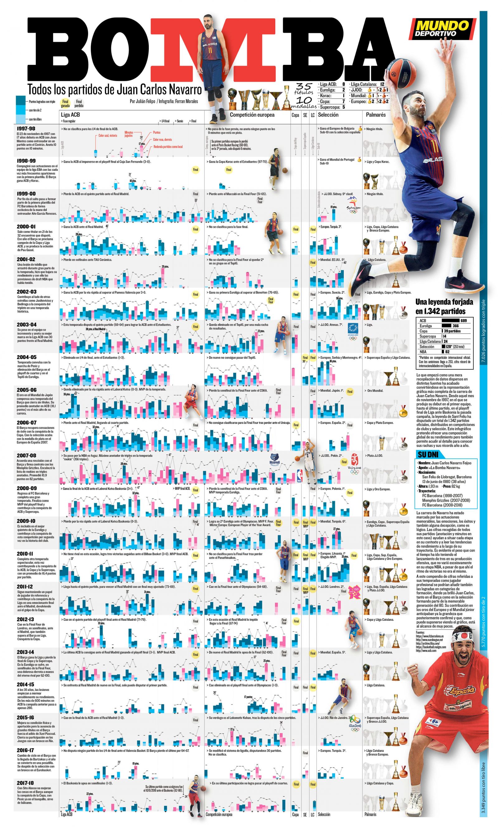
“All the games of Juan Carlos Navarro”?
I have a lot of affection for this infographics. It was created during the retirement time of Juan Carlos Navarro. One afternoon Mundo Deportivo’s Basketball specialist writer Julian Felipo also passionate about statistical data, came to my workplace and told me that he had almost all the data of Juan Carlos with him. We agreed to make a visualization. According to the Realgm website Juan had played 1342 games. But we had only data up to 850 games.
We started searching and comparing different sources to obtain the 1,342 games that he played.
The next step was to enter all the data from different sources into a single spread sheet. The data that we considered most important were: seasons, teams and trophies achieved. Also highlighted the points (Triples, field shots and free throw points) and minutes played in each game. We used color codes to differentiate between success (blue) and failure (pink).The visualization was a double spread in portrait orientation. The programs we used were Google Sheets (data), Illustrator, and Photoshop.
Compared to American and European infographics, Spanish creation is very different. What is your thought on it?
The Spanish press has always been committed to visual information. Thanks to this, a spectacular pool of infographic artists has been formed. Today many of them work in the world’s most renowned newspapers and magazines.
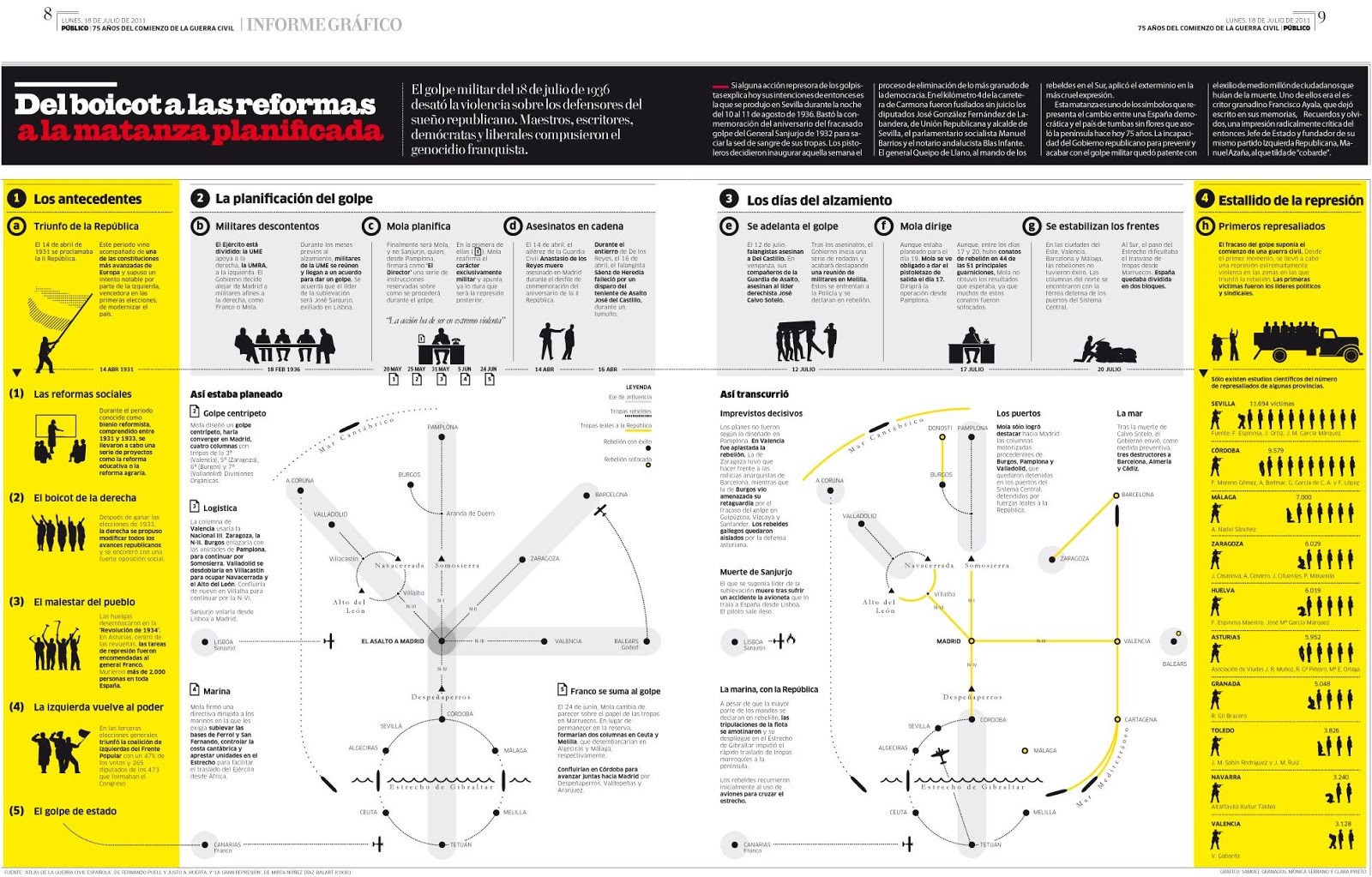
I have been a keen observer of the digital and visual transformation that has taken place in many media, especially in Spain. The one that caught my attention around 2010 was the commitment of the Publico newspaper towards visuals. That is Computer graphics strongly influenced by the visual synthesis of the design coming from the ISOTYPE culture. Álvaro Valiño, Samuel Granados, Mónica Serrano, Artur Galocha and Chiqui Esteban are the experts of this culture. They used very complex themes, with highly synthesized, schematic, and iconic visual elements which everyone can understand. Currently, in some infographics, you can see the influence of Publico in many of us and how the style remains in force even 11 years later.
Graphics: Samuel Granados, Publico, 18/07/2011
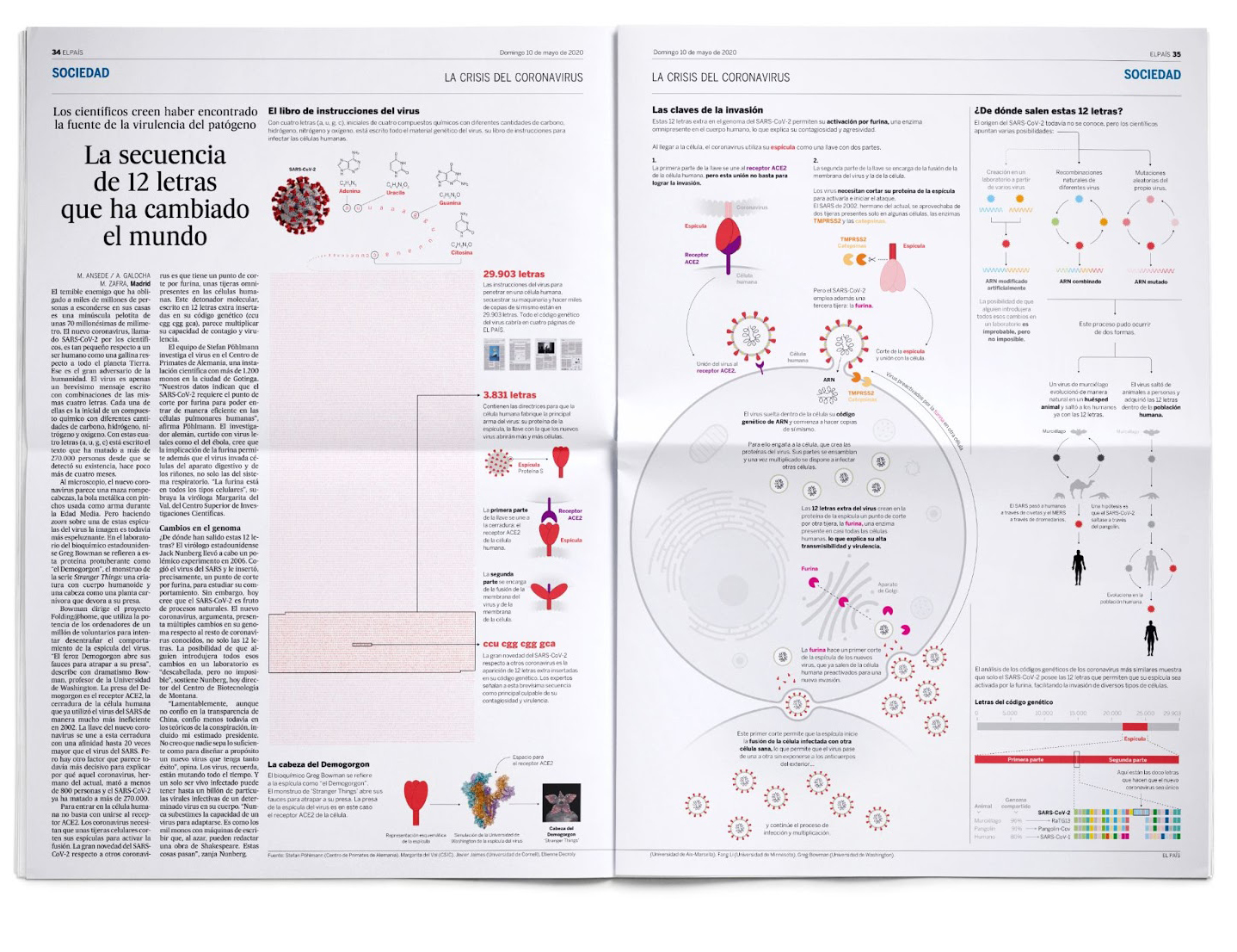 Graphics:Arturo Galocha, El País, 10/05/2020
How Spanish readers respond to the big infographics?
Readers usually like and enjoy big infographics. When we prepare a visualization for the website, it always comes with an adaptation for social networks (Twitter, Instagram and Facebook) to reach the maximum number of people. The feedback we receive from readers is always positive and they motivate us to continue with this and improve every day.
It is important as well to educate readers on the visual topic as well. Also it is important to make qualitative leaps, maybe more complex .But don’t stop making a visualization in fear that the user may not fully understand the message. It is clear that this process cannot be implemented in one day but have to evolve gradually .
Sports daily newspaper is a luxury in most parts of the world. How is your newspaper Mundo Deportivo running it successfully?
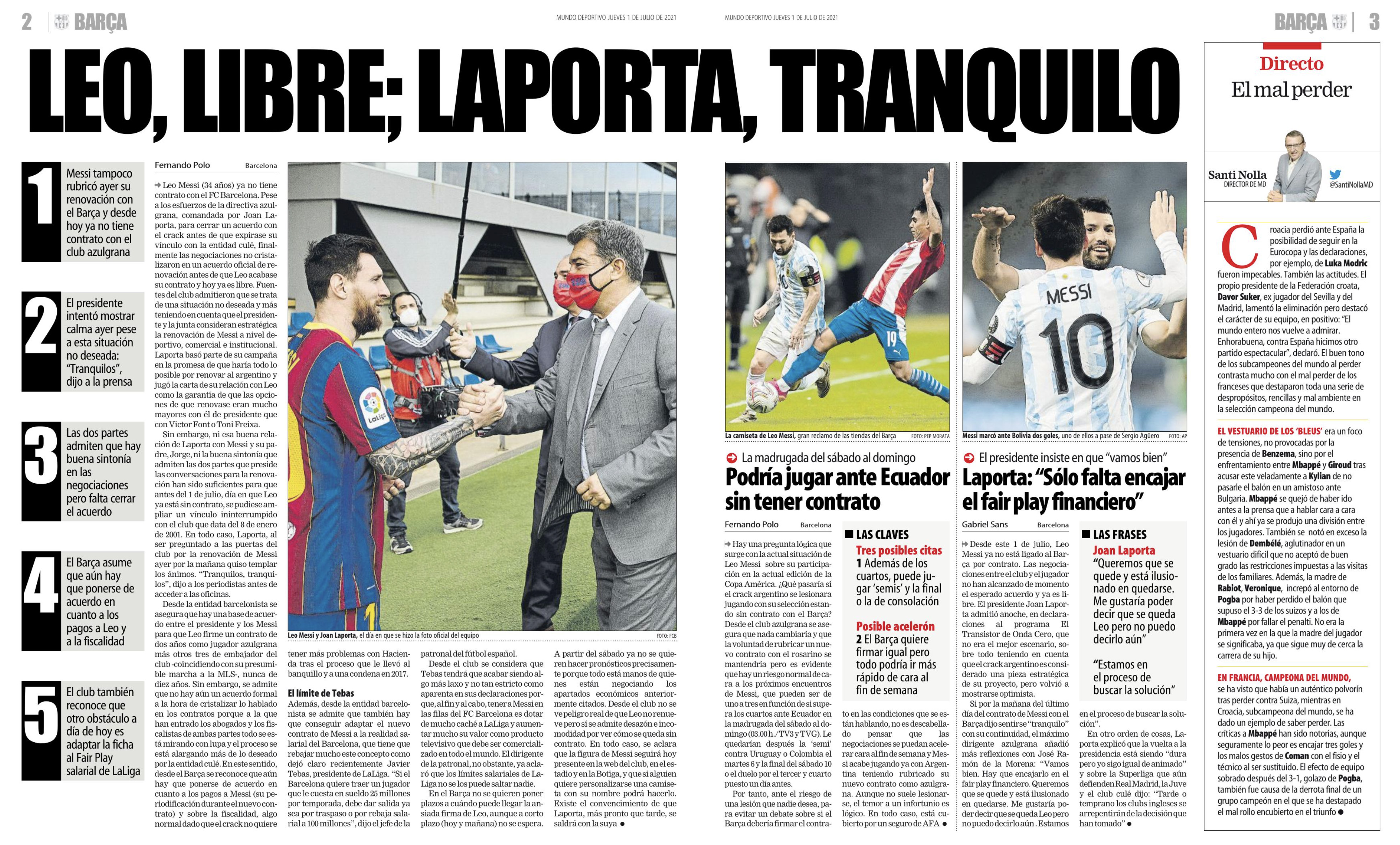
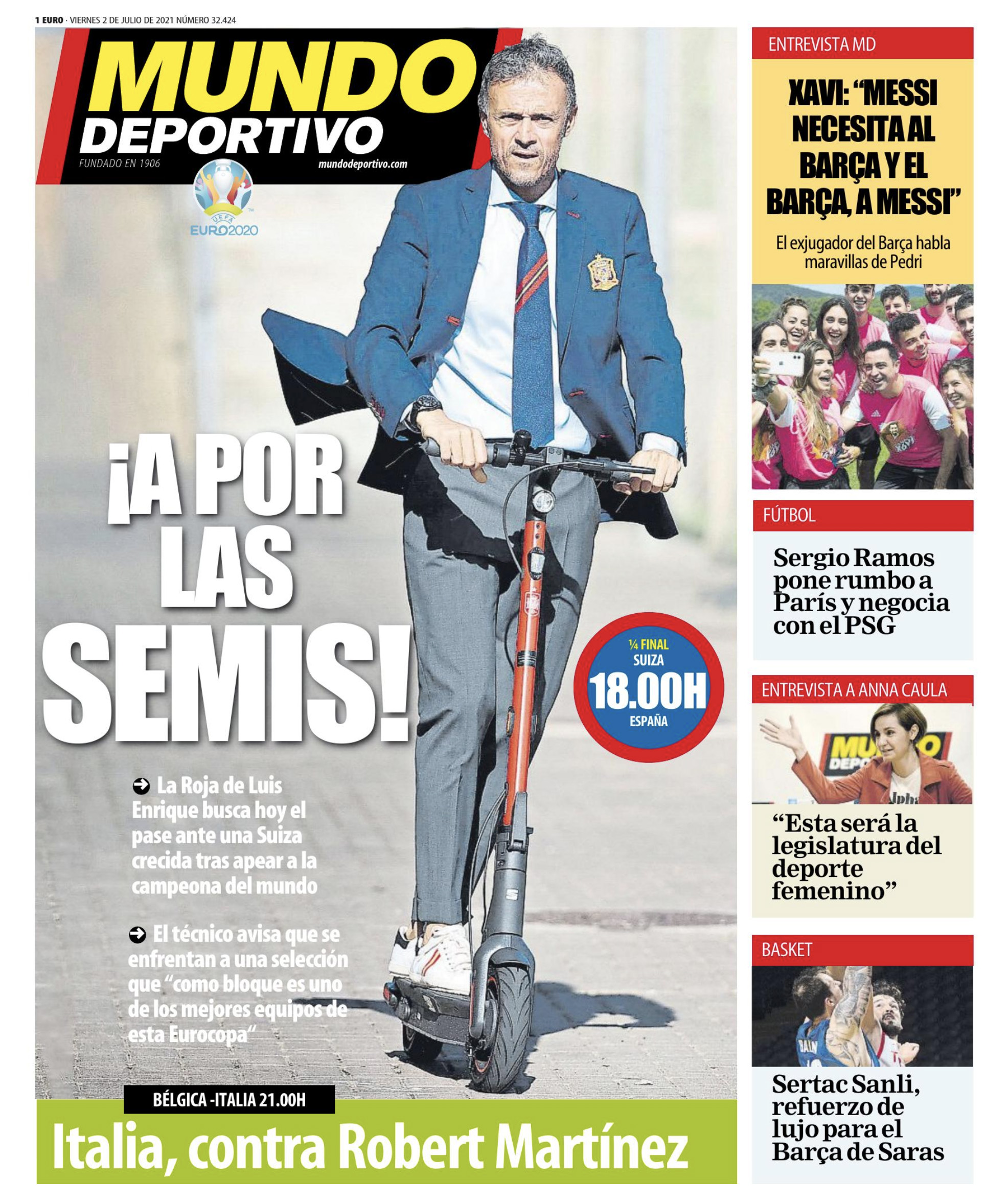 Page one of Mundo Deportivo.This is a Spanish nationwide daily sports newspaper
Inside page of Mundo Deportivo
The model of success is the methodology and work structure that a centennial newspaper such as Mundo Deportivo has implemented. The morning and afternoon meetings involving the management and section heads are of great importance. The meetings are held to decide the topics that we will deal with during the day. The web and SEO analysts will report which topics have worked better the previous day and are trending on the networks.
Our data visualization team is very active and is always observing current trends and applying them. It is a team effort. We usually work together with the specialist editor of the subject.
Are you very active in interactive graphics? Compared to print do you conceive it differently.
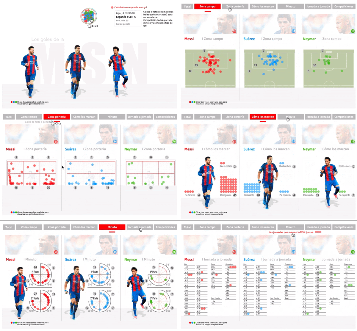
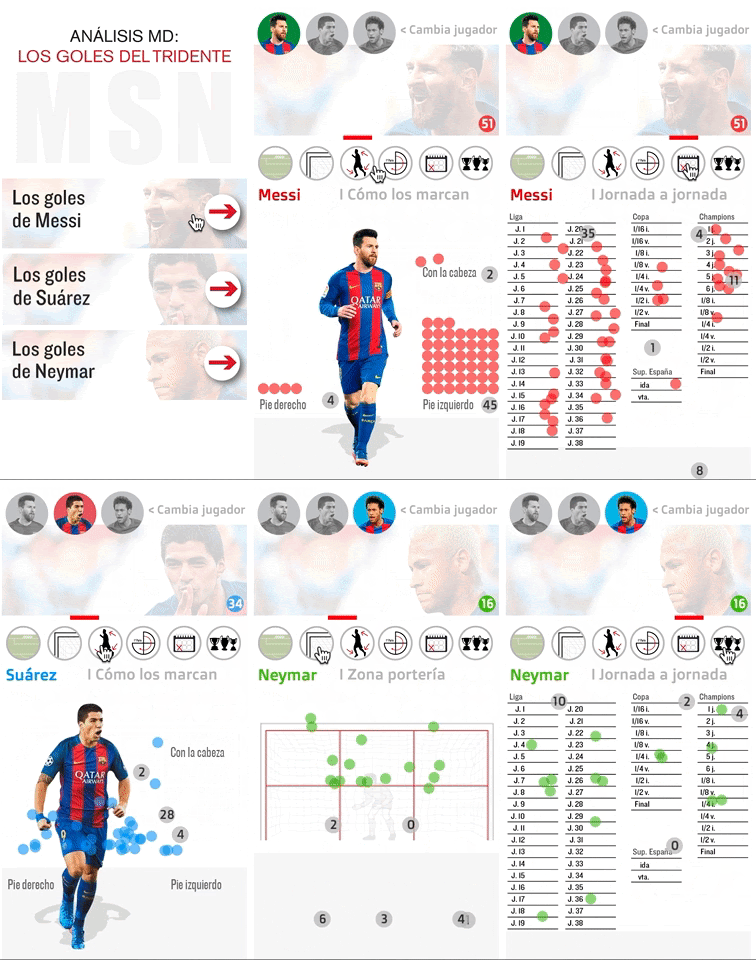
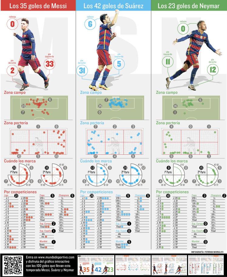
This week a student from Argentina conducted an interview with me and told me that he fell in love with an interactive that I have made about the 100 goals of the MSN (Messi, Suárez, and Neymar) in Barcelona in 2016-17 season . Five years later it is still agreed.
The approach was to make an interactive graphic for the web and it’s adaptation for print. It was clear that I wanted to reuse the elements as much as possible.The most important thing is the data. I invested a lot of time in creating a workflow of each goal and transfer it quickly to the digital format. We used the Tween.JS library. And used Adobe Animate for the programming of the buttons.
As you can see in the desktop or mobile digital version, we have the same data and transitions. One of the tricks to quickly adapt to the different sizes of the web is to make a 3 or 4 columns.By clicking the button of the player’s faces we can see their data. The drawback is that we cannot make a comparison between them at the same time.
Web-version and mobile version:
https://www.mundodeportivo.com/futbol/fc-barcelona/20170508/412776483323/goles-msn-tridente-temporada-2016-2017-messi-suarez-neymar-grafico-interactivo.html
In the print version, I arranged the player’s data in three columns. In the desktop digital version, I used different colors for each player showing from where they scored the goal and from where the ball entered to the goal and so on
Which work thrills you- Print or web? And how different are they?
My professional profile is more digital than print. For this reason, I like web infographics better.But both have their strengths and weaknesses. Our web work can be instantly seen all around the world and we can learn from colleagues through their daily creations also.The good thing about the web is that we can update or modify it at any stage. Only hurdle is that designer has to learn programming to carry out differential work. In recent years the trend is less and less to use buttons and scrolling to guide the narration, as Archie Tse of the New York Times says: “people tend to scroll before pressing anything. If you ask them to press something incredible has to happen”.
One of the biggest difficulties is that most readers read our content on mobile phones and we have to create visualizations that will be seen in the size of any device.Luckily in Mundo Deportivo, the visualization on print is very important even today. Readers are eagerly waiting to see our double-page infographics. Long-life to the print.
Compared to other sections, Sports has a lot of scope for infographics. Tell us about different types of graphics that can be used on a sports page?
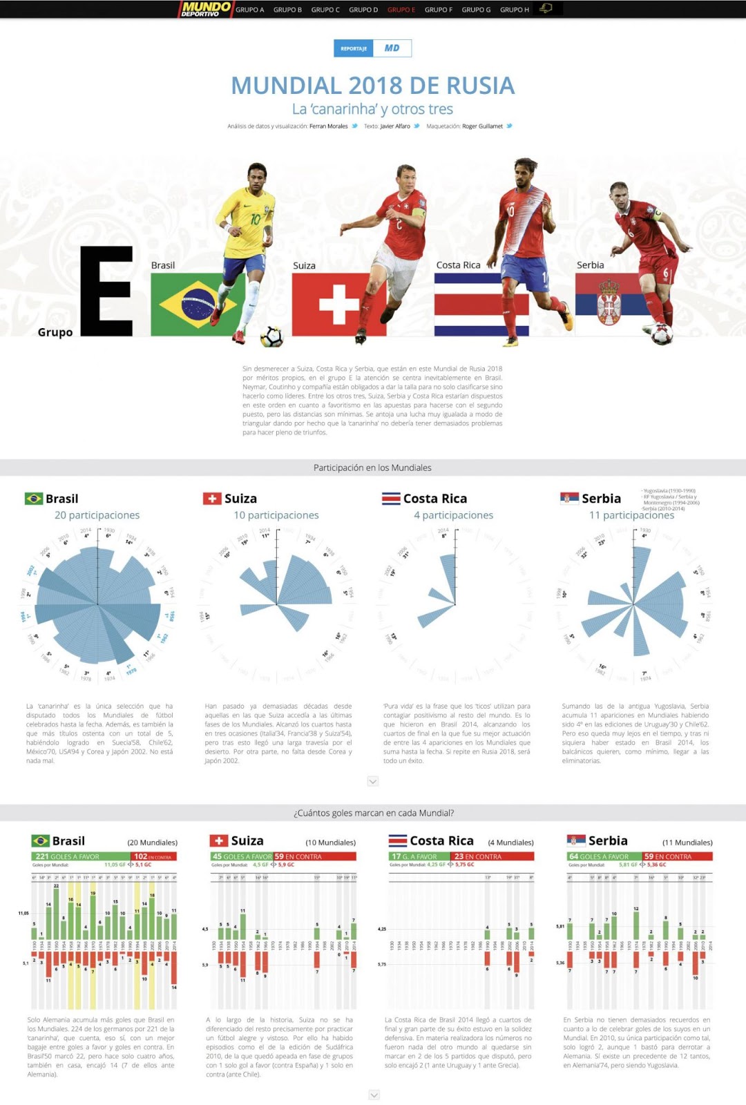
We make many recurring graphics such as previews of the matches, the cycling stages of the Formula 1 circuits. They do not take us long to have the bases prepared. The same is the case with the infographics of the great annual events, such as the special Football League, Basketball, The Tour de France, and the Tour of Spain. Below I will detail other infographics that we dedicate much more time to, such as the special website of the 2016 Soccer World Cup.
We visualized the historical data of each team that participated in the 2016 World Cup in Russia, group by group, we intended to use different typologies of infographics, with different degrees of complexity, simpler at the beginning and greater as you progress. We can find different types of graphs, such as Nightingale Rose, Sankey type diagrams, bar graphs, timelines among others. To facilitate reading and understanding by users, we used two very defined color ranges: green for the data of the equipment to be analyzed; red color for opposing team data.
https://www.mundodeportivo.com/md/futbol/estadisticas-mundial/grupod/index.html
For example if a player scored a historic goal. As an infographic expert what are the things that will come to your mind for the graphics?
At first, I will analyze how he scored the goal. Then the importance of it and the time he scored it.
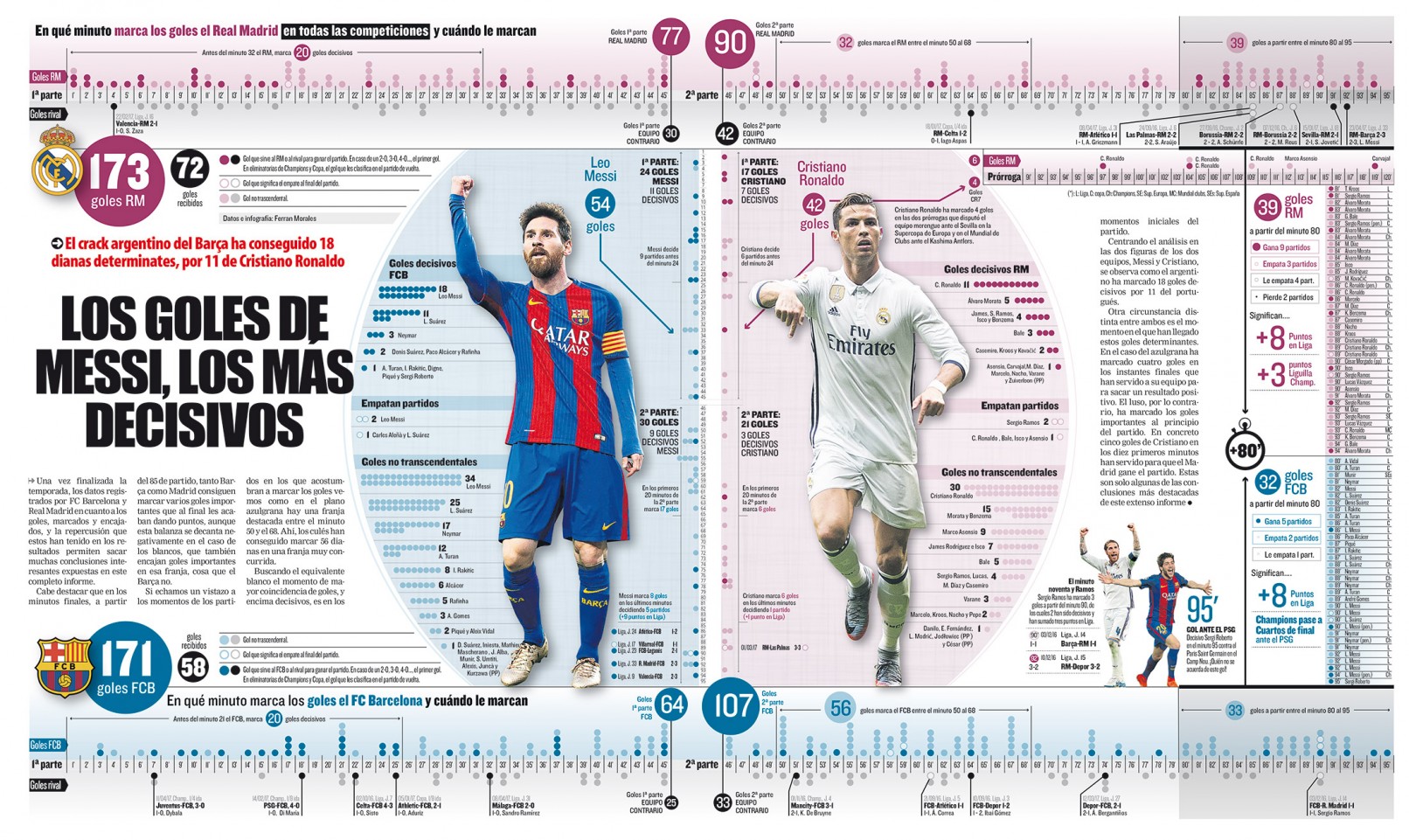
I still remember a game played between FC Barcelona and Real Madrid On December 4, 2016. FC Barcelona was leading by a single goal. But at the 90th minute, Real Madrid equaled through Serio Ramos. When I returned to the newsroom, I began to search and analyze in which minutes both FCB and RM scored goals in that season.
As can be seen in the infographic, FCB was a team that scored most of the goals in the second half (107 compared to 64 in the first half). Another detail that can be seen was that RM was a team that scored many goals in the first minutes of the matches.
In the central part, I put the data of the two stars, Messi and Christiano, comparing their goals and detailing in which minutes they scored. I was able to show that the goals scored by Messi were much more decisive than those of Christiano Ronaldo or Sergio Ramos.
What is your style of infographic creation?
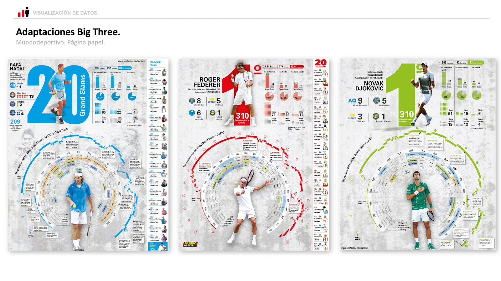
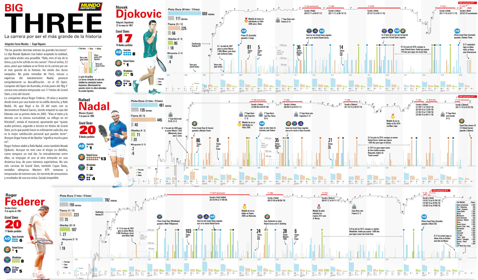
In recent years I have been very keen on capturing and analyzing a large amounts of data. During the pandemic, I dedicated myself to make a series of infographics about the Big Three (Nadal, Federer, and Djokovic). First I made three pages of each one of them separately. As you can see it was a very sober style with few colors and placing the most important facts in the middle area. In the end, I was left with the desire to make a visualization to be able to compare between them.
The final result was a double spread in the print.You can compare both the historical classification and the victories or points achieved in all the tournaments they played. The color was used to differentiate the different surfaces (blue/hard court, brown / clay, and green / grass). You can see I have a very characteristic style in most of the visualizations I make.
As an infographic expert how you visualize its growth ?
The growth of infographics in the last year has been spectacular and in the coming years, it will surely grow. It is very important to know in which platforms or channels our readers consume the content (apps, Instagram, Twitter, Facebook, Tik Tok, Twitch …). In most newsrooms around the world, there is a very high demand for visually minded profiles (not just infographics). The challenge of data journalism is that you have to be a continuous learner. Innovation should be your mantra.In recent years, I have spent a lot of time on a technology where the reader sees the content as augmented reality. I am trying to master it. Hope to show it soon.
Click here to see more works of Ferran Morales
![]()


