By Mario Garcia
CEO, Garcia Media
Senior Adviser on News Design, Columbia University School of Journalism
While the world is mobile first, print still holds a place within the Multiplatform environment of many publishing houses across the globe. Such is the case with the German financial daily, Handelsblatt, a newspaper with a long and rich tradition of authoritative, credible business journalism. I have had the privilege to work as a consultant with Handelsblatt through a variety of projects, including the 2006 conversion from broadsheet to smaller so called “business format”, or tabloid.
That was a success as it made the newspaper easier to carry in a world where we get information from smaller devices such as phones and tablets.
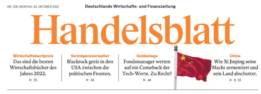
However, in 2021, editor Sebastian Matthes called me and he was a man on a mission: Let’s get this newspaper to be more modern looking, but also one where we change the structure of how the content is presented and add more visuals and graphics.
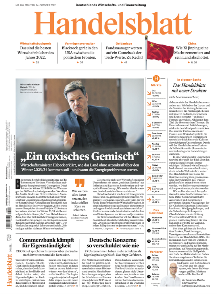
That was the mandate as we began the process which culminated with launch of the newly “refreshed” version of Handelsblatt October 24.
Editor Matthes refers to as a “refresh”. Here is how he explained it to the readers:
Like the economy, the Handelsblatt is constantly evolving. That’s why our newspaper will look different from Monday: We will appear with a refreshed layout and a new structure. In this way, we want to focus more on the economic issues that affect companies and politics most intensively and at the same time dovetail the print edition even better with our podcasts, newsletters and events.
Content and reorganization
One element that stands out in this visual rethink of Handelsblatt is the detailed thinking that went into the reorganization of and introduction of new content, a process guided by Sebastian with every member of his team. I was happy to participate, along with design director, Michel Becker, so that content led to the visual choices we made.
At the center of our visual thinking:
- Maintain the level of design elegance that has been a trademark of Handelsblatt for years.
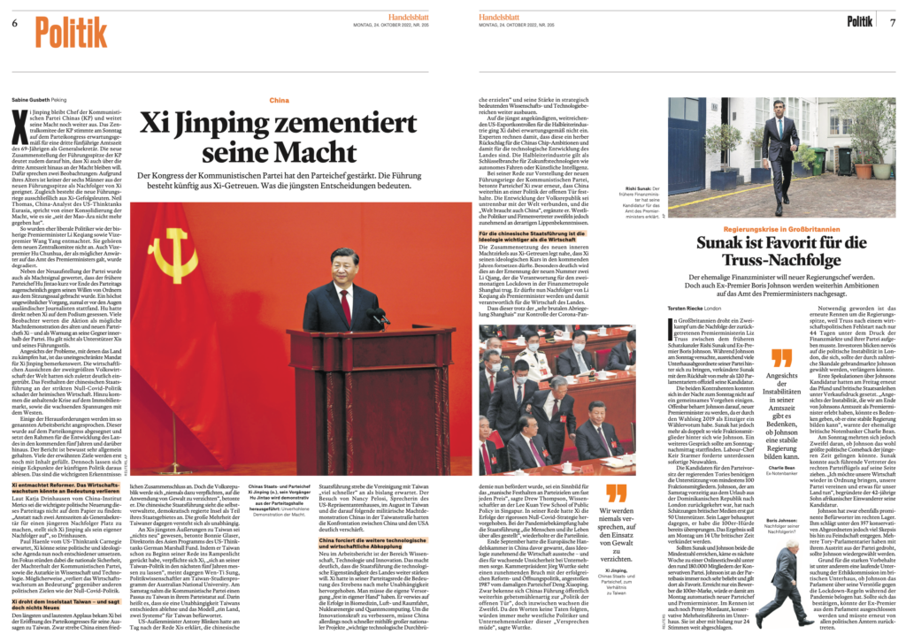
- Emphasize hierarchy on every page.
- Create a visual environment in which longer pieces are made easier and more appealing to the reader.
- Use of bigger photos and illustrations.
- Improved use of infographics.
- A table of contents that is visual and where we migrated digital ideas (as in a map to locate where correspondents are reporting from each day)
- Different approaches to storytelling, including occasional use of lists and snippets to facilitate presenting key facts of a story.
The creative director’s challenge
In the words of design director Michel Becker:
“For me, the biggest challenge was to visually represent the new structure of Handelsblatt. And to find a system for the different contents that unifies them but still differentiates them. For example, we now have opinion and commentary visually highlighted, and present the authors better.
At the same time, we look more visually appealing and retain the proven elegance.”
![]()


