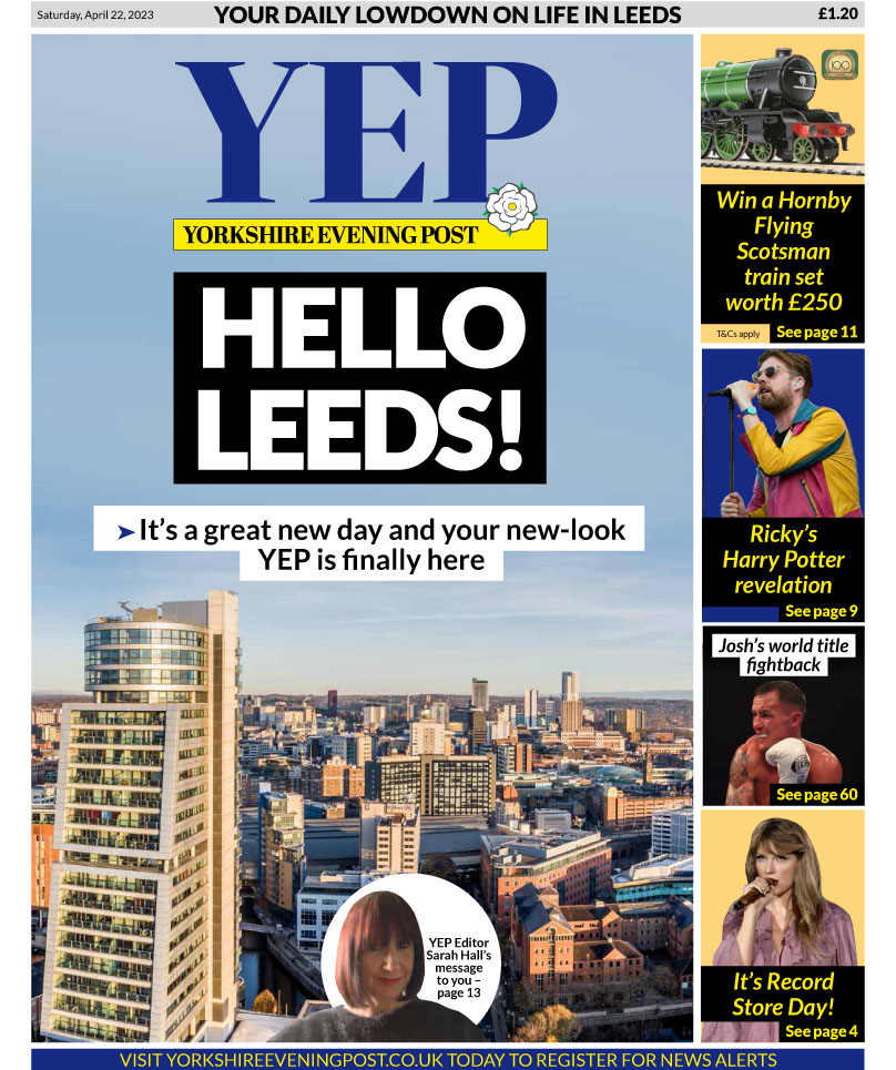
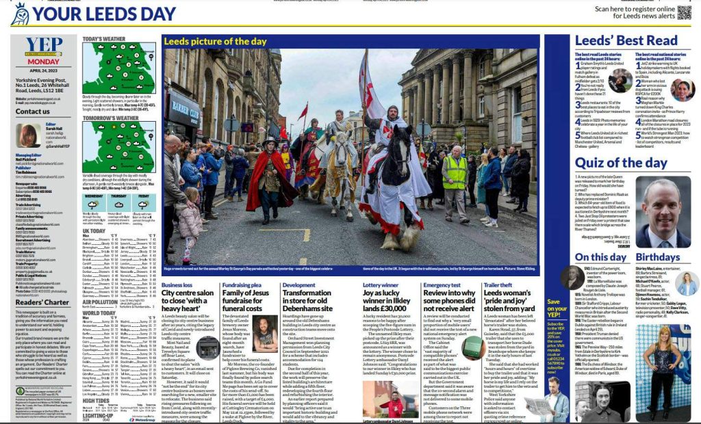
 THE UK regional publisher National World is embarking on a print relaunch of eight of its city daily titles in a bid to ‘reimagine’ the newspaper for a modern audience.Leading the charge this month was the first relaunch – of the Yorkshire Evening Post – a metropolitan daily serving the northern city of Leeds.Over the next few months the new visual language and design will be adopted by National World titles in Edinburgh, Portsmouth, Preston, South Shields, Blackpool, Sheffield and Sunderland.
Here, Tim Robinson, the publisher at National World’s daily press division, explains the thinking behind the project and how print can reach out in new ways.
Why are we doing this?
The modern reader is demanding and fickle – their time is precious and we are competing for their attention with many other types of media.
Even older readers, who form the bulk of our print audience have become inherently far less loyal to the daily print habit.
We have decided to completely rethink the presentation of our daily papers to make them more relevant and engaging, using different storytelling devices and visual hooks.
The war we are fighting is to stop people from turning the page – and to come away from reading with the sense of getting something really useful from the experience.
What’s different?
We have introduced matrix and digest presentations, summary pages of what’s happened this week and diary notes of what’s coming up in the next few days.
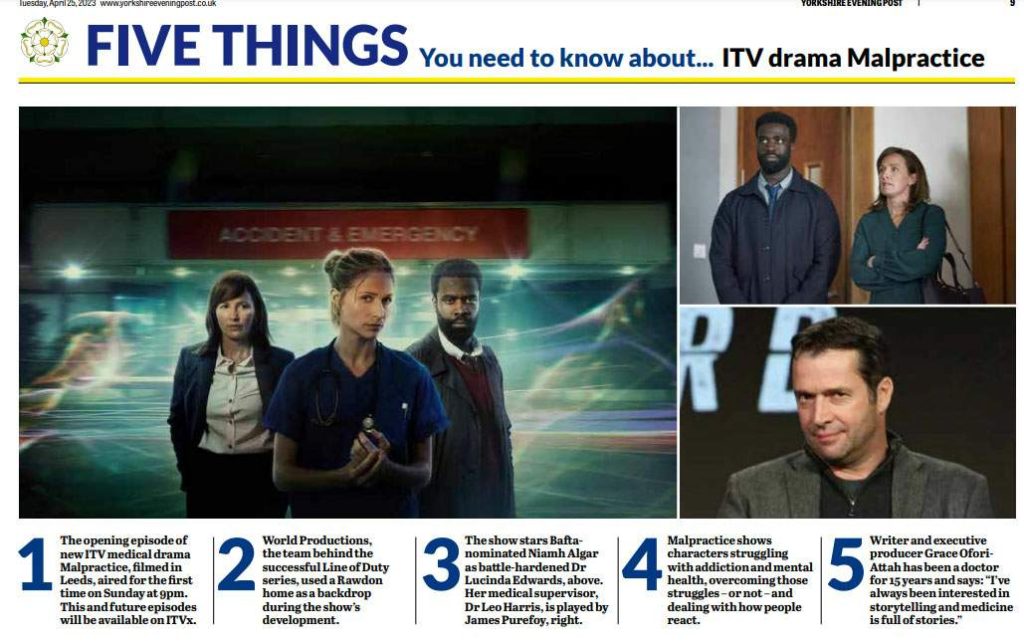
We are editing and re-editing the content which comes in from our digital teams into different formats, such as Q&As or Five Things to Know About or stories in lists of numbers.
The alternative story formats are not just the exception in each paper – they are fixed permanently into the running orders alongside longer reads to ensure a variety of reading speeds and rhythms.
And the use of graphics?
We are fully utilizing our small design team to add a layer of visual excitement to our template pages.
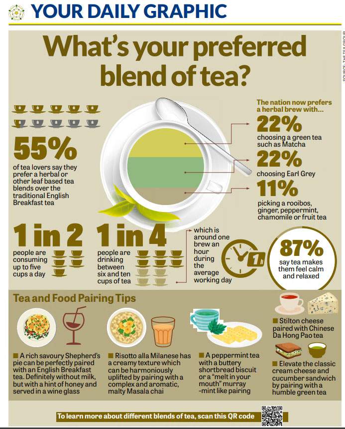
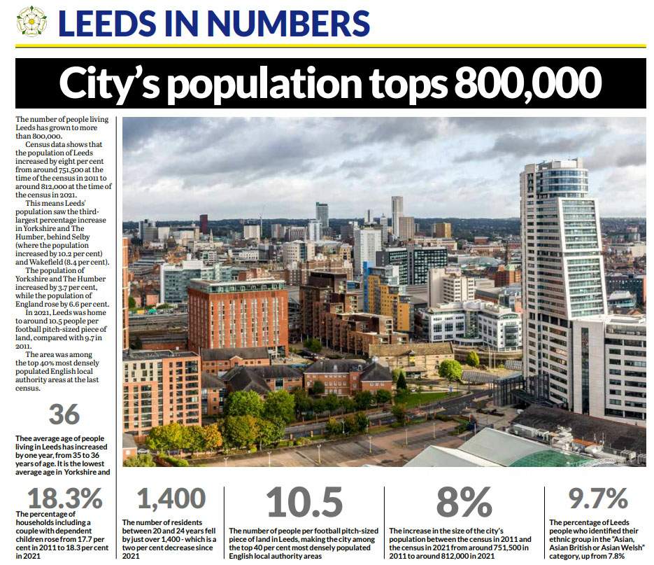
As well as explaining stories in text we are adding infographics or simple visual devices such as breakout boxes, fact files and number WOBs so that readers can digest content simply – and will hopefully spend longer engaging with it.
Each day the YEP features a full-page graphic explainer of a social issue or leisure activity which is relevant to our target audience – be it how to spot the signs of dementia, how much food prices are changing, even how to make the UK’s most popular cocktails.
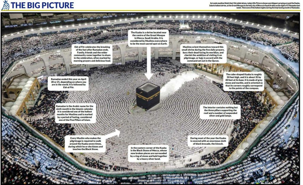
And each day we publish a picture from around the UK or the world across the center page spread of the YEP.
Not only can we showcase some great images, but we overlay the pictures with explanation captions, some pointing to specific details in the image.
We think this ‘Big Picture’ feature has the power to engage readers on a particular story far longer than it would by explaining it with 800-1,000 words of text.
QR codes have made a comeback?
We are using QR codes through the paper to heighten the reading experience.
Once consigned to history, the QR code has made a strong comeback in the UK since the pandemic – because of more intuitive mobile technology and their mass use in restaurant menus!
In print, we use them to point to more content on our own website and specialist sites in our group offering national news headlines, celebrity gossip and national sports analysis.
We are also trying to recognize the overlap with the online audience, pointing readers to the best read online stories in the region, as well as special interest content, such as property sales listings.
We are even publishing a video page in print.
This features frames from some of our prodigious video output, with short summary captions. Readers can either get everything they want from the digested print version – or use the QR code to jump straight to the video on their phone.
How can you present sport in a different way in print?
We are trying hard to re-inject the dynamism of sport’s subject matter back into its presentation.
Gone are the traditional blow-by-blow football match reports, to be replaced with statistics and background analysis, the content we know drives huge amounts of digital audience.
Set piece designs by our teams use a blend of cut-outs and graphical devices to reflect movement and the fans’ excitement of sport.
How is this new presentation meeting the needs of the reader?
In print, we lost the battle for breaking news to online platforms a long time ago.
Our papers now need to offer depth, explanation, background and analysis – the very things you can’t get from social media or quick takes online.
The ethos behind these papers is to offer that sense of greater all-round explained content, with a healthy dose of entertainment, to give our readers a sense of utility and reward.
Has the branding changed along with the design?
We have taken the opportunity to update our branding to look more modern and to represent the vibrancy of our city.
But more than that, the front page feels different – it’s more a news magazine, with an anchor image than a traditional newspaper page one layout.
And we are continually reviewing the language used throughout the book – out go journalistic puns and slang in the headline, replaced by more personal language (lots of ‘you’, ‘yours’ and ‘us’) and simpler, more direct words.
We have downgraded the usual diet of crime and grime to the back of the book and now the paper is unashamedly optimistic about life in Leeds.
We want our readers to feel like we do about the place – it’s a great place to live and work and here’s your newspaper which truly reflects that dynamism.
*National World is one of the UK’s largest regional publishers, with more than 130 online and print brands of all sizes reaching millions of readers every day.
![]()

