News Art & Design Editor Carrie Mifsud at The New York Times talks about her award-winning project “One million a nation’s immeasurable grief ” in an exclusive chat with tksajeev
Carrie Mifsud
How do you visualise the award-winning page one, “One million a nation’s immeasurable grief ” ?
When I was asked to do this, I knew it would have to have news value, be informative, be sophisticated but also carry the weight of the loss somehow. I was looking for a way to do all of that.
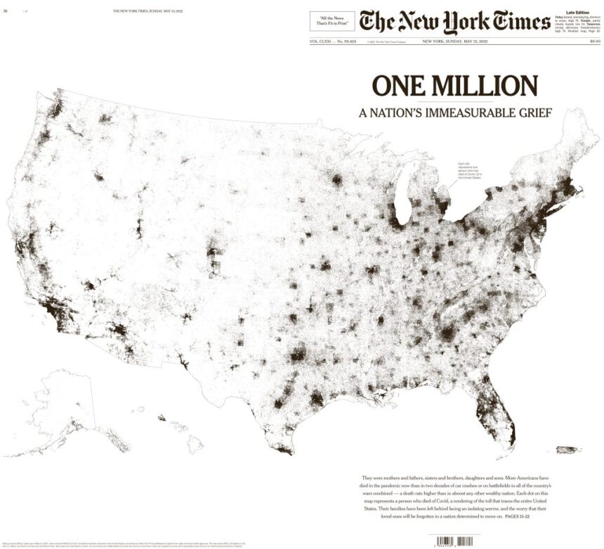
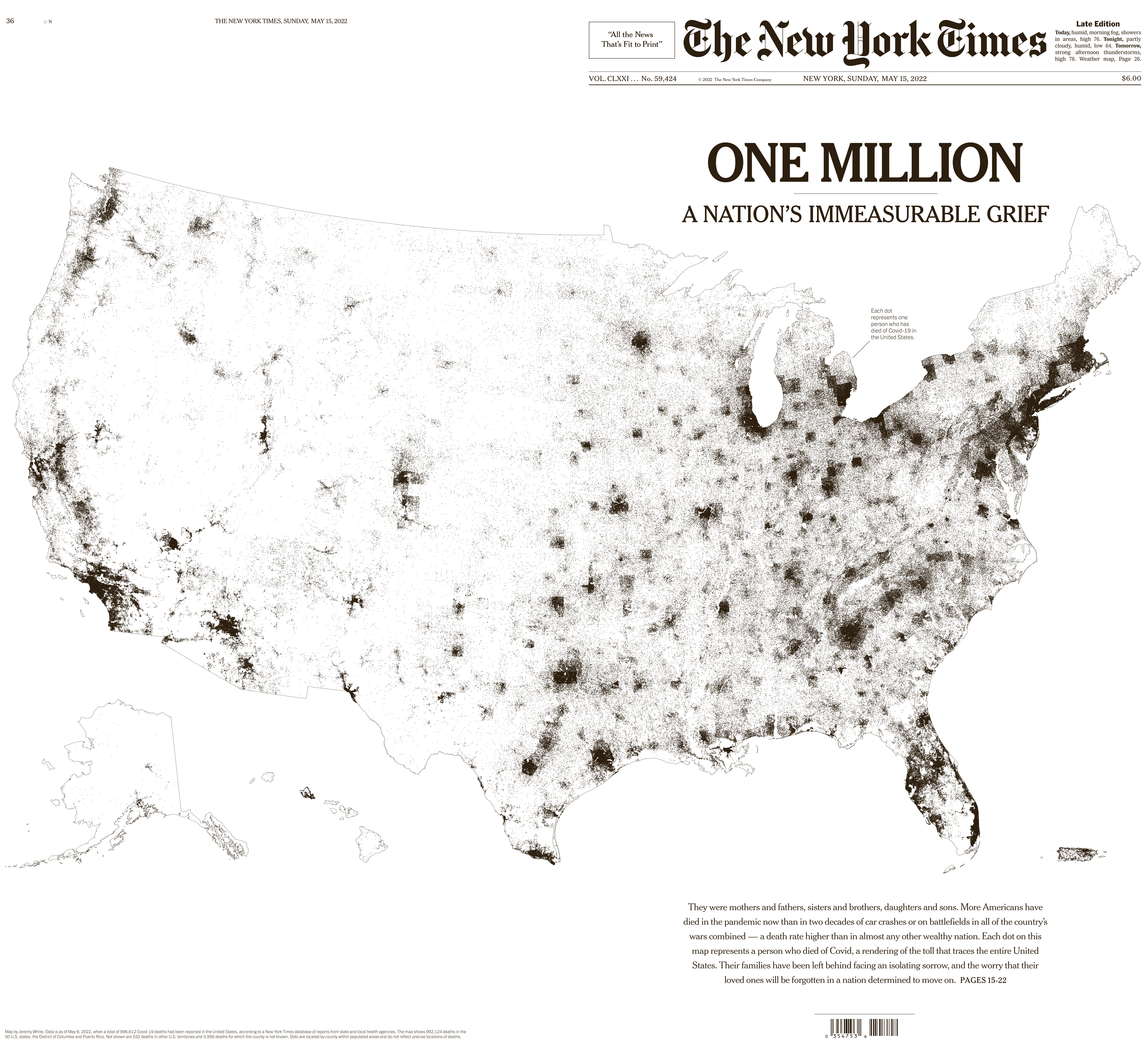
I heard the graphics editor, Jeremy White, who was working on this already had ideas. The dots concept was his, I just saw it and saw some of the shapes the dots might take… when I saw the United States formed by the dots and each of them was a person, I knew that was the image. It was informative, emotional and simple (while also being very complex). It did a lot of work without overwhelming the viewer. Adding the annotation that each dot was a human was something I felt got to the heart of the image, so I knew we’d need to include that somehow.

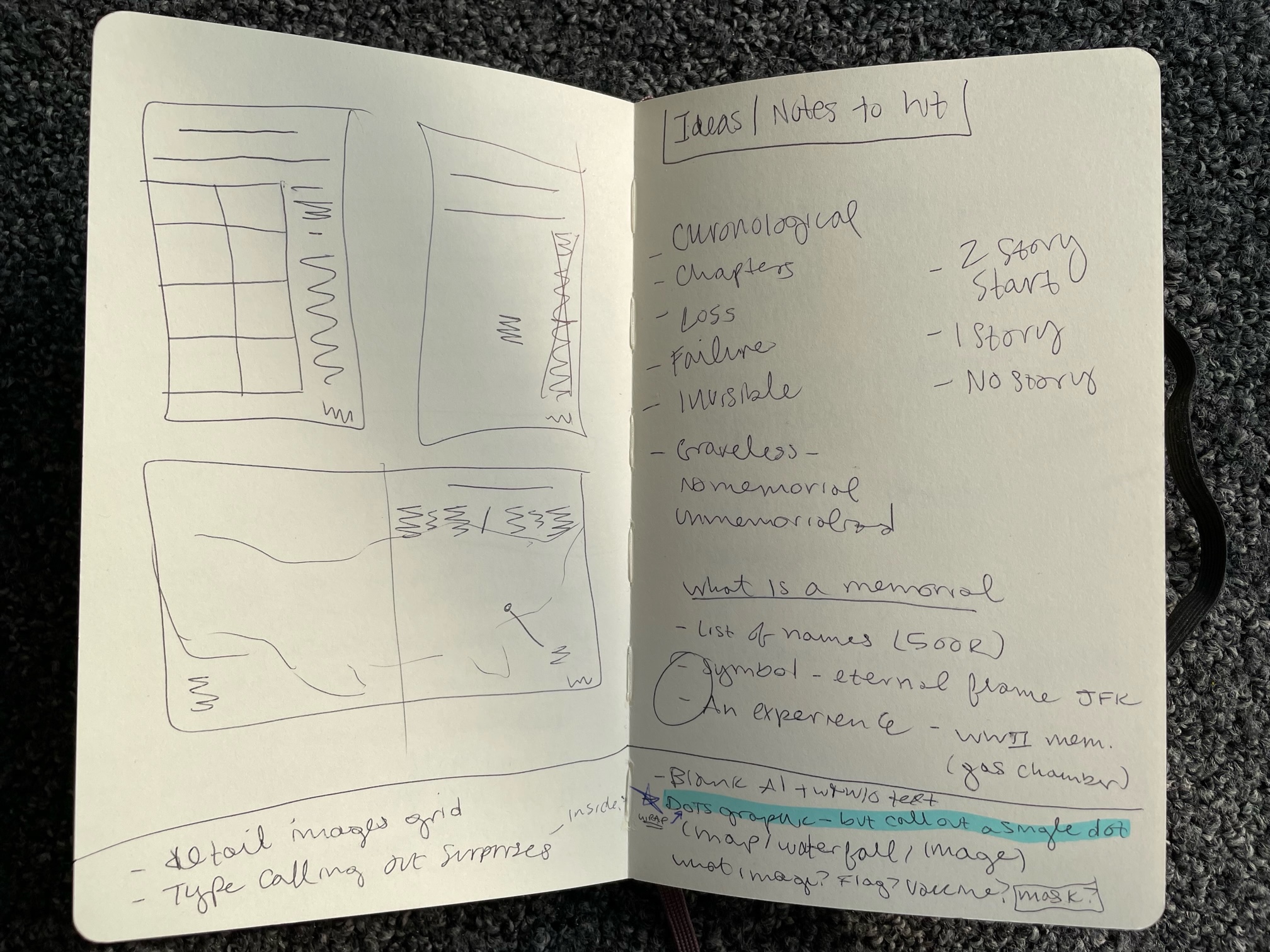
Sketch book pages: A look into brainstorming the concepts and ideas behind One Million. The basic wraparound design with the United States is roughly sketched out here with notes and evolved into the final layout.
There was talk of making this front page bigger than the others to make the statement that this was a historic moment.So my managers, Fred Bierman and Andrew Sondern, and I wanted to make it a wraparound page one if we could, though we knew it would be a challenge…
Was it even possible? We needed to see a print version of the graphic. Then we needed to figure out how it would print best on newsprint. We really wanted the dots to print well. This was very complicated and involved trying various dot sizes and ink combinations (grayscale and black & white) and opacities. Also had to figure out whether it was worth adding outlines for the country, states, counties, etc. We actually did an 8-page press test to make sure we were doing the right combination for print so that it would be readable. After that we just had to wait until we were closer to the date to finalize the map with the latest data.


Pages from the press test for One Million. This was an eight page section printed to check the dot density and overall constitution of the map on the page at this size. Different dot point sizes, black and white versus grayscale, strokes around the country (and states and counties) were all part of different test combinations.
At the same time we had to convince editors at The New York Times to just run this on the front page and clear the back page of ads for this paper. One thing on the front page of The New York Times?! And it’s not even a story start. But once people saw this, they started to get on board. They found it as moving as we did. Tom Bodkin and Tom Jolly were very helpful in helping us move forward.
Then at last, there was writing of the display type, which took a village. But I believe where we landed was right.
It was a sleepless night both before and after this went to press.
layout of the million deaths page one
How have readers responded to that unconventional approach?
We never do something like this for page one. Never. Readers took note. Of the responses I heard, people found value in this treatment in remembering loss and recognizing what we, as a nation had been through. That meant a lot to me, because that’s why I do what I do.
Which software have you used to make it perfect?
I know our graphics team has special software to gather and analyze data, and they had been gathering since the start of the pandemic. For me, to make sure it would print well, I placed the high res .tiff I received from Jeremy into an InDesign document with the single dot annotation and the display type and exported it as a pdf with our press settings to insure everything would stay together and print well. Then I had to place onto the live pages in Newsgate as a single image. But with the normal page elements (like the NYT flag) undisturbed in our system.
This page won so many top awards in different categories of the SND competition. Why is this work striking from your point of view?
First, I just want to say that I am so honored and proud of this work receiving recognition. Everyone involved worked very hard and with great care. I think it’s striking because to me, this feels like more than a newspaper page. This feels like more than a layout. This feels like a moment of recognition and memoriam that we visualized. That is something that I didn’t know was possible but that is how I see this.
As an artist, what is the emotional feeling that passes through you when doing this?
I’ll be honest, I cried a lot working on this. Ans I’m okay with that. This was such a massive loss and I think really letting myself feel that, lets me know that I’m doing work that is honest and has depth.
To whom are you going to dedicate this award?
To the readers and the future readers (two of which are my kids). Journalism makes the world a better place, and I’m glad I am still a part of that effort.
One of your works that attracted worldwide readers was “The Russian Troops: Call Home Bitter Tales of Failure and Fear.” Can you tell how you worked on it for print media?
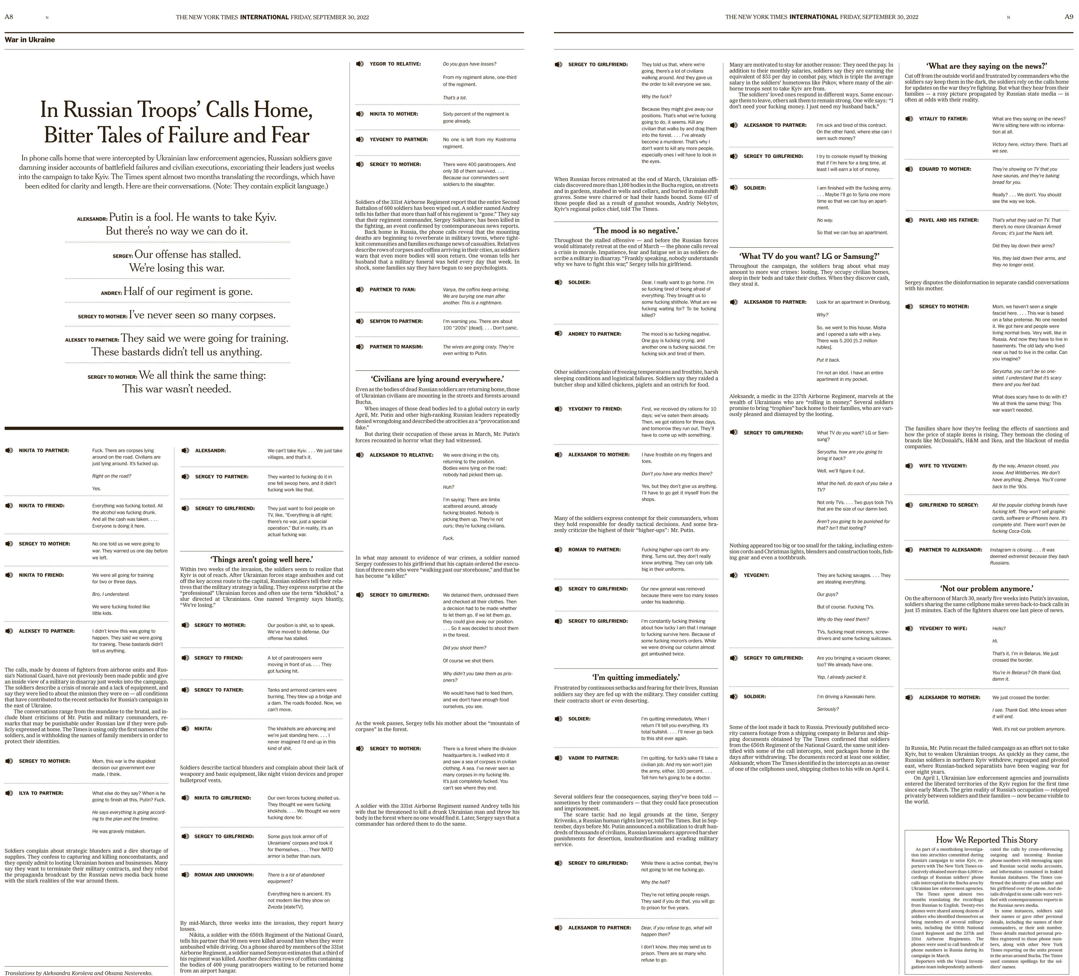
layout of the Russian Radio intercepts
The core of that project was having the radio transcripts and our incredible Visual investigations team had gotten a good amount of them. Russians speaking freely, it was access to a secret world.I feel like when I see something like that, it’s an opportunity to lean on type and just let the words be the story and the art all in one and do the work.
How do you approach your projects?
I always ask myself what’s the core of this piece? What makes it special? What does it need to convey? And I let that inform how I envision it in print. Then I like to talk with any editors involved, make sure I know everything I should know and am thinking correctly about the project. The. I usually start from to write ideas, words, concepts and then start drawing pages. That translates to the computer and then eventually to the page.
How editors and artists work closely in the New York Times?
It depends on the team and the project. I think my best projects have been because of good communication and collaboration with editors. I think every project needs to be about the story first and if you can’t work closely with an editor, you might be missing out on ways to elevate a piece in print.
Do you think AI is going to create a revolution in the field of data visualisation and information graphics?
I think it will be a great asset but not a revolutionary tool. You still need a human to evaluate certain parts of projects, be sensitive to tone and nuance. I’m also interested to see how news organizations will keep readers trust and maintain editorial excellence as they begin to use these tools.
![]()