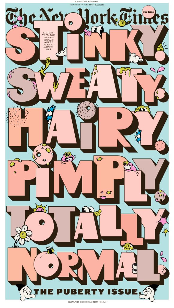
Tom Jolly, the Associate Masthead Editor for Print of The New York Times, describes the secret behind the innovative and engaging design of The New York Times in an exclusive interview with tksajeev
Page one is the face of the newspaper. Can you describe how The New York Times’s (NYT)design team approach page one?
When we know a big moment is approaching, we do our best to talk about the best approach for presentation.
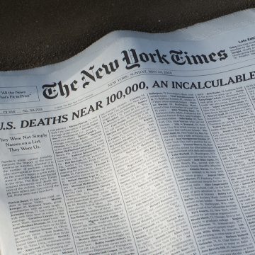
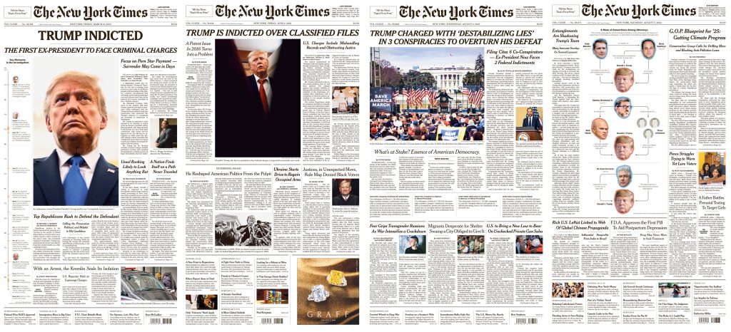
Sometimes we have a long runway, as with the sad death milestones of 100,000 and 1 million during the pandemic. Sometimes, as with the indictments of Donald Trump, we know something is likely but have less time but can talk about possibilities. And on many if not most days, we are figuring out the page in more or less real time
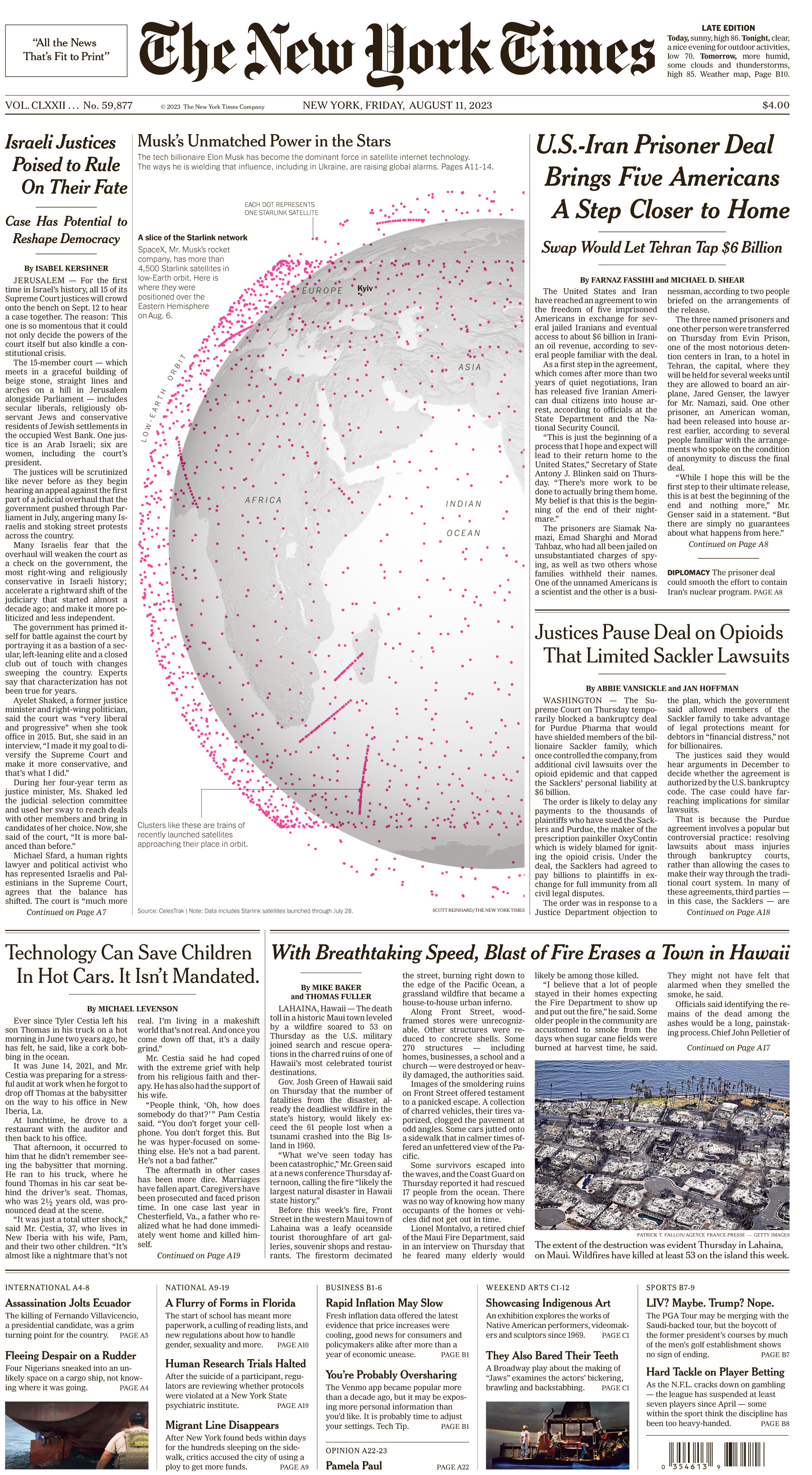
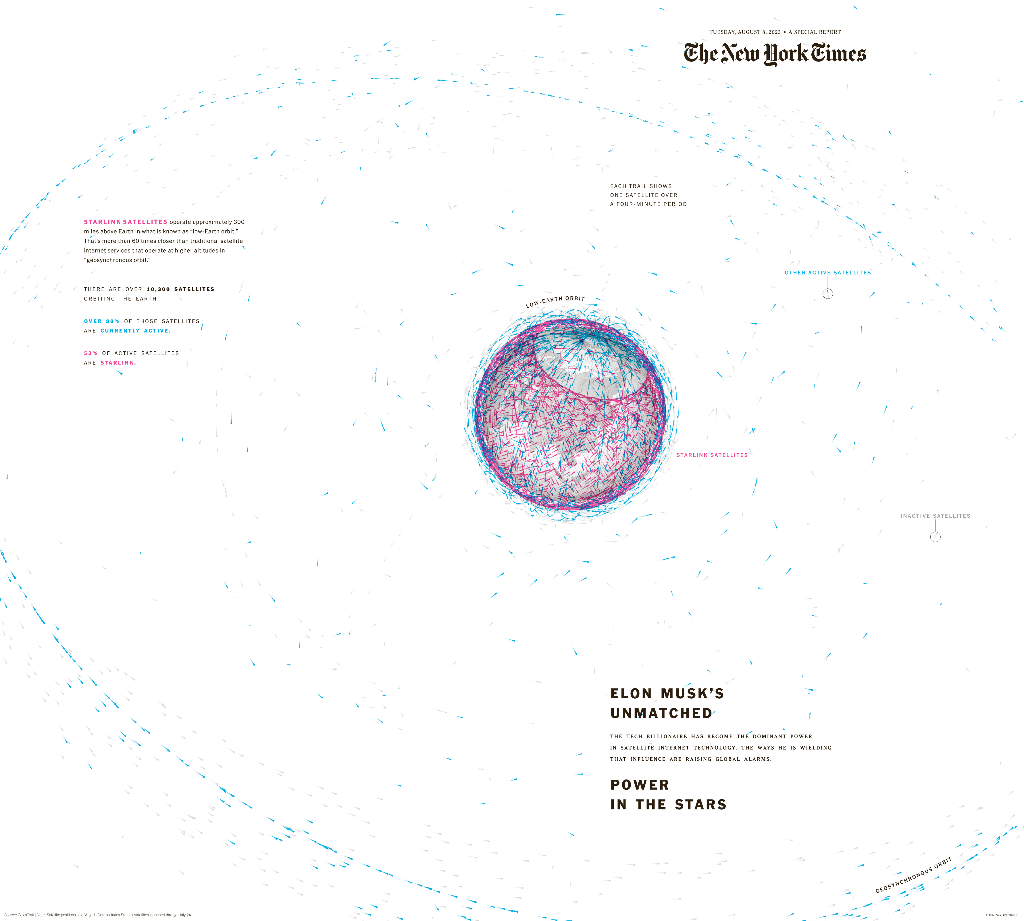
As with the design for the Starlink page, the graphic for A1 was conceived by Jane Mitchell and Molly Bedford as a way to give the story a big presence on A1 even as it ran on four inside pages. The page is usually drawn by Tom Bodkin, our creative director, but he has encouraged designers to think about ways to promote stories like that on the front page, to great effect.
That same approach is true of Amy Kelsey, a deputy design director who draws the front page on days when it’s not being done by Tom.
Starlink pages
Do you think page one has to surprise readers every day with innovative news or design approaches?
We want to make the page engaging and we do look for opportunities to surprise, but trust is the most important ingredient in our relationship with our readers and if we are not true to the news in how we present it, that trust erodes and so does our readership. So our No. 1 priority is to produce a page that prioritizes the news for our readers and gives them insight into what it all means. But it’s always nice to deliver something unexpected when it’s possible.
How has the NYT’s design evolved over time?
The expansion of our digital report has been a major influence in design for print: Visuals are an essential part of a digital presentation and our print designers embraced them too. In fact, embraced is too tame a word; they grabbed hold of the expanding visual opportunities and ran with them, deconstructing interactives and videos and making them work for print to stunning effect.
We think about the way print can play to its strengths, by packaging stories in a way that digital can’t and by taking advantage of the scale of our pages in a way that isn’t possible with a phone.
We think about ways to leverage the unique capabilities we have at The Times. For example, we have the only newspaper press in North America capable of printing a pano-eight – a full four-page spread of newsprint. It’s not something that works for all uses, and it requires considerable advance production work, but with the right opportunity, it makes for a fantastic presentation.
Another example: Our paper is printed at two dozen printing plants around the United States and when we did a story on the record number of women serving in Congress, we used a portrait of a different congresswoman on the cover at each press site, linking the portrait to their geographic area as closely as possible.
What are some of the most popular design features of the NYT?
I’m not sure how to measure the most popular features, but the most striking ones have been those that were the most dramatic. That was particularly true during the pandemic, most notably the moment when we reached 100,000 deaths in the United States and the day of a particularly dire jobs report. The same has been true of moments like the Jan. 6 insurrection and many moments involving Donald Trump.
What made these work was that they matched the moment: A dramatic reflection of a dramatic news moment.
It’s always our goal to reflect the magnitude of a moment, with perspective. We often look back at how we handled comparable events and try to think in terms of how a long-running event might evolve in order to keep that perspective.
What are the key principles that guide your design process?
Beyond the fundamental principles that guide us in journalism, we look for opportunities to use print to its fullest advantage. A basic question is always: How can we tell this story in the best and most inviting way. That could include photography, annotated documents or graphics, a timeline, breakout quotes.
We also are always conscious of keeping a story in perspective. That means we weigh the significance of a story against the amount of space we devote to it. We want the paper to serve as a reader guide to the relative importance of individual stories.
How do you balance the need for visual appeal with the need to communicate complex information?
There are of course many ways to create visual appeal, whether with white space, type, photography, graphics etc. That balance changes with each story, but the key factor is always to answer the question of how we can communicate that information in the clearest and least complex way possible.
Often, the work of getting to a simple design is much more complex than the final design since we need to determine what elements of the story are most important to telling it and what we need to do to distill those elements into a form that works for print.
What role does typography play in your design?
It’s crucial as a design element in itself. We have essentially three elements to work with: typography, photography or infographics and white space. In each design, the challenge is how to use them to their best effect. Used wisely, typography can be the most effective design element, whether that means using it in a way that makes a statement by its familiarity, as was the case with the 100,000 deaths page, by using it boldly to signal something urgent, or something in the middle, as with an annotated document.
How do you use color to create impact?
Color is a particular challenge for us because our press capacity limits the number of pages available for that use. That means we need to be strategic about where and when we use it. The unintended consequence is that it forces us to put more thought into its use than we would if we had unlimited access to it and we often hold large presentations for a day or two in order to display them in color.
How do you use photography and infographics to tell stories?
Infographics are a great growth area at The Times, much to print’s benefit even if the driving force has primarily come from the digital side. Done well and in the right circumstances, they tell a story – or at least illustrate it – better than anything else. The primary example of that was the two-page wraparound of the paper that illustrated the deaths from Covid in each area of the United States.
As for photography, we are fortunate to have an incredible photography department and we always want to take advantage of their great work, which often tells a story itself. When we have the opportunity to display exceptional photographs, we do it.
How do you keep your design fresh and engaging over time?
Fresh ideas come from people who aren’t afraid to express them. With us, all ideas are welcome, as is feedback. Our designers embrace creative thinking and collaboration. It’s a joy to see someone like Carrie Misfud brainstorming with Jane Mitchell or Andrea Zagata and vice versa. Many of our word editors help fine-tune ideas, and we welcome thoughts from reporting desks as well. Those desks know the ins and outs of a story better than anyone and their input is often essential.
We all have egos, of course, but everyone sets them aside for the greater good. It’s quite something to see, and something I greatly admire.
It also helps that our design director, Fred Bierrman, is incredibly enthusiastic and supportive of great ideas and execution. He and deputy directors Amy Kelsey and Andrew Sondern hold regular meetings with the staff to review the work and invite critiques and occasionally invite creatives from outside the newsroom to help inspire everyone.
What are some of the challenges you face in designing a newspaper in the digital age?
The most obvious challenge is using a static medium to reflect the moving images that are a growing presence in our digital report. Our designers excel at deconstructing interactive graphics and even videos and making them work for print, but it’s a laborious process and means that our presentations of those story forms are necessarily published days after they appear digitally.
How do you measure the success of your design?
Does it fully and accurately tell the story? Is it clean and easy to comprehend? Does it make the best use of photography and graphics, if applicable
.
How does the NYT’s design compare to other newspapers?
We’ve been fortunate to have leadership that understands the value of great design. We’re not alone in that regard, but in an era when resources are increasingly scarce at many newspapers, design is too often discounted.
What advice would you give to other newspapers about design?
Play to the strengths of your medium. If you’re designing for print, take advantage of the opportunity to boldly display the best photography and graphics. Put your greatest effort on the most important stories of the day, and look for opportunities to add elements to your presentation – beyond the basic text and photography. Are there breakout elements that add both interest and information? Are there documents, excerpts, quotes, detail images?
Great news design informs and engages the reader. Dull design does neither.
Push back against efforts to overload pages with text or minimize design.
Does NYT design work mostly on templates?
The vast majority of our design work is bespoke in the sense that we design to suit the story rather than making a story fit the design. We do use templates for standing features like Inside The Times on pages A2-A3, which is our front-of-the-book presentation, as well as in most feature sections. But those are the exception rather than the rule.
Do you think in this digital area, e-paper and the print edition should be entirely different?
As I’ve said earlier, it’s important to play to the strengths of the medium while staying true to the look and feel of your brand. When our digital report first took hold, there was a sense of competition with print. Over time, we began to understand that both have unique capabilities and that it’s important to our readers to relay on those capabilities as we present the news to them.
Can you describe the structure of NYT design department ?
The print hub consists of three groups of designers: news (led by Fred Bierman), features and special sections (both led by Shannon Robertson), but design crosses into all areas of the newsroom: print, digital, video, graphics etc. – a great accomplishment of Tom Bodkin’s leadership as creative director.
picture courtesy:The New York Times
![]()

