South China Morning Post designer Rocio Marquez talks about her onlineproject “Israel-Gaza war explained” exclusively totksajeev of newspaperdesign.in
How did you approach this subject?
After the October 7 events in Israel, Marcelo Duhalde and I were planning to build a visual summary of the information of the Gaza-Israel conflict, because at the beginning there was a lot of daily new information and we wanted to collect first the most information available, to later organize and define an effective explainer . We decided in that moment, to put our attention in Gaza mainly because the coverage those days was more over the aftermath of October 7 Hamas attack in Israel. The Israeli response was starting and we wanted to give a full context to our readers for them to understand more about the Palestinian territory under siege, and the possible consequences of an armed response from Israel over the civil population. We also had meetings with our international expert and Content Editor Andrew London, who agreed with us in the main focus decided previously, He also suggested limiting our explainer to the first stage of the war, in order to limit the frequent updates. In some point, it was necessary to define a date to end the research. In that way it is possible to establish a deadline for publication
What is the concept behind this project?
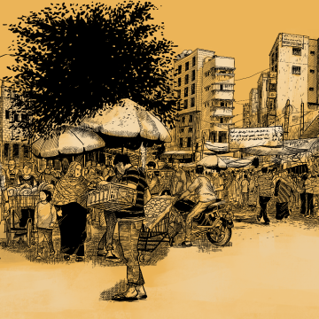
We wanted to offer a more human approach, not only using technical data, cartography, and charts, a way to achieve that was to include illustrations of Gaza’s daily life at the opening of the piece and some other data not directly related to the conflict itself, such as energy sources, internet connections, education etc. All of this would help us to depict more accurately the situation and daily needs of the population inside the sieged territory. We decided to work in this way because one of our distinctive features is to always offer a different angle in the explainers we build. Seeing a scene of their normal life can remind the audience of their own life and see the story in a more personal way and attract them to explore the multiple visualizations and maps.
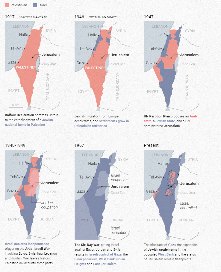
What was the process you went through in visualizing the evolution of Israel’s border?
This part was not that difficult; there are plenty of good maps where we got the information. It was necessary to give historical context, and it is necessary to understand first that the region has been under multiple conflicts and evolution over the last seventy years. I would say the main visual in our project was the current situation in Gaza; the historical evolution is only a necessary reference to include.
And also Gaza today …?
For Gaza, we first investigated all the sources available and later filtered them with the help of experts to keep only the most accurate and reliable data. At the beginning of the conflict, the information coming from the region was profuse but also very inaccurate or not true. We were also continuously checking some social media accounts for fresher information (mostly X) on their official account updates. For the map base information, we decided to use the same as the United Nations High Commissioner for Refugees (UNHCR), updated in September 2023.
For the interactive map, we decided to start with a general view of the region and later approach the Gaza Strip in order to visualise borders, geolocation, and further detailed information. We decided to use a set of clean cards to explain in detail other aspects of the Palestinian territory and to show as a reference our own city, Hong Kong, comparing the population density and size. In the next zoom, we explore the Gaza Strip, comparing this length with something familiar to our readers, the Macao Bridge. The last storytelling part is more centered on explaining the situation inside the Gaza Strip in the first part of the conflict, like the buildings destroyed by the Israeli forces, the evacuation of part of the population from the north to the south, and the main roads in the territory. Also, we include some information about internet connection because nowadays, being connected means the availability of services, information, and coordination for any group of people in the world. It is very important to inform the media and humanitarian organisations located inside the territory of a conflict.
What are the software and technical aspects you have used?
The project took us 13 days to finish; it went through several rounds of checking, double checking, triple checking, and continuous updates before being ready to launch.The tools we used were: Figma for prototyping and sharing our initial processes; Illustrator, Photoshop, QGIs, and Procreate for the design, infographics, and illustration parts. HTML and JavaScript for the code. And After Effects for the video editing.
This project is one of the regular duties that any infographic team belonging to a newsroom seeks to produce. We usually take care of all the assets and content, and our goal is to deliver an accurate set of graphic maps and visualizations to help our readers understand more about this conflict. The objective of infographics is to be precise and neutral, always based on the most reliable sources and research.
click here to see the graphics Israel-Gaza war explained


