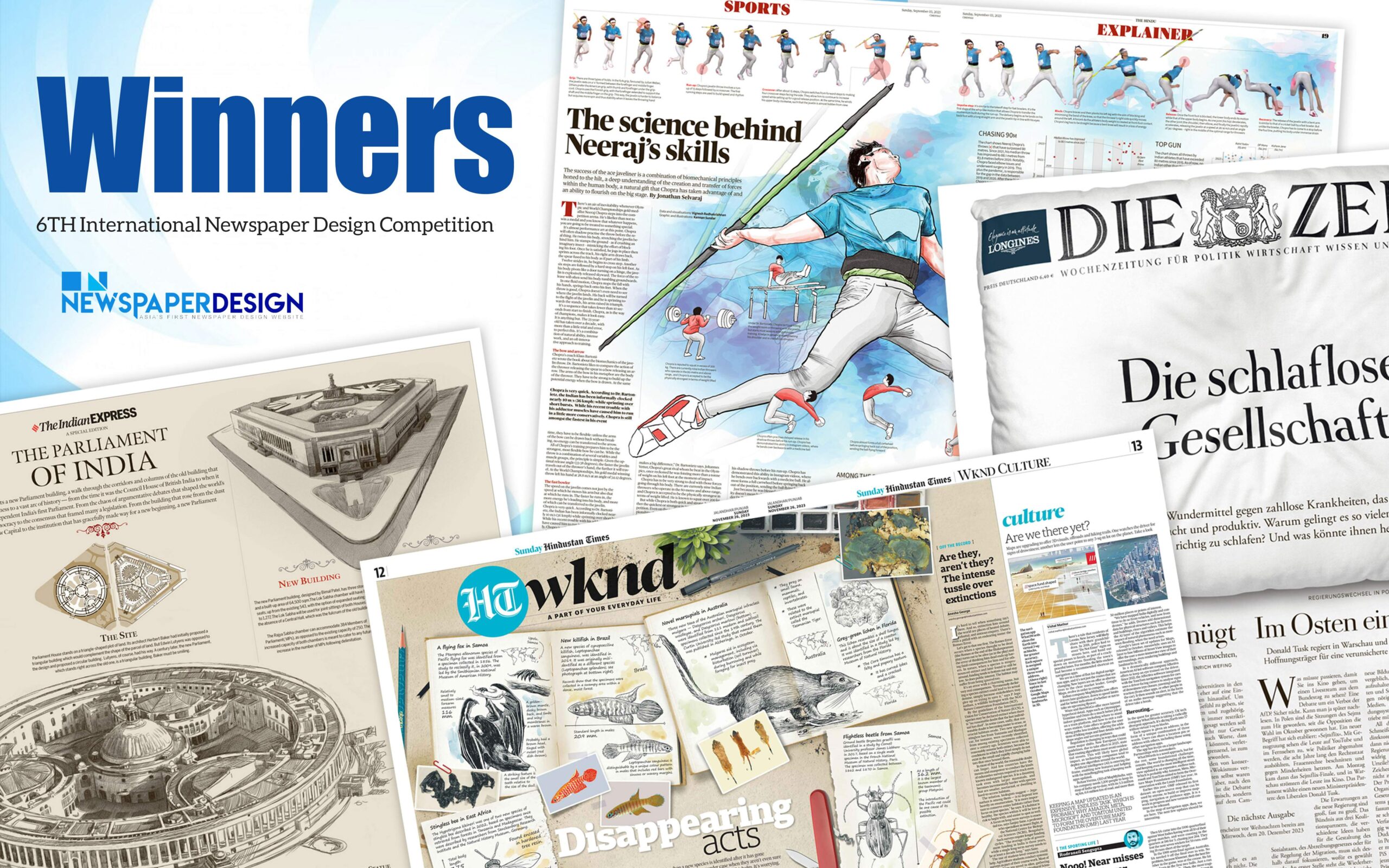
The winners of the 6th International Newspaper Design Competition, organized by newspaperdesign.org, have been announced.
Note from Chief of Jury Mario Garcia
Thanks for allowing us the opportunity to judge these entries. My fellow judges and I have learned much from seeing the variety of pages presented. At the same time, we are aware of the differentiation in terms of resources, training and trajectory of titles like Germany’s Die Zeit and some of the others included in the contest. Of course, the goal of these competitions should be that editors and art directors see the awards as stepping stones to becoming better. As I mentioned earlier, we were meticulous about recusing ourselves from titles with which we have been involved as consultants. Do keep that in mind if you get any repercussions from those who may question the objectivity of the judging team.
As I looked through the entries, I felt pride for the job that art directors continue to do with the print edition of their newspapers. These entries reflect overall meticulous care and attention to detail. Typography is handled well, and I even see experimentation with new fonts; visuals are presented generously in terms of size, allowing for print to do what it can do best – displaying large visuals, which is something that we can’t do on small phone screens. This remains the one feature where printed pages provide testimony for the power of print. The pages entered in this competition reaffirm that thought visually, a reference that I hope you will mention as you recap the results of the contest.
I am particularly impressed with the quality of infographics as a visual way of presenting news and information. The entries for coverage of the Gaza/Israel conflict are outstanding, showing that these teams have invested considerable time to present the complexity of the war to the readers in a visual way. Double page spreads, a print edition’s most powerful way to display images, are rich and at times it was difficult to decide which are the best in a group of distinctive entries.
Page One design entries are strong, reminding us of how a print edition can use design to create variety according to the news agenda. While we emphasize familiarity when designing for mobile, for print we can still surprise the reader, something that entries such as A Tribuna and Die Zeit make evident.
The entries in this competition show that rather than imitate the design of mobile and digital, art directors of print publications are capitalizing on what print can do best, maintaining the rich legacy of how typography, grids and color palettes can come together to make news content more accessible while emphasizing large photos and illustrations.
Thanks for the opportunity to review these entries. Recognizing the good work here is also a way of reaffirming the role that print design continues to play in a mobile/digital world.
I want to give extra thanks to my colleagues on the jury who took time to share their career expertise. Many thanks to:
- Josh Crutchmer, Planning Editor, The New York Times
- Steve Dorsey, content innovation leader and design consultant and former SND President
- Miguel Angel Gomez, consultant and former design director, Gulf News
OVERALL STATEMENT FROM THE JUDGES
Die Zeit is, without a doubt, the Best of Show in the majority of categories. It continues to inspire art directors and designers worldwide with its visual surprises. In addition, its success with readers is testimony that its commitment to high-quality content is the ultimate strategy to gain and engage readers.
Die Zeit’s design influence is evident in the overall quality we saw throughout this competition.
We saw very good work among the entrants. We are hopeful that our choices will shine a light on the power of print newspaper design, and its ability to communicate complex information effectively via visual presentation while distinguishing itself from mobile/digital platforms. Print editions will continue to be with us for years to come.
Best of Page One

BEST OF SHOW
Die Zeit: Die Schlaflose Gesellschaft ([Translation] “Sleepless Society: There is a miracle cure for countless diseases that also makes you happy and productive. Why do so many people no longer succeed in sleeping properly? And what could help them?”) The standout Page One of the competition combines creative art direction and classic, organized design that boldly pushes the creative limits of print design. We were impressed with both the decision to illustrate an absence (lack of sleep) with the bold use of white space – an empty bed – and the very detailed and dedicated application of this concept. Weaving the logo, advertisements and all the page furniture, as well as the main stories themselves, into the bedding concept, and rendering it to the greatest detail, was masterfully executed. It was such a committed, expert delivery.

GOLD: Die Zeit; Die Schlaflose Gesellschaft (Sleepless society). The standout Page One of the competition combines creative art direction and classic, organized design that boldly pushes the creative limits of print design.
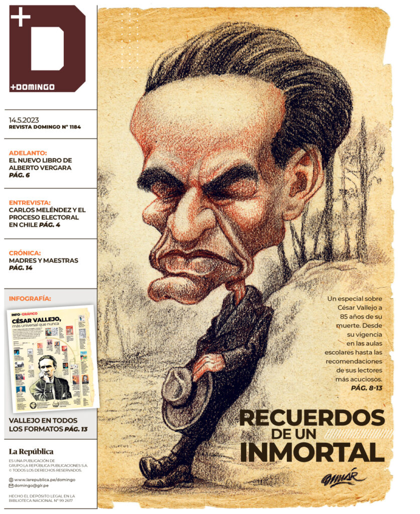
SILVER: La Republica, Recuerdos de un Inmortal. Bold art direction and a well-executed portrait make this a gripping front page that captures the emotion of the story.
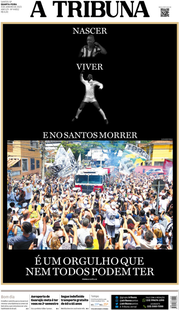
BRONZE: A Tribuna, É Um Orgulho que nem Todos Podem Ter. Combines strong photography with simple typography that standout against the black background and insist that readers engage with the front page.
AWARDS OF EXCELLENCE:

- Arab News; The Kingdom’s Bride and Joy. This page marks a historic occasion and captures the sweep and significance with a polished illustration that looks more like a well-directed movie poster than just a newspaper centerpiece.
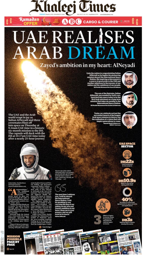
- Khaleej Times; UAE realizes Arab dream. As the lead off to a raft of detailed, special coverage, this page captures the scale and scope of a major accomplishment and a point of national pride in a compelling non-traditional visuals and summaries – and could serve as a historically important poster summary of the big news.
Best of Sports Page

BEST OF SHOW: The Hindu; The science behind Neeraj’s skills. The standout sports page of the competition is layered with information organized on a simple grid around world-class illustrations. Every part of this page informs and engages readers.

GOLD: The Hindu; The science behind Neeraj’s skills. The standout sports page of the competition is layered with information organized on a simple grid around world-class illustrations. Every part of this page informs and engages readers.
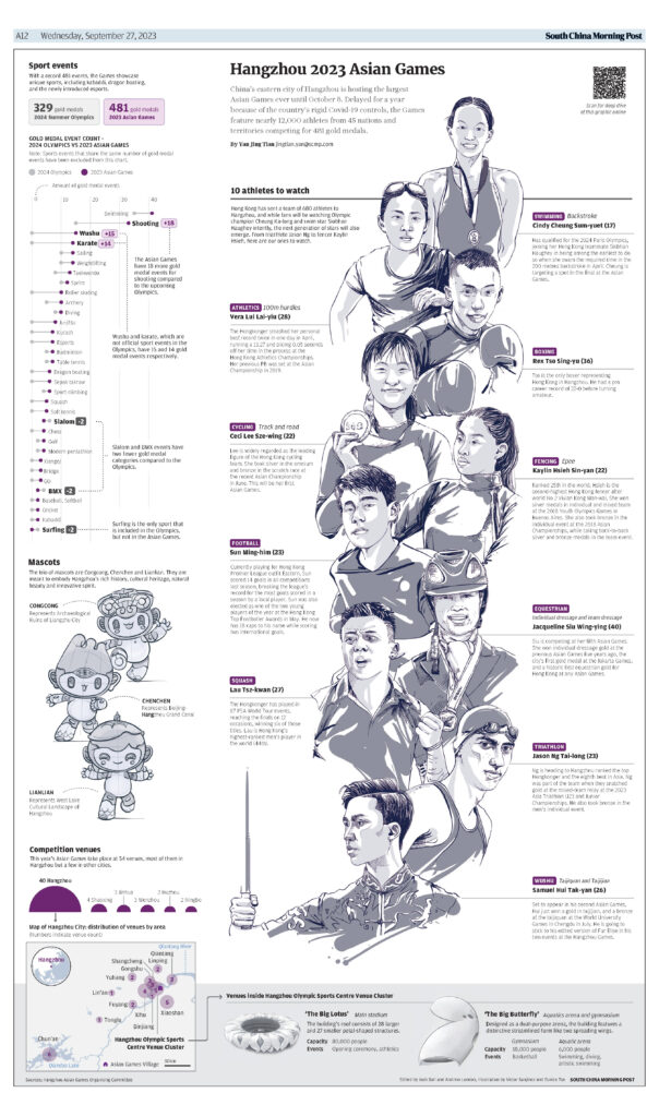
SILVER: South China Morning Post; Asian Games. The use of white space and limited color in the illustrations is in itself a powerful design tool. The vertical art direction invites readers to spend time with a page that is filled with essential information about the Asian Games.

BRONZE: South China Morning Post; The Dangers of Solo Hiking. This page is built around powerful art direction of a serious topic, and it does not disappoint. The illustrations are almost haunting, and the use of a black background and reverse type works to enhance the mood and tone of the imagery.
Best of Double Spread
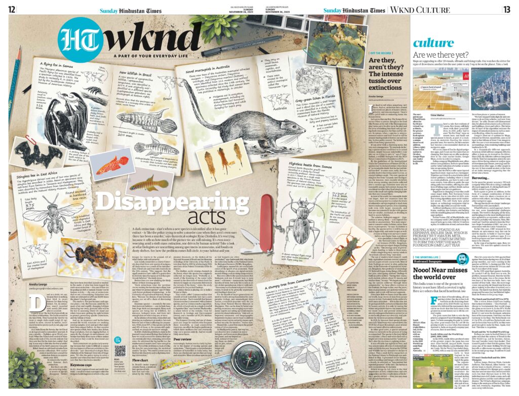
BEST OF SHOW: Hindustan Times; Disappearing acts. Such a clever way to illustrate an absence (always the most difficult visual) – extinctions of animals discovered after they already are gone. Smart biological style but still keeps it approachable and intriguing to the reader with a more casual (less scientific text look and feel) approach. Manages to work a lot of information into a focused reading experience.
AWARDS OF EXCELLENCE:
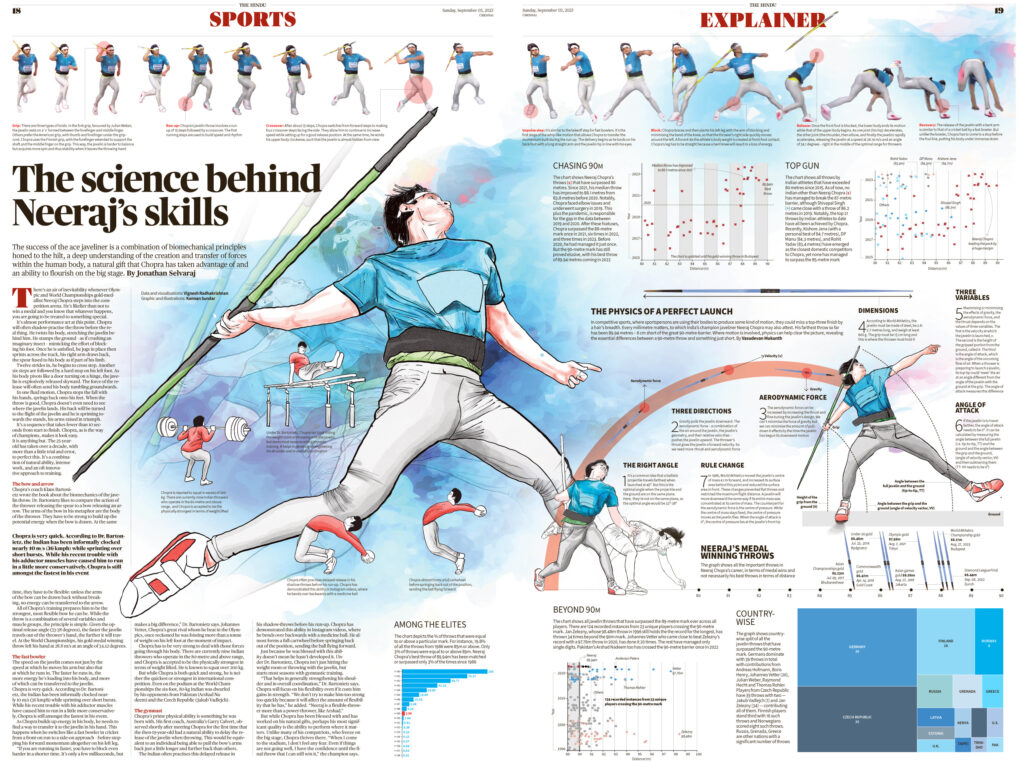
- The Hindu; “The science behind Neeraj’s skills.” A great balance of strong visuals, detailed explainers, and well-edited narrative text combines to deliver the reader a medal-winning experience.

- Report Indigo; Indigo Fan, Un Western ‘Vibrante.’ A fresh, unique take on a traditional big game preview. Active and inviting.

- Report Indigo; Indigo Fan, La gran batalla Estambul. A vibrant, detailed spread of rich information that’s so richly styled and meticulously edited into a compelling poster any fan would be proud to display.
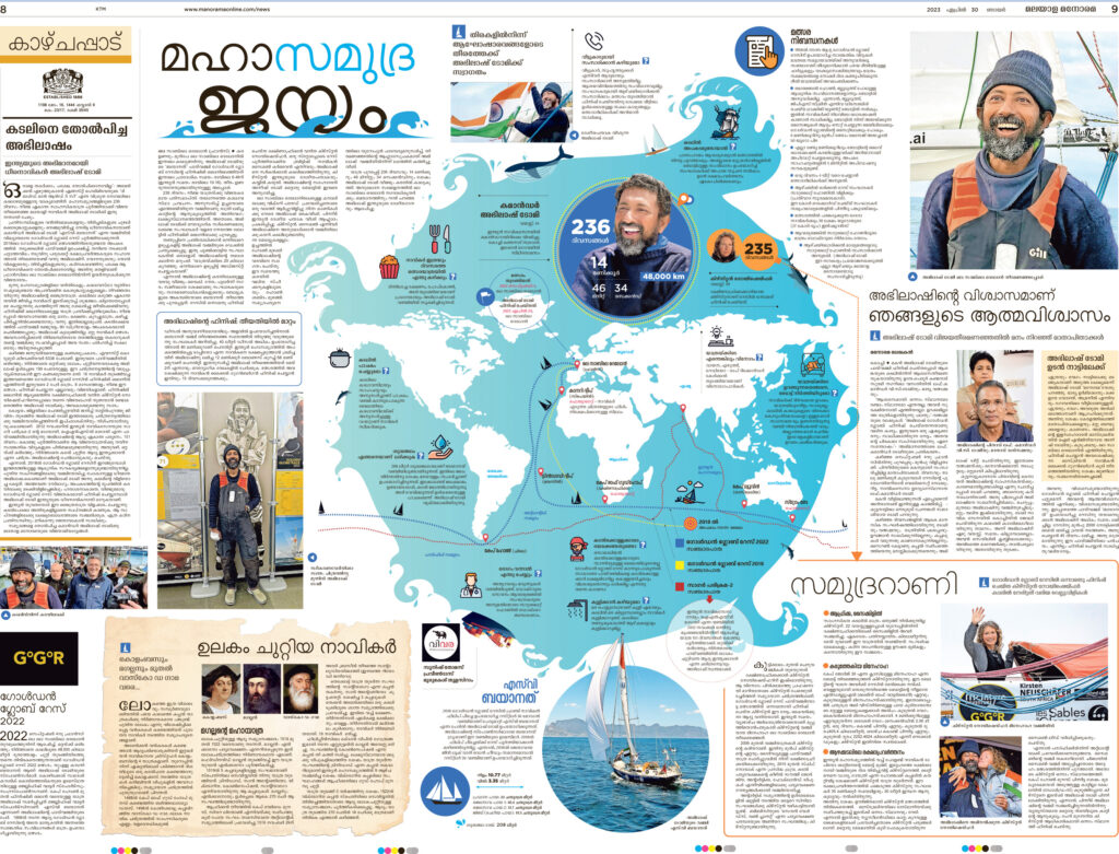
- Malayala Manorama; Centre Abhilash Tomy. An ambitious – and sometimes busy – tapestry makes a broad tale approachable and refreshing.
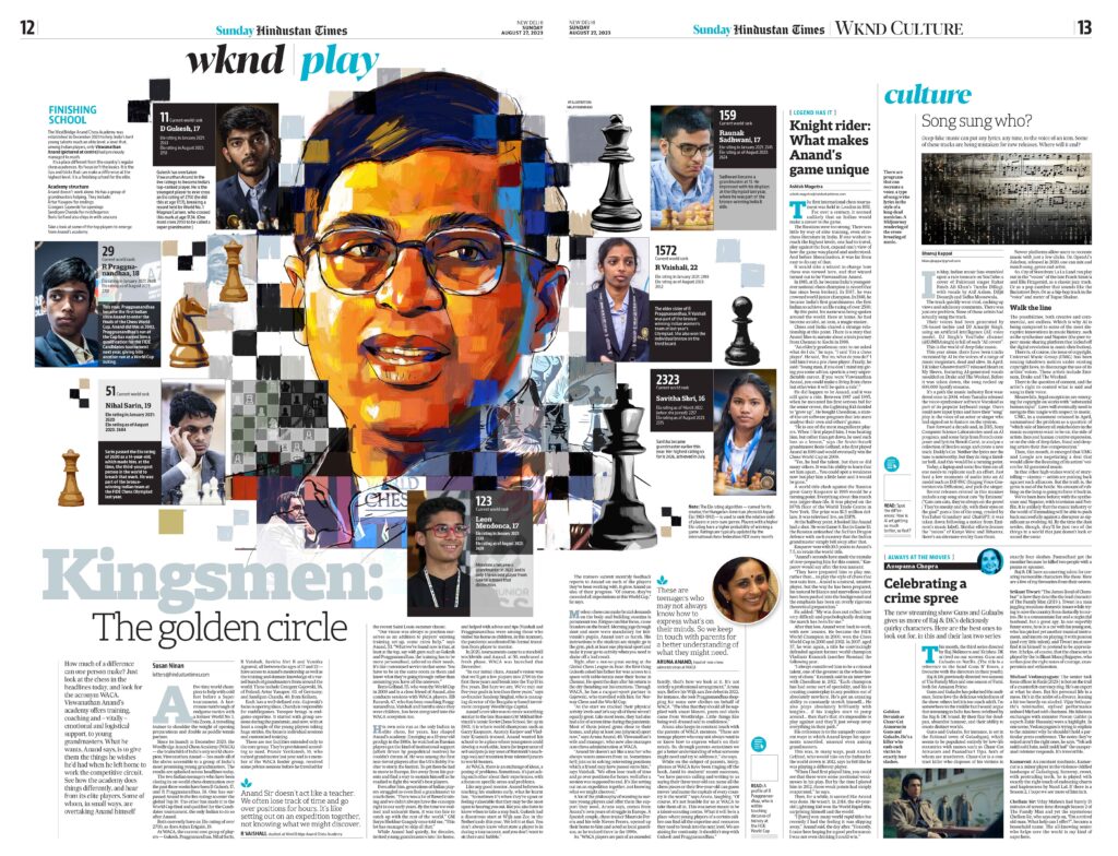
- Hindustan Times; Kingsmen: the golden circle. Great balance of illustration and photography combining to tell a complex story about a panel of subjects in an attractive, approachable way.

- Hindustan Times; Sachin at 50. Compelling illustration style with strong art direction across a vast double truck helps the reader through a comprehensive tale told visually, with breakouts, and long-form narrative.
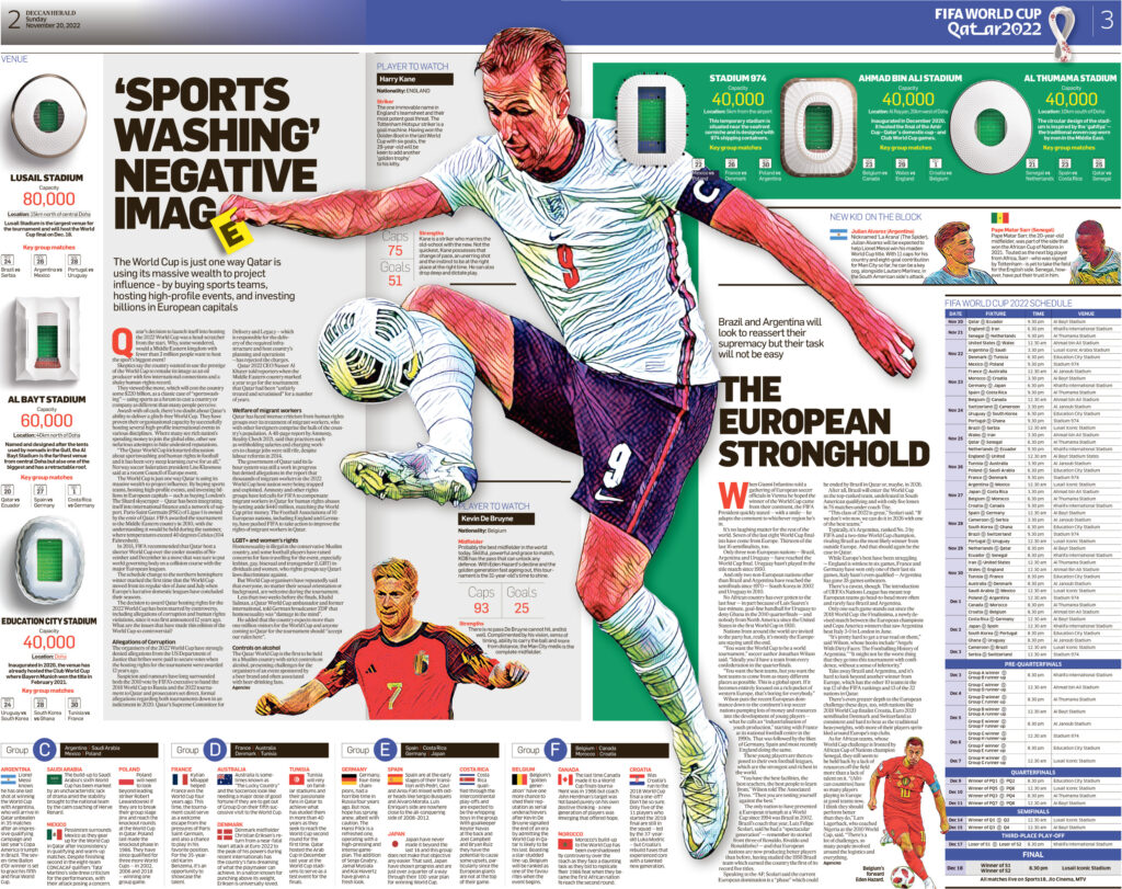
- Deccan Herald; Sports washing negative image. A refreshing approach to the significance of the World Cup storylines with a fresh illustration style, with lots of great details and clever touches woven throughout.
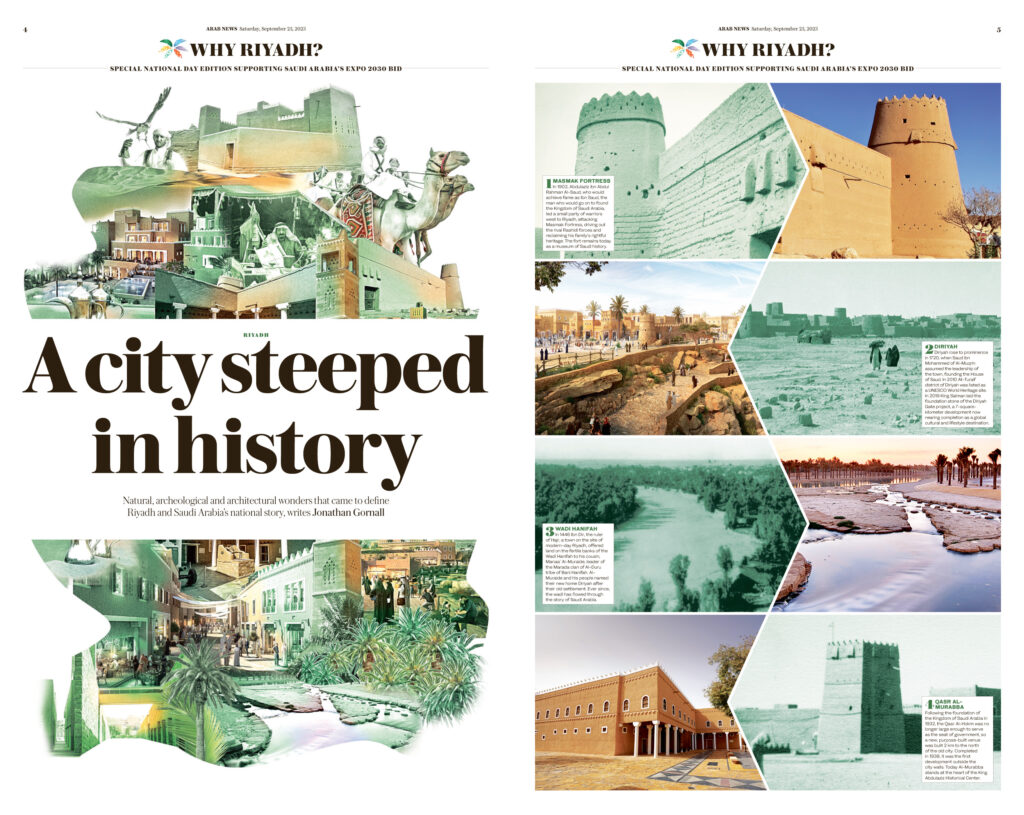
- Arab News; Riyadh: A city steeped in history. Great use of combining landscape photography and illustration to help tell the story of a national holiday. I especially like the print interpretation that feels like a digital photo slider to compare venues over time. Great coordinated overall look and feel.

- SCMP; Modern take on ancient style. A history lesson baked into a fashion spread, layered with information and detail. A great service to culture for readers.
Best of Infographics
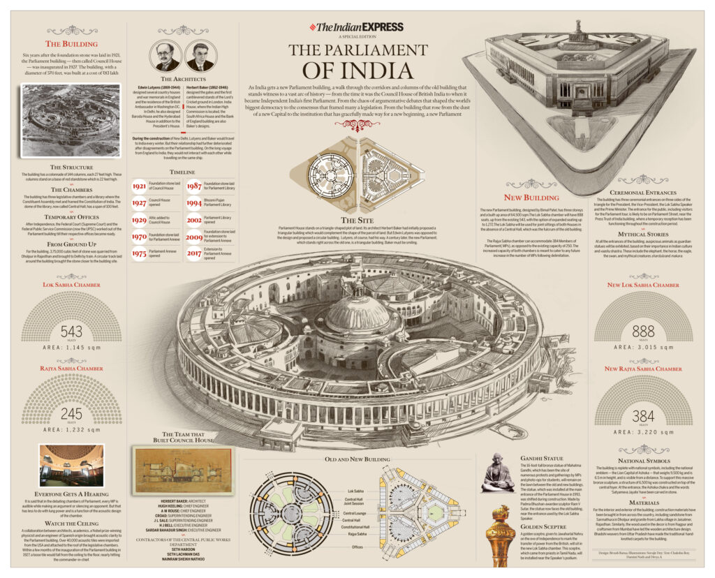
BEST OF SHOW: The Indian Express; India; The Parliament of India. This is a clean and elegant execution, easy to read and follow, and the color palette does not take the attention away from the topic.
AWARDS OF EXCELLENCE:

- Arab News; Saudi Arabia; Accession to the British Throne
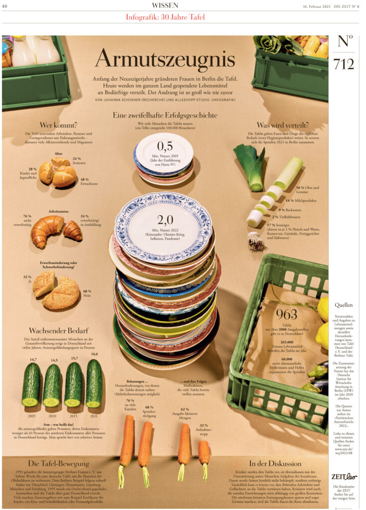
- Die Zeit; Germany; Armutszeugnis

- Die Zeit; Germany; Morgenkonzert

- Die Zeit; Germany; Putschisten, abe popular
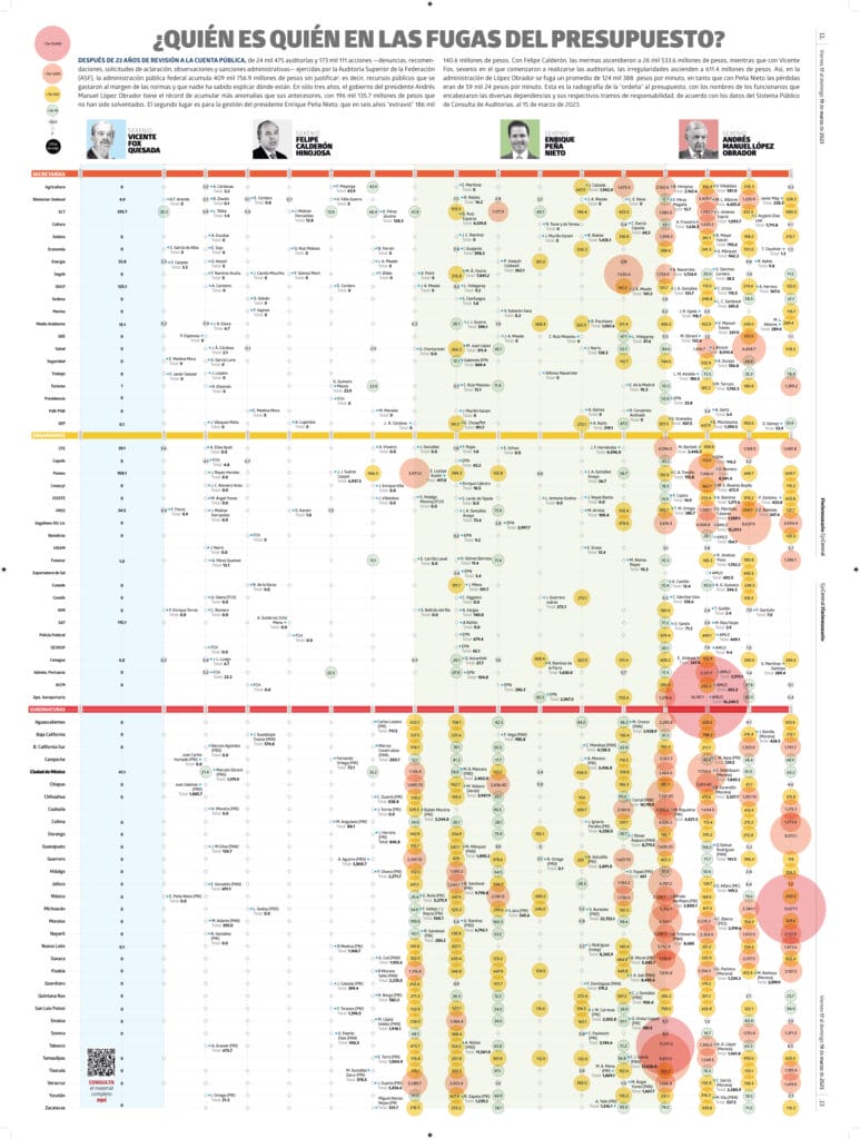
- Eje Central; Mexico; Quién es quién en las fugas del presupuesto

- El Heraldo; Mexico; El Tequila también es sustentable

- El Heraldo; Mexico; Ruta 2024

- El Heraldo; Mexico; Salvan murales

- El Heraldo; Mexico; Siempre verde y oro
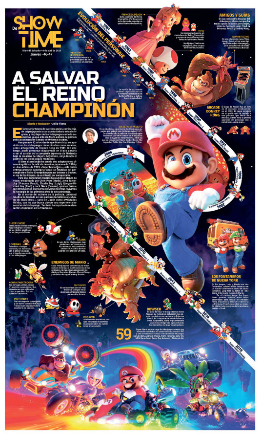
- El Salvador: A salvar el reino champiñón
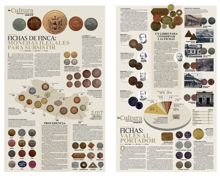
- El Salvador: Fichas de finca
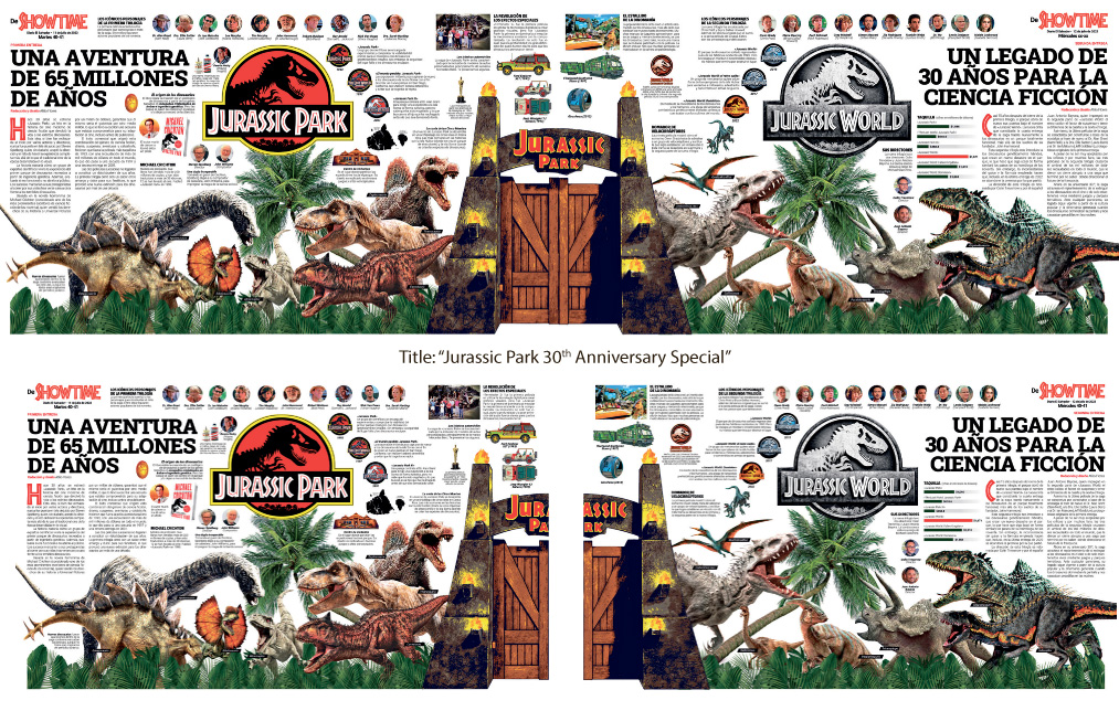
- El Salvador; Jurassic Park, un legado de 30 años

- Hindustan Times; India; Athletes special
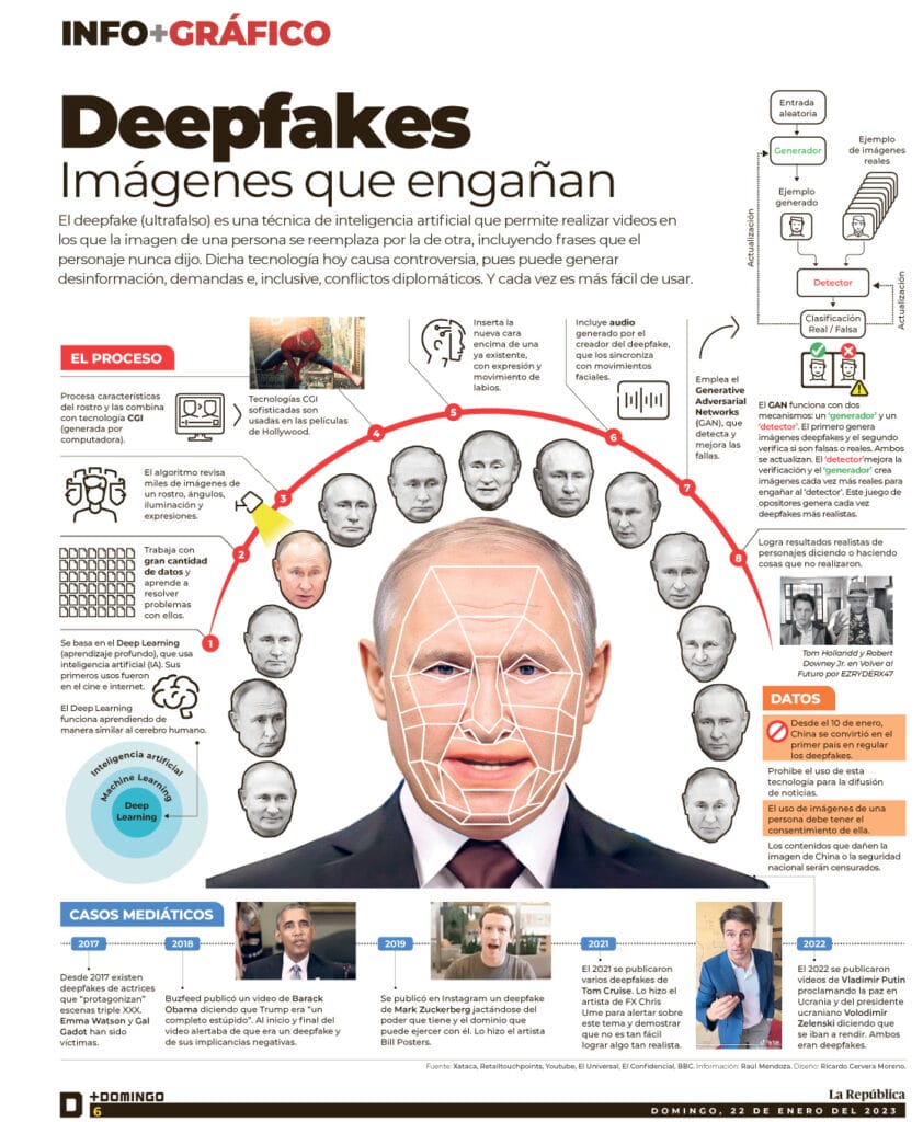
- La República; Peru; Deepfakes, Imágenes que engañan
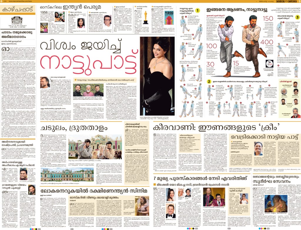
- Malayala Manorama; India; Dance moves

- Nuestro Diario; Guatemala; Arjona, Seis décadas de altura musical

- Nuestro Diario; Guatemala; Café de Guatemala
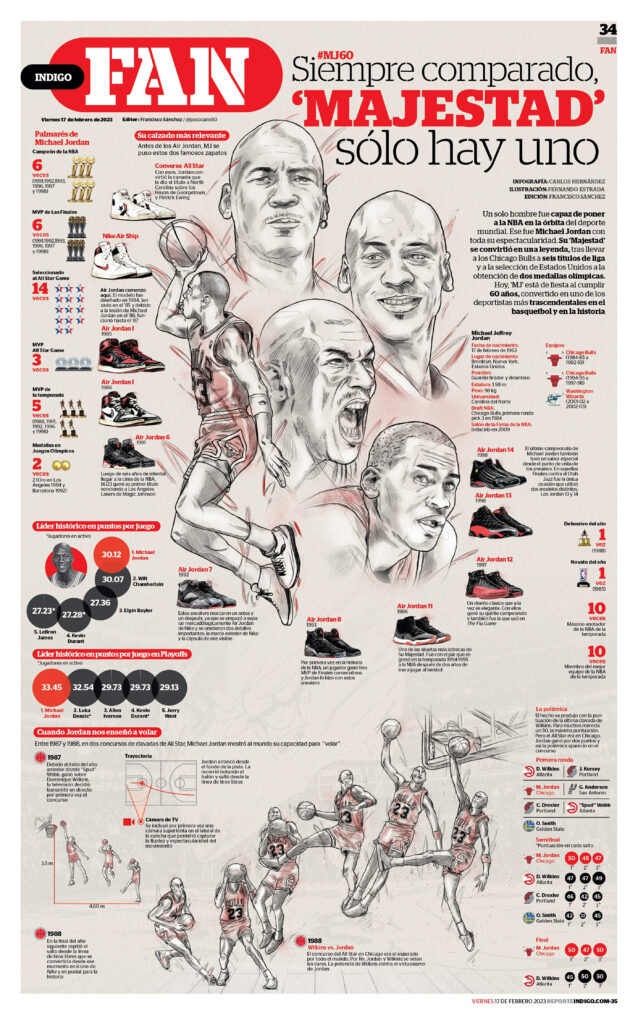
- Repórte Indigo; Mexico; Majestad sólo hay uno
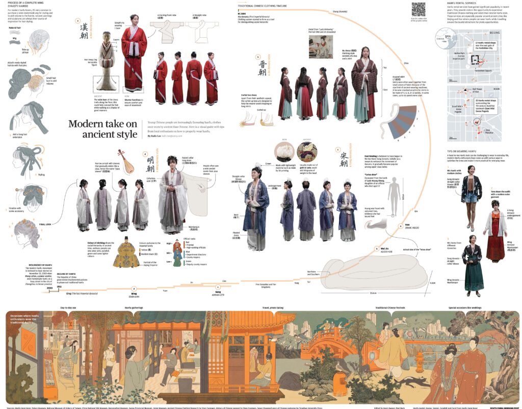
- South China Morning Post; Hong Kong; Modern take on ancient style
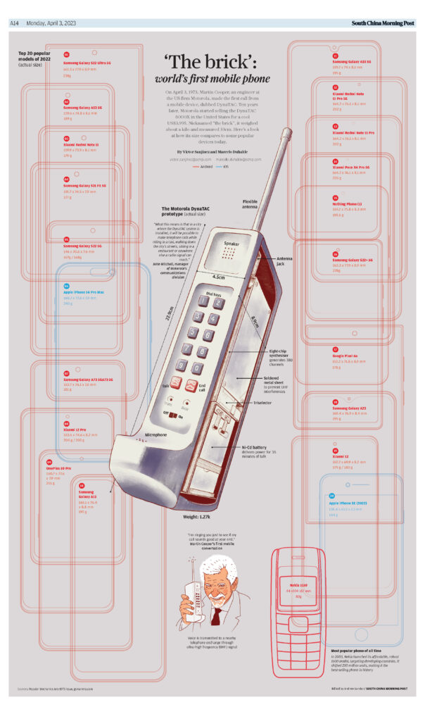
- South China Morning Post; Hong Kong; The Brick

- The Indian Express; India; The Parliament of India
Best of Israel-Gaza

BEST OF SHOW: Die Zeit; Germany; Der tag, Der nicht enden will. Strong message, organized and without ornament, good photo editing, and usage of negative space.
AWARDS OF EXCELLENCE:
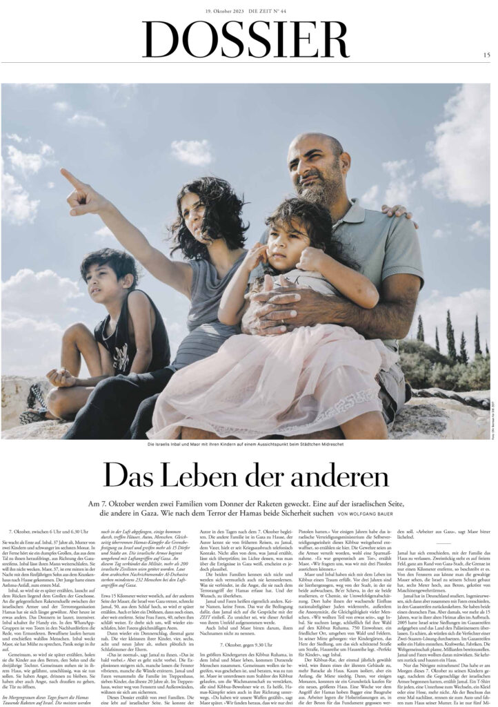
- Die Zeit; Germany; Das Leben der anderen

- Die Zeit; Germany; Der tag, Der nicht enden will

- Die Zeit; Germany; Wo soll das enden
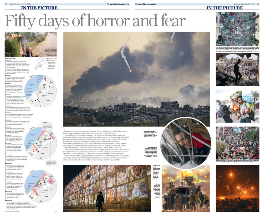
- South China Morning Post; Hong Kong; Fifty days of horror and fear

- The National; United Arab Emirates; A logistical nightmare
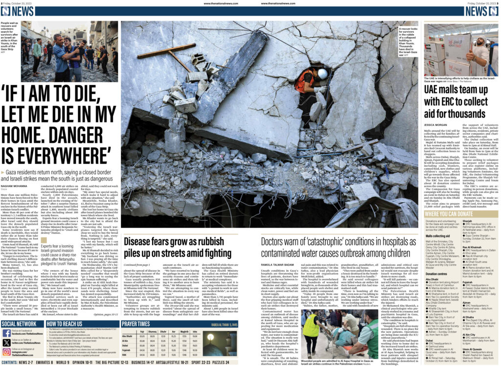
- The National; United Arab Emirates; If I am to die, let me die in my home


