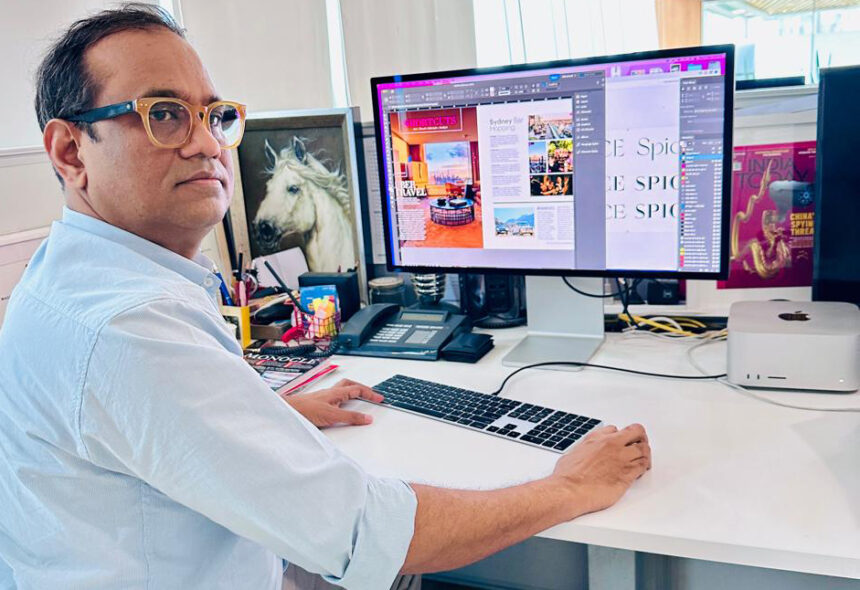
Nilanjan Das, Group Creative Editor at India Today, shares insights into his redesign of Spice magazine. His vision was to align the publication’s visual identity with the luxury and sophistication it represents.
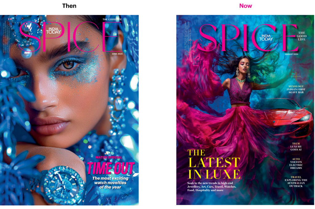
When I embarked on the redesign of Spice magazine, my vision was to align its visual identity with the luxury and sophistication the publication embodies. Known for its focus on gourmet culinary experiences, exclusive wine tastings, high-end fashion, beauty, and prestigious travel destinations, Spice needed a refreshed look that would distinguish it from competitors while staying true to its luxurious content.
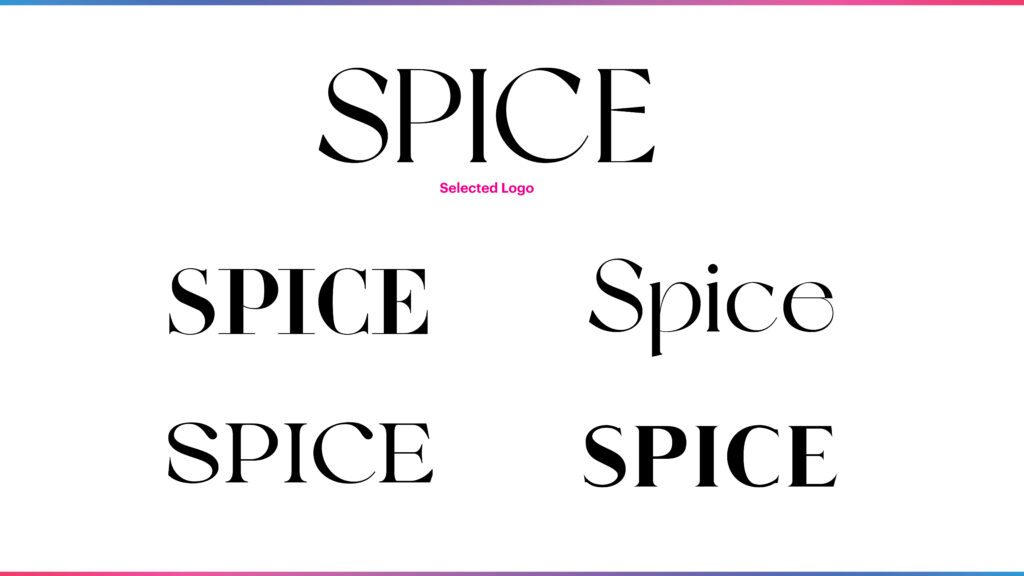
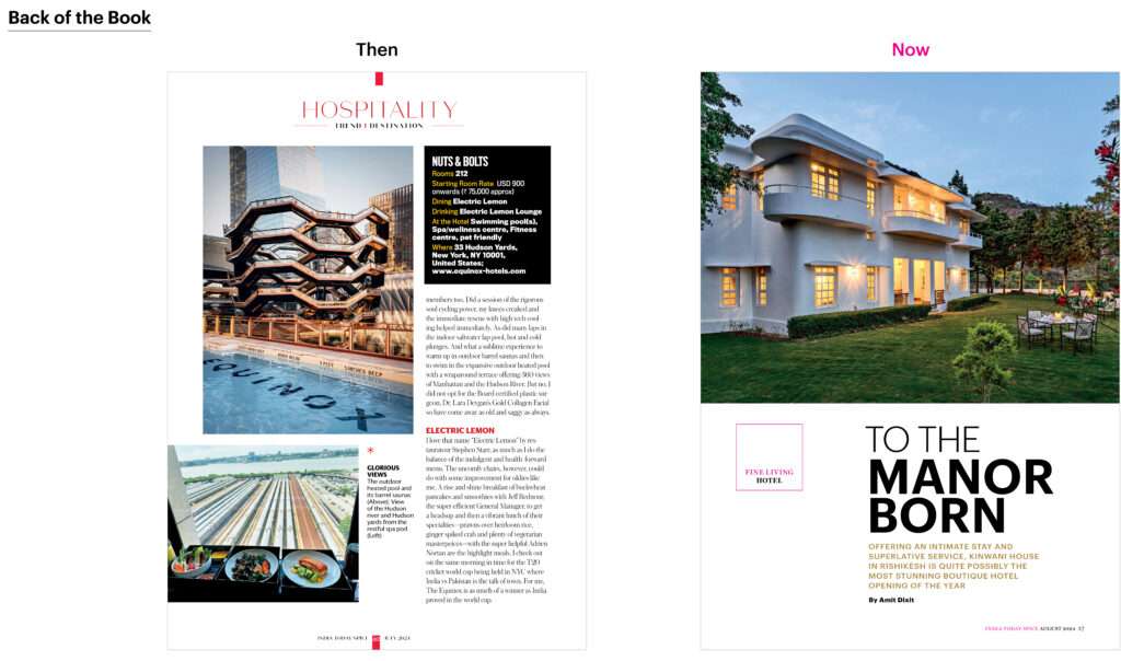
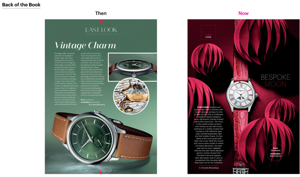
I began by modernizing the typography, choosing sleek, elegant fonts that conveyed a sense of refinement. The goal was to achieve a balance between sophistication and readability, allowing the content to feel both upscale and approachable. The new fonts are minimalist but luxurious, giving the magazine a distinct visual voice.
A key aspect of the redesign was the use of minimalism and ample white space. I created a breathable grid system that allows each element—whether text or image—to stand out. The white space adds a sense of calm and elegance, guiding readers through the magazine without overwhelming them.
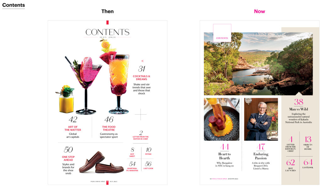
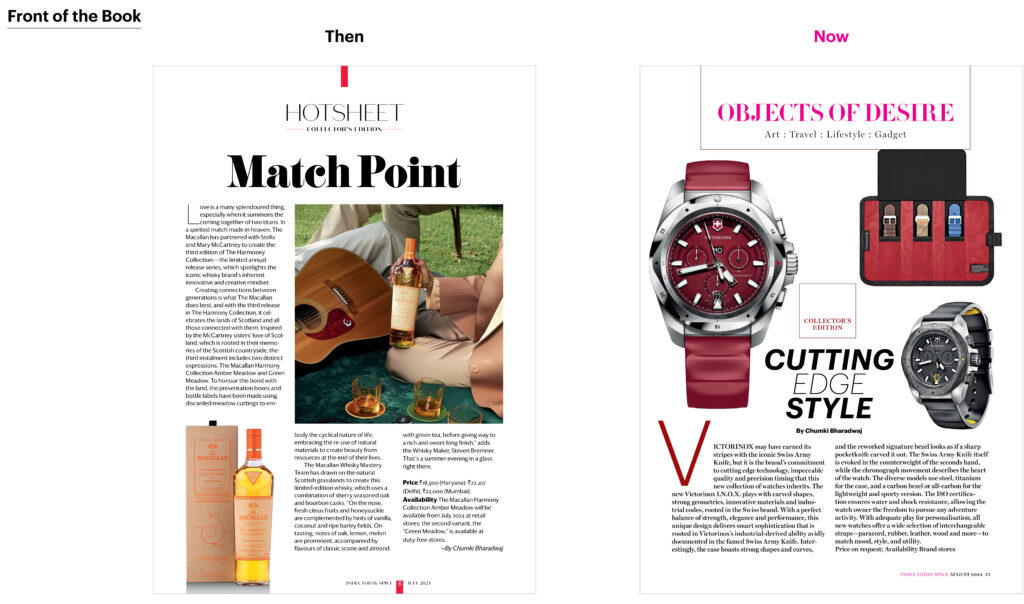
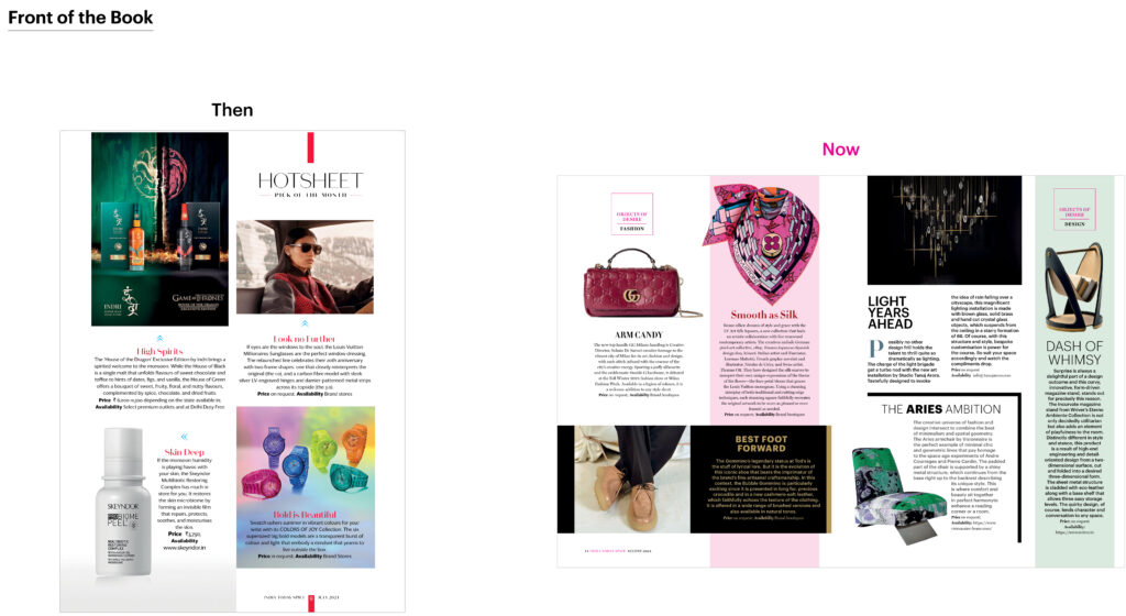
This layout fosters an easy flow of ideas, enhancing the reader’s experience by making the content more digestible and enjoyable. The redesign also focused on enhancing the presentation of the magazine’s core themes.
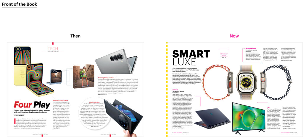
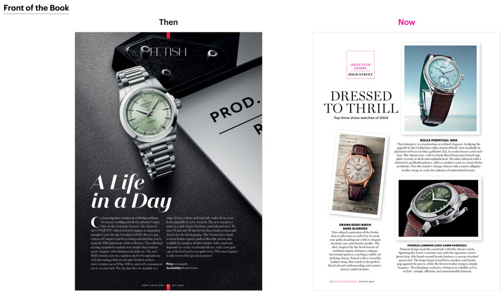
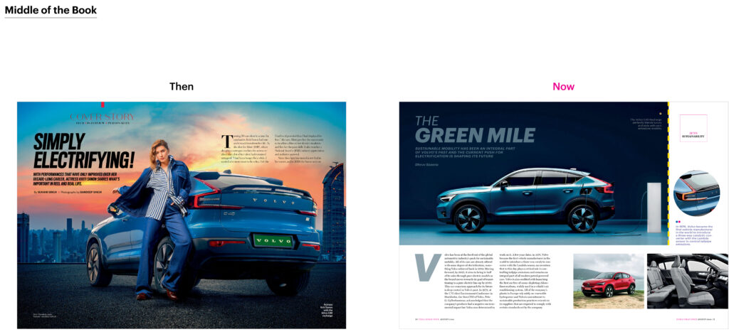
From gourmet food and wine to cutting-edge fashion and luxury cars, I wanted the design to mirror the exclusivity and prestige of the content. The visuals were given space to breathe, creating a seamless narrative between imagery and text. Ultimately, this redesign was about creating a modern, sophisticated reading experience that reflects Spice’s commitment to luxury.
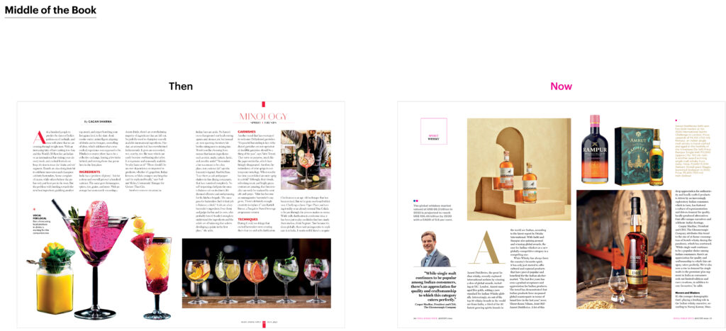
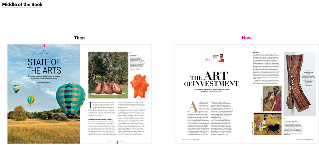
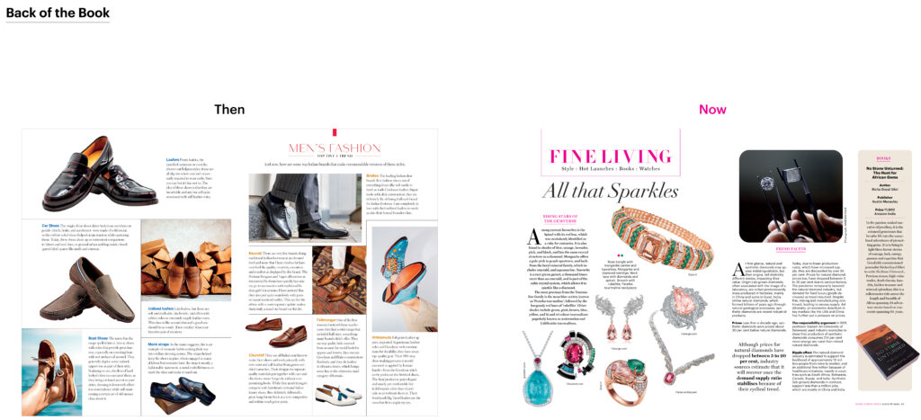
By embracing a minimalistic approach with refined typography, a breathable layout, and enhanced readability, the new design sets Spice apart as a leader in the luxury publication space. Every aspect of the redesign serves to elevate the content, ensuring that the magazine not only looks luxurious but feels like an indulgent experience for the reader
![]()


