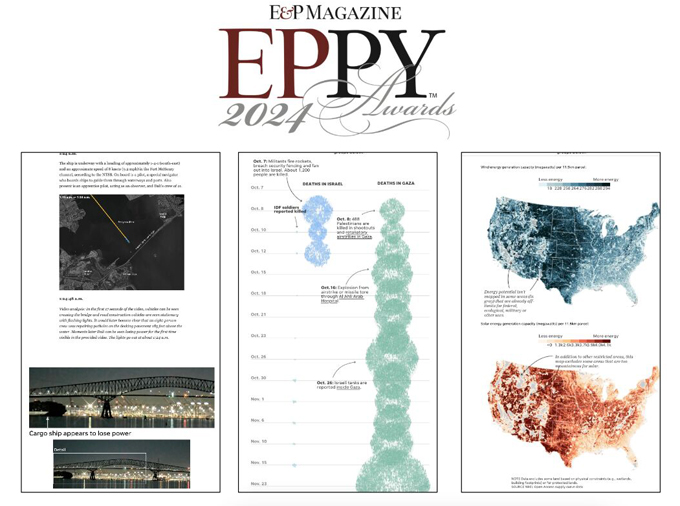
Javier Zarracina, Senior Graphics Director at USA TODAY, highlights his team’s win of the 2024 Editor and Publisher Eppy Award for Best Use of Data/Infographics with a timeline of Baltimore’s Key Bridge collapse. USA TODAY NETWORK also secured second-place Eppys in six categories, including investigations on counties blocking renewable energy projects and visualizing the devastation in Gaza.
Javier Zarracina in conversation with T.K. Sajeev of newspaperdesign.org

Are there features that enhance or hinder user interaction?
We try to make the navigation clear and easy so that the audience can access the critical points in the information. We have found that most readers prefer scrolling to clicking or exploring interactive, so often, we design the experience along a vertical flow, alternating the different visualizations. Many readers find our stories on mobile platforms, so we try to streamline the user experience for these devices.
One could say that these constraints may limit the types of experiences we can design. Still, I find these parameters helpful in focusing the stories and making us think about how to edit each story more carefully.
How does the use of animation or interactivity affect comprehension of the data?
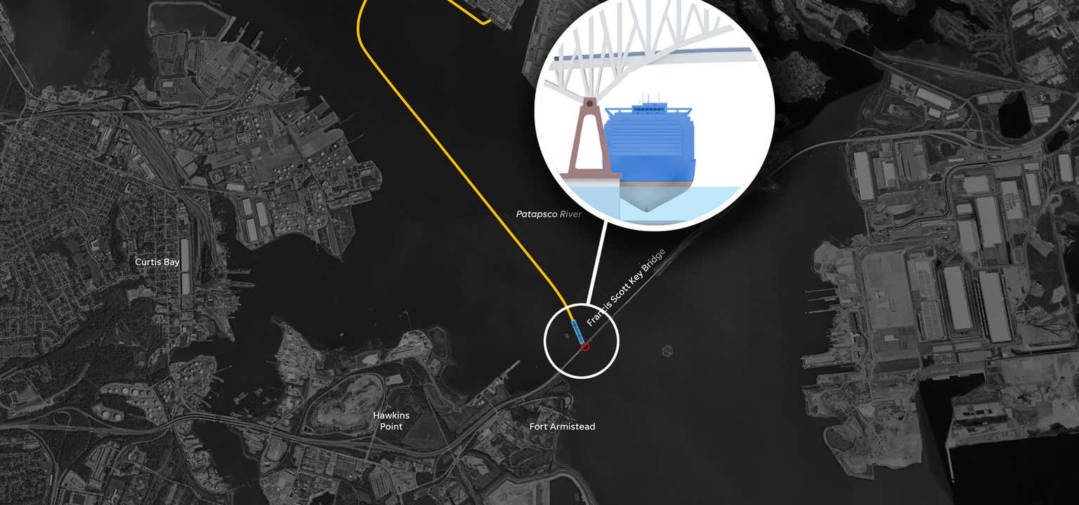
Absolutely! Animation and interactivity are powerful tools for understanding and highlighting the critical points of the information. For instance, creating an animation of the increasing number of counties with restrictions on wind energy in the United States was an effective way to show the spreading of the bans. Another example is our investigation of the collapse of the Baltimore Bridge, where animating the path of the ship minute by minute or annotating the surveillance videos was the most efficient way to show the timeline of events.

Animation and interactivity can significantly help storytelling but are labor-intensive, so it’s key that our newsrooms and departments have expertise using these techniques efficiently.
Are colors used to distinguish different categories effectively?
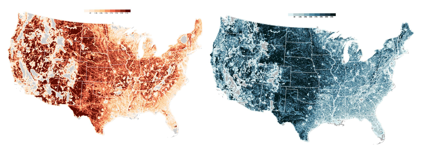
Color is one of our most effective tools for information designers. For data visualization, color helps distinguish between data categories and highlight the most critical elements. For instance, in our renewable energy investigation, we assigned a warm palette to the solar energy visuals and a cool one for wind power to guide the navigation of the story.

For narrative purposes, colour also evokes mood and visual tone in the story that we are telling. For instance, most of the events of the collapse of the Baltimore Bridge happened at night, so we created the animations in dark tones.
Is the information presented in a way that is easy to understand for a broad audience?
Graphics stories make understanding big data sets or complex event sequences easier. Our traffic numbers show that readers enjoy graphic formats—especially when searching for context and more information about current events, and these types of stories are very helpful for engagement. USA Today has always been known for creating graphics and visualizations to explain the news of the day, and my team is proud to maintain this tradition.
However, producing these presentations is complex because we must collect the data, organize and create the right combination of visual elements, and carefully edit them to maintain interest and invite further exploration.
Often, newsrooms don’t have enough people able to create graphics or animations on breaking news or short-term bases.
My advice for newsrooms is to invest in the skills and professionals able to build these presentations to make it easier to create them more frequently. This brings significant benefits to the ambition of the coverage, the audience engagement, and it’s an investment in the newsroom’s innovation and technological capacities in the future.
What role do design elements play in eliciting an emotional response from viewers?
Sometimes, there is an apparent conflict between the “cold” charts’ objectivity and the stories’ human dimension.

In our analysis of the destruction in Gaza, our goal was to put the suffering in context, so we made a point to represent each life lost in the conflict—and to use a visual unit representing 100 people as the base of the
visualization.
I think that every visualization is a visual metaphor—some of them are standard, like bars and pie charts—but we can think of creative ways to find the correct form of visualization that combines data visualization precision and emotional response to the story we are telling—that’s our role as information designers.
How do interactive features enhance the depth of exploration?
Yes! We have found that visual stories have one of the highest engagements on the site. I think the audience is very interested in this type of content—because visuals and graphics make it much easier to understand complex topics, and readers tend to spend time exploring and analyzing the different elements. Graphics are powerful tools to engage and retain readers in an economy of attention.
How are different datasets layered or connected to provide a comprehensive view?
We often collaborate with the USA Today data team to analyse and evaluate the datasets, but relevant data only makes sense when we find the right visualization for it. Our task as information designers is to guide busy reader’s exploration and easy understanding of the data.
![]()


