Presenting KT LUXE, the new weekend newspaper from Khaleej Times, designed by Raja Choudhury,former Creative Head. He shares insights on the design
How does the cover design reflect the theme and content of the book?
KT LUXE, the new premium weekend newspaper from Khaleej Times, debuted with an ultra-luxury theme for its first edition. To capture this essence, we focused on the rising prominence of lab-grown diamonds. Our cover featured a thought-provoking question: Are celebrities wearing natural diamonds losing their charm to lab-grown alternatives?
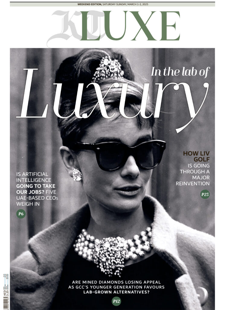
For the cover design, we choose the iconic still of Audrey Hepburn from Breakfast at Tiffany’s, where her diamond jewelry takes center stage. This timeless image perfectly aligned with our story, creating a seamless and sophisticated blend for the launch of our luxury edition.
What typography and color choices were used, and how do they contribute to the book’s branding?
As a weekend luxury publication, we wanted to create a relaxed and leisurely reading experience. To align with this vision, we carefully selected a mix of stylish and sophisticated fonts, including the TT Moons family and Dubai Font. Since KT LUXE is a Dubai-based newspaper, we incorporated Dubai Font, a sleek sans-serif typeface, to reflect the publication’s roots while maintaining a modern aesthetic.
For the color palette, we curated a luxurious combination of four distinctive hues. Moss green, a fresh and soothing shade, adds a touch of elegance. Medium Spring Bud, a vibrant green, symbolizes new beginnings and growth. Orange brings a youthful, dynamic energy, while red conveys passion, luxury, and exclusivity—perfectly complementing the essence of KT LUXE.
Does the cover appeal to the target audience?
KT LUXE is designed for readers who seek a touch of luxury in their weekend reading. As mentioned earlier, the concept behind the cover was carefully crafted to resonate with this audience. Dubai, home to over 200 nationalities, is one of the most glamorous cities in the world. And when we think of glamour, icons like the stunning and talented Audrey Hepburn naturally come to mind—especially with diamonds taking center stage.The cover design is timeless and captivating, appealing to anyone who lays eyes on it. KT LUXE is truly a love-at-first-sight experience for its readers.
How is the text organized throughout the pages?
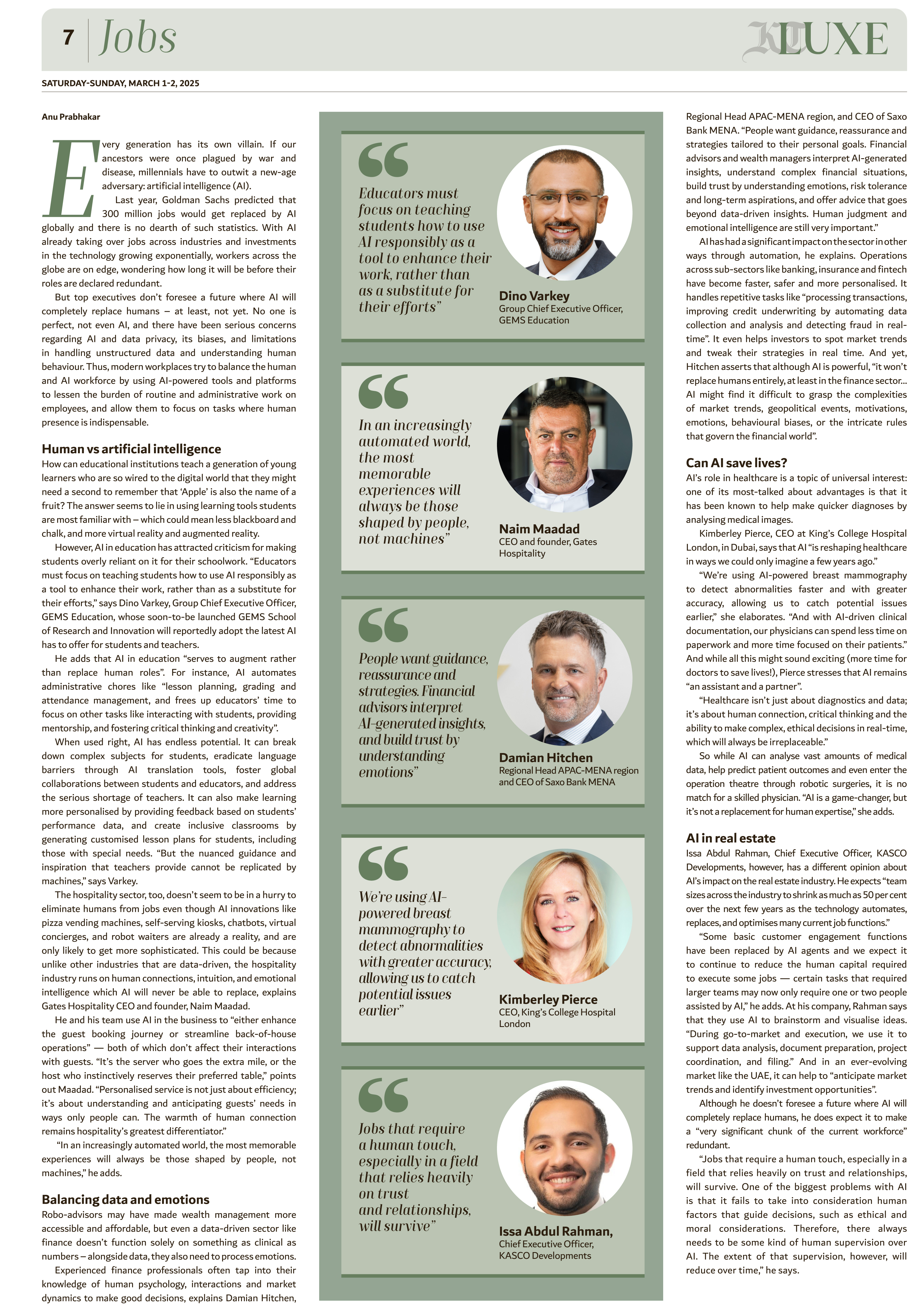
The text throughout KT LUXE is organized in a way that ensures a seamless and enjoyable reading experience. We’ve carefully balanced the content with large, striking images to maintain a visually appealing layout. The typography is thoughtfully chosen to enhance readability, making it easy for readers to navigate through each page effortlessly.
The design prioritizes a clean and spacious look, allowing key stories to stand out while ensuring a luxurious and leisurely feel. Whether it’s in-depth features or quick reads, the layout is structured to engage the reader without overwhelming them, making KT LUXE a perfect weekend indulgence.
How effective is the use of white space in making the content visually appealing?
White space is a key element in modern design, creating a perfect balance between text and imagery. In this edition, we have carefully maintained a serene harmony of white space to enhance the overall visual appeal. It allows the content to breathe, making the layout feel more refined and luxurious.
By strategically using white space, we ensure that both the articles and images stand out without overwhelming the reader. This thoughtful approach not only adds elegance to the design but also makes the reading experience more enjoyable and immersive, perfectly aligning with the essence of KT LUXE.
What typefaces are used for body text, headings, and captions?
We have carefully curated a mix of serif and sans-serif typefaces to create a distinctive and engaging reading experience. For the body text, we opted for a sans-serif font, giving it a modern and unique feel that enhances readability.
When it comes to headlines, we primarily use serif fonts—about 80%—to maintain a relaxed and luxurious aesthetic. However, we balance this with 20% sans-serif headlines to add emphasis and boldness when needed. The combination of serif and sans-serif fonts in just the right proportions ensures visually striking and dynamic headlines.
For body text captions and straplines, we stick to sans-serif fonts, ensuring they are easy on the eyes and provide a smooth reading experience. Meanwhile, blurbs are designed with serif fonts to make them stand out and draw attention, adding an extra layer of visual appeal to the layout.
How well are images and illustrations integrated into the design?
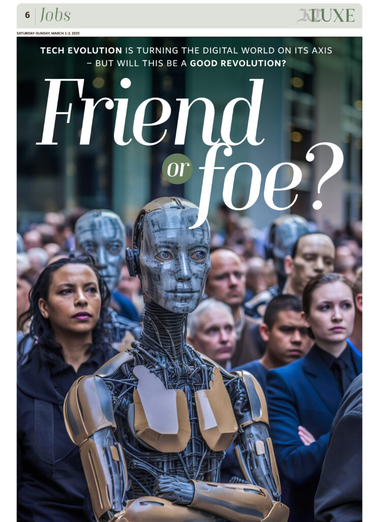
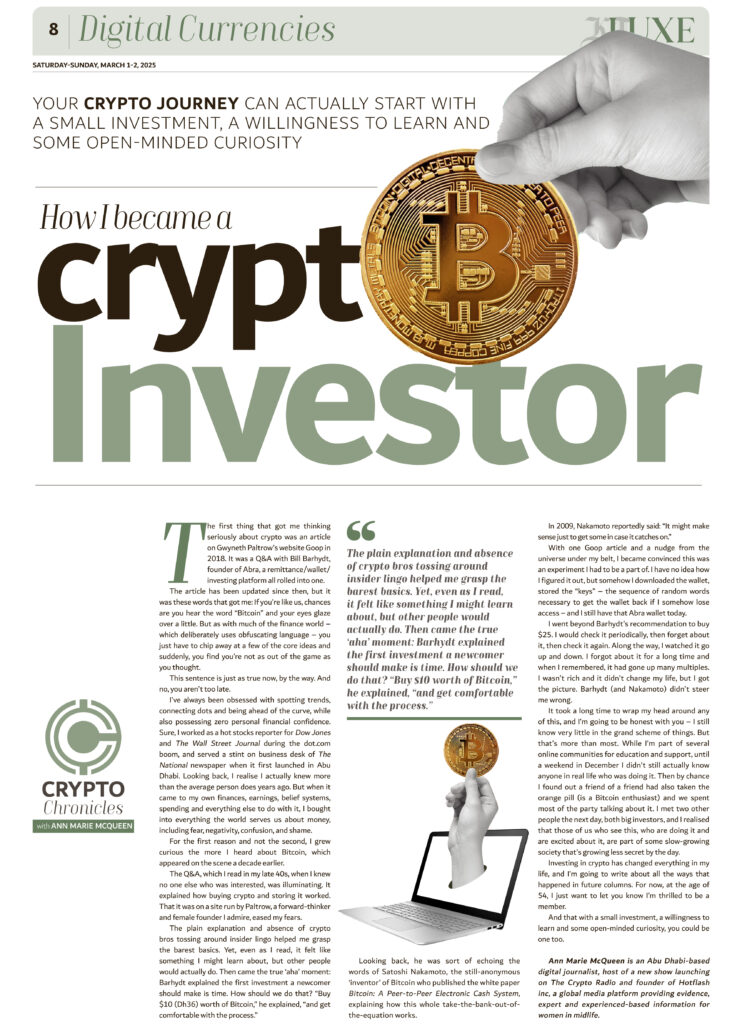
To make the design more visually appealing, we have carefully blended images with illustrations in a well-balanced way. This integration ensures that every visual element complements the overall aesthetic of the publication.
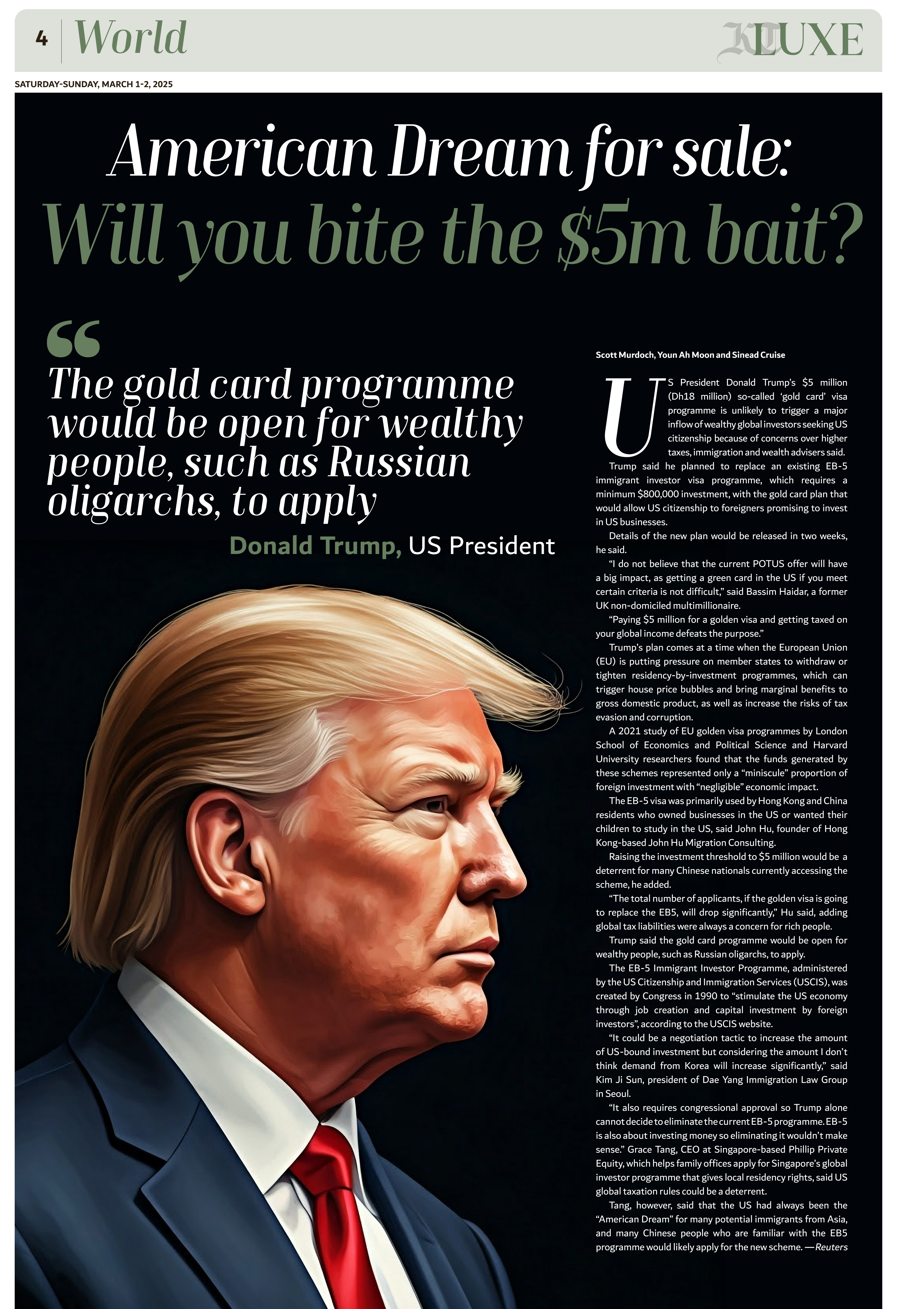
We also incorporate AI-driven images, embracing modern technology to stay in line with contemporary design trends. Additionally, we experiment with unique image treatments, such as adjusting hues and tones, to enhance the luxurious feel of KT LUXE. These artistic modifications help create a sophisticated and immersive visual experience, making the publication stand out while maintaining its premium appeal.
Are colors used consistently across different pages and sections?
Yes, we strive to maintain color consistency throughout the newspaper. The chosen colors are applied across all components, including headlines, blurbs, logos, and quote styles, ensuring a cohesive and polished look.
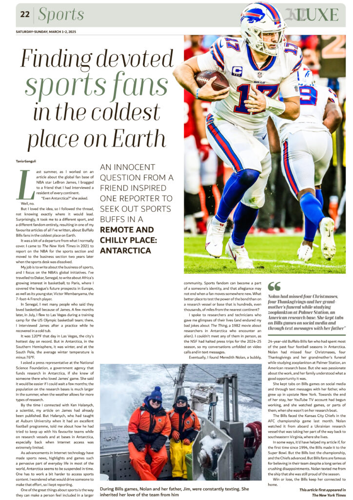
While the images may vary depending on the stories, we carefully align them with the overall color theme. This approach helps create a unified visual identity, giving KT LUXE a seamless and sophisticated appearance from start to finish.
![]()