Denise M. Reagan, recently named the 2025 SND Lifetime Achievement Award winner, speaks exclusively to TK Sajeev of newspaperdesign.org about her career and vision for the future of design.
Denise M. Reagan is a communications expert and nonprofit leader based in Jacksonville, Florida. She holds a journalism degree from the University of Florida and was an adjunct professor at the College of Journalism and Communications for five years. Throughout her career, she has held key media roles, including assistant managing editor at The Florida Times-Union, editor of Folio Weekly, and director of communications at MOCA Jacksonville. She served as the first executive director for the Garden Club of Jacksonville until 2024. Recently, she received the SND Lifetime Achievement Award for her contributions to design and the organization.
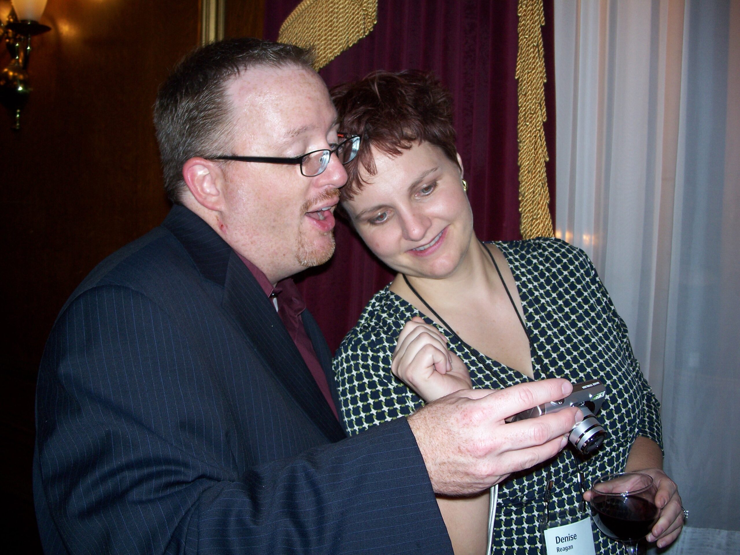
Savannah Morning News/ Denise M. Reagan
You have a rich background in journalism and media. How has your experience in storytelling influenced your approach to design?
My passion for journalism—fueled by my father, a journalist, and my mother, a teacher—began in childhood. In high school, I edited and designed the annual yearbook, but I never really thought about “design” as a job.
I owe the launch of my news design career to Pegie Stark. She happened to be teaching at the University of Florida during my time at the College of Journalism and Communications. At the end of a semester in Pegie’s design class, she took me aside and said this is what I should be doing. I guess I believed her. I didn’t realize you could get a job doing design.
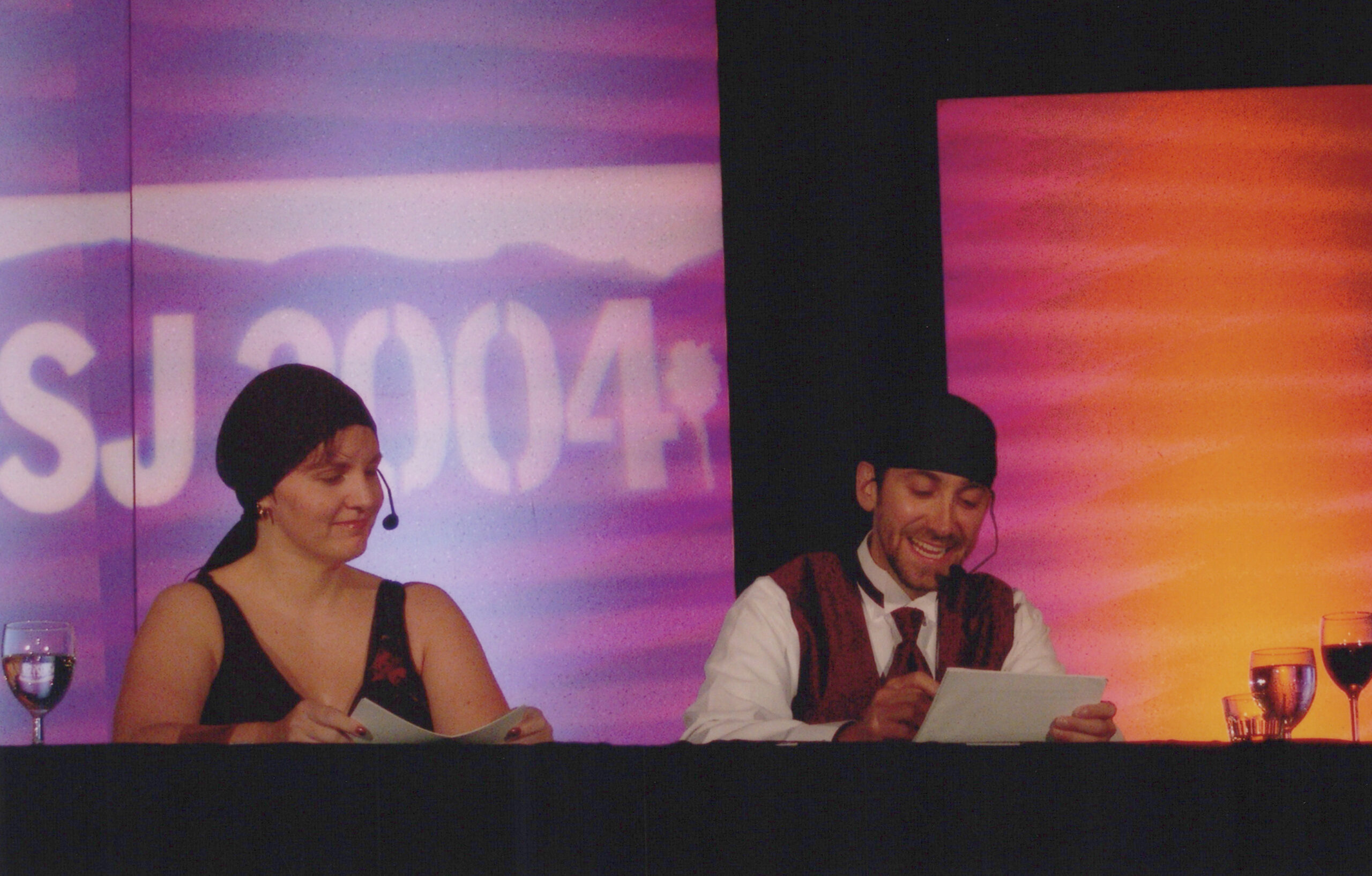
I joined Pegie to attend my first SND workshop in Fort Lauderdale in 1989. That’s when I got my first peek into SND, and it was overwhelming.
Pegie was also teaching at the Poynter Institute and gently demanded that I apply for the design fellowship. I got to spend a glorious week in St. Petersburg, staying at the fabulous Don CeSar hotel, where I learned at the feet of Pegie, the amazing Mario Garcia, and visiting faculty Deborah Withey, Mike Campbell, and John Bodette. The Poynter fellowship is when I first fell in love with Detroit (and Deborah Withey) and made it my goal to work there.
Every job I’ve ever had has been about telling stories—with words, with images, or the combination of those elements. Now I think of my job as sharing stories in many forms. I approach design as an extension of content—one cannot exist without the other.
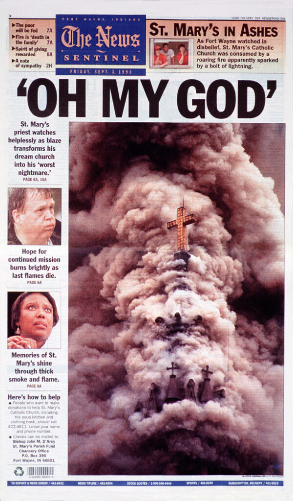
The News-Sentinel / Denise M. Reagan
Having worked across various cities and media platforms, how have you seen the role of design evolve in journalism and communication?
When I first started in journalism, we were in the relative stone age. Computers were glorified typewriters, we shot photos on film, and we drew page designs on paper.
Nearly every year, I was learning a completely new way of working—from QuarkXpress and Freehand to Adobe InDesign and Illustrator, and a dozen different newsroom proprietary systems in between.
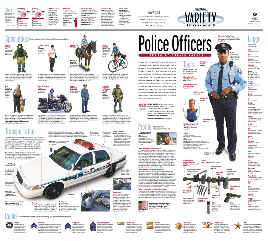
At my first job as 1A designer at The News-Sentinel in Fort Wayne, Indiana, one of my responsibilities was collecting and sorting hundreds of physical Associated Press photos printed on the AP Wirephoto service machine every day (remember, these were the days when a color photo would come across as four separations—cyan, magenta, yellow, and black in those days!). I also worked closely with the photo department which went from shooting on film and printing on paper, to scanning negatives to digital, then shooting in digital. These changes in technology vastly impacted the immediacy of what we could do as page designers.
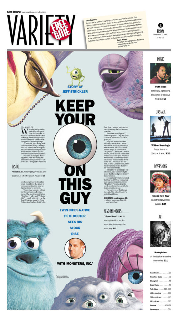

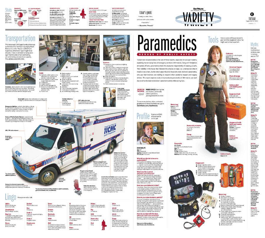
Star Tribune / Denise M. Reagan
I didn’t have a work email address until my third job at the Star Tribune in Minneapolis. I took my first HTML coding class from the Minneapolis College of Art and Design. During this time, I started thinking about how the stories I designed could be told on multiple platforms.
Design was still an alien concept for most newsrooms during the first 15 years of my career. I had to beg, plead, cajole, sweet-talk—occasionally threaten—reporters and editors to share even the most basic information about their stories to facilitate better visual journalism. Some reporters and editors “got it” and became amazing allies on projects, seeking out me and my fellow designers, photographers, and graphic artists to ensure their stories were presented in the most reader-friendly format possible. Others never did—to their detriment (haha!).
I stayed in the media business through the recession and was forced to lay off half of my staff, which encompassed the newsroom’s designers, news editors, copy editors, photographers, and graphic artists. It was personally and professionally devastating to witness how little value news organizations like the one where I worked at the time placed on visual storytelling. We weren’t seen as “content” providers, so we were expendable.
I know how much designers bring to the table when it comes to telling stories. Organizations that realize this are the ones that tend to excel.
As the former editor of Folio Weekly and director of communications at the Museum of Contemporary Art Jacksonville, how did design play a role in shaping audience engagement?
As a free publication, Folio Weekly lived and died on the effectiveness of its covers. Will someone pick it up or walk on by? The covers had to communicate the content immediately in the two seconds a potential reader decides whether or not to grab a copy. We had a lot of fun with those covers!


At MOCA Jacksonville, the creative director and I embarked on a transformational rebrand of the organization based on accessibility. All marketing materials, museum texts, and signage were developed to ensure that everyone could easily understand the information—through the clarity of the writing and images, the size of the type, the shape of the fonts, and the placement of the materials.
We developed a new website from the ground up, ensuring it was accessible for all audiences. We also built the site on a content strategy of brand journalism, so pages were spontaneously composed based on associated content tags. The entire site was also built to be automatically responsive for any device.
Fun fact: The museum had a very popular restaurant, so I had great fun rebranding them and promoting daily specials through social media and print materials. I became a low-key “expert” in food photography.
What aspects of design interest you the most—graphic design, visual storytelling, or something else?
I am fascinated by the marriage of content and design, where they are intertwined so well it’s nearly impossible to distinguish where one ends and the other begins.
In your opinion, what makes a design truly impactful in the media industry?
To reach readers and make an impact, a design must quickly answer the question “So what?” A design must help readers understand why they should care or why it’s important to them.
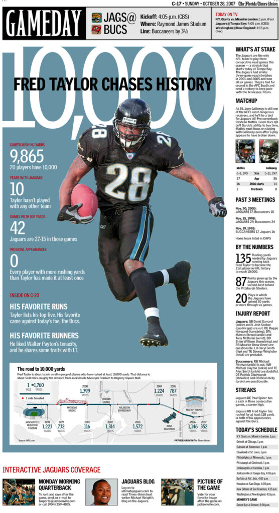

The Florida Times – Union / Denise M. Reagan
How do you balance functionality and aesthetics when working on visual communication projects?
If any mark on a page—a headline, a color, an image, a graphic—is there just for design’s sake, it’s not supporting the purpose of communication.
If the designer doesn’t assign meaning to the colors and images used, the reader will assign meaning that perhaps the designer did not intend.
As the Executive Director of the Garden Club of Jacksonville, how did you integrate design into community projects and environmental initiatives?
I was hired as the first executive director of the Garden Club of Jacksonville in its 97-year history. To signal the organization’s metamorphosis, I built a new brand identity that incorporated every aspect of the Garden Club—all marketing materials, signage, social media, and an overhauled website. The color palette comprised five signature colors: pear, violet, terra cotta, amber, and aqua. I incorporated the Archer typeface throughout, including the website and email. Each program series was sub-branded and tightly integrated with the overall brand. I created all of the images used to communicate the Garden Club’s work, integrating creative and inviting imagery and language.
The rebrand symbolized a revitalization of the Garden Club, transforming it from a somewhat insular club to an inclusive community organization. We changed the timing of the programs from weekday mornings to weeknights and weekends. We broadened the topics of all programs and invited a much broader range of people to present at events. As a result, the Garden Club reached a much wider audience, with program attendance increasing up to 200 percent.

Garden Club Budding Gardeners
Fun fact: My daughter, who attended eight years of public art school magnets from elementary through high school, drew the flower illustration in the redesigned logo.
Many nonprofits struggle with branding and visual identity. What strategies do you recommend to make nonprofit messaging more visually compelling?
The same principles apply no matter what organization it’s for; smaller nonprofits tend to suffer because they might not have the staff or expertise. However, any organization can benefit from these ideas:
- Keep it simple: So much messaging tries to do way too much, especially for the space they have. Too much text, too many images, and no central theme or idea.
- Keep it clear: Do the headline and image support each other? Is the text short, relevant, catchy, and actionable? Does the design have a clear hierarchy of text and image size that clearly leads the reader from beginning to end?
- Keep it coming: It takes numerous times for messaging to break through all the noise. Have multiple versions of your messaging ready to go out on multiple platforms over several days, weeks, or months, depending on your timeline.
Who are some designers or artists that inspire you?
Robert Newman has been an enduring influence on how I think about design. His signature work on Entertainment Weekly still stands out in my mind. Fun fact: I subscribed to Entertainment Weekly for more than 20 years, and I kept every single issue, filing them by year in dozens of banker boxes. I finally had to part with them (tearfully) a few years ago.
Jim Parkinson’s type design is the gold standard in my mind, including the nameplates he designed for nearly every publication you can name.
Roger Black’s work on Rolling Stone and so many other magazines makes him one of the best designers in the world in my book.
Tim Harrower did groundbreaking—and hilarious—work at The Oregonian, and his Newspaper Designer’s Handbook has taught thousands of students and professionals with simple and easy-to-understand lessons.
Too, too many people to name … Deborah Withey, Joseph Hutchinson, Steve Dorsey, Matt Mansfield, Harris Siegel, Melissa Angle, Jonathan Berlin, Tim Ball, Sara Quinn, Emmet Smith, Tiffany Pease, Jon Wile, Tim Frank, Paul Wallen, Chris Rukan, Greg Manifold, Brian Gross, Stephen Komives, Susan Sanchez-Young, Mike Rice, Vince Chiaramonte, David Kordalski, Stephanie Grace Lim, Wayne Kamidoi, Gayle Grin, Bill Gaspard, Frank Mina, Mark Friesen, Lee Yarosh, Colin Smith, Kris Viesselman, Suzette Moyer, Elizabeth Yee Burr, JC Edwards, Kevin Wendt …
I am constantly amazed by the digital work of The New York Times, which is how I access it everyday.
I am saddened to admit I don’t subscribe to any print publications these days except Vanity Fair. I have plenty of digital subscriptions, but I don’t get a chance to witness the impact of the print work the way I used to, unless it’s shared by friends on social media.
If you could redesign one aspect of the media or nonprofit sector to make it more effective, what would it be and why?
Local newsrooms must reimagine themselves and show the value of local reporting and the context they provide. Too many local newsrooms have been swallowed up by corporations who have drained their resources and cut their staffs. The Tributary (jaxtrib.org) nonprofit newsroom is an example of what could be done. There’s no one solution, but we crucially need to support local journalism.
Most nonprofit board structures are broken. We should reimagine boards to focus on authentically engaging with the communities they serve, sharing leadership with professional staff who better understand the mission, and prioritizing transparency in their decision-making processes. Nonprofits must embrace more collaborative and inclusive approaches.


You have been involved with SND in various roles. How do you think SND should adapt its focus in the era of artificial intelligence?
I will sound like a troglodyte for saying this, but I absolutely abhor AI. I know there are areas where AI can be used for good, such as making billions of calculations to help cure diseases. But so much of AI has hugely detrimental consequences, both intended and unintended. The loss of human jobs will be devastating. And the amount of energy required to fuel AI will ruin our environment.
![]()


