Manuel George, Visual Editor at Malayala Manorama, engages in a conversation with T.K. Sajeev, Editorial Director of newspaperdesign.org, on how the legacy publication harmoniously blends tradition with innovation in visual storytelling. As one of India’s highest-circulated dailies, Malayala Manorama—published in Malayalam—prioritizes reader convenience and cultural relevance. Its design philosophy is rooted in clarity, creativity, and collaboration, spanning from compelling infographics to cutting-edge AI-generated visuals.
How would you describe Malayala Manorama’s core design philosophy?
Our design philosophy is rooted in reader convenience. Every page is crafted with purpose. We don’t just report news — we present it with a rhythm that respects the reader’s time. While our pages are often packed with information, we ensure that the layout never overwhelms. We believe design should not merely beautify, but guide.
How has Manorama’s design evolved while preserving the identity of a legacy brand?
With a legacy spanning over 135 years, Malayala Manorama has built a strong visual identity across generations. Our evolution has always focused on refreshing the reader experience without disrupting continuity. Over the years, more than 20 design consultants have contributed to our transformation. In 1962, eminent journalist Tarzie Vittachi came to Manorama as an advisor, and Manorama generously extended his services to other Malayalam newspapers — training editors and designers across the Malayalam newspaper industry
Design legends such as Peter Lim (1996), Peter Ong (1998), Mario Garcia (2008), Javier Errea (2012), and Lucie Lacava (2024) have played vital roles. I served as design coordinator for the redesigns by Errea and Lacava, and was also part of Mario Garcia’s project. Additionally, I led the internal redesigns in 2017 and 2022.
How does regional culture and language influence your visual design?
Regional identity is central to our visual language. As a Malayalam daily rooted in Kerala, our design is shaped by local reading habits, emotional tone, and cultural nuances. The vibrancy of Kerala is reflected in our color palettes, photo choices and illustrations.
How do you balance traditional print aesthetics with modern design trends?
It’s a conscious balance. While embracing modern visual storytelling, we retain the discipline of traditional print. For instance, when color printing began, it was often overused. Color headlines took precedence over good visuals — a mistake. From our 2017 redesign onward, we restored the prominence of black headlines for news, limiting color headlines to feature pages. Lucie Lacava retained this in her redesign, using black headlines to signal editorial credibility. The newspaper is now more colorful, but with black headings and strong visuals.
How do you approach visual storytelling for complex or sensitive stories?
We adopt a layered approach using infographics, timelines and graphic narratives to guide the reader. The aim is not just to inform, but to build understanding — showing cause, context, and impact. We often use graphic novel–style storytelling to forge emotional connections, always prioritizing clarity over visual flair. That’s why we avoid overcomplicated visualizations common in global dailies.
Can you share an example where visuals enhanced a story’s impact?
There are many. The latest is the Ahmedabad plane crash. During the Ahmedabad plane crash, we created a horizontal front page with a sequence of photos.
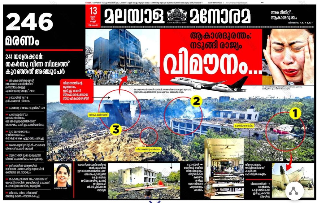
Ahmedabad plane crash
For India’s strike on terror camps in Pakistan, we used a double-spread infographic. One unforgettable moment was during the 2018 Abhilash Tomy boat accident — we created a detailed half-page graphic in under an hour. In the 2019 surgical strike, we again turned the lead story into an infographic on deadline. The 2024 Chooralmala landslide in Wayanad was another — we used drone shots, locator maps, survivor photos and terrain vulnerability graphics in a storyboard-style package.
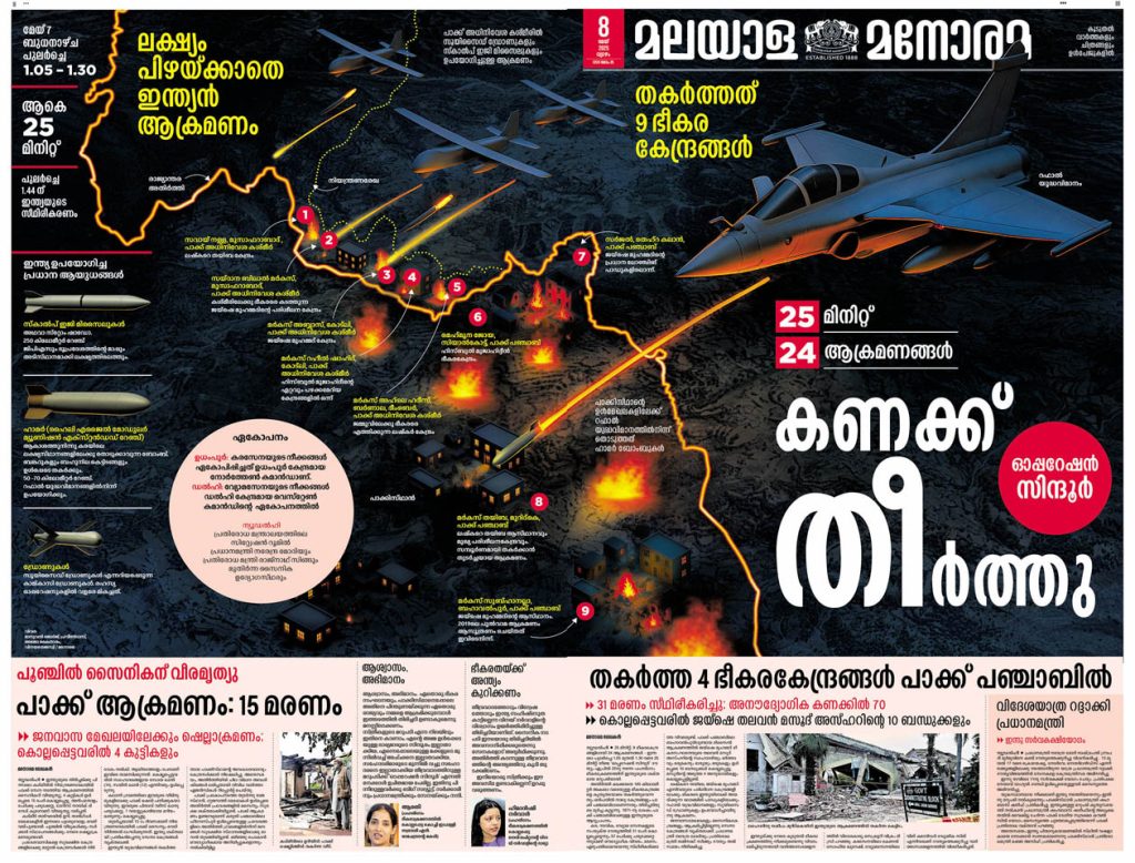
Page one:India’s strike on terror camps in Pakistan
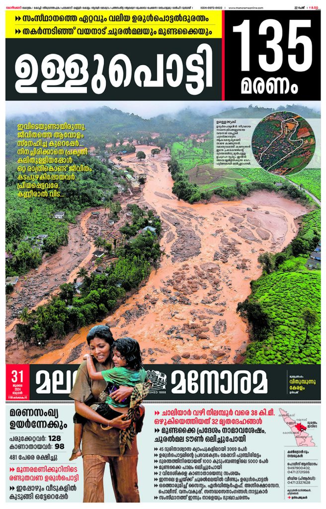
Page one: Chooralmala landslide in Wayanad, Kerala, India
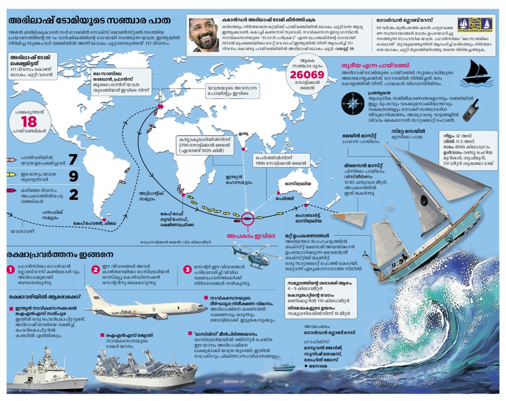
Abhilash Tomy’s accident and rescue operation
What role does creativity play in your workflow?
Creative headlines are a Manorama hallmark. Whenever major news breaks, people on social media speculate: “What will Manorama’s headline be tomorrow?” Some even send us suggestions. But we strive for headlines no one expects.
Personally, one page I’m especially proud of is the one when Kerala Chief Minister Pinarayi Vijayan shouted at journalists and said “GET OUT” (കടക്ക് പുറത്ത്). We used “കടക്ക് പുറത്ത്” (GET OUT ) as the headline for all stories on the front page that day — the India-China border tension, the removal of the LPG subsidy, political clashes in Kannur, etc. That page went viral on social media the next day.
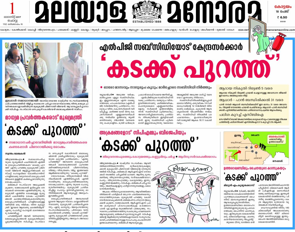
Page one: GET OUT (കടക്ക് പുറത്ത്)
Another creative project I was part of was the recreation of Malayala Manorama’s front page dated August 15, 1947. Manorama was banned at the time and we were unable to publish a newspaper on the day India gained independence. During the 60th anniversary of independence in 2007, we recreated that historic front page. I was part of the team and thoroughly enjoyed the creative process. We designed the page in the original layout style, using vintage typography that was copied letter by letter from the last edition of Manorama printed before it was sealed on September 10, 1938
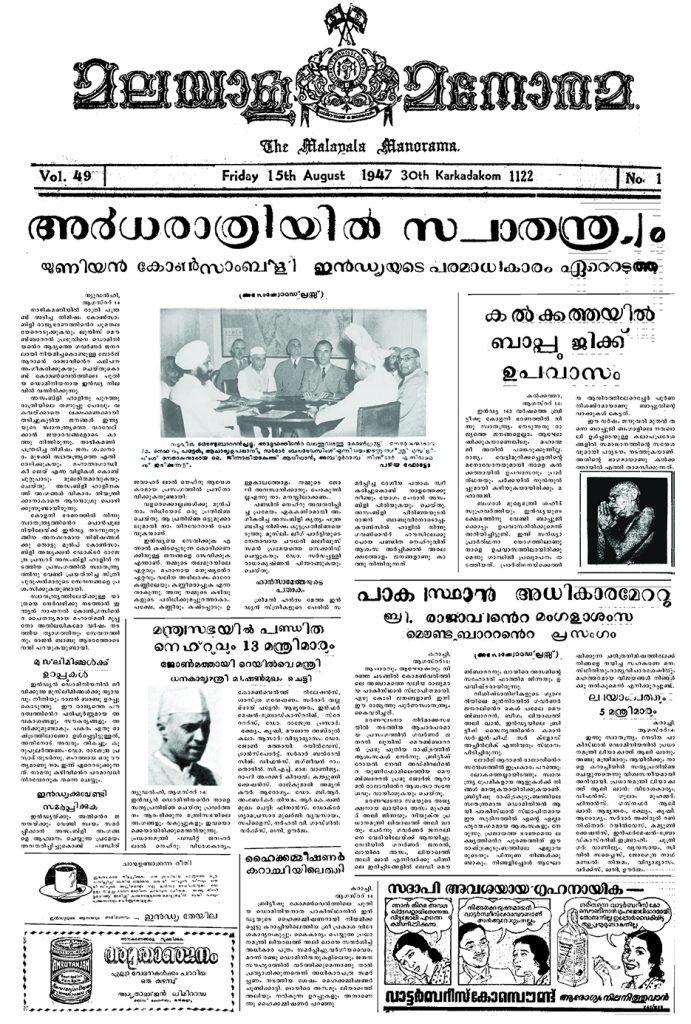
Recreated historic front page
What role do infographics and data visualization play in your editorial process?
Infographics are central to our storytelling — never mere embellishments. Manorama was the first Malayalam newspaper to publish a full-page infographic, which I designed for the Mars Mission in 2014.
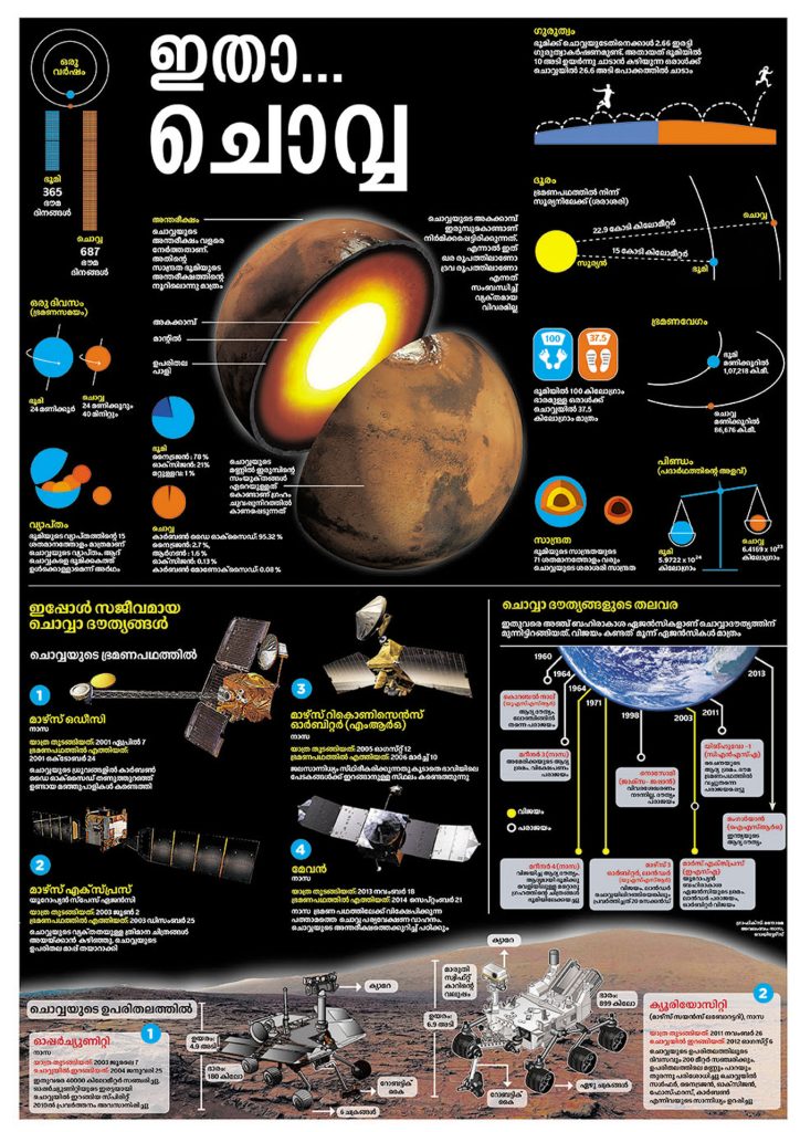
Mars Mission
We also created the first double-spread infographics during Kerala’s 60th anniversary (2016).
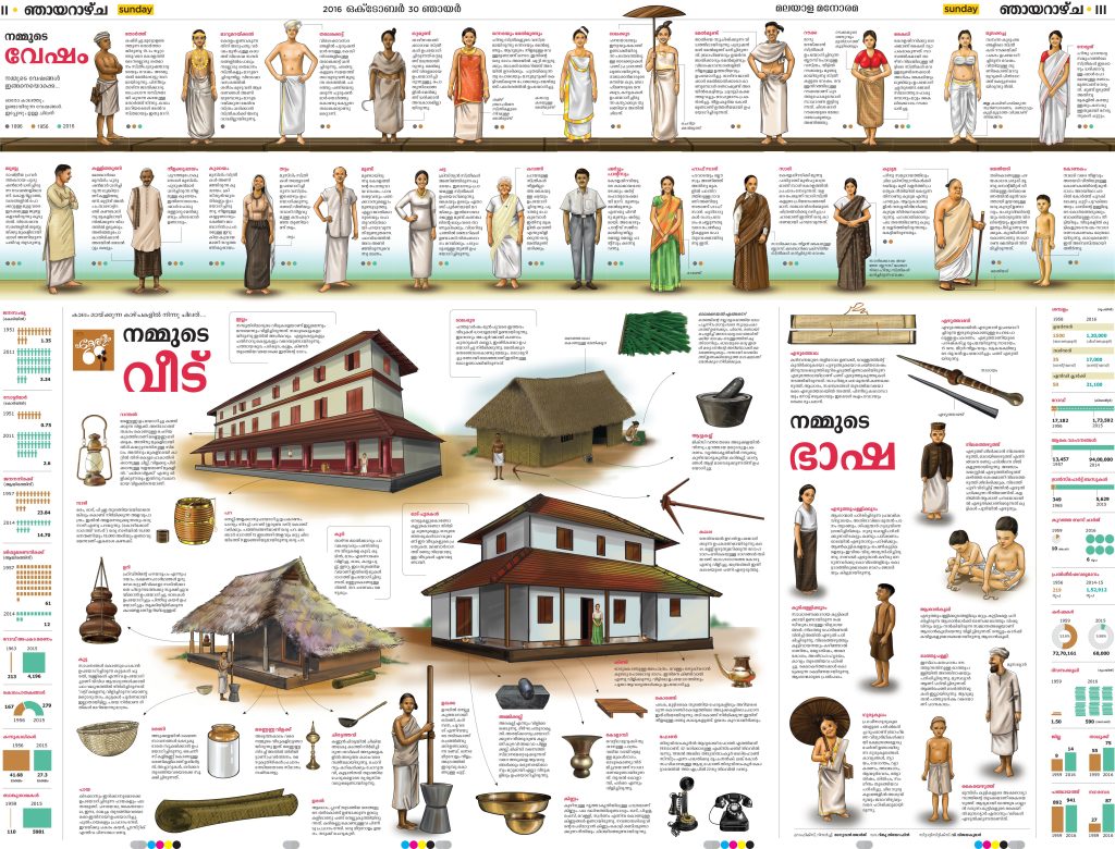
Kerala’s 60th anniversary page
Sometimes our front-page leads are purely graphic — no traditional text. Manorama’s archives contain pages with graphic-style presentations dating back to the early 1900s. So this isn’t a new trend for us. Today, our infographic continue to spark conversations — and even trolling — on social media, which we take in good spirit
How do visuals support engagement in a multilingual and diverse readership?
Visuals are vital. Without strong photography or design, even important stories risk being overlooked. Since space is tight, we can’t give every story a large headline. Visuals — photos, illustrations, and infographics — draw the reader in. Visually rich pages especially appeal to younger audiences who may skip dense text.
Can you walk us through your design process for major stories or special editions?
Teamwork is our biggest strength. For major events, we start with morning meetings, evolving plans until the last-minute corrections. For breaking news, there’s no time to plan — we act instantly. For special editions, like elections, we initiate planning early, though real-time changes are often necessary.
How closely do designers collaborate with reporters, editors and photographers?
Very closely. Our visual desk constantly coordinates with photographers and reporters. Strong visuals are our starting point. Infographics rely on input from the field. Layout isn’t a post-production step — it evolves alongside content. Everyone contributes ideas and headlines.
What design tools do you use?
We use InDesign and Scribus for layout, and Illustrator, Photoshop and other tools for infographics. Interestingly, much of our planning still happens with pencil sketches — quick, flexible and intuitive.
Do you conduct reader research or usability testing?
Yes. We regularly gather feedback via surveys, field visits and long-time readers. Many design updates — such as color usage and navigation — are based on this input. We also observe how our pages perform on social media to track engagement.
How do you differentiate your print design strategy?
Space is a constant constraint. Unlike foreign newspapers that carry less news, we must fit in everything — news, obituaries, and updates — within 18–20 pages. We focus on high-density layouts with visual clarity. Weekly features allow more creative freedom. We manage limitations with creative presentation.
What are the challenges of visual storytelling for mobile-first readers?
The idea that all news is mobile-first is a myth. Social media algorithms create echo chambers. Newspapers, by contrast, offer a comprehensive view. We aren’t rushing to adopt vertical formats. But we do consider short attention spans. Strong visuals and infographics help.
Unlike global giants like The New York Times, regional papers like Manorama work with limited design manpower — sometimes just one or two visual editors. Yet we compete on global stages with creativity and speed.
How do you maintain visual consistency across platforms?
Each platform — print, TV, web, social media — has its own identity. But the core Manorama style remains recognizable. Even without branding, our pages stand out in a lineup. That’s the strength of a consistent visual identity.
Are you exploring AI or interactive visuals?
Yes. When tools like Midjourney and DALL·E became available in late 2022, we printed our first AI-generated visual within a week. We now use AI creatively — often refining AI-generated images with our own artistic input. However, with AI visuals becoming common, we’re refocusing on original artwork. Authenticity still matters.
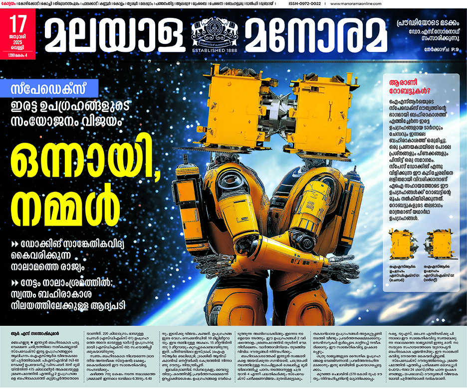
AI assisted layout
What’s the future of newspaper design in a digital-first world?
Design must become participatory. Readers aren’t just viewers — they’re part of the story. In 2021, during the Parliament elections, we printed dotted outlines of Narendra Modi and Rahul Gandhi for readers to complete.
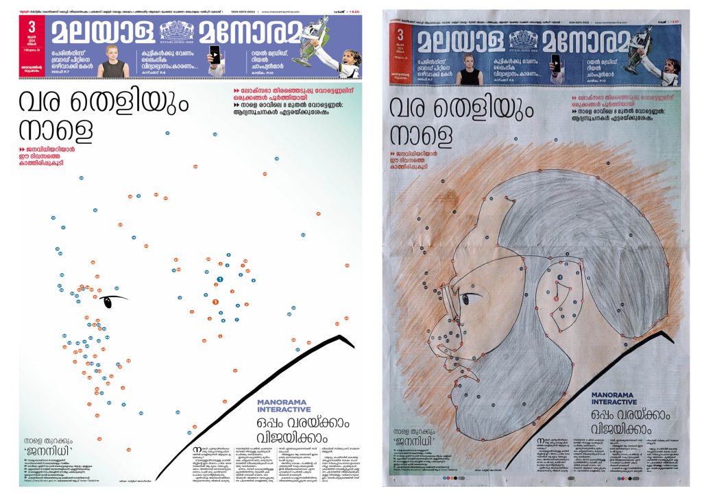
Interactive page one
For an anti-drug campaign, we created a front page where readers could cut out a portion and take a selfie with it.
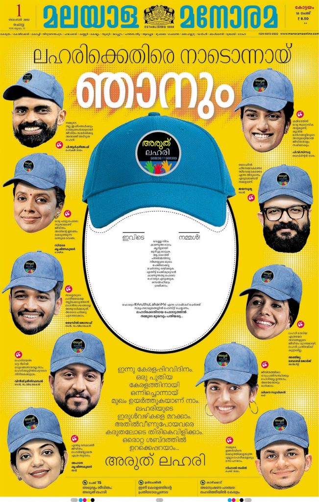
Anti-drug campaign front page. Reader should remove the white portion, put their face into it, take photo and share it in social media.
When the song Naatu Naatu from the Telugu film RRR won the Oscar, we visualized the dance steps as an infographic — readers could literally dance with the newspaper in hand! It went viral on social media. I had posted it on my Twitter (now X) account and was surprised to see it widely shared by Japanese users — more than 2,000 shares for a Malayalam infographic! Curious, I looked into it and found that RRR had just been released in Japan at the time. It proved once again that language is no barrier to creative presentation.
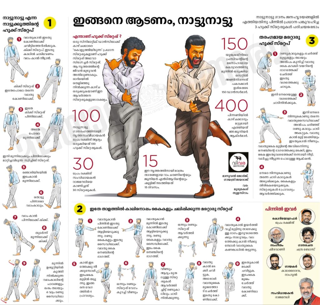
RRR infographics
What have you learned from reader feedback about what visuals work best?
Readers value clarity and relevance. They notice color misuse or visual clutter immediately. Creative layouts are appreciated. Every now and then, the question comes up: ‘Why stick to the same design style and color every day?'” I compare it to a fabric store: you may see odd colors, but someone will love them. With 1.8 million copies,we need consistency — not everyone’s personal taste. That’s why we rely on a strong, unified design language shaped by global experts
![]()




Thanks a lot dear Sajeev for this valuable interview with Manorama’s visual editor Manuel George. As a reader and a Designer I appreciate their planning and professionalism.
The art of shaping stories
through design-Malayala Manorama stands apart compared to other newspapers in India in its vision,creativity ,utilisation of contemporary tools and professionalism.Congrats to the visual editor Manuel George and his team for the great work.