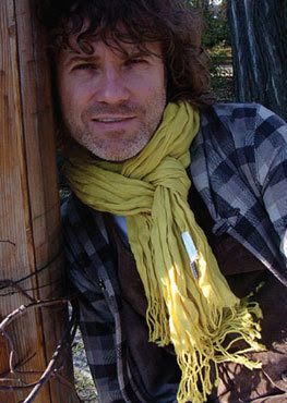
 Famous Polish Design Director Jacek Utko talks to T K Sajeev
-
-
-
- Which is the first priority- good content or good design?Good content is king but presented in a way that ‘sells’ the story, shows clear hierarchy and significance of the information. So those two things can’t live apart. We need content driven designers, editorial designers and visual journalists on the other hand.
- Without a good content whether a visual editor or designer can create good and attractive page?
yes, you can make a ‘nice’ bland, empty, non-relevant page. The design must be proper for the topic it deals with. Don’t make ‘over-designed’ pages when a story is not worth it. But often you can ‘create’ the news with help of designers, make a non-traditional presentation. But at the end content must be still relevant for readers.
- While designing page one of a broadsheet daily do you think the designer has to concentrate more on the above fold or conceive page as a whole?
The page is a whole. Unless readers don’t unfold it. But they do. I hope broadsheet papers will be a history in few years so we won’t spend more time debating it.
- Whats the basic techniques to make page one attractive-broadsheet and tabloid?
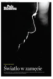
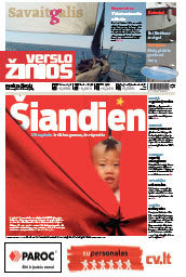
The very basic is: good proportions between text, headlines and photos. This is most common mistake. Only if you do this well you can think of advanced techniques, which is magazine-style design of front page. And at the end, the highest level, you make posters.
- How can an editorial team and the design team join hands effectively?
I have one brilliant idea that works: joint planning. Sketching all pages on a board with editors, photo editor discussing about content, ways of presentation, elements to the text, etc.
- Do you think the color headlines(Indian language newspapers are using color headlines) in news pages disturb photographs?
Depends how you use it, in which texts, how often and what colors. I can imagine that you can do it well, but also easily kill design and hierarchy.<

- Is there any new trend in designing?
For newspapers, there is one trend: magazine design. With all consequences concerning format, colours, type and elements of text. - Whats your opinion about the right ragged text for every story.In our part usually right ragged text is used for soft human interest stories?
May work for opinion (I usually use it this way) and maybe also feature. One technical issue: you may need lines between columns to make reading easier. - To be a good designer what one have to exercise?
Years of practicing what is EDITORIAL design and what is not. That’s most common issue in Asia. People don’t get the difference, want to make ‘nice’ things that doesn’t sell the story or contain any information. You learn it by your own mistakes and observing other good samples.
- Which is the first priority- good content or good design?Good content is king but presented in a way that ‘sells’ the story, shows clear hierarchy and significance of the information. So those two things can’t live apart. We need content driven designers, editorial designers and visual journalists on the other hand.
-
-
![]()

