Five design principles derive from the Gestalt theory: proximity, similarity, continuity, closure and figure/ground. Each employs different methods to create unity within the whole.
PROXIMITY
Proximity refers to objects placed close together being perceived as a group. When spaced far apart, objects are perceived as separate. Proximity occurs when objects are closer to each other than to any other object.

Proximity spacing can be as close objects in direct contact, or as far apart as opposite sides of a page.

The strongest proximity relationship is when objects overlap, leaving no doubt that they belong together.

Using other design elements, such as lines or shapes to surround objects, also creates strong proximity. Lines and shapes can also link objects by passing through them or by underlining them.

SIMILARITY
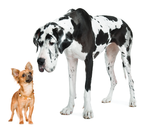
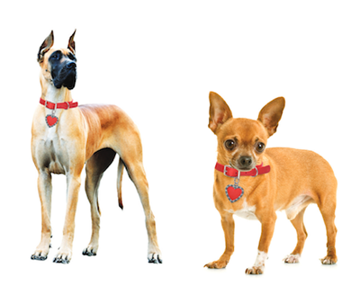
Shared visual characteristics automatically create relationships. The more alike objects appear, the more likely they are to be seen as a group. Note that similarity is based upon what an object looks like, not what an object is. Two dogs on a page do not automatically have similarity because they are dogs. One could be a Great Dane and the other a Chihuahua—dogs that have very little in common.
However, similarity would be created if both were brown and wearing red collars.
Similarity can be achieved in many different ways, including size, color and shape. Objects of a like size have similarity, illustrated by the fact that on a page filled with big circles and little circles, the mind will see all the big circles as belonging in one group while all the little circles are in another, even if they are evenly dispersed on the page. Color and shape have the same effect. On a page filled with similar-sized circles and squares in two different colors, the mind will separate them into two groups based upon color.
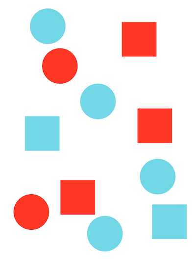
However, if the circles and squares are all the same size and color, the mind will group them according to shape.


CONTINUITY
The principle of continuity dictates that once the eye begins to follow something, it will continue traveling in that direction until it encounters another object.

A good example is a line with an arrow at the end of it.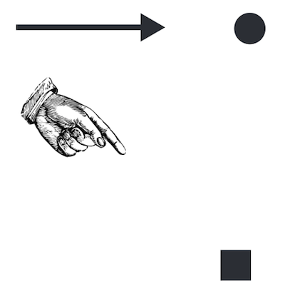
This symbol indicates that a viewer should follow the line to the end to see where the arrow is pointing. Symbols and objects that are similar to arrows, such as a hand with a pointing finger, are used frequently in design to create continuity.
Other ways to lead the eye include a photograph or illustration containing an eye. A common design rule is that if an image of a person is used, make sure the person is looking for the rest of the design.

This helps the viewer move through the information instead of looking off the edge of the page, turning away from the information. A designer can also create a path through the page, either literally or figuratively. An image of a road, a path, a fence, a row of flowers or a tunnel can all guide the eye across a page. For readers from Western cultures, the natural inclination is to lead the viewer’s eye from left to right. Continuity gives the designer significant control over the viewer. The mind can’t help but follow the path.
CLOSURE
Closure is related to continuity in that it asks the eye to complete a path. As long as enough essential information is present, the mind supplies the missing pieces of an object.

Closure works best with objects that are recognizable. For example, an outline of a triangle that slowly has pieces taken away is still recognizable as a triangle even when down to a bare minimum of pieces. Complex objects are trickier for the mind to complete.

The designer must strike a balance between what is taken away and what remains. The mind cannot complete the object if too much of it is missing.
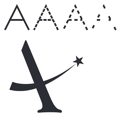
Closure can be found quite often in paintings, mosaics and sculptures through the ages. Classical artists have long recognized the ability of the mind to fill in the blanks.
FIGURE/GROUND
The figure/ground principle is based on the relationship between an object and the surrounding space. Figure/ground is also referred to as positive and negative space, the positive being the object and the negative referring to the space around it.
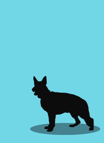
This principle gives the illusion of depth, and is a fundamental principle used in almost every design. Figure refers to more than just imagery; type is considered figure as well.
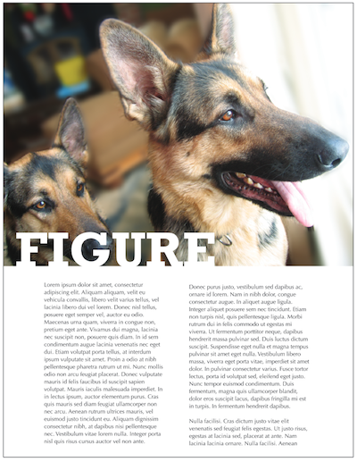
Figure/ground can be used quite creatively when both the figure and ground form recognizable shapes at the same time. There are many examples of this, one of the most common being the optical illusion of two opposing faces on opposite sides of the page with the negative space in between them forming a lamp, spindle or another recognizable shape.

![]()


