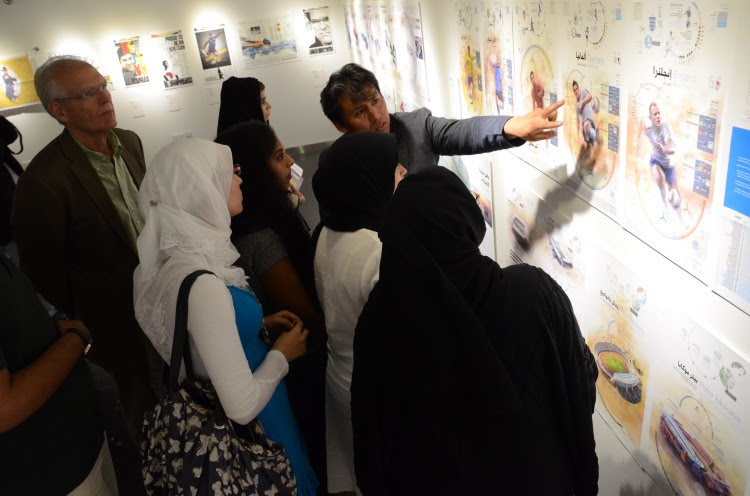
Luis Chumpitaz pointing out the aspects of his information graphics
1.What factors contribute to the rapid growth of newspapers and news design in the Middle East?
I would say the main factors are the continued development of the region, combined with globalization and the resulting influx of a large expat population. The Middle East is becoming more and more connected to the world, so new platforms of communication and interaction are needed. When something happens here, the world press relies on its foreign correspondents, but also on local media. Local outlets can give them an idea of public opinion or potential sources. This is common across all types of news media; the idea is to bring in a local voice. As the world gets more connected, there is also more of a local focus. Of course, the economic dynamics of publications here are different, with powerful sponsors backing the media. Media ownership and operations are not only guided by profit, but also by the wish to have a presence in the media landscape.
In Gulf countries, the surge of news design also has very practical reasons: there are so many people here who are living, working and reading in a foreign language. Here more than anywhere else, clear and captivating layouts, infographics and illustrations do the job of getting across information much better than a page of printed words with fewer visual cues.
2. Why have MENA publications captured so many awards?
MENA is a big, big area, but judging from my experience in the Gulf countries, I would say that this success has a lot to do with a healthy attitude towards innovation and experimentation at the managerial level. There is top-down support for initiatives aimed at improving the field. This includes redesigns, hiring qualified staff and, last but not least, a certain continuity and commitment to long-term projects. Strategy and planning are an important element in this context. Contrary to what we might expect from countries that appeared on the world media stage seemingly “out of the blue”, news design standards here were neither set nor reached from one day to the next. Local publications have had to bring in international newspaper design experts, including international newspaper design powerhouses such as Pentagram, Innovation, Garcia Media or Lucy LaCava, to fast-track the evolution of their publications. Another factor to consider is that most of the staff currently working in such publications is familiar with world-class press standards, so their work is already imbued with this know-how. This knowledge is already consolidated and established, so it is fair to say that in some way, we are standing on the shoulders of giants.
3.History and current assessment of newspapers, publishing, printing in the Middle East
In UAE, the first newspaper was launched as recently as the 1920s, when a shopkeeper in Al Ain started to produce a cardboard publication about local news and products at his shop. This cardboard went into his shop window each morning, attracting people to come and find out about what was happening around them. It was essentially advertising, but it was also the start of something new. The oldest newspapers still running date back to the late 70s: the first was Al Khaleej, an Arabic paper and its English version, the Khaleej Times, followed by the Arabic Al Bayan and the English Gulf News, still two of Dubai’s leading publications. More recently, the following titles were launched: Emarat Al Youm, in Arabic, and a number of English papers such as 7 Days, Emirates Today (now called Emirates Business 24/7, available online only) and Sport 360°, all in Dubai, and finally The National, in Abu Dhabi.
In terms of infrastructure, printing and distribution can be an issue. Speed, quality and price don’t always match up. If you want to distribute internationally, there are too many legal restrictions and distribution networks are not really connected. This will hopefully improve soon because many projects that could work internationally end up being “locked in” by regulations and patchy infrastructure.
4.There is a crisis in newspaper publishing in the US.What about the Middle East?
The financial crisis has definitely been felt here, too, with layoffs, closures and migrations to cheaper online formats. But it seems we have left those difficulties behind now and most of the publications are already looking at the next steps forward. It seems that just because newspapers, as we used to know them, aren’t viable anymore, this does not automatically mean there is no future for newspaper publishing as a whole. I would say we have been witnessing a metamorphosis and, in the end, change will probably turn out as a good thing.
Generally, the fate of print media elsewhere has brought a lot of good people here. Since 2008, the competition has become much tougher. Human resources is a critical factor and, seen purely from this perspective, the crisis experienced by Western print media has also been good for the development of Middle Eastern media.
5. Print media versus new media; Do they go hand in hand or are they competing?
By now everyone should have realised that in order to make the most of our journalists’ hard work and to attract advertisers, online and print need to work together. I think in many respects the different formats are already going hand in hand, even though the general perception might be that they are competing. In economic terms, the long-established print business seems more solid than its digital partner. In the end, people rely on both complementing each other. What is more, digital media rely on print or other sources for much of their content, because they tend to lag behind in reporting capability. The Gadaffi case revealed once again the advantages of multimedia journalism combined with the empowerment of citizen journalists. Nevertheless, thorough investigative journalism remains the domain of print media.
6.Visual information vs. verbal information; why do information graphics work?
Well, each has its advantages and information graphics work because they bring together elements of both. An image is simultaneous, meaning it can transmit information almost instantly; that is why we say one image is worth a thousand words, that is why we use pictures on the covers of newspapers. The text is linear and successive – one word follows another, one sentence follows on from another, and so on. Sometimes the “IKEA manual” approach to infographics works, and while that is marvellous, it is not always possible. In IKEA manuals, a sequence of simple written instructions corresponds to a sequence of numbered images. Each bit of text has a direct reference to a specific image for direct comparison.
But just as perception and understanding are tied together, our capacity to handle information is limited; just think of memorising statistics, dates and names. That is why multilayered diagrams and complex maps can be extremely confusing for the reader. In texts, the meaning of each word is usually already defined. A chair is not going to be understood as a car unless your text is a poem. In visual language, references to abstract concepts can lead to misunderstandings much more easily than in written communication. What an icon stands for might be clear to “insiders”, but not to people who are not used to getting information this way.
7.Content versus “design noise” (Edward Tufte); When does design become over-design?
Design becomes overdesign when it becomes gratuitous; when it tries to fill some vacuum. This is true for all kinds of design, including information graphics. What Tufte criticises is the divorce between content and form. In an article he wrote about Megan Jaegermann, an infographic designer at NYT, he praises the fact that she handles both the research and the design. Thus, he said, her work displays an inherent content-form correspondence that facilitates the transmission of information. Also when Tufte argues against the use of PowerPoint, he argues against content that is overwhelmed by the medium to the level of distortion. In that way, Tufte’s critique harks back to design credos such as “form follows function” or “less is more”. A really overwhelming design will overshadow the content, transforming itself into content. This is, of course, a flexible concept that needs to be adapted to the purpose of the message and its audience. That is why editors who uphold the standards of visual culture are so important; they must set the right tone for each story.
In the case of graphics, this is crucial because the allure of aesthetics is always present. Sometimes a graphic is a graphic is a graphic. The data is just shown, and maybe just some bars are enough. There is a compromise between the functional rigour of the graphic as a piece of information, and, let’s accept it, the visual appeal of graphic elements as part of a commercial product that is the newspaper. Curiously, I have seen that overdesign is sometimes encouraged by editors who get carried away by the commercial appeal of bold visual communication. Using the helpful metaphor of the musician, I would say we should recognise the value of silence, just as much as we recognize the value of sound. Both are tools and we should aware that they need to match their function. In the case of a graphic, this is not to impress or seduce, but to inform.
When practised at its best, this balance between form and function is a kind of art form – just think of the famous Minard graphic, a famous example given by Tufte.
8. How does a story make it into print? Role of designers vis-à-vis editors.
At Al Bayan, the night editor creates a list of topics that might be covered for the next day. The next morning, all reporters receive their briefings and spend the day producing their news stories. This process can stretch into the late evening in some cases. Based on feedback from reporters, editors come up with a hierarchy of content. Different amount of time and space are given to the various news items, while some are dropped altogether. It is the task of the design staff to liaise with editors to keep up to date with these developments. The evolving nature of the design briefing requires the designers, as the ones who understand visual language, to engage with editors, who are in charge of the hierarchy of the content as well as the content itself. News designers are not “just” mere operators but work in synchrony with the newsroom. One vision has to be translated into another and, as news comes in, layouts can change many times within a few hours.
9. Process and timeline for news graphics or infographics?
First of all, we receive a news briefing and check what information is available – this is the point of departure, the keystone. We then decide whether it is even possible to create a graphic. If it is, we need to determine whether it is more useful for the reader if the graphic focuses on a specific point or provides a contextual overview of the entire subject. Once all this has been taken into account, we start to define hierarchies and relations inside the space defined for the graphic. The information gathered has to be divided into what can be expressed with images and what can be said with text, always trying to convey as much as possible through visuals. Next, the data is synthesised, filtered, contrasted – a process that applies to both images and text. By now, the visual technique has been defined and the final text has been placed into the layout. Once all this is completed, it is important to get feedback from people outside of the project, to make sure the graphic is easy to understand.
This process can take a long time, especially for books and supplements, but in the daily news, it must all happen within a few hours. In the newsroom, beauty, or “visual kindness”, is never the priority. Instead, we focus on thoroughness and speed. Like all newsrooms, the graphics department can resemble a kind of emergency room at times. Each graphic has to be completed quickly and accurately. Once the deadline has arrived, there is no way to go back and correct mistakes.
10. Local sensibilities; what is allowed, what is prohibited? Relate to other regions
There are certain pitfalls for newcomers. For example, we are not allowed to use pigs in illustrations about financial issues or savings, something that is almost a cliché in many other regions of the world. One time, one of my colleagues made an illustration of a man hiding his head inside a hole in the soil, but some readers thought the position was too similar to Muslim prayer positions. Obviously, uncovered parts of the female body are not acceptable, even in a medical context. We also refrain from mentioning certain political issues related to certain countries.
11. Hard news or soft news; how to handle each?
In hard news, speculation and ambiguity are banned, both verbally and visually. Rigid structures apply and, sometimes, this rigour comes at the cost of being unappealing at first sight. Soft news, on the other hand, can be handled with more flexibility. There is more space for the creativity of the designer, especially in features and weekend sections. The strict difference between the two is rooted in the fact that strong visual concepts tend to imply a certain judgment or point of view to the reader. This, in turn, suggests that the reporter and/or publication are biased.
![]()


