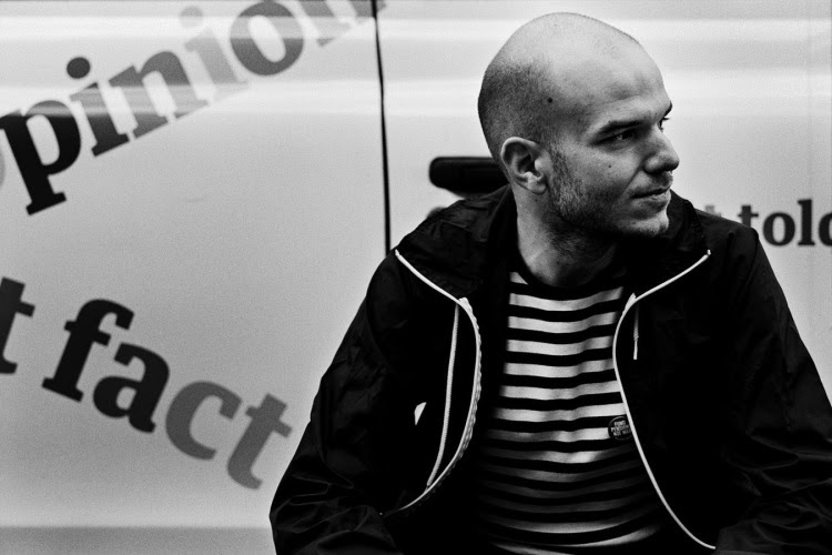
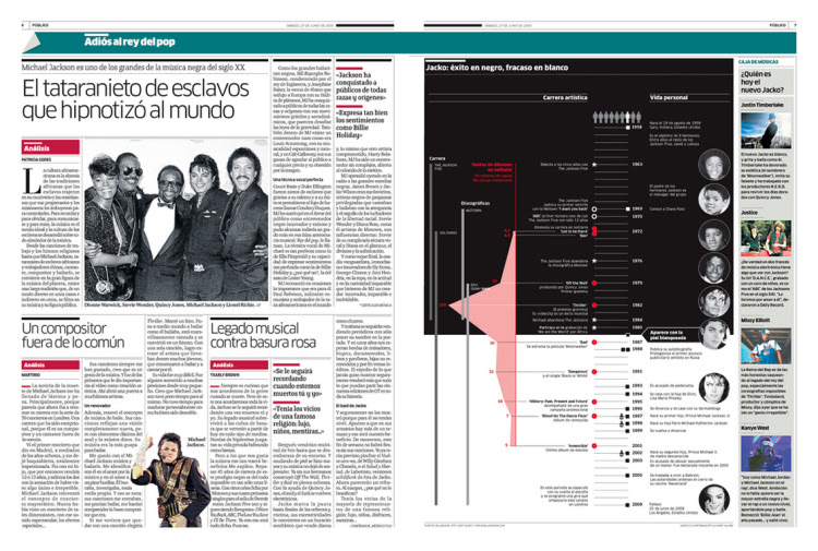
Alvaro Valino started his career as an Infographic artist, at La Voz de Galicia in 1998. After completing his Masters in Graphic Design from London College of Communication he joined Público in 2007 as an Infographic artist. Later on he was promoted as head of the graphics department.He had published infographics and illustrations as a freelance contributor in National Geographic Magazine, The Washington Post, The Guardian, Science, Il Corriere della Sera, El País, Courrier International or Revista Mongolia.
See Alvaro’s website: www.alvarovalino.com
1. What is the role of information graphics in a newspaper?
The primary role is to provide information in a more accessible way to the readers. Most of the best infographics produced in newspapers come from newer high-quality list high-quality information like The New York Times, The Guardian or The Washington Post. So the fact that they represent good quality information in an accessible, clear and attractive way seems to be the perfect formula for communication.
2. Describe the formation of information graphics from the “first spark”?
Every graphic has a different approach. For the common charts, like simple pie charts, fever charts or bar charts, we have a library of templates that help us speed up the process. The complex visualizations usually start with an idea or concept that can be part of a current issue or a feature that may come from any department in the newsroom. The infographics section is pretty good suggesting subjects, so we are an active part of the newsroom. At the beginning we ask ourselves lots of questions to understand the subject we are dealing with – most of them from a reader’s point of view, what will be interesting/useful/curious for him or her. After that we start with the research, normally together with the section that covers the story. During the process we come together in informal meetings to evaluate our findings. At this point we start sketching drafts. This is a critical stage. We come together with the design and art direction departments to share ideas about the layout and define the space we are going to need. For us this is the more important part of the process, the conceptualization and research of the information, more that the aesthetic value of the representation. We don’t look for virtuosity in our representations. We then decide if we need to do more research or if we have enough information to represent what we want to communicate. Now the production of the graphic itself starts. Most of the time, one infographic artist handles the complete representation, assisted by another co-worker doing final research. At the end we share the graphic within the section and with the department that covers the subject. Late corrections are made and it’s sent to press.
3. From which stage do you need to use the computer?
During the research, a, d the production stages are when we make heavy use of computers.
4. These days even school textbooks describe the subject through semi information graphics. Will this lead to infographics boom?
I think we are living that boom now. Visual information is getting ubiquitous in our lives: way-finding transportation systems, computer interfaces, packaging and labelling, and maps. Readers, journalists, students, people, in general, are more visually educated. We understand the possibilities of visual communication. And at the same time, we are living in an age of data. Lots of information is available and information graphics are definitely a way to filter and process it to make it valuable for the readers. Generally speaking, I think that now we are giving added value to information conveyed by graphics.
5. Explain the different types of infographics and its role in the visual presentation?
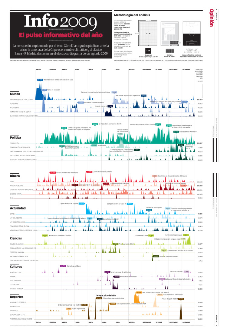
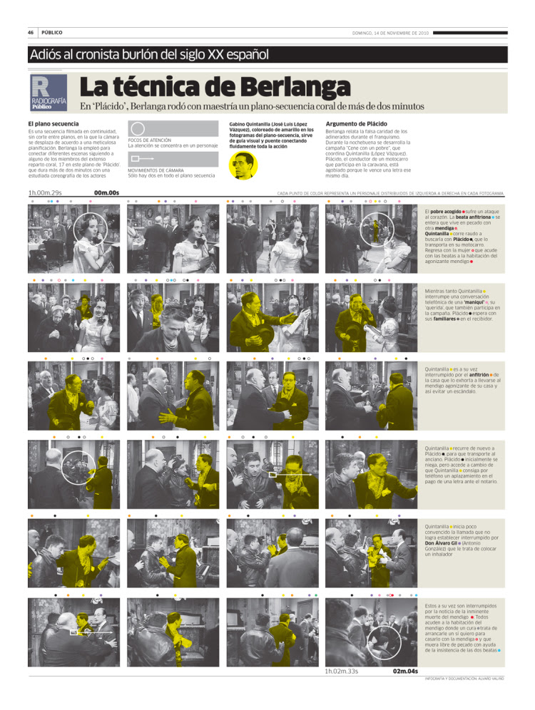
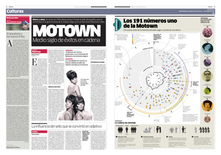
I’d like to talk about the kind of graphics that differentiate us. Relationship diagrams, process diagrams and rich timelines – all of them with carefully keyed information. We can add lots of layers of information to these types of graphics, providing a large amount of complex information in a clean and accessible way. These infographics work very well to provide readers with information context and the big picture of the how the is subject treated.
6. In a print conscious community like India, how can information graphics penetrate through the readers?
I think graphics help the readers to absorb more information in a natural way.
7. Do you favour using information graphic software?
Yes, I do, but I don’t like to lose the immediate drafts made by hand that help us to think out of the box. The kind of tool you select to work with restricts your output. The fast connection between brain and hand helps to save a lot of time and to focus on the way you want to communicate the information.
8. Which are the software’s that can be used without destroying the artistry?
From, my point of view we are not artists. I agree that graphics have an aesthetic value but that’s is not their main goal. It’s to communicate information effectively. Most of our graphics in Público are vector graphics made in Adobe Illustrator and Adobe Photoshop.
9. How much of importance is given to information graphics in your newspaper?
Público has a strong graphic discourse that is much more than just imagery. It’s our visual way to convey its editorial point of view: strong, determined, and passionate. Our infographics are part of this visual strategy and the staff really understands this perspective. We are probably one of the European newspaper that cares most about information graphics.
10. How did you get attracted to information graphics?
I come from the graphic design field and I was always interested in current affairs and social issues. So I found infographics a natural way to put all this together. I started my professional career in a big regional newspaper in Spain, La Voz de Galicia where I learned to be a journalist.
11. What is Isotype style infographics?
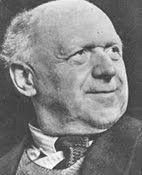 The most important key to isotype infographics is not the style, but the idea behind them. The revolutionary idea of Otto Neurat was to provide easily understandable information for the working class people during a critical time between the World Wars. A period of time when citizens needed to have a wider view of the world and Isotype achieved that by comparing, clarifying, and explaining information through icons systems, synthetic maps and lot of comparisons that gave a context and solid knowledge to that people. Isotype had a universal approach and target.
As Otto Neurat said, “Words divide, pictures unite.”
![]()

