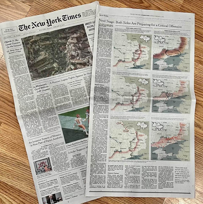
New York Times Graphic Editor Marco Hernandez
talks to newspaperdesign.in on how he
conceived the
next stage of the war in Ukraine visually
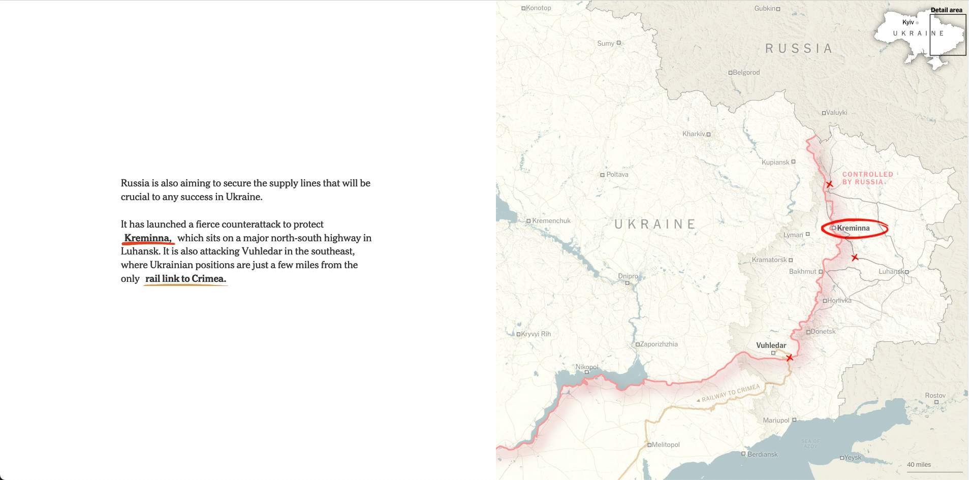
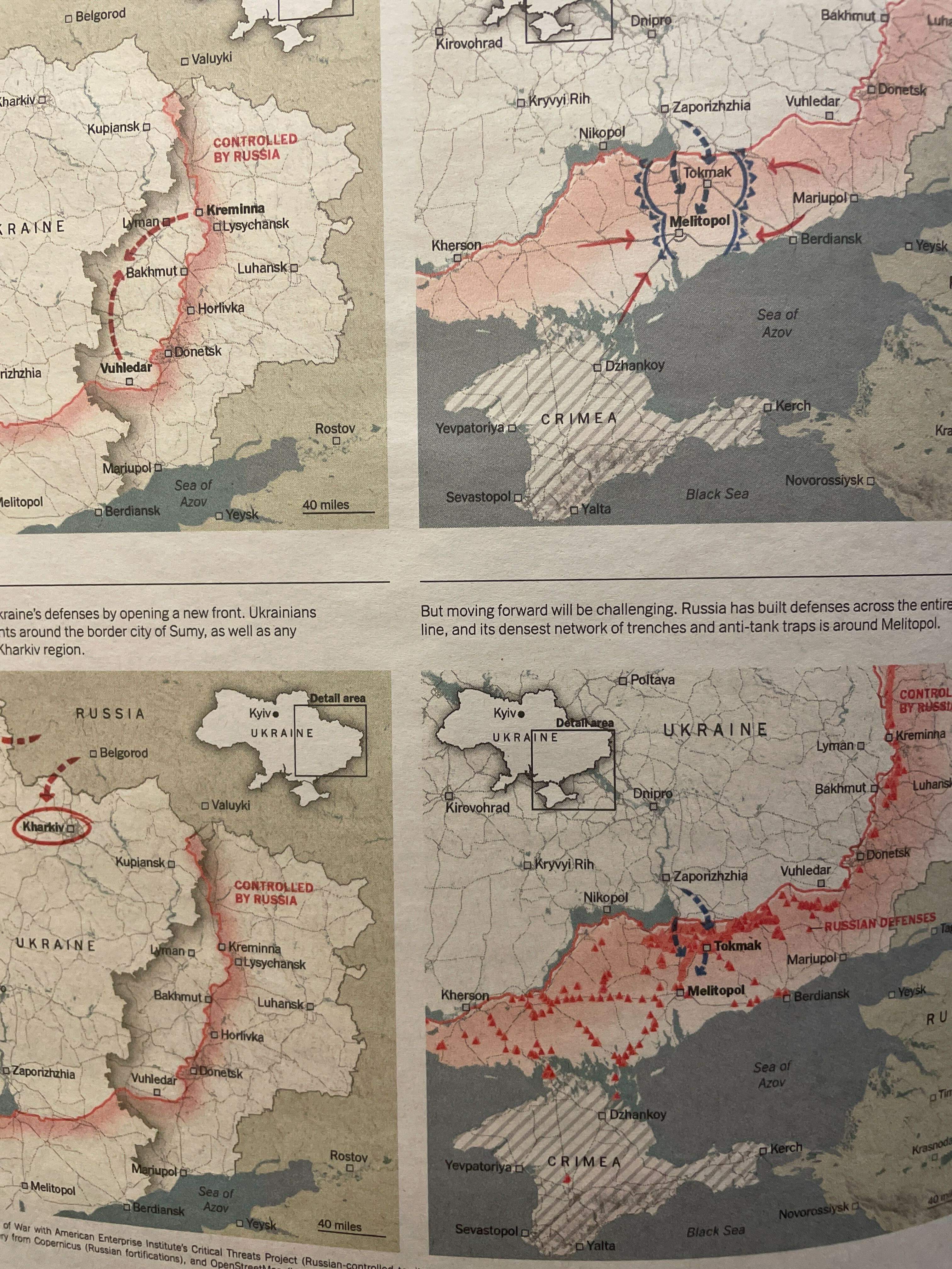
We spoke to military analysts to understand what the next stage of the war in Ukraine might be. We decided to split the story into two parts by drawing maps to show the possible Russian offensive option and the scenarios for a Ukrainian counteroffensive as well.
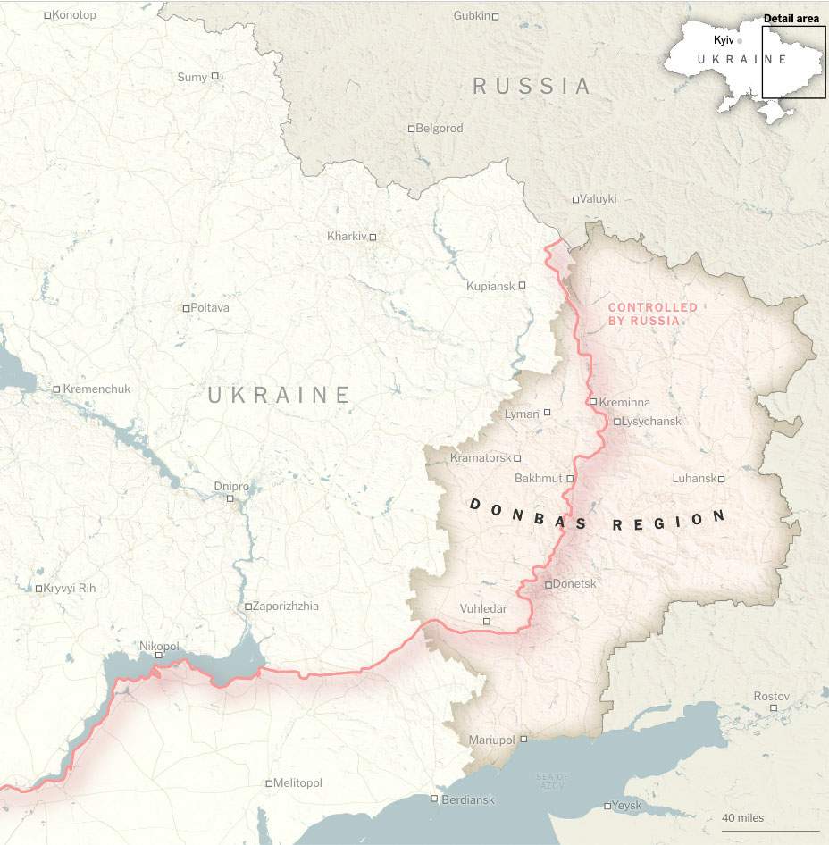
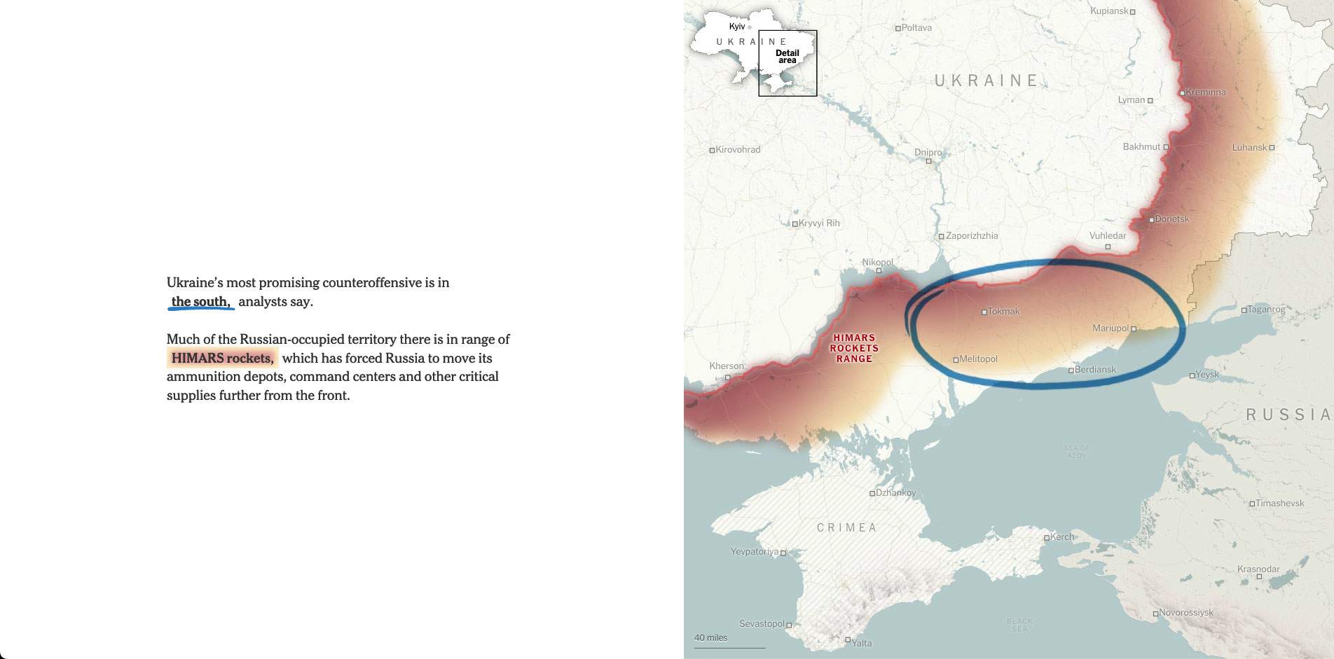
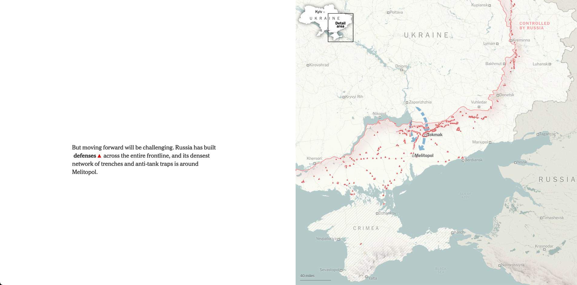
I knew that these maps would need many layers of information such as roads, railways, water, terrain, settlements and others. But also, and what is more important, the annotations on top to explain the possible moves and their context. My solution was to create a relatively clean base map, with enough precise detail to contrast the things we wanted to point to on them.
The contrast between a detailed map and the sketchy arrows works to explain the particulars of the geographies and strategies, just like when you explain something to another person on a scribbled piece of paper, I see it as the natural way to do it.
I always do that while working on stories with maps. Those are prototypes that help me shape the piece and understand where the story we are going to tell is going, but this is the first time we have published a version with my hand-drawn arrows and marks.
Image courtesy:New York Times
![]()

