Well-known caricature artist Howard McWilliam talks about reality and exaggeration in an exclusive chat with tksajeev.
Howard is the cover artist of The Week magazine, published in the UK and USA. He left his career as a financial magazine editor in 2005 to concentrate on illustration.

What’s the mark of a good caricature artist?
Good observation, primarily. An ability to capture the personality of the subject through the confidence of where to depart from “reality” and how to exaggerate each feature — and, crucially, in relation to every other feature.
How do you strike a balance between reality and exaggeration?
If a caricature is done well, that exaggeration can make the image look more like the subject than they do themselves. My caricatures are pretty gentle, really, and swerve closer to “reality” rather than exaggeration compared with many artists. I would also rather not be too “mean” in a depiction of anyone, partly through my own temperament and also the sentiments of the publications that I work for. There are many great artists who are able to push the exaggeration to wild extremes and somehow keep an incredible likeness, of which I’m in awe.
What’s the most common issue you face as a caricature artist?
Needing to give someone a facial expression for which there is no photo reference. This takes a lot of mental extrapolation to transpose an expression from someone else’s face (normally my own in a mirror, or a stock image reference) onto the subject’s while still staying faithful to their own features, mouth and eye structure, etc.
Your personal politics ever play when doing a political caricature?
This is probably inevitable, but I try to prevent it. The main magazine that I caricature for, The Week, prides itself on its political impartiality. Depending on what they’ve been doing, myself and the magazine are happy to make politicians from both the right and the left look equally silly.
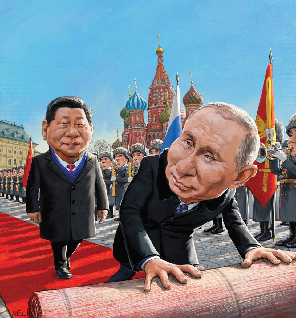
What is your political learning of other part of the world such as China , India?
As it happens, The Week is a great read for keeping abreast of the important points of international politics. So I know of significant policies from Xi Jinping
and Narendra Modi , for example, as well as a rough idea of public opinion behind them (as far as the expressing of that opinion is even possible in China). This wouldn’t necessarily be crucial for creating a good caricature of a world leader, though: an artist must simply study and familiarize themselves with the physical likeness. But familiarity with the issues does help with the briefing process with the editors.
Why did you leave your position as an editor to pursue a career as a full-time illustrator?
Even when I was writing/editing, I always wanted to be an illustrator. I had done since I was a small child. But it’s a much harder field to break into, or to make a living from: I continued the editing and writing just to the point where I could pay the bills with the illustration work I was doing on the side, and then never looked back.
Editor or illustrator. Which one thrills you most? What is the reason?
Even though I love words, I have always been more drawn to pictures. And my journalism work was always limited to finance, whereas I was more excited by the limitless possibilities of illustration: you can dream up all kinds of metaphors to depict a topic. In my early days illustrating for finance, tax and law magazines, I would relish coming up with ideas to make a dry topic some visual excitement.
Have any artists influenced you?
I’ve been influenced by a great many artists, too many to list. As with any creator, I’m always thirsty to see the work that others create, and constantly gain inspiration by viewing it. To list just a few across the genres in the order they influenced me: the economy and expressiveness of Quentin Blake (a huge influence when I was a child); the comic visual storytelling genius of Bill Watterson (Calvin & Hobbes); the chiaroscuro technique of Caravaggio; the extraordinary fantasy realism of James Gurney; the exquisite characterisation and composition of Carter Goodrich’s New Yorker covers. I’m privileged to share the covers of The Week’s US edition (we alternate each issue) with Jason Seiler, one of the finest portrait and caricature artists ever, which keeps me on my toes.
How do you conceptualise a cover page?
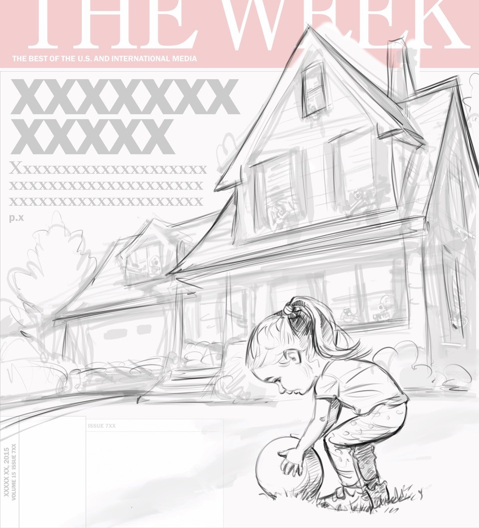
I’ve used a recent cover for the American edition of The Week as an example. The editors of The Week on both sides of the Atlantic are very good at coming up with visual ideas; occasionally they’ll be stumped and ask for a selection of sketched ideas from me, but normally they come to me with a brief and my job is to stage it in the most effective way, adding any embellishments along the way.
The cover story in this example was about the culture of fear in the US following another spate of shootings, this time of people who had found themselves on others’ property innocently — ringing the wrong doorbell, pulling into the wrong driveway, or even retrieving a ball from the garden. The editors wanted to portray a private home as a fortress, with guns protruding from multiple windows, trained on a little girl on the lawn bending over to pick up a ball (one of that week’s shootings literally began with a six-year-old chasing a ball onto someone’s lawn).
I always begin with a thumbnail composition sketch, using the cover design elements as a template: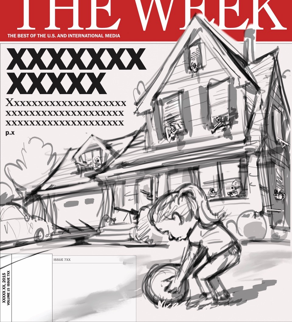
This particular example was approved, so I set about drawing it properly and in more detail. However, once I’d got this far and drawn the girl in the foreground I began to worry that the guns might not be as visible as I’d hoped if they’re all facing us and therefore not seen length ways:
I thought I should try reversing the viewing angle so that the guns would be more visible, and all “spoking” within the composition to lead the eye towards the girl. So I sent this new composition thumbnail: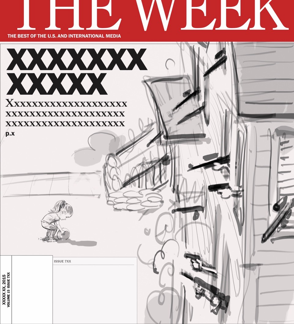
The editor requested to see a little more of the perspective on the lawn to make an informed choice, so I sketch in the rest of the house: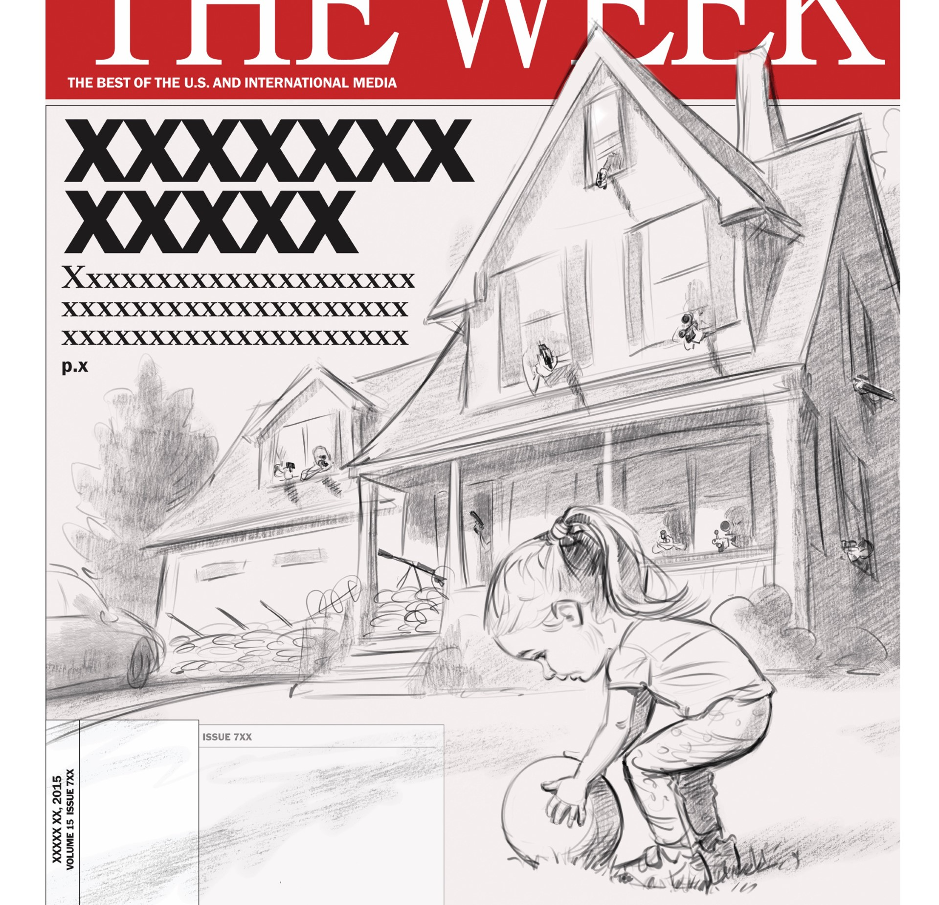
It was a tough decision — on the one hand the guns are more visible, but on the other the girl is shrunk considerably — but it was felt that the view from high up on the roof would be the more effective. So I drew it out properly and added some rough colour: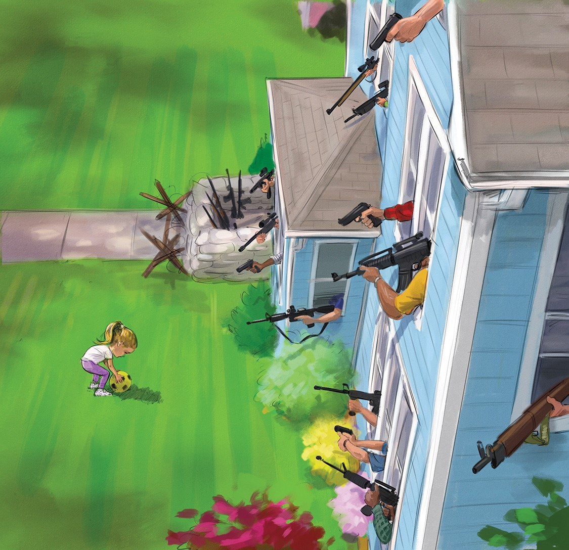
This was approved with no changes, so it was time to put in the bulk of the work painting it all in detail up to the final image: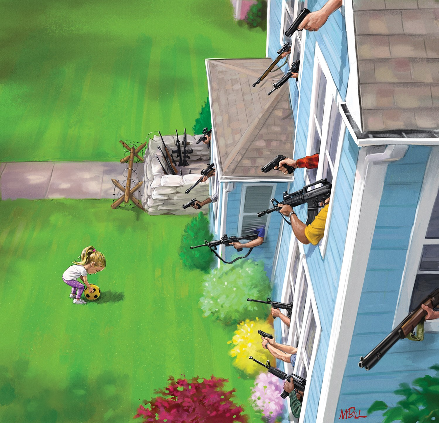
A few days later, it appears on the magazine. Interestingly, when I posted it on my Instagram later (where you can also see time-lapse process videos of some of my covers), some people felt that the original view from low down by the girl was the most effective — that’s the risk: these visuals are always subjective and there’s no “right” answer!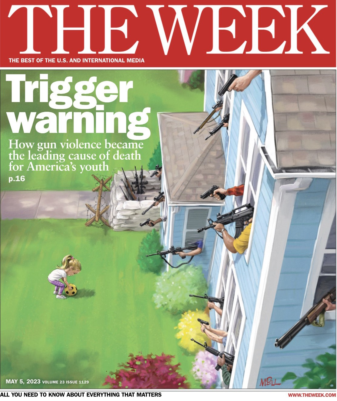
What are the tools you are using and how much time will it take to finish a cover page for The Week?
I create all my covers using Procreate software on a 12.9” iPad pro with a Paper like screen cover. I love the feel of the iPad pencil on the Paper like surface, and the responsiveness of the drawing experience with no discernible lag whatsoever is better than any alternatives that I’ve tried. I also like the ability to take the iPad away from the desk to carry on working on the sofa or in the garden. While I sometimes miss having the real paper artifacts (when I began my career, I used watercolor or acrylics exclusively), it saves so much time and heartache to work digitally this way. The changes that editors normally request are so much easier to accommodate. Working this way, a typical cover for The Week takes me anywhere between 9 and 15 hours to complete. I’ve amassed a suite of brushes and textures (bought or customized myself) that allow me to work in a fairly traditional-looking way, mostly using the same technique that I would in traditional paints… just without waiting for them to dry!
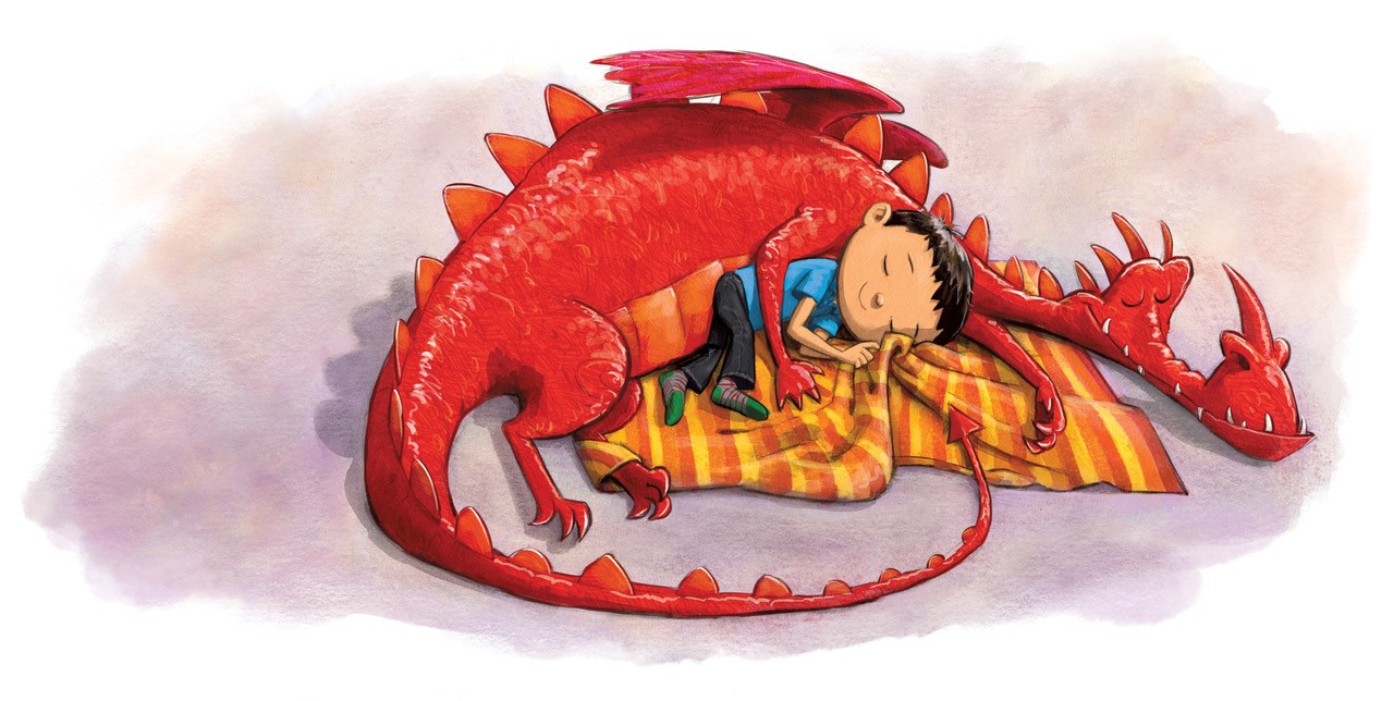
Apart from the serious work, you are also doing illustrations for children. How do you differentiate both of these?
I find the children’s book work a pleasurable counterpoint to drawing all those politicians, and it’s always an easy jump for me to make: first half of the week is magazine work, second half I unwind with children’s illustration. This September, the first book I’ve both written and illustrated will be published by Flashlight Press, called “Just Snow Already”, about which I’m very excited.
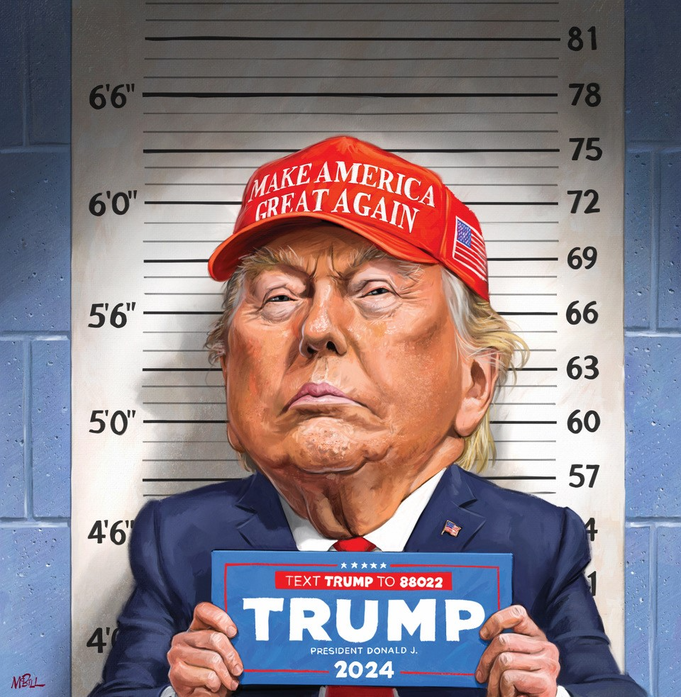
You have done a lot of caricatures of Donald Trump. How thrilling or challenging is it to draw Trump?
The problem with Trump is that he’s already a caricature of himself, so he can actually be harder to exaggerate than you might expect. While I’m fairly comfortable drawing him now (political opinions aside!), I look back on some of my earlier efforts and feel like I’ve concentrated on some of the wrong features or aspects of his face. That said, he is a lot of fun to draw.
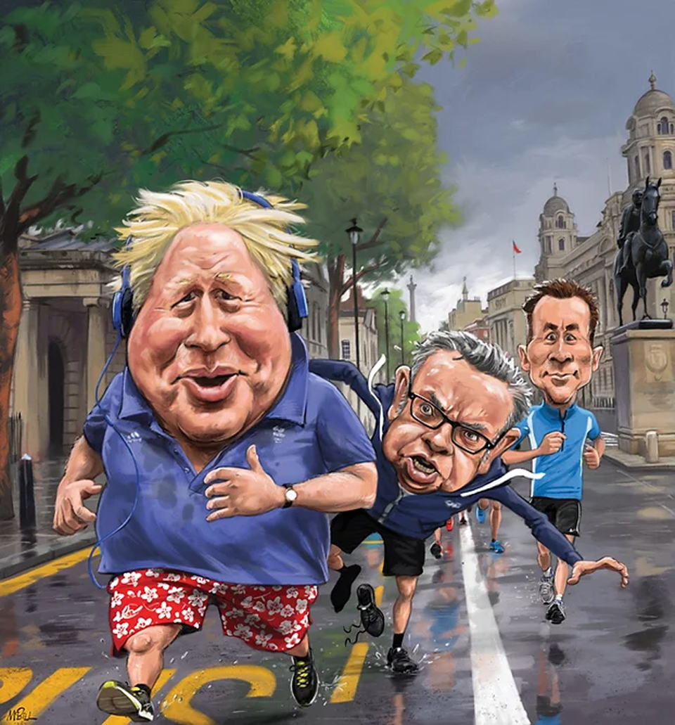
Who is your favourite international leader that you like to draw?
My favourite leader to draw is former UK Prime Minister Boris Johnson. The birds nest of hair, the rubbery lips and the buffoonish expressions — always fun.
Did you received any feedback from your cover characters after it was printed?
The Week normally pass on any complimentary remarks from readers, and people comment when I post on my Insta. Very occasionally, the politician depicted on the UK edition of The Week requests a print… so my depiction can’t be too terrible I hope!
You can see more works of
Howard McWilliam @ howardmcwilliam.com
and also @ instagram
Lorem ipsum dolor sit amet, consectetur adipiscing elit. Ut elit tellus, luctus nec ullamcorper mattis, pulvinar dapibus leo.


