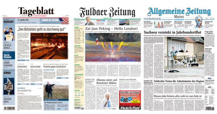
1.You have done redesign work at other side of the world. Have you gone through Indian newspapers?
Yes, of course, I have seen Indian newspapers. Besides being a design consultant, I represent the Society for News Design as International Director. This position oversees the development and collaboration of sections outside the US. So I am quite familiar with the worldwide newspaper development. But I have really started to look at Indian newspapers after the invitation to lecture for WAN-IFRA in Hyderabad this year.
2.If you have seen Indian newspapers what’s your thought on the Indian design.And also whats the difference you found in it compared to other parts of the world?
If I look at the Indian newspaper situation I notice two things:
1. The target audience loves to read. Unlike many western papers there is no shortage in text. While in most parts of the world the stories get shorter and more condensed, in Indian newspapers one can really read. This is amazing to me, because from what I know, the indian society is as multimedia and high tech as most western countries. And a newspaper is not the only information source, as it is in many countries where you find such a text/picture ratio in the papers. So this speaks highly for the value of the papers…
2. The papers are as colourful as it can get. In many other countries the use of colour is often restricted. Often you find colours that are not “offending” such as cool blue. In India the newspapers seem to reflect the peoples love for bright, loud colours. But maybe this is not so unusual for the Indian reader, and only seems bright to my western eye 😉
3. Many foreign newspapers are following the pattern of telling most of the story visually.But In India, still, there are at least 60% of the newspaper readers who like reading more.On the other side, the designers have to be innovative also.In your experience what the best way to manage this ?
The solution is to work with alternative story forms. Do not present one big text, but rather extract several aspects and build secondary information that can be seperated visually. To work with infoboxes should be mandatory. To show numbers and facts visually separated gives the reader several entry points in the story. And it also allows to “design” where there is only a limited use of pictures.
4.How different is the design pattern in Asia, Europe, America and other parts?
All newspapers are different, in my opinion. Of course one can find similar patterns on all continents, but it is the task of good consultant to enhance the unique appearance and not to destroy it. The differences can be found in the use of photography, the structure of the typography and of course, as in India, the use of colours.
5.What are the factors that makes a newspaper well-designed?
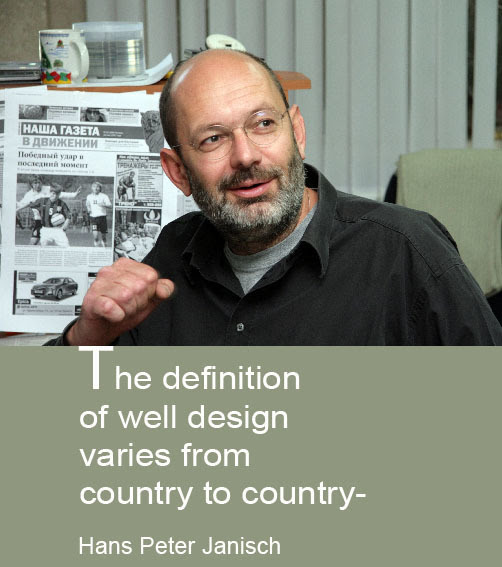
A newspaper is well designed if it serves its purpose and delivers the news in a refreshing, visually appealing way. Since we all have a different understanding of visual appeal, the definition of well design varies from country to country. But over all, I look for correct use of typography, a clever branding of the papers corporate design and correct structure of the papers sections. Those criterias can be applied all over the globe.

6. Will the American or German news design concept work well in India or other Asian countries and vice-versa?
No, I do not think so. I think it is the same as with food. While we do have several Indian restaurants in Germany and people like to explore different dishes, when it comes to the basics they prefer bread and bratwurst. A good designer has to look around, study and understand a countries newspaper culture. Only then, he has a chance to create some concepts that will work for the local reader.
7.In some parts of the world, the newspaper design innovation is carried out in large numbers today.This question is based on the criticism that American designers are not innovating these days
I have witnessed the change of innovation for the last 20 years. Back then, the US was the homeland of newspaper design. Everybody looked at the American newspapers and copied the design trends that came from there. If you look at the biggest design competition, the SND Worlds Best Design, nowadays, you hardly find a US paper there any more. Innovative design concepts are born in the Spanish speaking regions, in countries like Germany and more and more in places like Russia. So what once was regional is now a real global development.
8.What are the basics a designer must follow in the below sections
(a) Color (b) Typography (3) White Space (4) Photo Cropping
To answer this question in full, one should attend my seminar ;-), But seriously, there are a few guidelines that one has to follow:
Colour: Use it as it seems proper for your readership and your country. But use it consistently. Don’t change your colours on a daily basis. Make sure the reader recognizes the value and understands what it stands for or what a certain colour represents.
Typography: Again, the structure is the most important part. The recognition of sizes and styles gives the page a guideline. As is many cases with design and artwork – maybe fewer styles are better.
White space: Some say, the newspaper of the future is a daily magazine. While this is correct in terms of storytelling, I think a newspaper will never work as well with the amount of white space as a magazine does. Do not overuse white space, your reader will be offended.
Photo cropping: Contrast, contrast and again contrast is the main key of great photocropping. This applies to position and relation of the photos content to the chosen format. Show the differences between important things and less important things in your pictures, create tension by showing unsual aspects of well the known…
9.Can you differentiate between the classical and modern design?
That’s hard to answer. Many design trends repeat themselves over and over. So what we consider classical today, might be modern tomorrow. Often classical and modern can be distinguished by technological features. For example the use of infographics was hardly seen in newspapers before the Macintosh appeared in newsrooms. Modern design seems to understand the needs of the reader much better, will recognize the readers’ wishes. Classical newspaper design was often a tool for delivering news, nothing more.
10. Some designers think that news pages are not for exploration and experiments, limit it to feature pages.Do you agree with this? why?
No, one should be very open minded in all sections of a newspaper. Why not experiment with illustrations in a news section, especially for longer stories that carry background. The news section is not “newsy” anymore anyway. Not in the age of internet, mobile platforms and hundreds of TV channels. Our grandfathers newspaper was a really “news”paper. Today a paper has to do much better, even in the news section.
![]()


