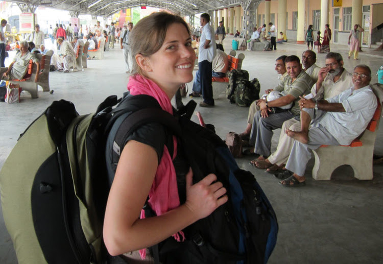
Kaitlin Yarnall in a Delhi railway station She visited India in 2011
1. Tell me about your work in National Geographic Magazine. How it is different from other magazines?
My current title at National Geographic is Deputy Creative Director for the Magazine. I work closely with a very talented group of design editors, graphics editors, and cartographers, as well as those who work on our iPad edition. National Geographic Magazine (NGM) is a visual magazine – our photography is world renown and our principal storytelling device. The magazine is also known for its graphics, maps, and original artwork. As a visual journalist, I’m fortunate to work for a magazine so devoted to visual storytelling. This focus on the visual components of our stories makes NGM different than most magazines where most stories are text-driven.
Our production process at NGM is also different than most magazines. We work on stories for months, often for more than a year. This long production process allows us to do more in-depth work but also means that we work on many issues, and even more stories, at the same time.
2. How do you differentiate a feature magazine work and news magazine work? Which is most thrilling?
I haven’t actually ever worked at a news magazine and NGM rarely covers news events. The main difference lies in our production timeline. We close issues more than a month before they hit newsstands, which makes covering breaking news impossible. We do, at times, cover current events but take more of an analytical and long-reaching view. We did this type of coverage following the Gulf Oil Spill in 2010 and after the Egyptian revolution this spring. While our feature work may not have the thrill of covering breaking news, we’re able to dive deeply into topics. Our additional time allows us to travel, contact many sources, and do extensive background research.
3. These days newspapers were following magazine in design and storytelling to compete for television. What’s your thought?
I see newspapers, magazines, and television as all very valid and different storytelling vehicles. I believe that the experience and expectation of a viewer or reader are very different for each platform. These are generalizations, but in the case of a news event, I see readers looking to the TV for live coverage and immediate information, newspapers for short-term analysis, and news magazines for more in-depth analysis and perspective. In the case of feature topics there is more cross-over in coverage, but again I do believe that each platform delivers a different experience. In general, readers spend more time with and pay more for magazines than newspapers and therefore expect something more lasting, something that feels special. We seek to give readers something special in every issue of NGM. Something that makes them want to not only keep their issue but recommend them to their friends.
4. How the magazine designers competing for the television visualizers?
The NGM design team works independently from our TV production unit and channel. While we may cover some of the same topics, our workflows are separate. Designing for a printed magazine page or our iPad edition is very different than producing graphics for a television show. I don’t see what we do as competing with what’s done in our television department. We deliver different experiences to our members.
5. What’s your method of planning a work? And how it helps you to reach the goal?
Once a story is approved at NGM there is usually a story team meeting that includes a photo editor, text editor, graphics editors, and design editor. All members discuss our coverage plan and what parts of the story will be covered by photography, the main text, photo captions, and graphics or maps. If extensive mapping or graphics are part of the story the graphics editor works to create his or her unique plan for the story. This plan may include travel for research and reporting. We involve graphic and map researchers in most of our stories. These researchers assist editors in gathering material and fact-checking everything we produce. Once a preliminary sketch is produced and placed within a layout there are many stages of refining, tweaking, and editing. This process insures that the graphic or map works well with the rest of the story as well as in the issue. Once content is final and approved we enter a stage of final production and colour correcting to arrive at a print-ready piece.
6. Which is your best work and describe its mode of operation?
Last year I was lucky to work with one of our Senior Graphics Editors, Fernando Baptista on a 4-page gatefold about the Sagrada Familia church in Barcelona, Spain. Fernando and I travelled to Barcelona to research the church and speak to the architectural team there. It was fascinating to dive into the mind of the church’s architect Antonio Gaudi and understand his process. Once we understand his process, the challenge lies in visualizing and explaining it to our readers. For this graphic, I played the role of researcher and Fernando produced a stunning package of graphics and artwork.
Some of the most interesting pieces I’ve worked on recently haven’t been huge pieces but have been covering new topics for me. I love when I get to cover something that I know nothing about when I start the process and am able to finish with an understanding of something new. For our October issue, I worked on a two-page piece on new nuclear technology. I hadn’t taken a physics class since I was 17 years-old and came to the topic cold. I was able to interview scientists at MIT and gain a basic understanding of what new technology we should cover and how it should be portrayed. I then worked with the 3d artist Stefan Fichtel to create an explanatory graphic of how the technology works. Pieces like this are enjoyable because I get to learn about a completely new topic and share my learning with our readers.

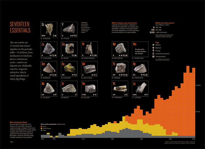
One of the Kaitlin’s work with Lawson Parker
7. Best designed magazines other than National Geographic Magazine?
I try to get my hands on copies of the following magazines often. While they do things differently than we do (and cover different topics), they all deliver inspiration in one form or another.
Monocle
IL
New York Magazine
The New York Times Magazine
Bloomberg Businessweek
ESPN The Magazine
8. This year you have visited India. What’s your thought on Indian design culture?
I loved my trip to India! I was impressed by the general growth of newspapers in India and the extreme interest in new formats and publications. While I didn’t spend enough time there to fully understand it or appreciate, I was struck by the difference in design in India. Colour palettes are much brighter and type choices are bolder. It’s definitely a different culture but one I would love to explore further.
9. How did you get attracted to the world of design?
I studied cartography and geography in college. I stumbled upon the discipline, I didn’t know I’d be able to make a career out of it. I’ve always loved maps and learning about global systems – geography and cartography was a perfect marriage of the two. While it’s not a typical path to design, many of the principals are the same. When making a map one thinks about the hierarchy of information, a cohesive colour palette, type hierarchy, symbols, and how to guide a reader. I worked five years in the cartographic division at National Geographic before joining NGM. My time working on maps definitely taught me much about design, visual storytelling and the invaluable editing process.
10. As an artist what’s your dream work?
That’s a tough question. I’ve definitely enjoyed when I’ve been able to work on our large format posters. I think I’d absolutely love to work on a poster dedicated to global immigration and migration patterns. Human migration is a pet topic of mine. I think a poster dedicated to the subject would be fascinating.
![]()


