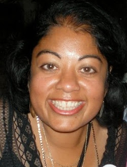
tksajeev talks exclusively with Shraddha Swaroop for www.newspaperdesign.in
On Layout
I prefer a vertical layout because it lends itself to providing emotion, impact and motion while pulling the whole page together so it becomes an organic experience for the reader.
On International standard
I can tell you that I think a person’s standards are different depending on their training, experience and the people who have taught them. When I look at any type of design, I look at how the visual journalist has treated color, typography, photo play and if they have respected the grid. If all of those items have been, at a minimum, been treated with respect then that is the beginning of successful design. The design should tell the story in the easiest, simplest best way possible for the reader or user. If it does all that and provided a visual surprise for the reader it begins to approach excellent design.

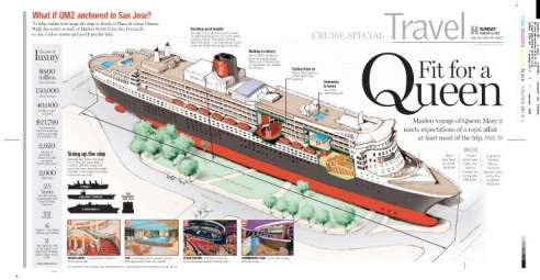
Shraddha’s page:Alternative story form using graphics & illustrations (San Jose Mercury News)
Designers and Editors
The best way to work as a designer in any situation is to be collaborative. I’ve worked in newsrooms where editors are more powerful than designers, where designers are more powerful than editors and where they have equal say in the final product. In all three of these situations I sought out the editors, reporters, graphic reporter, photographer –everyone whose work will be represented on my page – and discussed with them the story we collectively will tell the reader. When you create a relationship with these people and your work, that everyone sees the next day, reflects what was borne from the discussion you will gain the trust of everyone involved in the process. Once you have their trust, then you will have a stronger voice in the process. And as you gain more trust, then you can suggest some of your more innovative design ideas … and you may be surprised when those ideas are praised as just the thing needed to tell that story. Just remember all the time that you are part of a storytelling team which includes the editors, photographers, graphic artists and copy editors. Not someone dictating your actions to your fellow team members.
Shraddha’s page: Alternative Story Form using illustrated icons (Los Angeles Times Travel section)
Modular and beyond
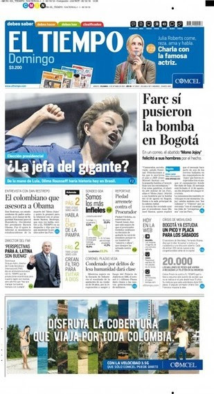
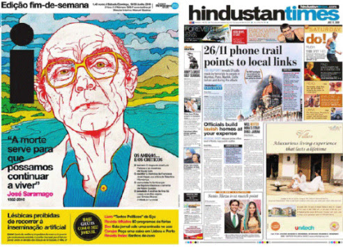
If any trend beyond modular layout is emerging it is the tendency of newspapers to go for a more adventurous, interesting, magazine-like look especially at papers abroad. You see this in Mario Garcia’s recent redesign of El Tiempo and definitely at the Hindustan Times, La Presse, The Globe and Mail, and i.
India and SND
I don’t think changing the practices of SND contest judging is going to www.snd.org help Indian designers and art directors send in entries. I agree that India has one of the largest numbers of newspapers around. Conversely, it has one of the smallest in numbers of SND members – only one person.However, I think that having a SND region in India would make all thedifference in getting Indian designers informed about the contest and getting them to send in entries for the annual competition that is judged in Syracuse, N.Y. annually. As more Indians become members you will see a growth in the number of entries from India and consequently more awards for India
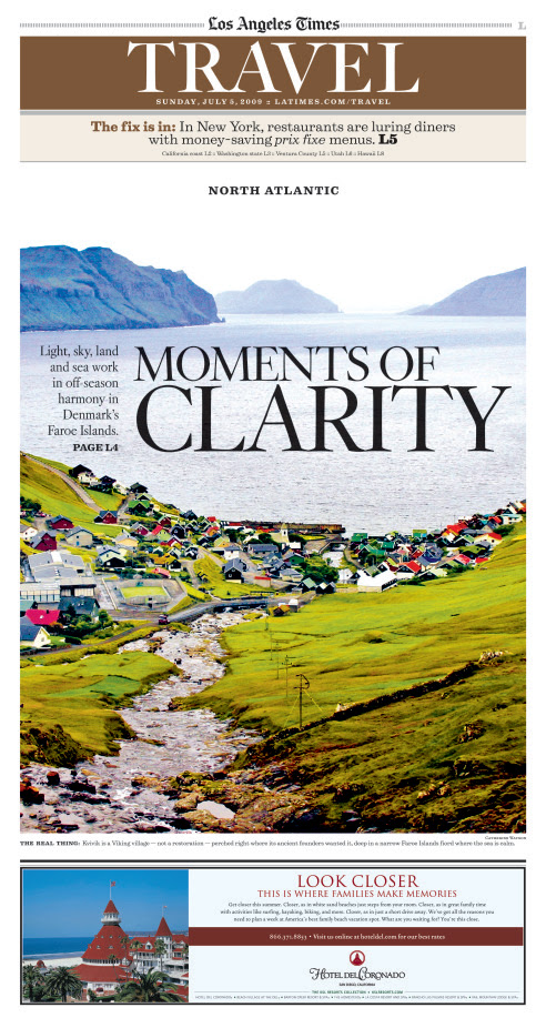
use of photo for impact (Los Angeles Times Travel section)
On Mario’s thought
What Mario Garcia said is American design has been less innovative than design happening in elsewhere in the world including Latin America, India, China, Russia, etc. I think that is changing but the design by U.S. papers is still stagnating due to financial pressures, fear and tradition. A positive attitude, passion about doing excellent journalism and a willingness to try new things are what is needed to combat reasons for stagnation I cited above. I have seen what happens when you put those three components together right here in the United States, When you have that you create an exciting, vibrant, charged atmosphere where the journalists are saying “Yes, let’s do that!” instead “No, I don’t think the readers are going to go for that.” This synergy will make all the difference in nurturing our print product back to health. I think the United States has many examples of innovation happening at its newspapers. As Ron Reason cited in his blog post.
(http://ronreason.com/ designwithreason/2010/10/06/innovation-in-u-s…) there are several reasons to celebrate U.S. newspaper design which include: Seattle’s alt-weekly The Stranger: This publication has some wonderful content packaged in a snarky, color way that boldly touts their editorial, marketing and advertising content. They clearly know their audience and aren’t afraid to be playful with it. McSweeney’s San Francisco Panarama: This one-time only gorgeous, informative piece of journalism was envisioned as a massive love letter to Sunday newspapers of another era. It’s just a pleasure to peruse as it includes compelling writing, illustrations, photography and even comics! If you never got yourself a copy you can buy one through Amazon . And then there are the innovative strides that are made daily at free daily, tabloids like Red Eye of the Chicago Tribune, Express which is published by the Washington Post Co. and even the now-deceased Link which was published by the Virginian-Pilot several months ago.
On approaching a page
My approach to designing any page including Page One is to look to the stories. Which is to say to read the stories, look at the photographs and the graphics that are all a part of the storytelling package. After I have done that and have been told by my editors the priorities of the stories, I will turn to paper and pencil to sketch out several possible design solutions for the page. While all of them succeed a telling the stories the design can vary widely. I make one traditional, one wildly innovative and the rest fall in between those two extremes. After I am finished sketching, I will look at the ideas I have come up with. Often the page that I end up will take different storytelling ideas from my sketches and put them together for my final design. Then, of course, I need to show a version or a couple versions to my boss to make sure it works for him or her.
Photo Editing
Photography and the way we display it in the United States is excellent. As Mario Garcia said, “most importantly, NOBODY does photo journalism like the American newspapers do, even today; our photojournalists are that, men and women trained in journalism schools, for the most part, who bring to their craft all that is good and worth knowing about the reporting of the story. I heartily agree with that. That is profoundly true at the newspaper I work at now: The Los Angeles Times has a staff of the best and most celebrated photo journalists around. Since they are so good often I don’t have to crop their photos at all. Often the way that they come to me tells the story and provide emotion, impact and motion for the story and the page. You can see more examples of paper’s fine photography at www.latimes.com
Broadsheet and Tabloid
Well, since you have far less space designing a tabloid than a broadsheet that is the main difference. I find that I edit myself – stories, photographs, graphics – much more rigidly when I am designing for a tab than if I have a broadsheet space to play with. Usually there is only one story per page so the tabloid page often has more impact and emotion.
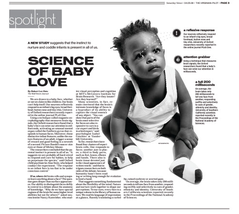
Shraddha’s page:example of b&w tabloid page (The Virginian-Pilot main news section)
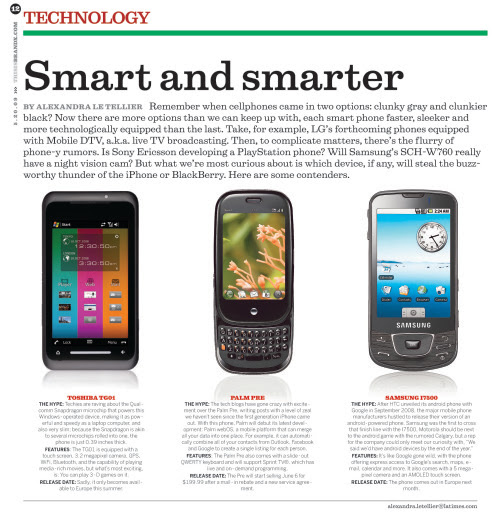
another tabloid page showing an alternative story form (Brand X page done at the LA Times)
Picture Paper
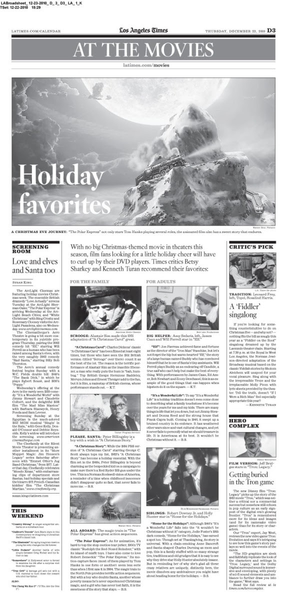
Shraddha’s latest page
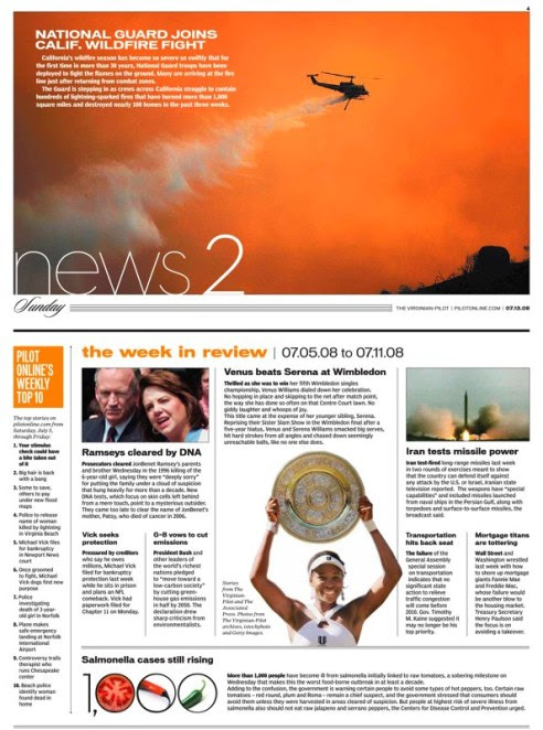
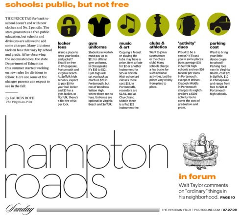
Shraddha’s page:Alternative story form with bold use of photography (The Virginian-Pilot)
![]()

