First was Good Trouble, a lively orange-and-black political broadsheet newspaper developed from a website with editor Rod Stanley (second issue due soon). Then there was his reinvention of Mushpit – already a fabulous editorial confection – as a contemporary glossy zine packed with the typographic language, social media and meme references familiar to anyone who has followed Turley’s social media channels. His designs lifted the magazine, matching the wit and invention of its existing editorial character.
Now he’s co-founded his own publication with a couple of New York friends, Lucas Mascatello and Mia Kerin.

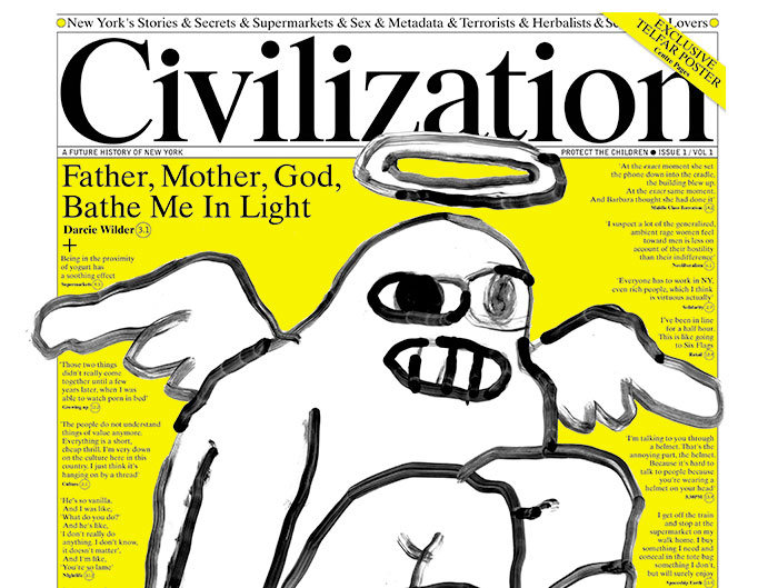
Civilization is another newspaper-format publication. ‘I was totally inspired by Good Trouble,’ Turley told recently, ‘I’d had such fun doing it I wondered after doing it whether I could do my own paper.’
‘Then at the start of the year I was in a magazine store and realised that the NY media had gone to sleep of late on actually covering New York. They’ve either scaled up to deal with Trump/shitty men or closed down completely. So maybe… just maybe… there’s a bit of a gap in the market.’

The result is a 16-page publication that aims to reflect its home city, New York. ‘We want it to feel like spending a day in the city, with fragments of life interrupting you. Little scenes playing out, random conversations.’

The densely-packed pages are a visual treat, instantly recognisable to anyone who read Turley-era Businessweek or the latest Mushpit. Deliberately wordy – ‘I think we’ve become over reliant on pictures,’ says Turley, ‘so there’s only one big image, in the the centre spread’ – it is a text collage, with stories spread axcross the pages and interrupting each other. Flashes of infographics, display fonts and spot yellow break the otherwise plain B&W pages.

With more attention paid to the people of New York than the city’s culture or politics, Civilization is full enough that it makes a virtue of its sometimes meandering editorial direction. 16 pages doesn’t sound much but those pages are full.
It’s a glorious experiment, but perhaps the most intriguing thing is how its design effortlessly refers to a previous generation of editorial design. Many elements – including the front cover – are almost timeless, with a logo by Paul Barnes and artwork by Kurt Woerpel. It’s this balance between classic editorial design and the pulling apart of the same that is so exciting, the end result sits comfortably alongside the long history of the alternative press.
![]()


