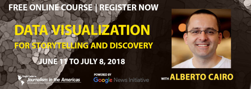
This free online course is co-ordinated by Knight Center for Journalism in the Americas
Here is the Press release :
We are thrilled to announce a new free online course on data visualization with Alberto Cairo, one of the best #datavis experts in the world.
You don’t need to be a designer to learn how to assemble amazing interactive and static data visualization pieces. But, if you are designer, you can still learn new tools and tricks from Alberto.
Sign up now for the massive open online course (MOOC) “Data Visualization for Storytelling and Discovery,” offered by the Knight Center at the University of Texas at Austin and powered by Google News Initiative.
This four-week online course will run from June 11 to July 8, 2018, totally on the internet and with a lot of flexibility. You can complete it during the days and times that are most convenient for you, during the four-week period.
With video classes, presentations, readings, quizzes and discussion forums, students will learn how to use different graphical representations like histograms, bar graphs, maps, line charts and scatter plots, and tools like Google Sheets, Data Wrangler, Excel, INZight and Flourish. During the last week, students can share the projects they produced as part of the course and receive feedback from colleagues and from the instructor.
Please read this blog post and go to the course page to see the program and watch a short video that gives more details about the course.
This is an amazing course and we are grateful to Alberto Cairo and to Google News Initiative for making it possible.


