The Economist’s designers on the thinking behind its fresh look

The last time The Economist’s pages were redesigned, George W. Bush was settling into the White House, the dotcom bubble had just burst and Geri Halliwell sat atop the British charts with “It’s Raining Men”. All editorial pages in The Economist became full colour and were furnished with a new typeface. At the time Bill Emmott, the newspaper’s editor, wrote: “Good design, like good writing, should blend into the background; it should be the servant of editors and readers alike, not their master.”
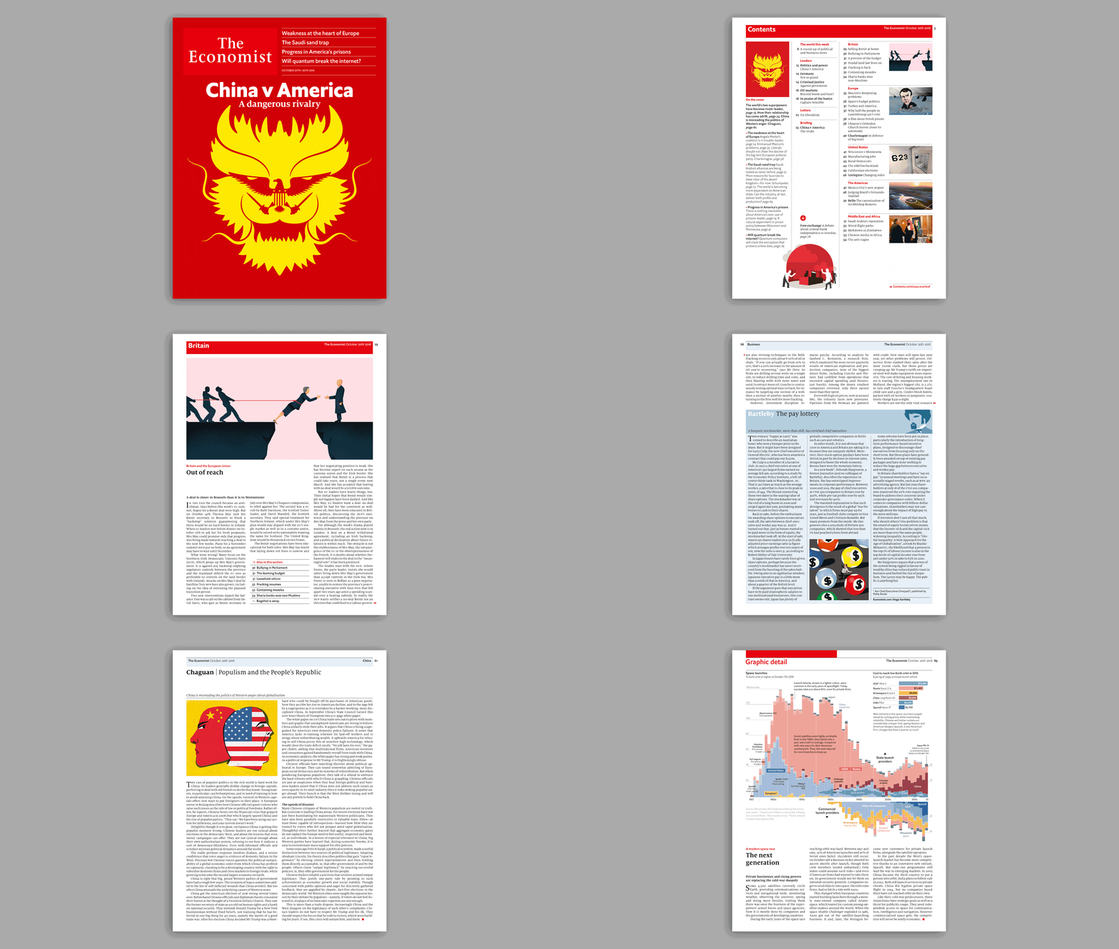
That iteration of the paper served readers well for the past 17 years, but it needed to be updated. From this week, The Economist has a fresher look, with typefaces better suited to both print and digital formats, new column idents and a new weekly section called “Graphic detail”, featuring stories told through data visualisation. It is the last step in a multi-year process to align the look and feel of every iteration of The Economist, on the web, in our apps and now in print.
The driving forces behind the revamp are Phil Kenny, head of graphics, and Stephen Petch, art director. They talked to Bo Franklin about the challenges of reimagining the newspaper—and why the pages of The Economist have an enduring link with railways.
Why did the paper need to be brought up to date, and what took so long?
Phil Kenny: The last redesign was in 2001. Ordinarily a publication would refresh every seven years or so. We’ve gone 17 years. If nothing else it was overdue. It was starting to look tired. That was our own opinion, but we also heard it externally. The print edition is our flagship product, but it’s just the final part of a much wider exercise to modernise and align our design. So our website already uses the new branding and typefaces, all our apps use it too, and the newspaper is just the last product to come into line with that.
Stephen Petch: Sometimes you need to re-examine things. What started out as a strict set of design rules in 2001 has become a bit flabby. People no longer realise the intended purpose of the design rules. So it’s a chance to re-examine all that.
So what’s changed?
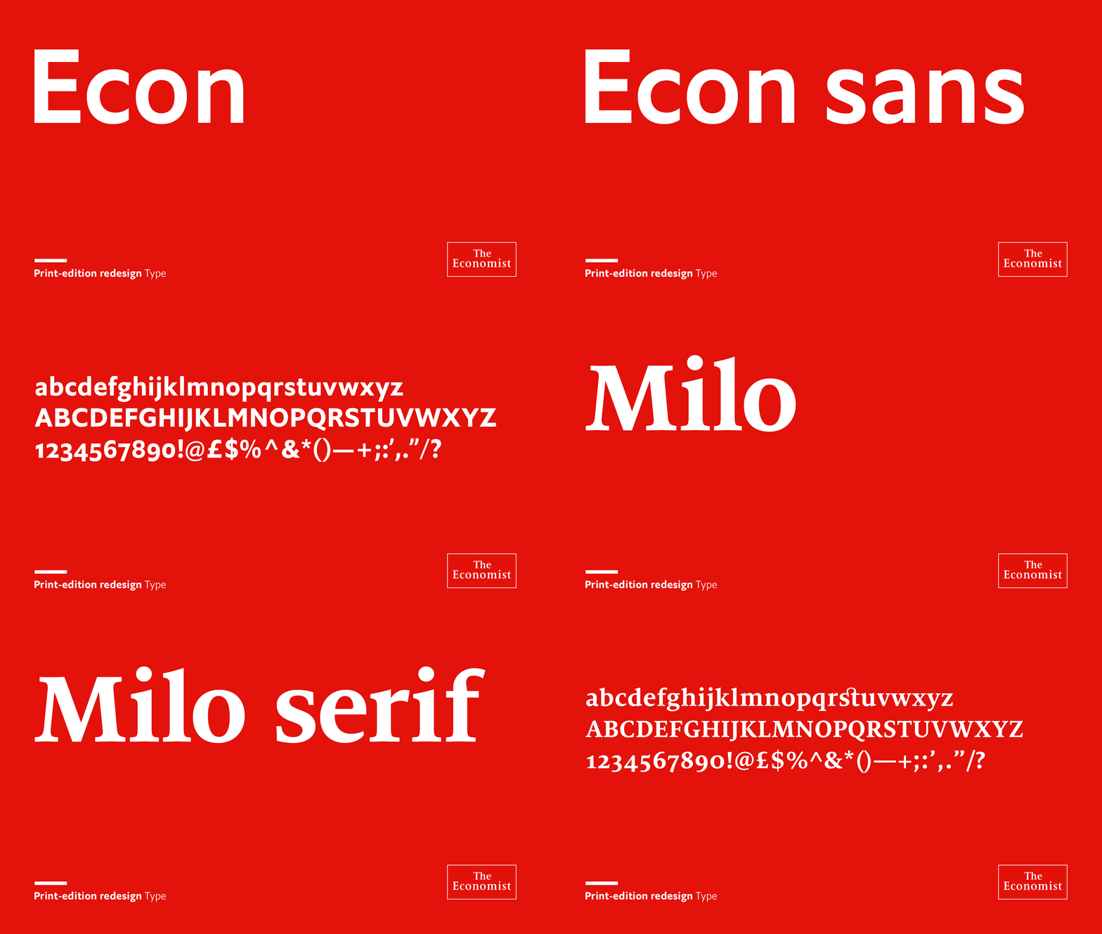
SP: The whole thing starts with the reading experience, so we needed to make sure the typefaces work. If you can’t read the paper, clearly it’s not doing its job. I think the new typefaces, Milo Serif and Econ Sans, work particularly well. They give the pages an airier, less forbidding feel. And a British feel too. The previous typeface could be a bit overbearing. It’s something we hear back from our subscribers, and people who unsubscribe; there can be too much to read and navigate. I was quite reluctant to go through the whole market-research process, but it was beneficial. When it came to updating the way the text reads, we found that most people prefer the changes.
PK: The idents that Stephen’s put on the three-quarter length columns are by an artist called Noma Bar, who we work with a lot. He’s worked on a lot of our covers, but also the blog idents online — now they tie in to the print columns too. There’s a stronger connection with what readers see online, in apps and in print. It’s all part of the same family.

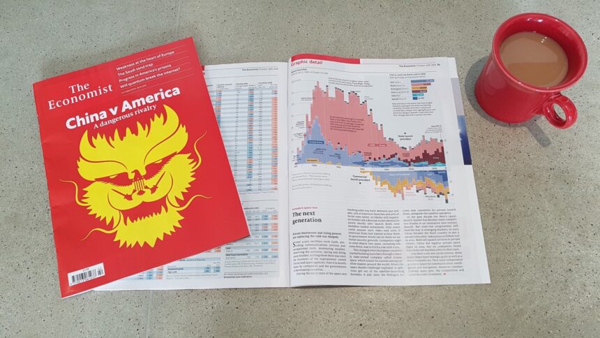
PK: And there’s the new data section, “Graphic detail”. The paper has always been text-heavy, so there’s a constraint on data visualisation. We became attuned to getting a lot of info into a small space. Going back to the 19th century, The Economist always had data storytelling. But text won the fight against graphics somewhere along the line. In the 1980s there were full pages of data vis, and they’ve since been compressed. Now they’re back.
We were so well versed in it online, because you’ve got infinite scroll-ability on a webpage. We have already been putting out great quality, large data vis features on the website with no outlet in print. Now we have redressed the balance. And it’s probably the first example of a digital product finding its way back into print, rather than the other way round.
You mentioned the British feel of the new typefaces. How can text have a British feel?
SP: Well you can’t get more British than Johnston, which is the London Underground typeface. I guess these things are subliminal. That was chosen by Edenspiekermann, the design agency that was part of the redesign early on. They were probably looking at Johnston and Gill Sans, all these British humanist typefaces, sort of early 20th century…
PK: And the new Econ Sans typeface isn’t quite Gill or Johnston, but it’s a close relative, and it has similar characteristics.
SP: Whereas Officina [The Economist’s previous typeface] is very… German. That’s a good thing, and one of the things I was briefed on when I came in. Ed [Carr, deputy editor] said our design is very German. I guess what he means is that it’s very structured, rigorous and calm.
PK: Erik Spiekermann was the designer who put Officina together, and he designed a rail system typeface in Germany too. It all comes back to the railways somehow. Our early issues from the 1840s were subtitled “the Banker’s gazette & Railway Monitor”.

Which of The Economist’s visual elements have you preserved and enhanced?
SP: We almost lost the blue running heads [at the top of each page]. Navigation is a really important part of such a text-heavy publication. So we’ve enhanced it by beefing up the section openers, and we retained the mini contents. We realised, speaking to readers, that many of them use the mini contents to navigate, rather than the main contents page. There are lots of things that could have been pushed out just for the sake of it. Being a dense publication, you need something to create a bit of an anchor point. So these navigational elements are bolder than they were. We’re generally going for the three-column openers [the images on the first page of each section] to give a bit more punch to each section as well.
PK: We spoke to lapsed subscribers and first-time readers in London and New York, our biggest readership being in America. Subscribers’ reading habits are often very rigid. They know which section they like to read first, so they go straight there. Some will go straight to the back and read the obituary, then work in. Hence we kept the mini contents. And in terms of clarity, data vis is something we’re known for, being clear, direct and to the point without being boring. So we’ve had a tweak of the design to further clarify the charts and cartography as well, as well as introducing the “Graphic detail” section.
SP: The brief from Zanny [Minton Beddoes, editor in chief] was always evolution rather than revolution. There’s no need to change what is a successful product. So it was always treading a line between making it sufficiently better to add value for the reader, and retaining the visual language of The Economist.
Will the covers look any different?
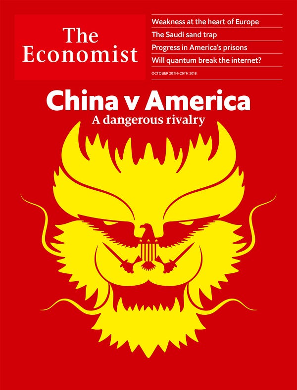
SP: The covers are the obvious shop window. We’ve been simplifying them slowly for the past two years, as there was often a bit too much going on. I’m sure you’ve witnessed the system where you have editors, almost a committee of people, trying to agree on a direction for the cover, much like they would with a leader article. Does that always translate? I’m not sure it works quite so well when you’re trying to create a visual story. We’ve turned that around, and moved towards a simpler, more conceptual style of illustration.

We have a wall of covers outside Zanny’s office. If you compare that to two years ago, you’ll see quite the difference. They’re evolving all the time. Graphic designers, myself included, can easily get a self-indulgent or self-important, but we have to retain the wit that The Economist is known for — just focused a bit more. Shorten the visual jokes.
How long do you see this latest iteration lasting?
PK: Seven years?
SP: Seven years, yeah. Although there’s this assumption that unlike digital, print is fixed. But print is essentially digital as well now, apart from the output. We’ve pretty much redesigned like-for-like, but further down the line there will be editorial innovation, different columns and ways of presenting the information, maybe more visual information. So you can tweak things, and that might well happen.
PK: I’ve been here long enough to remember the last redesign, and we did tweak it after launch. Not everything works straight away.
SP: We’re going to get feedback from readers too. We’ve had rounds and rounds of editor feedback, but it’s the readers’ turn now. Zanny is inviting it.
Data journalism at The Economist gets a home of its own in print
![]()


