I’ve always been skeptical about claims that data visualization can elicit empathy. Not in the sense of bringing attention to people’s suffering —I think it can be used for that for sure— but in the sense of making you feel a tiny bit of that suffering. Paul Bloom’s Against Empathy explains that there’s a difference between between rational compassion, which sometimes is confused with empathy, and his narrower definition of empathy. I used to believe that visualization can foster the former, but not the latter.
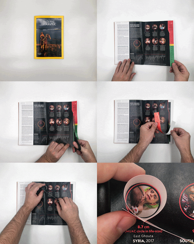
I’m not that skeptical anymore. The reason is this graphic by National Geographic magazine’s Alberto Lucas, which just won the Best of Show award at Malofiej; I was the president of the jury this year:
Once I realized that the size of the red circles is the actual circumference of those children’s upper arms, I felt my stomach tighten. I didn’t even need to see the children’s photographs to feel uneasy and worried. The bracelet on the right is a genius addition.
![]()


