Well-known infographic specialist Charles Apple describes how he created this graphics
Here in the U.S., Memorial Day is a day in which we remember our military dead. As opposed to Veterans Day in November, when we remember everyone who served in the military.
It’s a National holiday here and an important one — one in which we visit graveyards and display the U.S. flag.
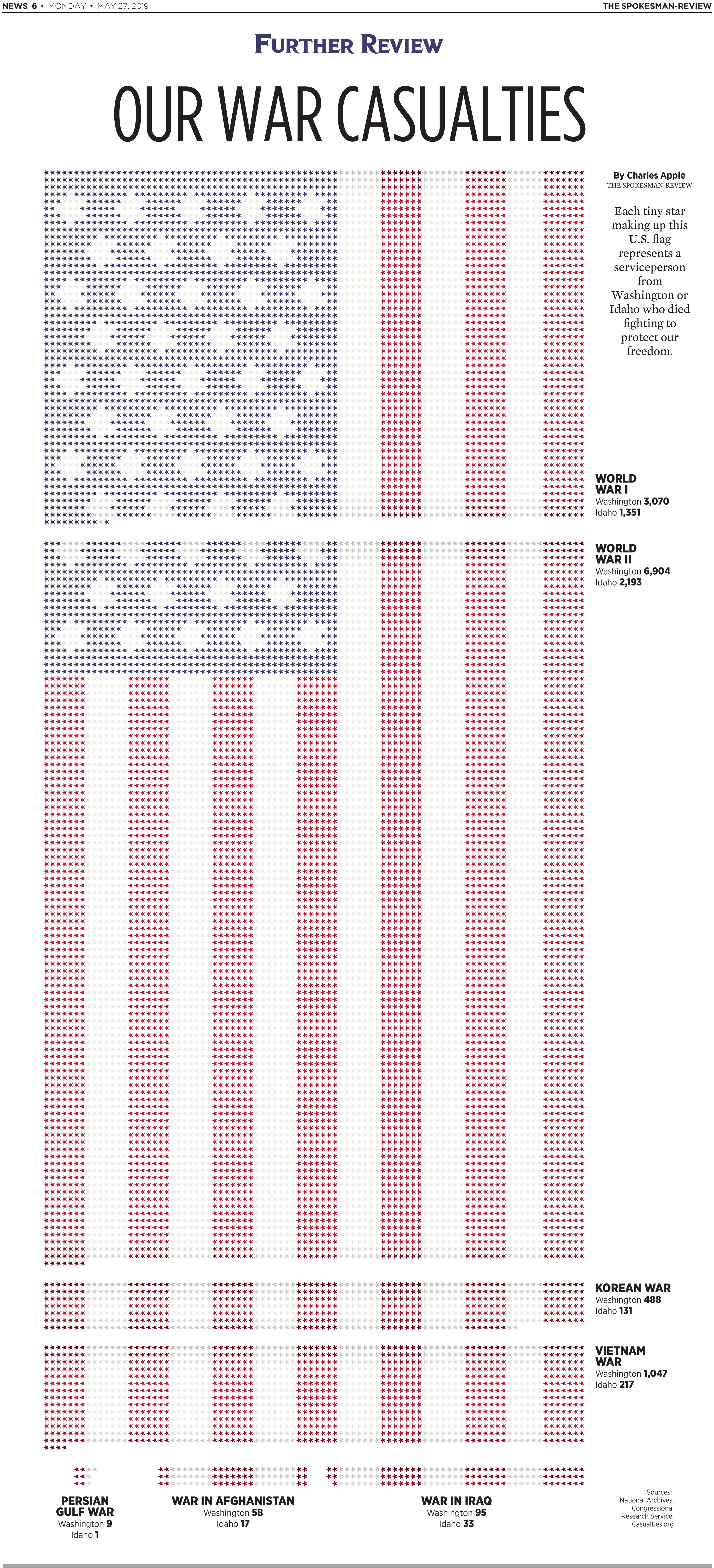
For today’s Spokesman-Review, I built a nearly-full-page U.S. flag out of tiny little stars. Each star represents a fallen soldier from either Washington state or Idaho — the city of Spokane sits near the border of Washington and circulates widely in both states.
I’ve done graphics like this before: I tried hard to get the Houston Chronicle to run one three years ago, but the editor wasn’t interested. So the process was fairly easy this time around.
The first step was to find out how many war dead the two states had for each of the armed U.S. conflicts. That data came from the National Archives in Washington, D.C. and from a veterans’ group. It’s broken down by conflict: World War I, World War II, the Korean War, Vietnam and then our more recent wars in the Middle East.
From there, it was just a matter of math. I started out with 90 stars across and calculated how many I’d need for each segment. This can be complicated because the U.S. flag has 13 red-and-white stripes and 50 stars in the blue rectangle. So there were details to work out there, too.
I picked out a nice blue and red color to use for the little stars, plus a neutral color to substitute for “white.” I darkened the stars at the start and end of each segment to emphasize the breaks.
I probably spent three hours on the print page — an hour on the research and maybe two hours on the visual. There wasn’t much text to write, so that helped speed things up.
For every “Further Review” full-page graphic I do, however, we also like to build an online version. I work with our digital folks to come up with a way to do that — sometimes, my visuals don’t easily work in a digital environment. Full-page fever charts and giant timelines and whatnot.
For this one, I redrew the flag art with fewer stars on each row. For the print version, I used 90. For the digital version, I used 52. This (hopefully) means the little stars will show up when viewed on a smartphone.
I gave our intern, Colleen Bell, each flag segment separately and all the text in a separate text file. She used my PDF as a guide and worked from there. I’ve viewed the digital version on both my home laptop and on my iPhone. I’m awfully pleased with the result.
Here’s a link to the digital version:
http://www.spokesman.com/stories/2019/may/27/further-review-our-war-casualties/
![]()


