Kompas, South China Morning Post, Mathrubhumi, O Globo, Arab News and The National bagged Gold in the 5th International Newspaper Design Competition conducted by Asia’s first newspaperdesign website www.newspaperdesign.in
Video by Jury Head Charles Apple
BEST OF PAGE ONE
GOLD
Kompas
Judges comment
Charles Apple: Two days after 125 fans were killed in a stampede in a soccer stadium in East Java, Indonesia, Kompas of Jakarta paid tribute by listing all the victims on the front page. That’s not a zero — that’s meant to represent the stadium itself. Amazing work.
Jennifer: Outstanding tribute design, using limited a palette and space in the design. Thoughtful.
–
SILVER
Madhyamam
Judges comment
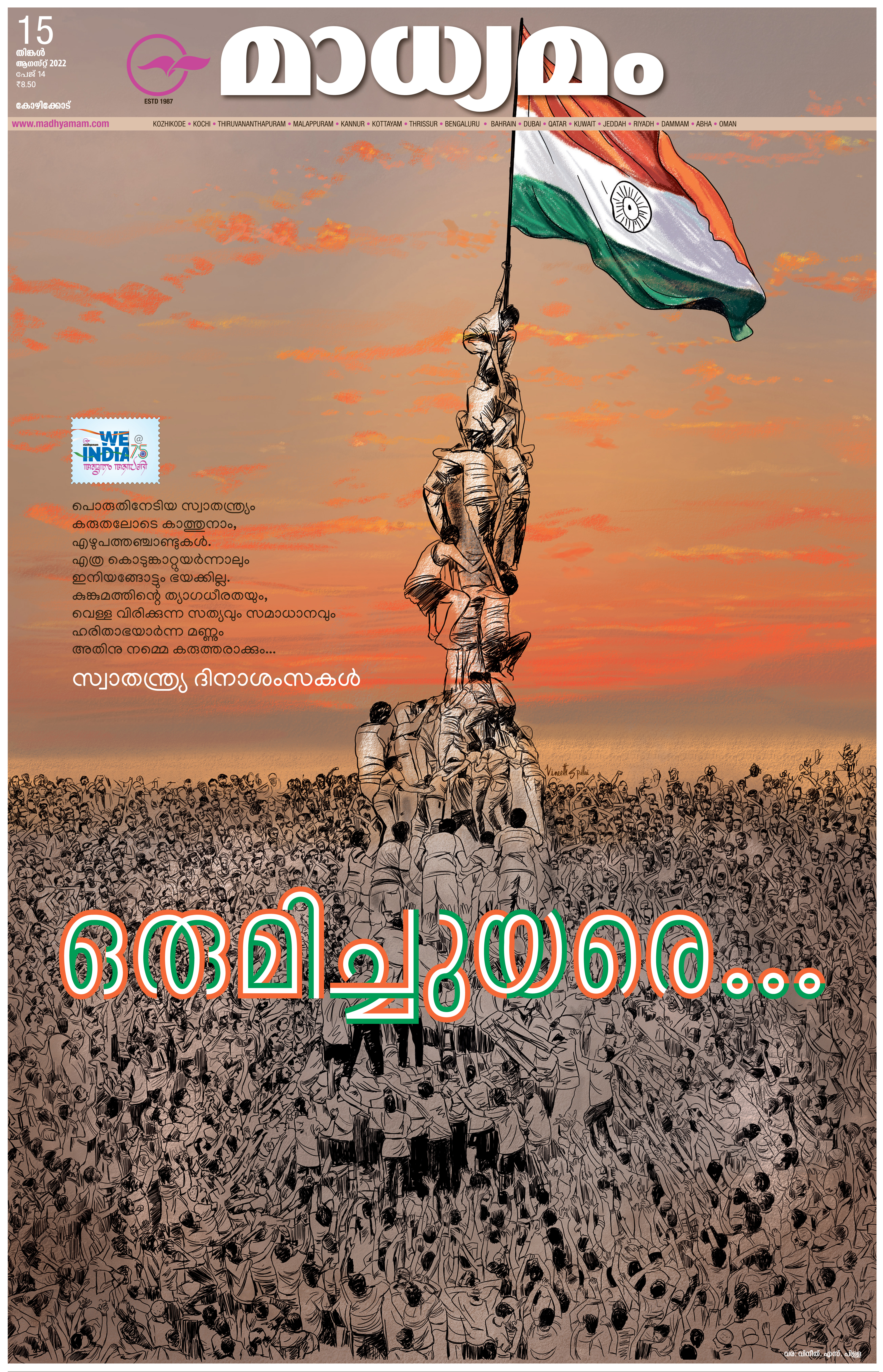
Charles: Madhyamam of Kerala, India, celebrated the nation’s 75th birthday with this gorgeous illustration of a crowd erecting a national flag at dawn. The line work is exquisite and the gorgeous color wash making up the sky sets off the national flag to great effect.
Jennifer: The use of illustration and letting it take over the page is an effective way to show the emotion and convey the importance of the event.
BRONZE
O Globo
Judges comment
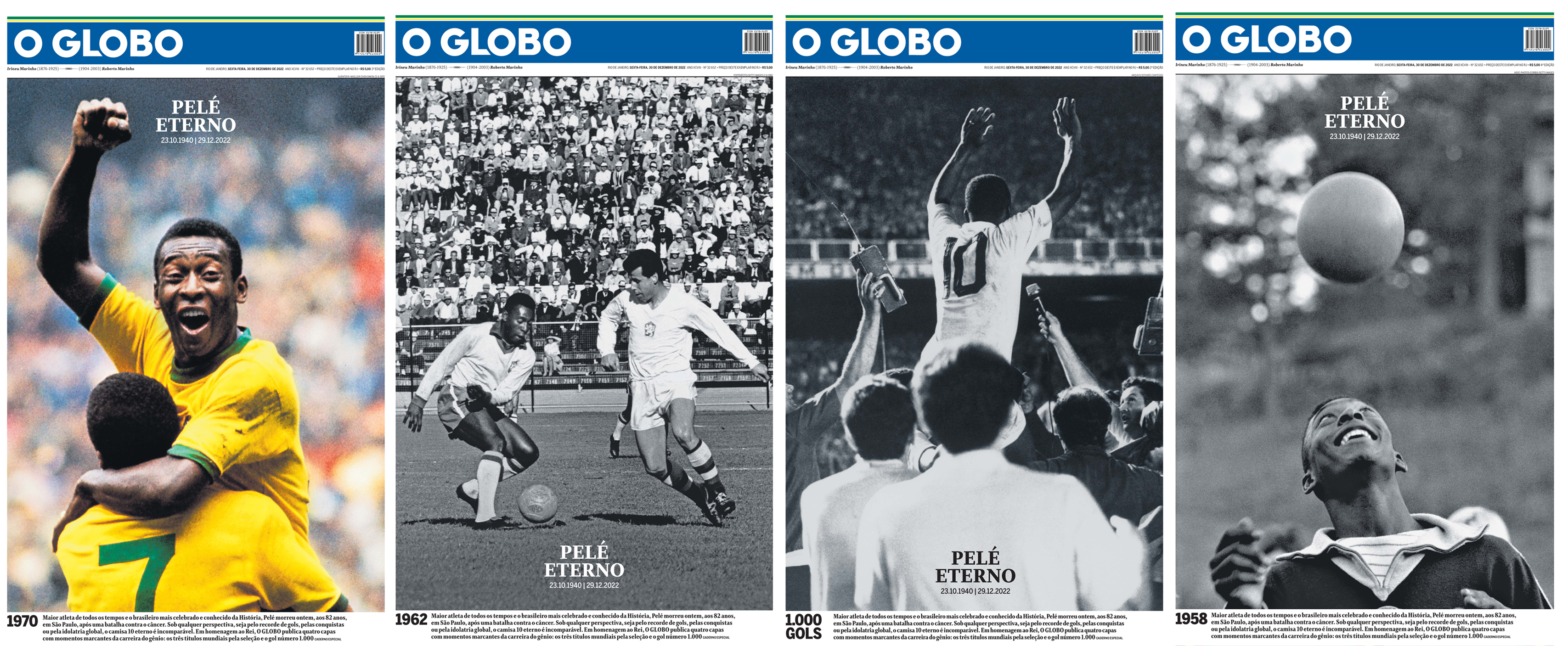
Jennifer: This page harnessed the power of design in playing its subject big and powerful, the same way that Pelé played the sport of soccer.
Charles: Having four alternate covers for the passing of Pelé was a powerful way to show his importance to the nation and to the world of sport. I agree with Jennifer that the best of the four was the last one, in which the King is bouncing a football on his head early in his career.
–
HONORABLE MENTION
The National
Judges comment
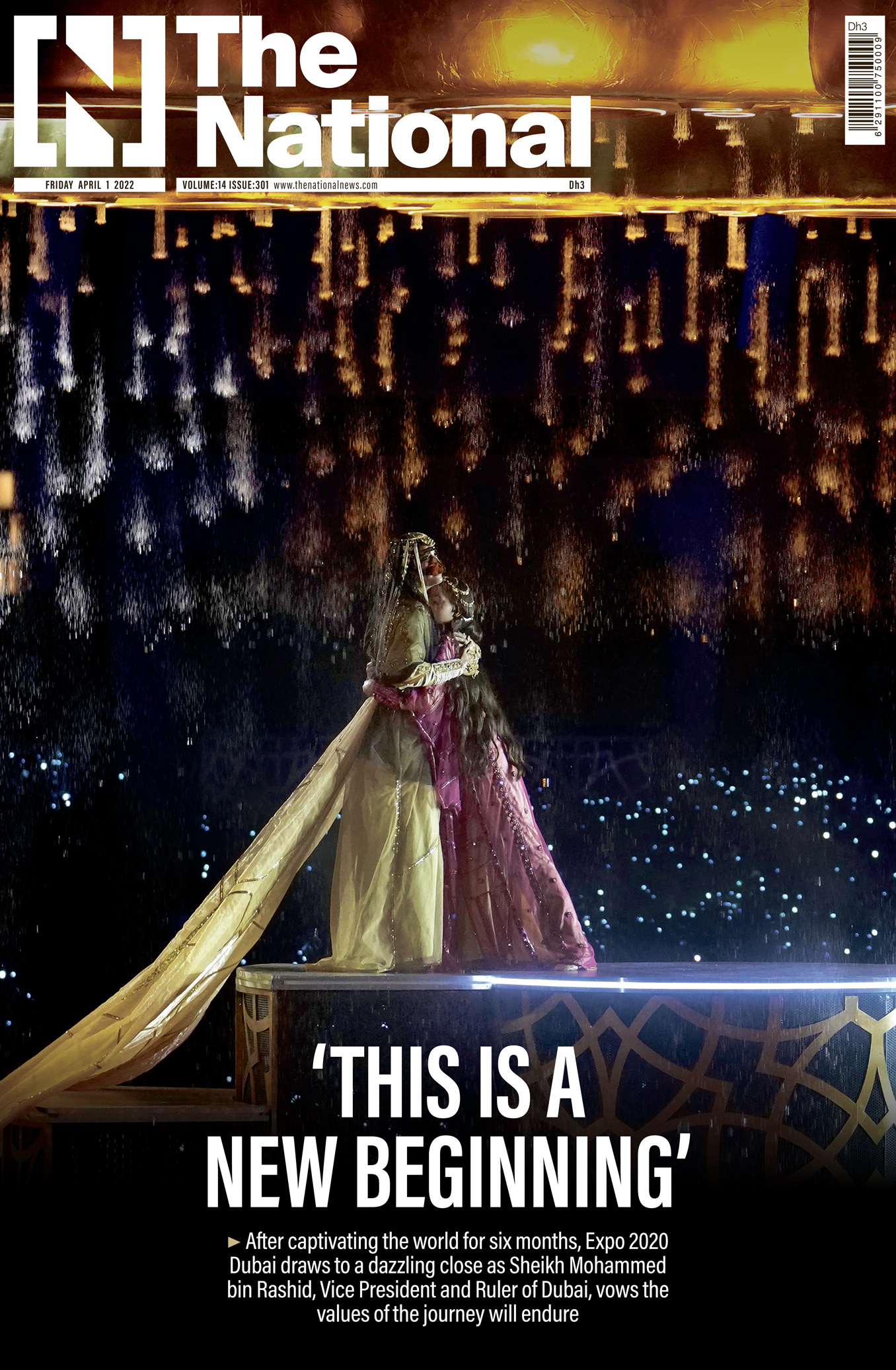
Charles: The photograph that fills the entirety of page one of this edition of The National of Abu Dhabi is a stunning shot of the ceremony that closed the world exposition in Dubai. It was an amazing moment and the photo is cropped and sized perfectly. The only tiny flaw: I’m not finding a credit here for the photographer — Ebrahim Noroozi of the Associated Press.
Jennifer: Wonderful use of the page using this amazing photography. The right way to capture such a momentous event.
–
HONORABLE MENTION
O Globo
Judges comment
Jennifer: Queen Elizabeth’s reign spanned 7 decades. Seeing her image though the ages in the same pose was thoughtful and served readers who remember her in different ways.
Charles: I love the idea of collecting these four profile photos of Elizabeth, allowing us to watch her age over time into the Queen we all knew.
BEST OF INFOGRAPHICS
GOLD
South China Morning Post
Judges comment
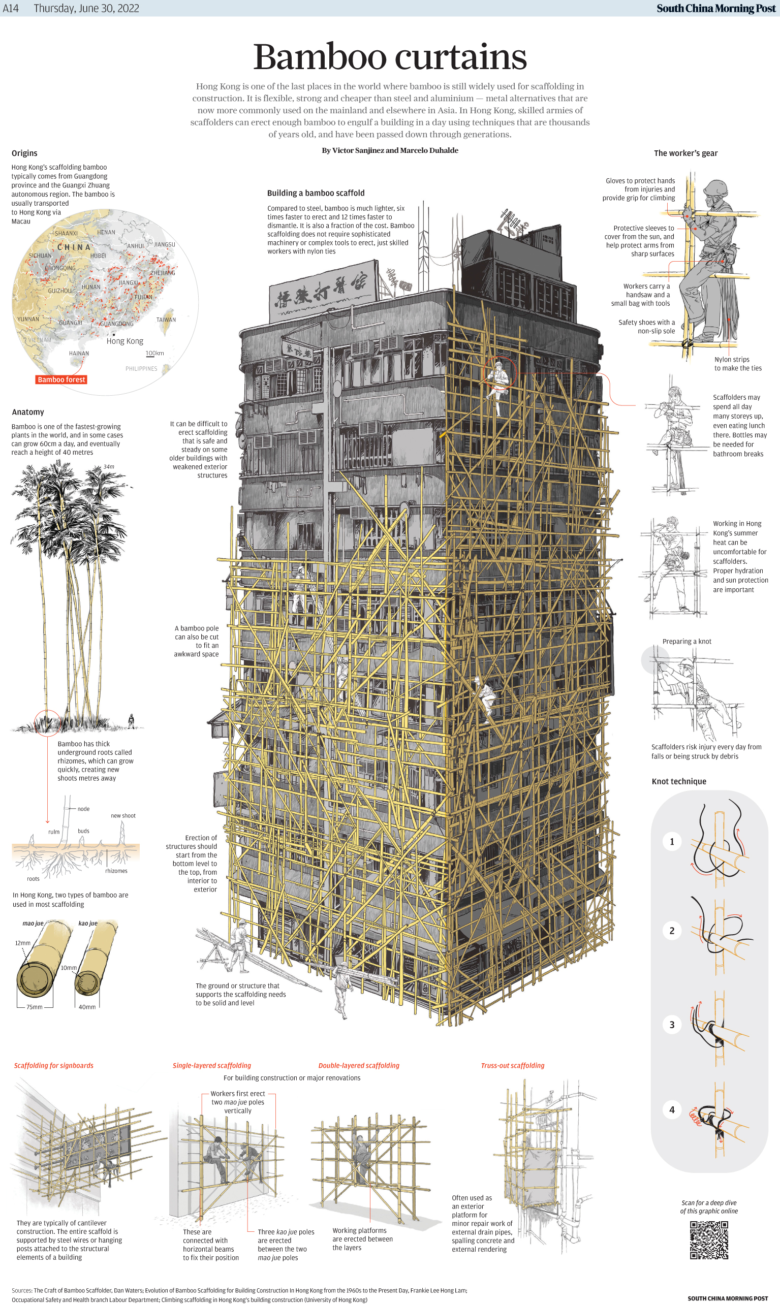
Chiqui: If it was possible, I would have awarded every single SMCP graphic, but this was my favorite since I first saw it. Elegant, clear, magnificent use of color. Simplicity to enhance clarity with excellent illustrations. Delightful.
Jennifer: You pointed out or drew each belonging and with a fantastic illustration style and detail. Colors? *Chef’s kiss*
SILVER
South China Morning Post
Judges comment
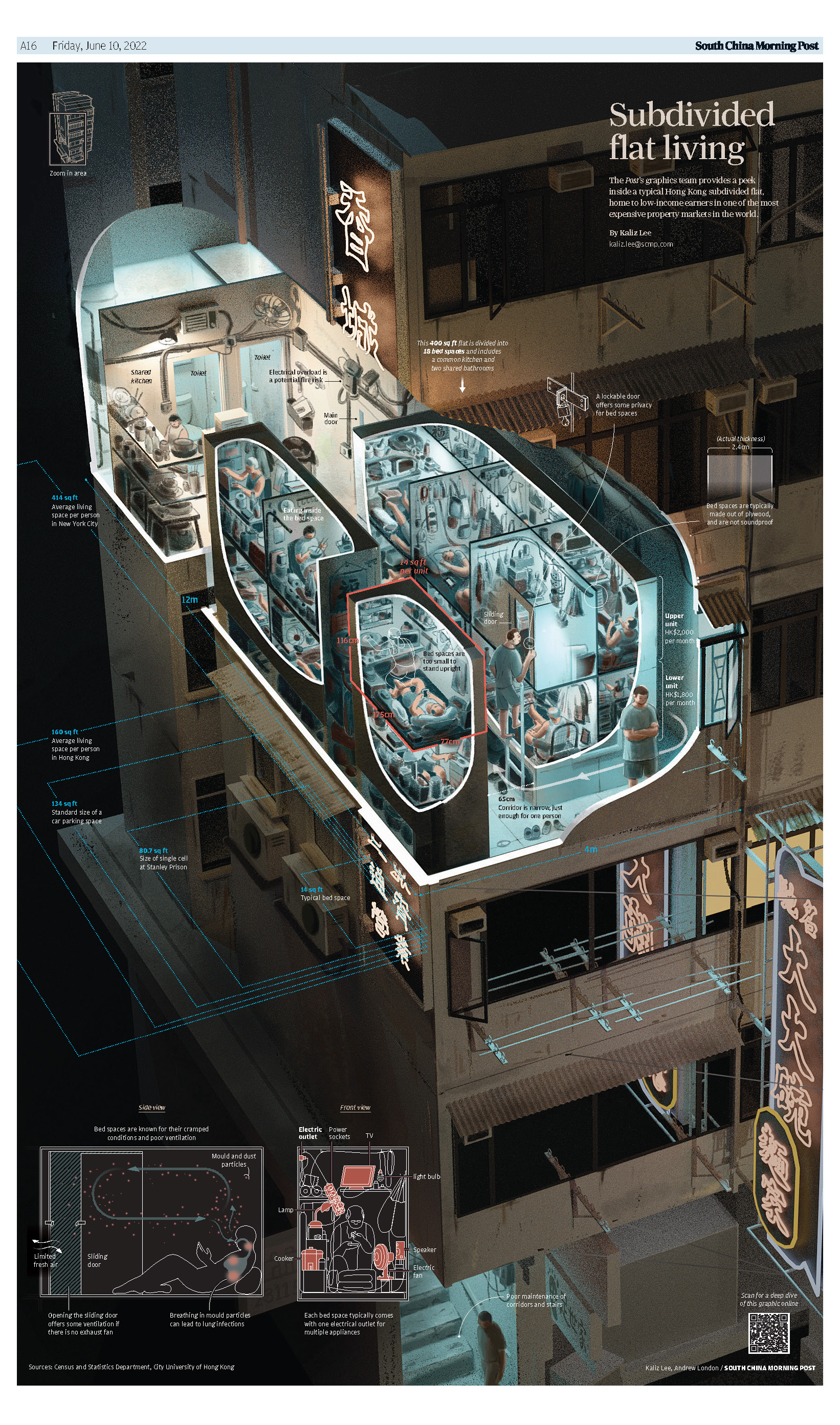
Jennifer: An inside look at subdivided flat living in Hong Kong gives an almost graphic novel quality with it’s warm and cool tones. Its detail gives a clarity and understanding to a life we would not normally see.
Chiqui: While the style of this graphics diverts from the well known clean line work and illustration that’s most typical from SCMP, it’s still masterful storytelling in a scene and strikes the right mood.
–
BRONZE
South China Morning Post
Judges comment
Chiqui: We can see here the typical SCMP simplicity, clarity and magnificent illustrations they are so good at. This is what SMCP does better than any other newspaper in the world, and they do it with local, interesting stories.
Jennifer: A huge fan of this, drawing from life, illustration style, especially for this topic. It hits all the marks that make a great informational graphic. Compelling, rich, simple.
–
HONORABLE MENTION
South China Morning Post
Judges comment
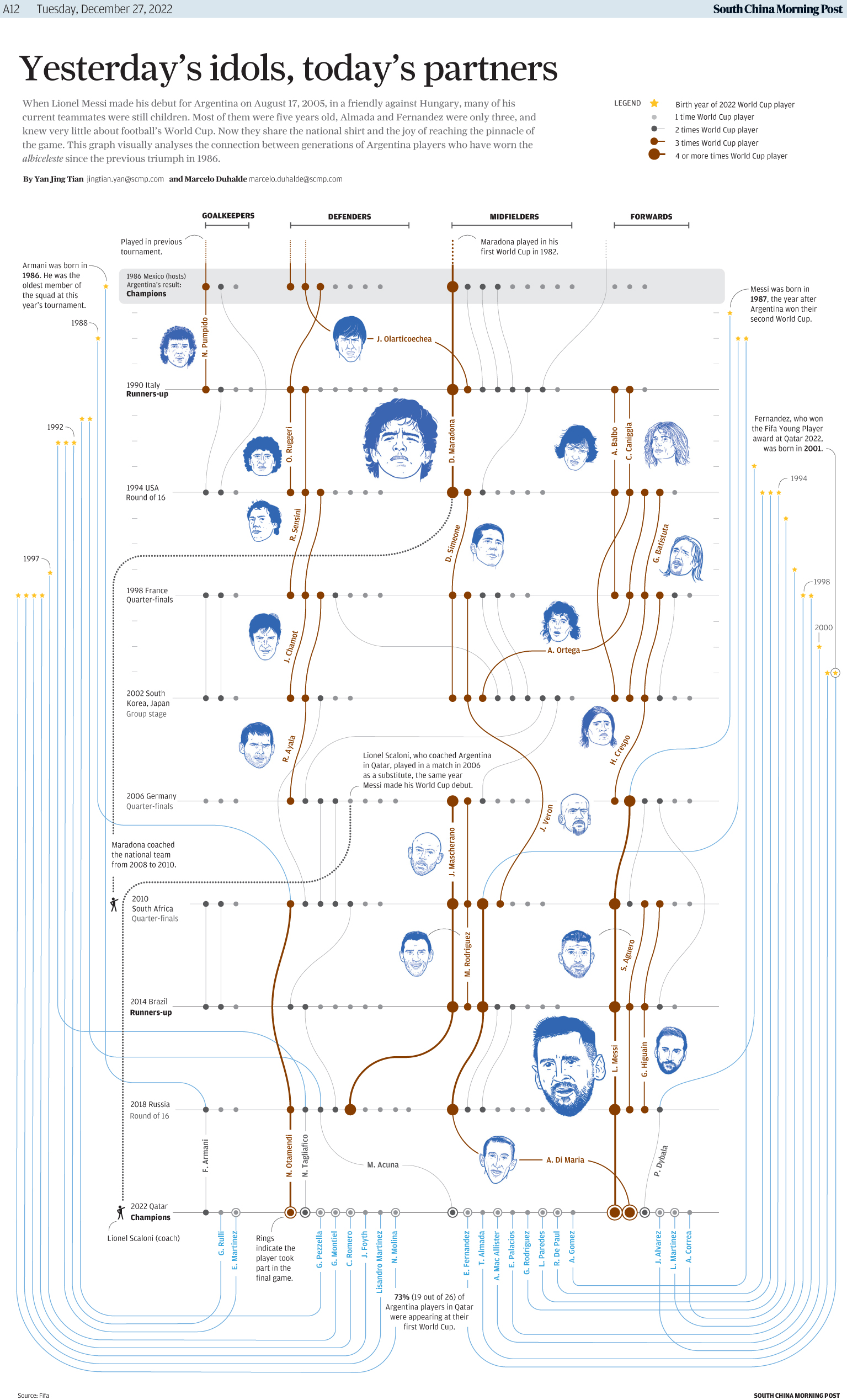
Jennifer: Wonderful analyses. It made me explore a sport that is fairly new to me. The use of illustration instead of photos fits this design so well.
Chiqui: As the soccer freak I admit to be, this was a wonderful walk through memory lane, beautifully combining illustration and dataviz.
–
HONORABLE MENTION
El Financiero
Judges comment
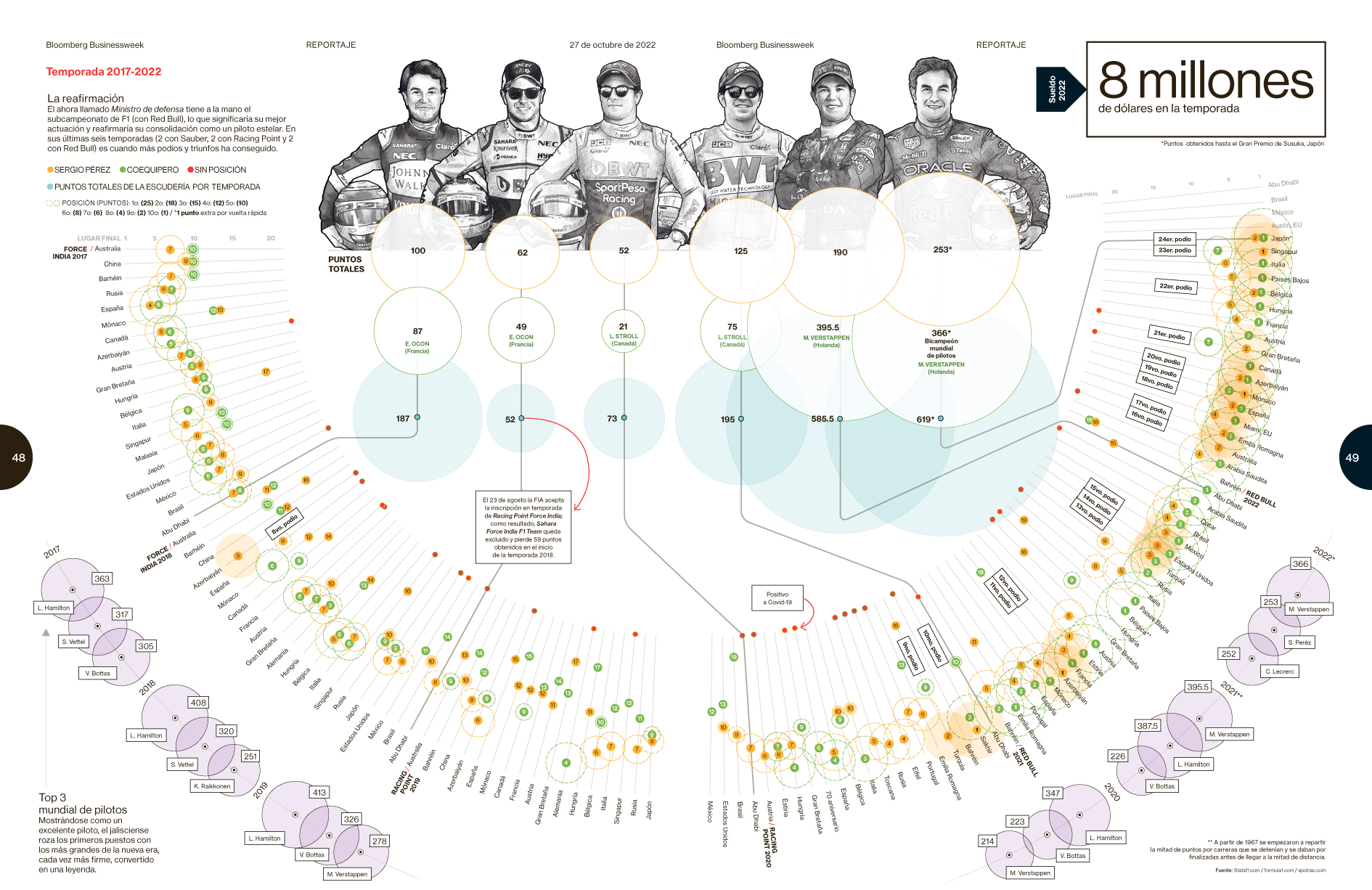
Chiqui: These complex data visualization are sometimes hard to follow. Not this time. It was actually very clear, very clean, sophisticated, and using color and design in a very effective way.
Jennifer: Data that is well organized, well thought out and well designed. Love the color choices.
BEST OF MESSI PAGES
GOLD
Mathrubhumi
Judges comment
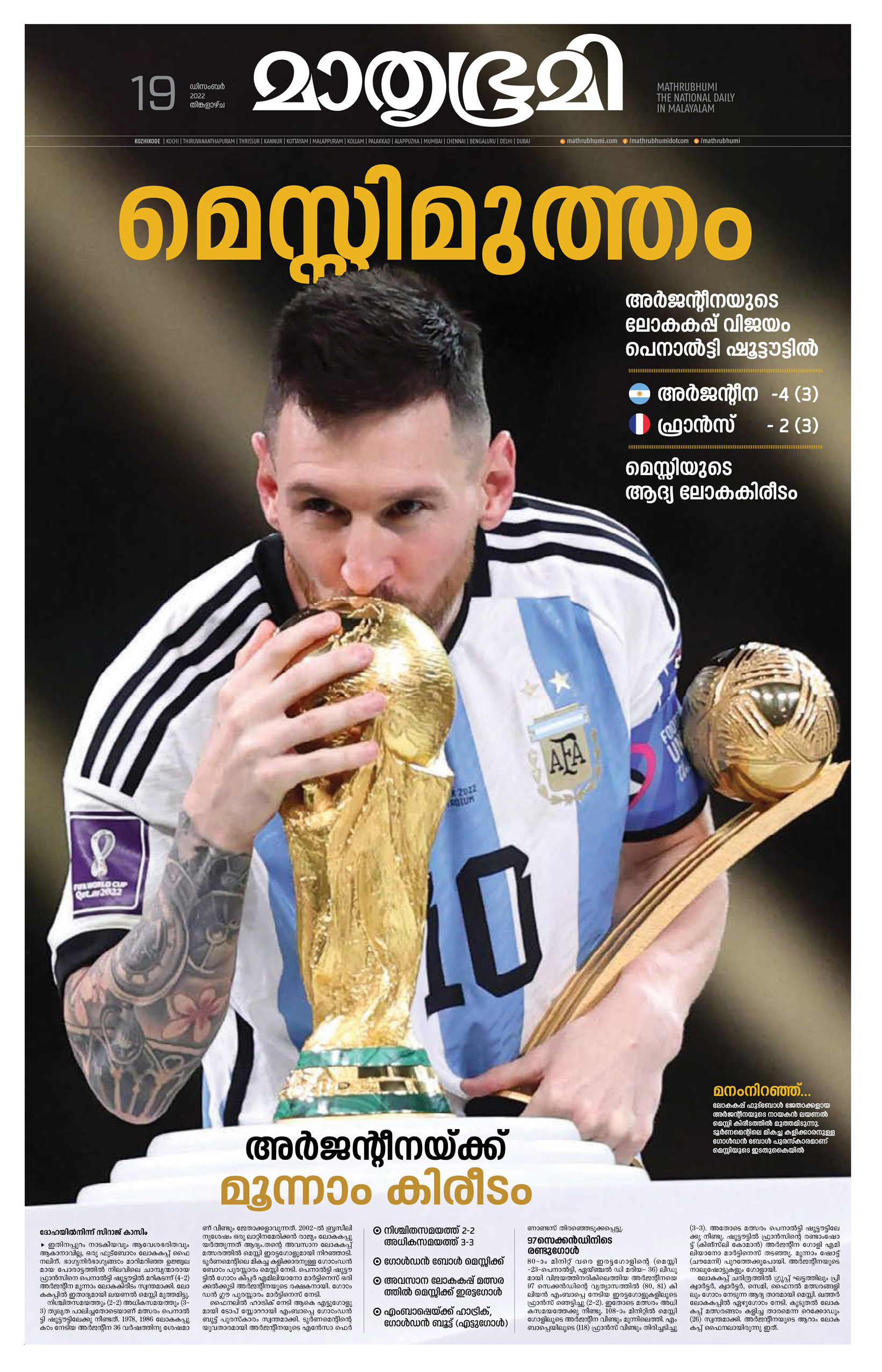
Gary: Before Qatar, Argentina hadn’t won the World Cup in 40 years. Now Messi is finally adding the cup to his collection of hardware. The kissing the trophy image says it all. And, as Charles says, when you get a great image, get the hell out of the way.
Charles: This was the big win for Messi and what everyone was talking about that day. Mathrubhumi of Kerala, India, ran the image big and tried not to overload the image with too much text.
–
SILVER
O Globo
Judges comment
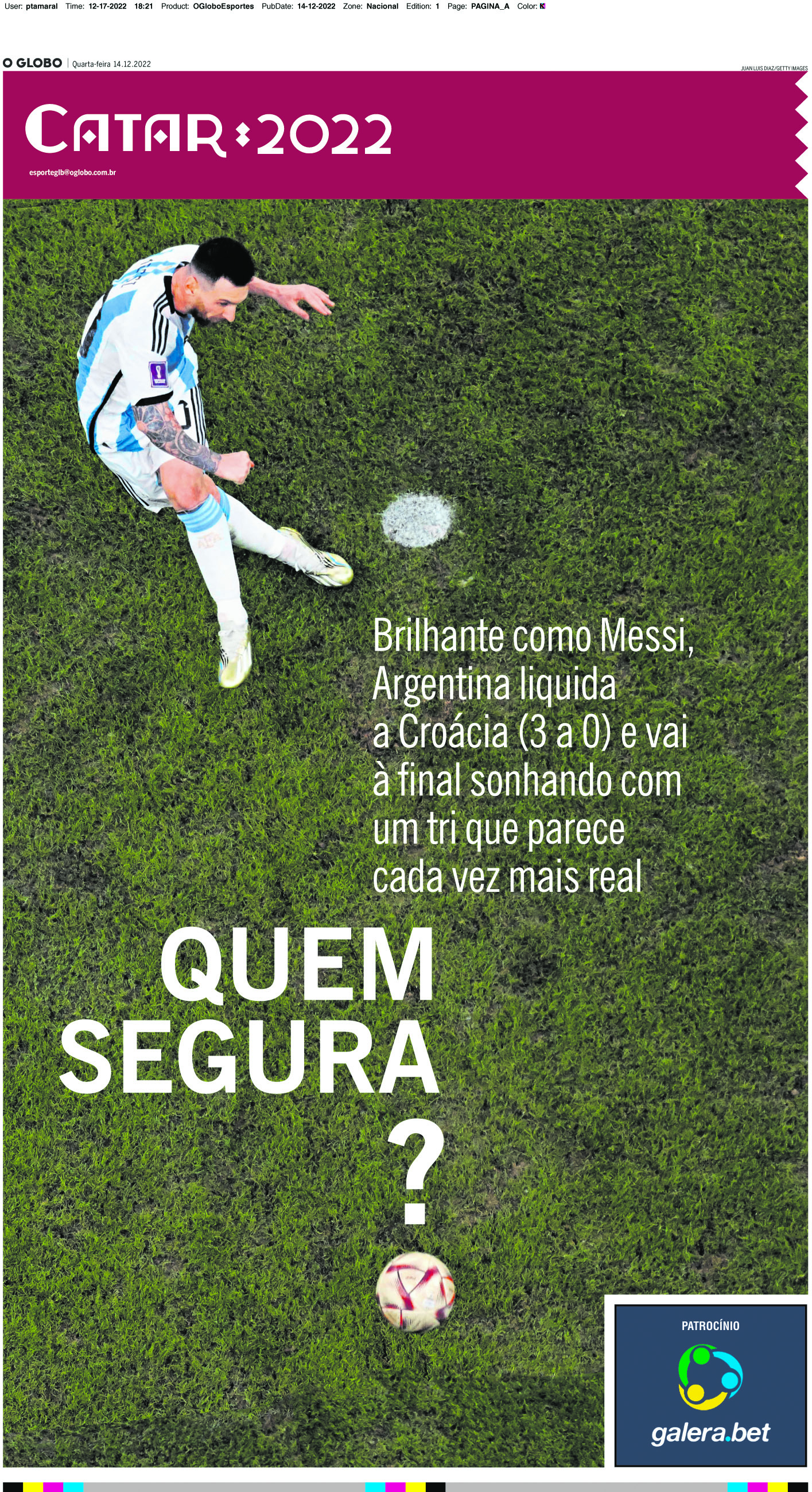
Charles Apple: This World Cup section front of O Globo of Rio de Janeiro stars Messi in wonderfully huge photo play, accented by masterful type treatment. The text talks about Argentina’s 3-0 win over Croatia that put them into the final match. Awesome in every way.
BRONZE
Madhyamam
Judges comment
Charles Apple : This page by Madhyamam of Kerala, India, is a fun, colorful look at Messi’s previous cup experience at topped by a great headline.
HONORABLE MENTION
La República
Judges comment
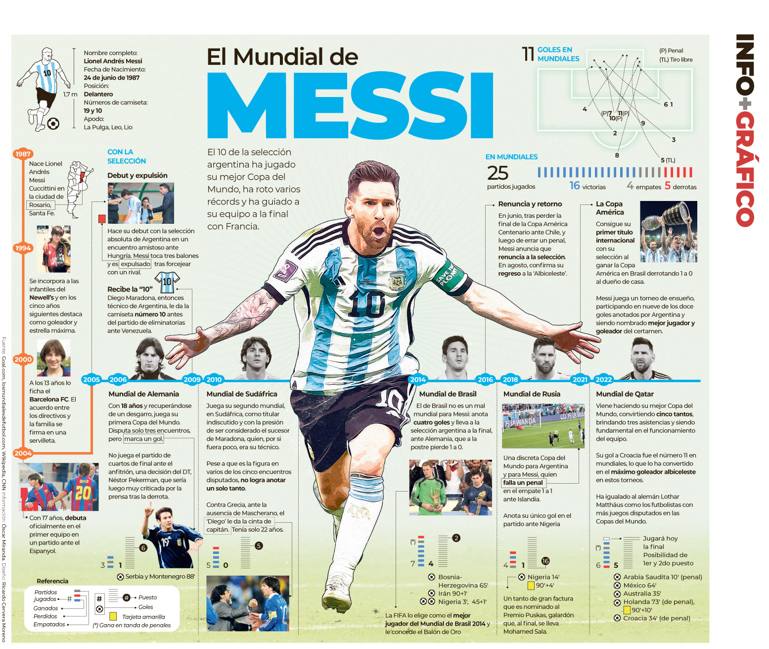
Charles Apple: La República of Peru, created this graphic timeline of Messi’s career, focusing on his performance in previous World Cups. There’s lots of information here for followers of Messi’s exploits.
–
HONORABLE MENTION
Deshabhimani
Judges comment
Gary: It’s not everyday that a paper utilizes its front and back page for one photo. And you don’t need a thousand words to understand that this photo declares Lionel Messi and Argentina as winners of the World Cup. The headline creates a solid entry point into the page.
BEST OF PELE PAGES
GOLD
O Globo
Judges comment
Gary: My first place goes to the O Globo 4 front pages … a brilliant idea and a keepsake for many.
Charles: O Globo of Rio de Janeiro celebrated the life of Pelé with four front pages — each of which featured a full-page photo of the famed football star. Each of the pages contained a minimum amount of copy, allowing the visual to tell the story. After all, one has to imagine that most readers — and most football fans — have heard the news by the next morning. So the primary task of such a page is to observe the death and to celebrate the life of Pelé — rather than to simply inform. These pages are clean and gorgeous.
–
SILVER
Hindustan Times
Judges comment
Charles: We saw a number of terrific Pelé infographics, but this one by the Hindustan Times of Delhi was topped by a wonderful portrait and illustrated vignettes from his career. I like the way we see Pelé’s international goals charted out, rather than simply cited here. And the mix of illustrations and photos is just perfect.
–
BRONZE
Mathrubhumi
Judges comment
Charles: This page from Mathrubhumi of Kerala, India, features an enormous photo of Pelé. The red background makes the image pop off the page.
HONORABLE MENTION
Deshabhimani
Judges comment
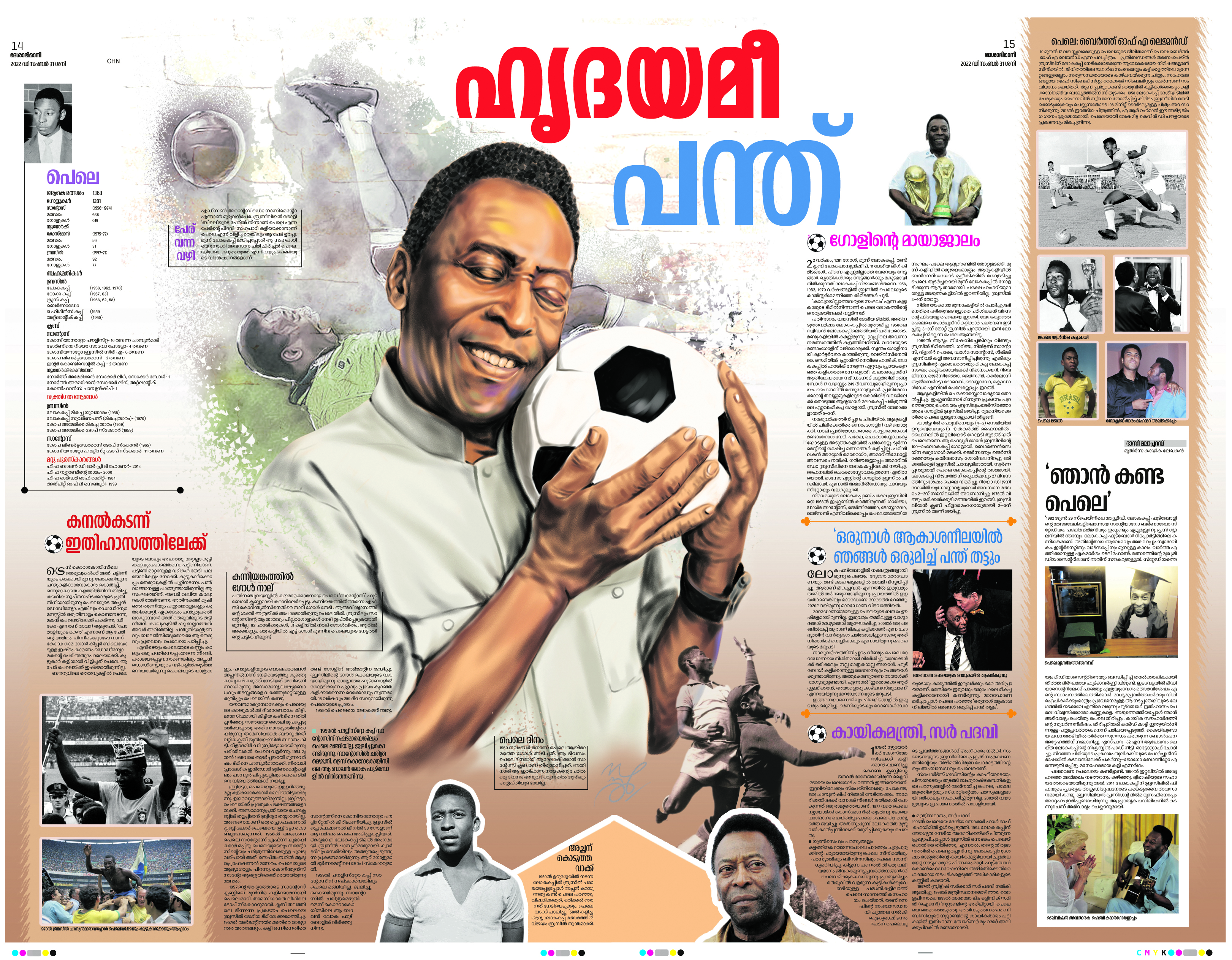
Charles: This Pelé page by Deshabhimani of Kerala, India, included a mix of photos and stories about the man but was centered around this gorgeous illustration of Pelé nuzzling a football. I just loved the visual here.
–
HONORABLE MENTION
La República
Judges comment
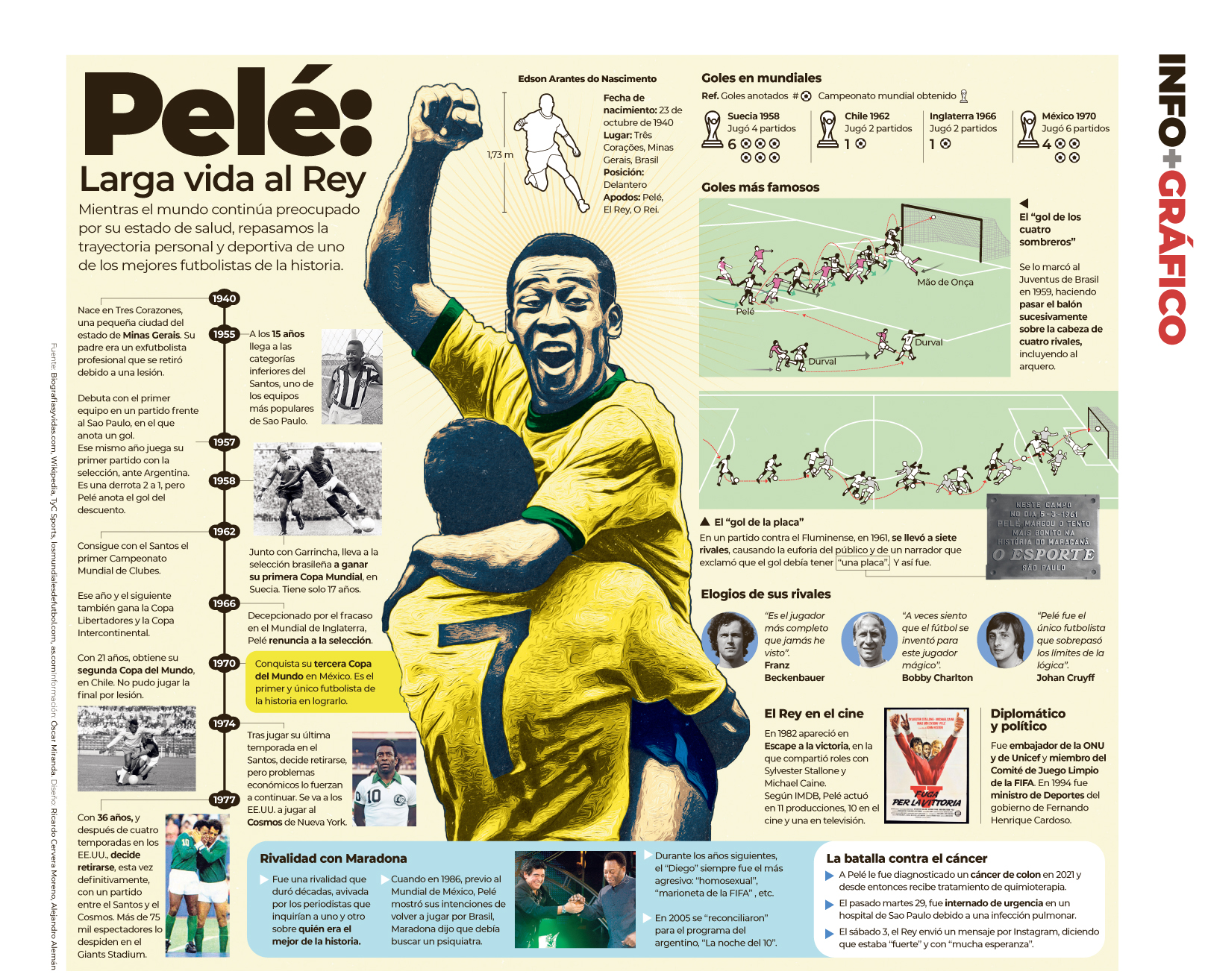
Charles: This spread by La República of Peru, combined an illustration of Pelé, a timeline of his career and a number of infographics to visually tell the story of the man. In particular, I like the diagrams of two of his most famous goals.
BEST OF QATAR WORLD CUP
GOLD
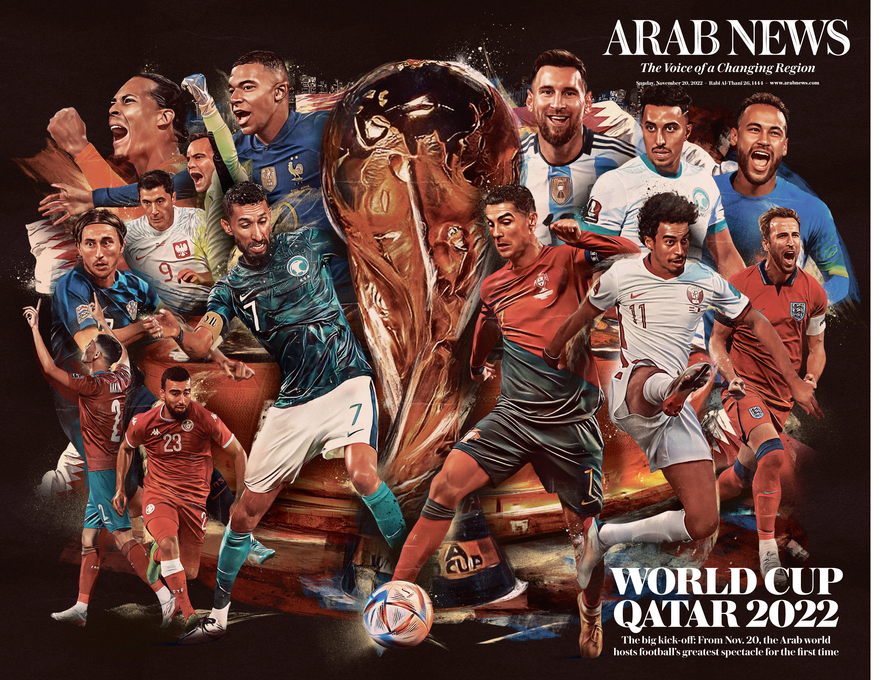
Arab News
Judges comment
Chiqui: We have seen this concept in every newspaper, every sticker album for each World Cup, and this is maybe the most practical I’ve seen. This is the double spread you keep, fill during the World Cup and find between your things 30 years later when you visit your parents house. It has perfect space for annotations, beautiful and elegant design, and all you want to remember, except maybe space to annotate the PK shootouts.
Gary: This full page graphic is chock full of news and information even the most casual WC watcher can use. The attention to detail is impressive as is the specificity of the details of the stadiums.
–
SILVER
Arab News
Judges comment
Gary: If ever there was a keepsake; something to frame and put on a wall, then this double truck presentation from Arab News is it. The attention to detail is impressive.
Chiqui: Once again declaring my love for the concept of a great illo/photo that you play big and let it shine. This one is very much into the Arab News general style, the typography works great with it and the quality of the illustration is remarkable.
BRONZE
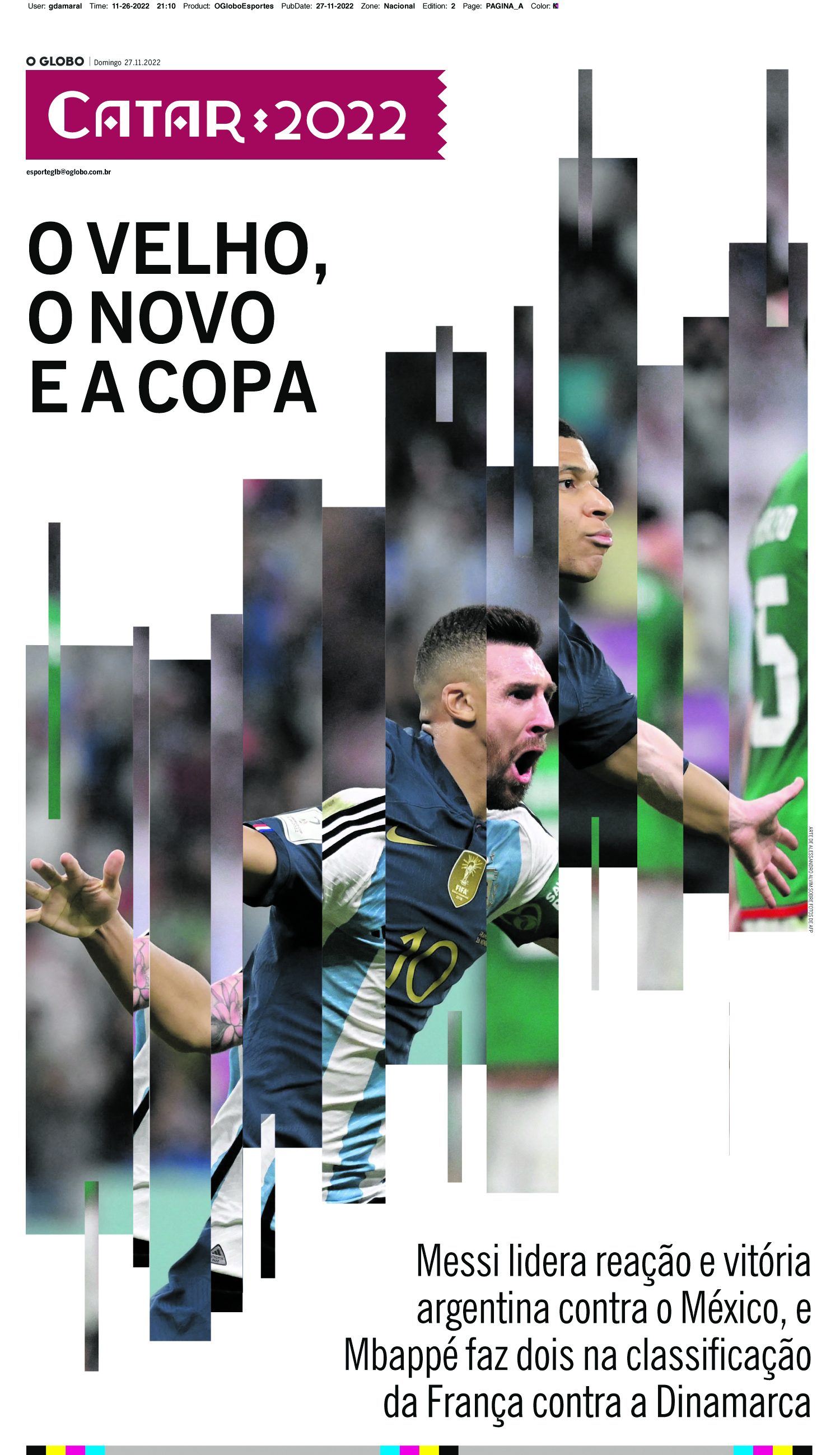
O Globo
Judges comment
Chiqui: Being brutally honest, I’ve loved many of O Globo’s pages for the World Cup, but it was difficult for me to give an award to a page with that typeface because it tore down the sophistication of the many smart, creative and great illustrations the team produced. But this one was to good to let go. The concept, the execution, and even the foresight of the page (this was done way before we knew Mbappé and Messi were going to play against each other for the World Cup) makes a perfect combination.
–
HONORABLE MENTION
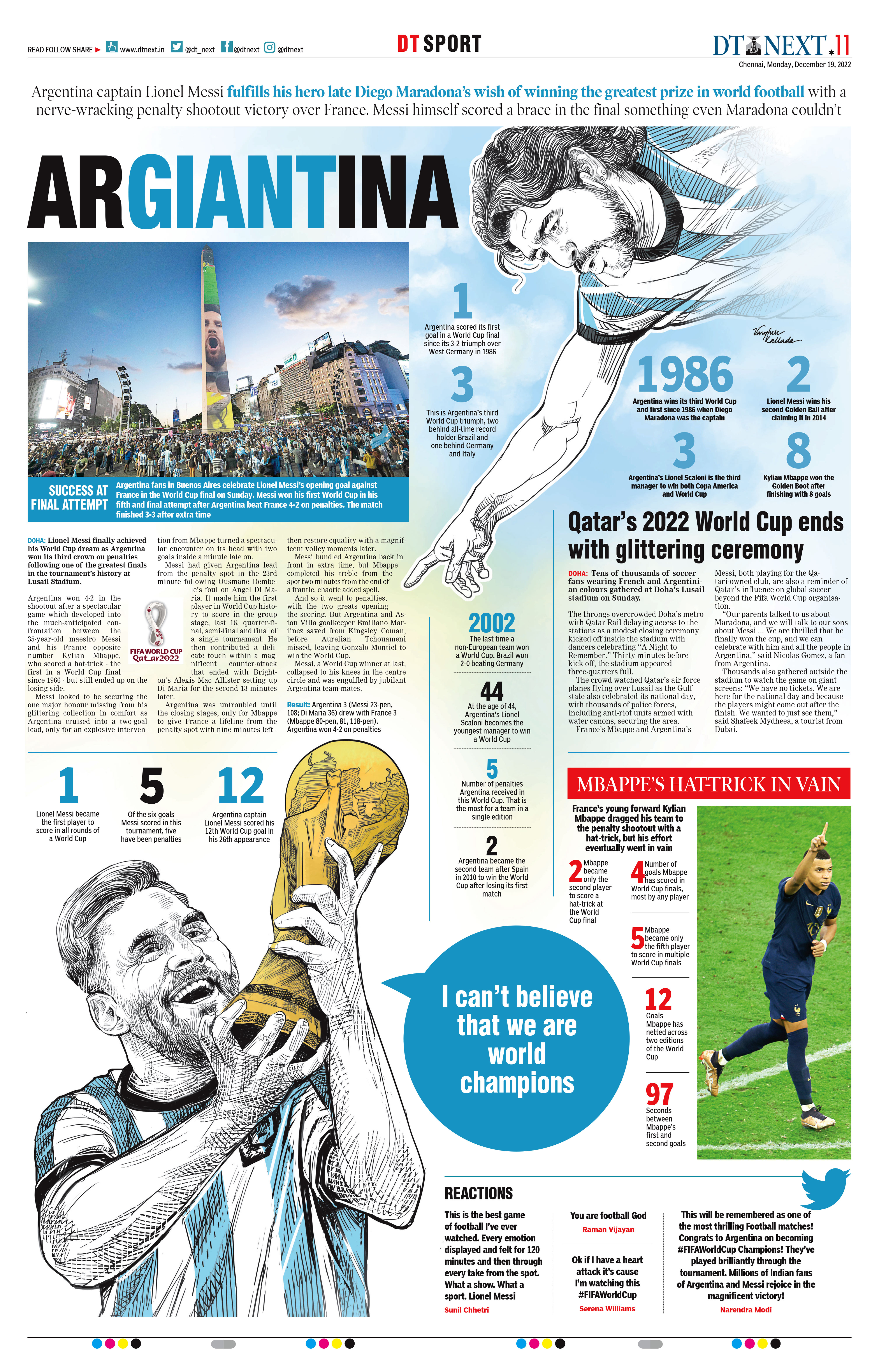
DT Next
Judges comment
Gary: Maradona looking down on Messi? I mean talk about the hand of God!!! The headline alone plus the statistics make this page an award winner.
–
HONORABLE MENTION
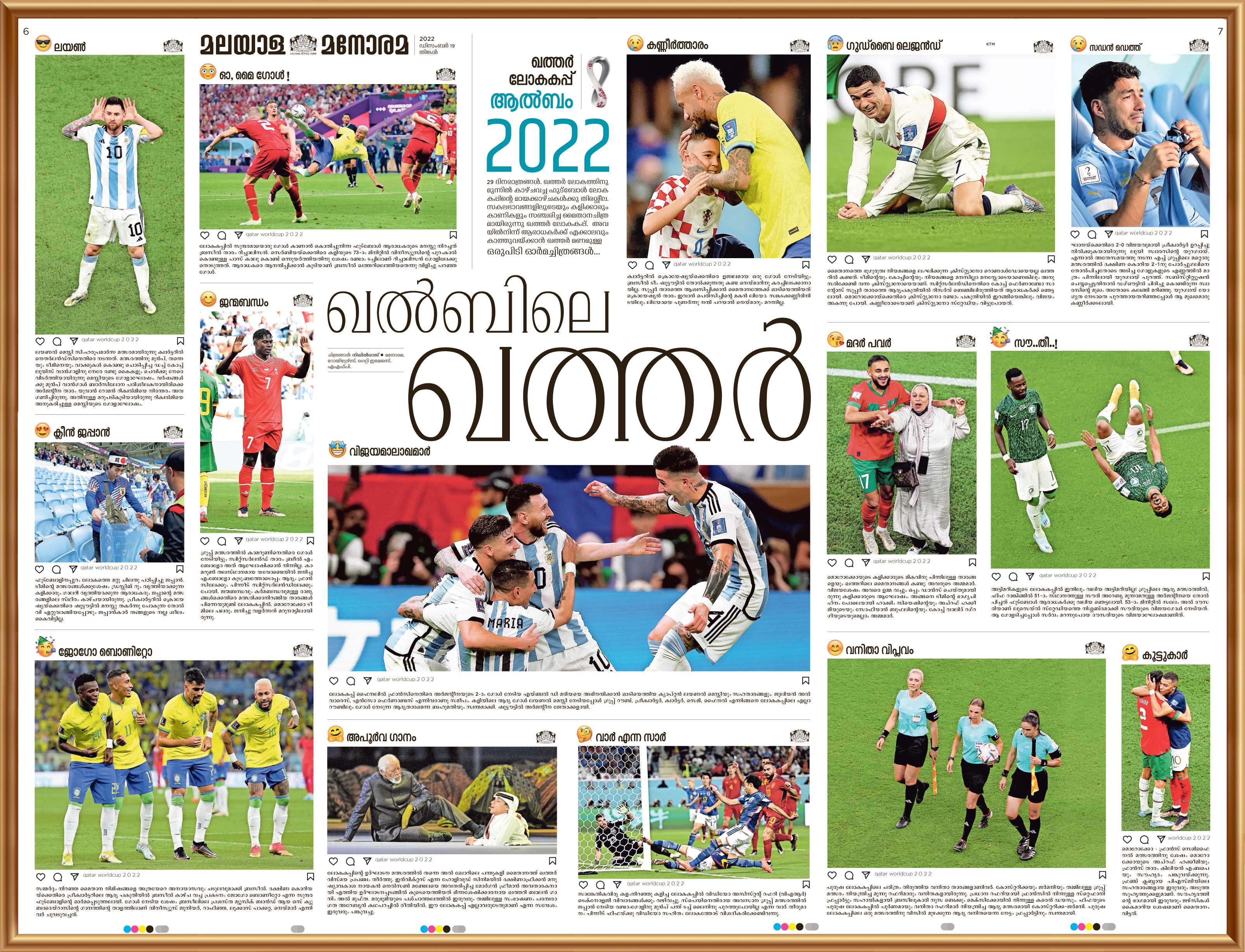
Malayala Manorama
Judges comment
Chiqui: I can’t understand a word of this and still spent a long time looking at this page, remembering some of the most distinctive moments of the World Cup. A playful, original collection in which the icons do a lot of work to tell the story of this tournament.
BEST OF RUSSIA – UKRAINE WAR
GOLD
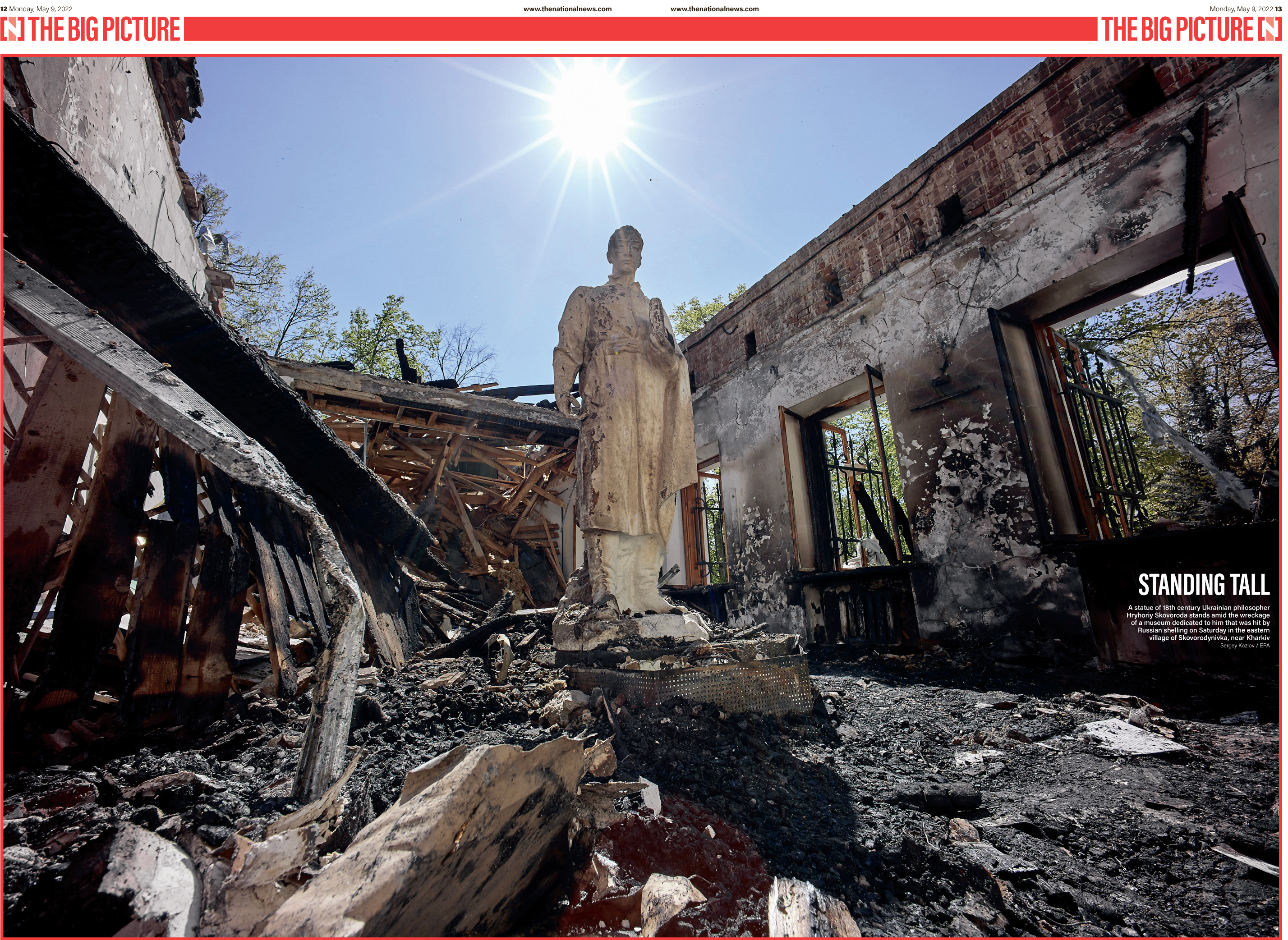
The National
Judges comment
Chiqui: The design is tremendously simple: a big picture and stay away, which is what this needs. I found myself looking through the different destroyed rooms and spending much more time on this page that you would expect from a story that’s just an image.
Jennifer: Wise choice in playing this photograph big. It both terrifies and engages the reader with this simple design.
–
SILVER
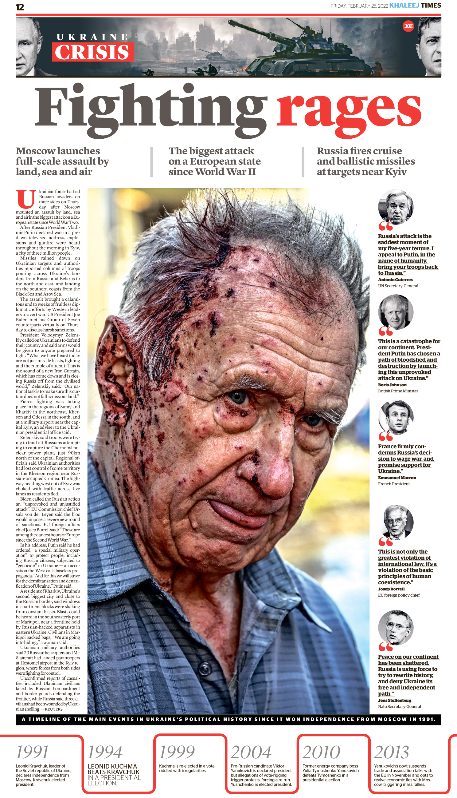
Khaleej Times
Judges comment
Jennifer: The use of color, space, pull quotes, a timeline to give the reader understanding, and the choice of photo evokes emotion and engages the reader.
–
BRONZE
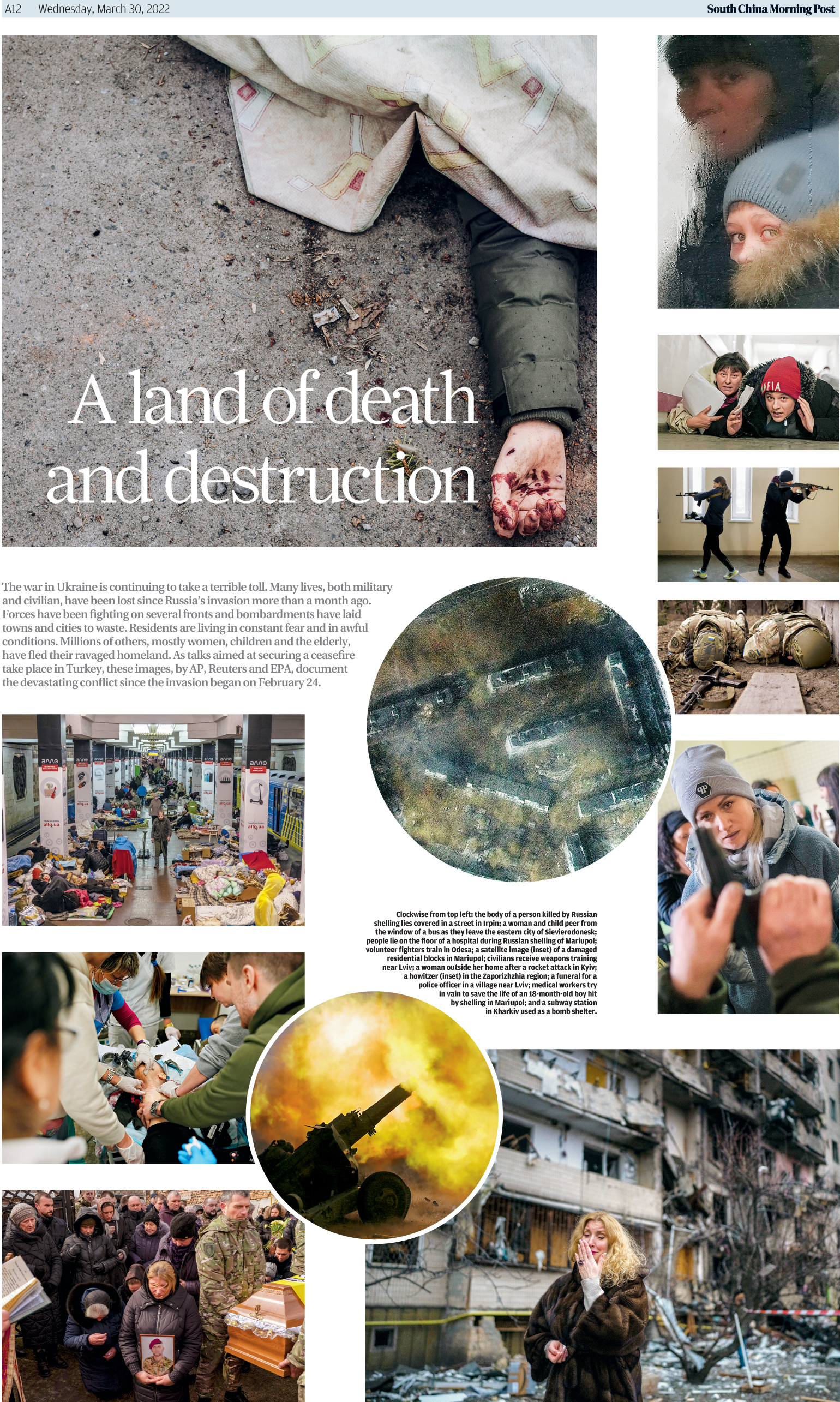
South China Morning Post
Judges comment
Chiqui: Similarly to my winner, I like how the selection of photos tell a story through different angles, although without the variety of points of view (more personal, more human) the winner has.
Jennifer: A look at six months of destruction. A balanced design of powerful photos.
–
HONORABLE MENTION
The National
Judges comment
Jennifer: Powerful design choice with this strong compositional photograph.
Chiqui: Like the other Big Picture, I understand design here is not doing much and that this is not an original format, but it’s still powerful, poetic and beautiful when it’s well executed, as this one is.
–
HONORABLE MENTION
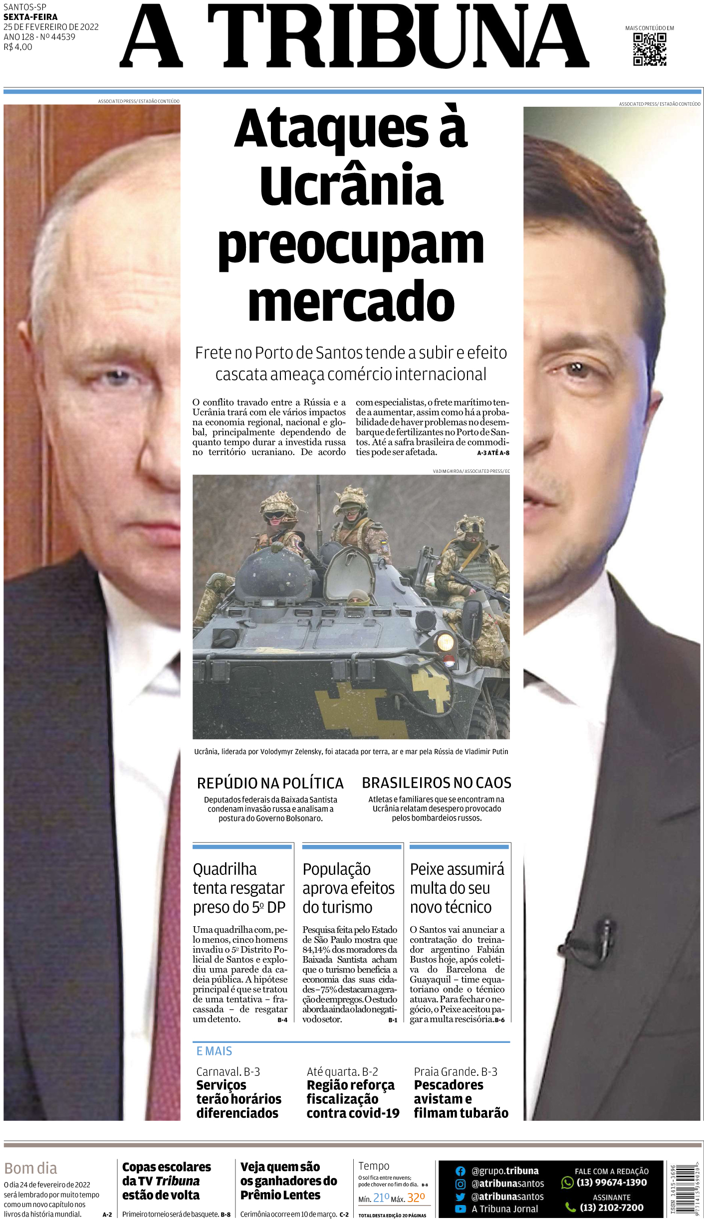
A Tribuna
Judges comment
Chiqui: I appreciate deeply when newspapers take risks on A1. This is an unorthodox presentation, and still works on several levels. The juxtaposed photos, the soldiers caught in the middle. I miss that the design doesn’t indicate that one country invaded the other, and not a two-sides story, which made it lose a good number of points on my opinion. Could have been a winner otherwise.
Jennifer: Strong, symmetrical design.
JURY MEMBERS
Charles Apple
(Jury Head)
Further Review Page Editor
The Spokesman-Review, Spokane, Wash.
Jennifer Borresen
Data Visualization Editor
USA Today
Chiqui Esteban
Graphics Director
The Washington Post

Gary Metzker
Lecturer and Media Advisor
Cal State University, Long Beach
![]()


