Lucie Lacava, a design consultant from Canada, discusses her latest project, the redesign of Malayala Manorama, in an exclusive conversation with tksajeev of newspaperdesign.in
What were the primary objectives driving the redesign of Malayala Manorama ?
Can you describe the key elements or features of the new design that distinguish it from the previous version?
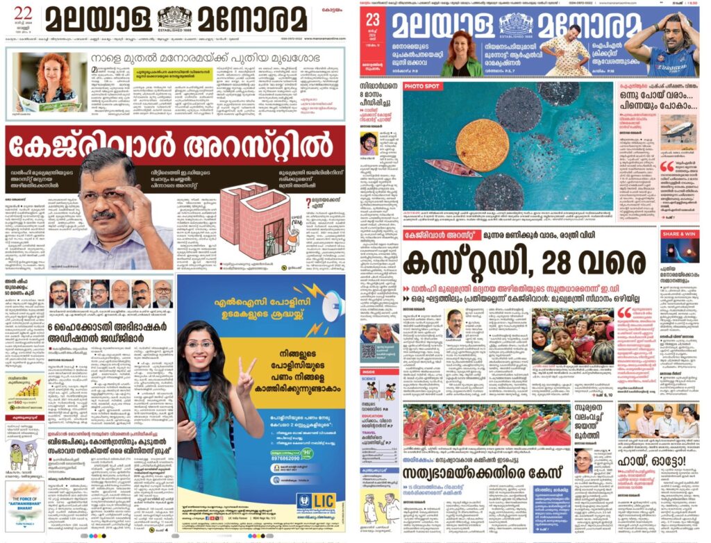
We made navigation easier, established a strong hierarchy, added more colour, created a better environment to display visuals especially photojournalism, introduced briefs packages, subdivided the grid for added flexibility when designing pages.
To see more new pages click the link
https://newspaperdesign.in/manorama-unveils-their-new-design/
How did you incorporate cultural and regional nuances into the redesign process?
By retaining the masthead and some of the existing font families. Also the local and city pages differ from one region to another.
What considerations were taken regarding readability and accessibility for the target audience?
We increased the point size of the text font, and aligned it to the left in order to avoid unwanted rivers or wide gaps between the words. We made sure that with the improvements to the text font the length remained the same.We did many print tests regarding text on colour washes. We also tested different fonts at various small point sizes before selecting the ideal version for the different story structures.
Did the redesign involve any changes to the newspaper’s branding or visual identity?
Not dramatically, but we gave it a more international look and feel, while improving the local content. we’ve added more English words on the section headers to be in tune with Manorama online website.
How was reader feedback or market research integrated into the redesign process?
Excellent, we got a 9.2 average, even after the launch the feedback has been extremely positive.
Were there any specific challenges or constraints you faced during the redesign, particularly in the context of vernacular media in India?
At first the biggest challenge for me was the language. But having worked in the past with non-Latin projects, I was confident that we would be able to handle it. Besides, Google translate makes it so much easie
Can you discuss any innovative or unique design solutions implemented in the new layout?
I would not say unique, but bringing the newspaper up to date on what works in terms of news design. For example making the design more hierarchical is one, adding more visible cross-references to the Manorama web site is another. I think everyone was open to change, and new ways of presenting the information. As a matter of fact my early sketches were too conservative. In the end I’m happy we achieved a more dramatic redesign.
How do you measure the success of the redesign in terms of reader engagement or other metrics?
Only time will tell, let’s see in a few months. So far after three days it has been well received.
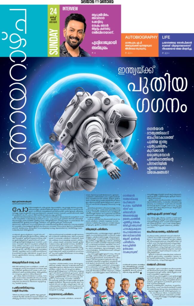
Sunday supplemen
Tell us about the selection of color palette
Throughout my entire career I have never used such an extensive colour palette. By making all headlines black, we had to add colour back in strategic and meaningful ways. For example every section now has a minimum of two distinctive colours. Colour is used in the section headers for navigation and to highlight stories. I am especially pleased with the Sunday supplements which use pastel washes on every story. We are in India, the medium must reflect the beautiful colourful culture of its people.
Could you explain the concept behind the big picture?
There were a lot of short stories sprinkled across pages. By repackaging and editing those into briefs we liberated space to display larger pictures, also putting more emphasis on photojournalism
And finally about storytelling…
We created a style book for infographics, recommending how to use illustration and photography, as well as the colour palette. The visual team does a good job with graphics already, especially full page ones. Space limitations are the only constraint.