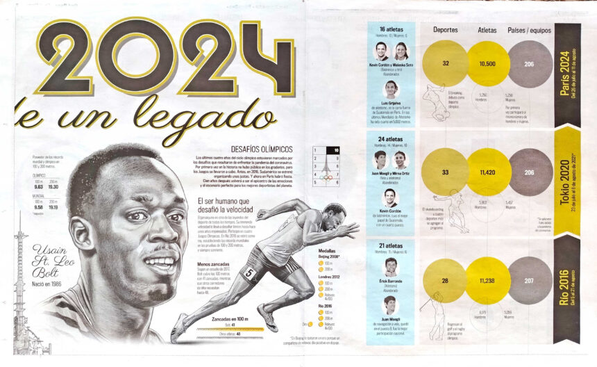
Ángel García, a veteran Guatemalan graphic designer with over two decades of experience, recently collaborated with Nelson Xuyá and Pedro Pablo Mijangos on an exceptional Olympics infographic for Nuestro Diario, the most widely circulated newspaper in Latin America. In this interview, he shares insights into the project and his thoughts with T.K. Sajeev of newspaperdesign.org

Angel García, Nelson Xuyá , Pedro Pablo Mijangos
Can you explain how this concept developed and what preparations went into creating the Paris olympics infographic?
Our newspaper usually publishes news specials when there are sporting events such as the Olympic Games or the World Cup. This led me to propose a poster that would go through the history of the modern Olympics, with the Eiffel Tower in the center and around it, the faces of the 10 most relevant athletes. Each publication had to have outstanding figures from a certain number of Olympics, from Athens 1896 to Paris 2024, which happily coincided with this year being the 30th Olympics. Although in the proper numbering there are 33 games, 3 were not made due to the world wars.
With a sketch, I proposed the idea to my immediate boss, who consulted with the editorial director, for his approval.
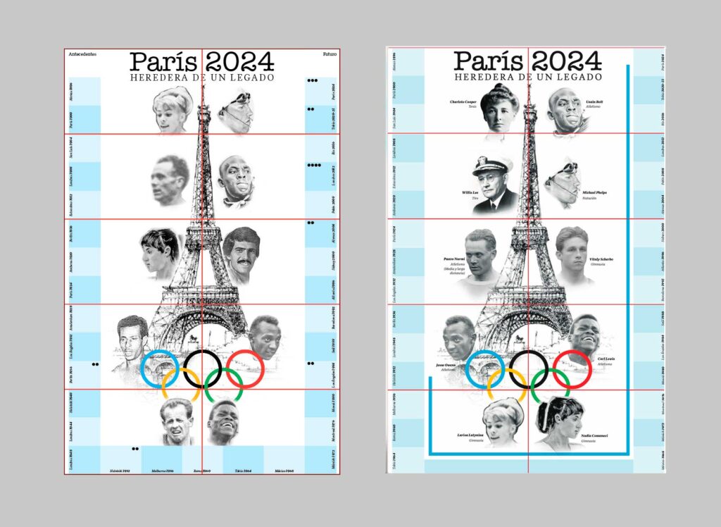
First idea and final distribution of athletes and content
We then agreed to publish two pieces per week, for a total of five weeks, which were to precede the opening of the Olympic Games. We were also given permission to print the double page spread in one piece on the condition that we managed the content of the back .
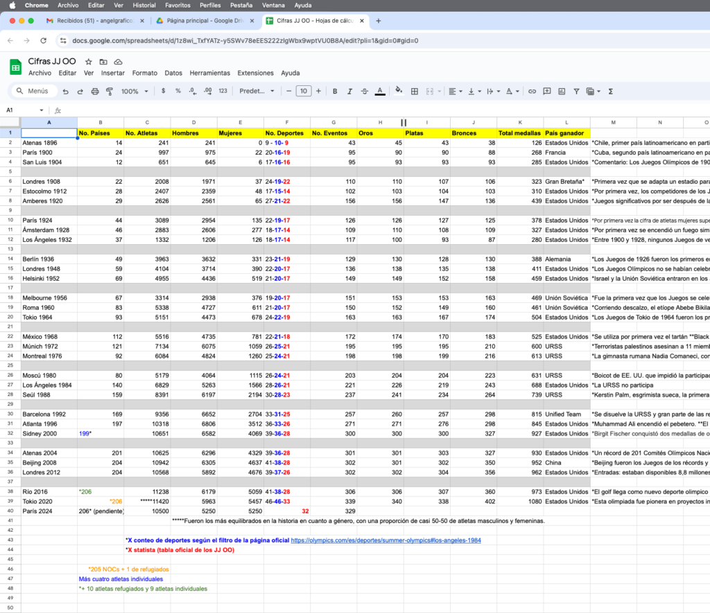
Data table: a teamwork with Pedro Pablo Mijangos, editor and main reporter
I think it’s worth mentioning that planning is key when you have an idea in mind that you want to make a reality. The more time you have to organize, research, do final artwork, review, etc., the more visual and content quality you can deliver. It’s also good to note that it’s important to work with people who are committed to the execution of the project.
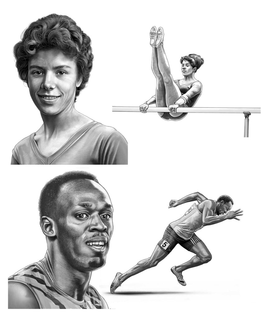
Main illustrations by Nelson Xuyá
Can you explain how the design of this infographic reflects both the history and future of the Olympic Games?
It reflects history in such a way that it presents the most relevant data from these 30 editions. As for the future, I can say that the graph shows a historical inequality in terms of the participation of men and women in this event, but that this continues to decrease, I assume that the next Olympics will be more equitable. This project also shows a tendency to include more and more new sports.
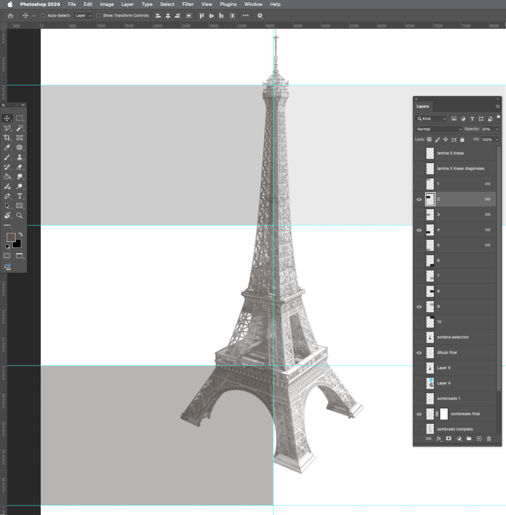
The tower and space distribution
What role do key historical figures, such as Charlotte Cooper and Jesse Owens, play in inspiring athletes today?
When we design a project like this, we dream that the content will be relevant to our readers on the other side, and more ideally, that it can inspire them. That is why we remember that Charlotte Cooper was the first woman to win an Olympic gold medal, at a time when female participation was not seen favorably; or that Jesse Owens, with his feat, demonstrated that the supremacy of a race, an ideology of those years, was not true.
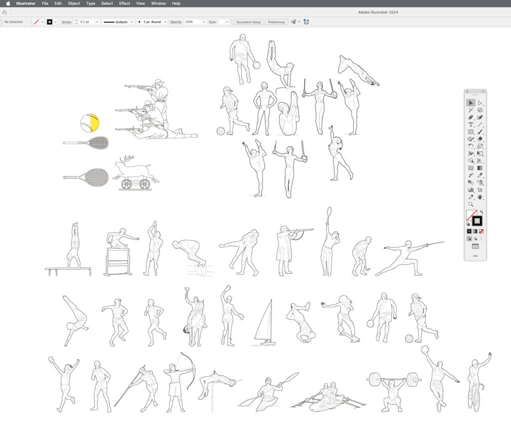
Vector drawings as secondary illustrations
Although many more athletes deserve to be highlighted, we had to choose only ten of them, one for every three Olympics, who with their Olympic achievements continue to inspire us all.
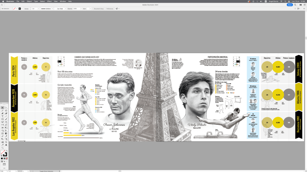
Assembly and review of alignments
Which sports or events are most symbolic of Olympic tradition and legacy in Paris 2024, according to this infographic?
Athletics is one of the sports that attracts the most public attention due to the feats of the athletes, the number of medals and the records, then there are gymnastics and swimming as seen in the poster.
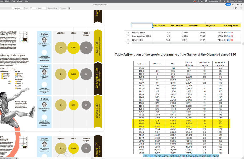
Data and information contrast
How does the color scheme of this infographic reflect the themes of legacy and continuity in the Olympic Games?
When you read about the idea of the Frenchman Pierre de Coubertin, his proposal to popularize sport or the practice of sports through an international event, which he did at a time when Paris was the city of reference for art and culture, and when you look at the information about the inspiration of the designers who created this year’s images and logo, you notice that his idea was to reflect artistic movements of yesteryear that are still present in the streets of Paris. This led me to think that a combination of black, grey and gold could refer to everything related to this emblematic city that is also linked to the very origin of the Modern Olympics.
How does the timeline of Olympic events in this infographic help in understanding the evolution of the games over time?
We matched the chronology to the order of the publications, so that the poster was read from top to bottom for the first five pieces and from bottom to top for the next five. In addition, it was considered that each piece should function independently of the others, each one from a certain period of the history of the Games. In this way, the numbers of athletes, sports and participating countries on each sheet allow us to quickly see the increase or decrease in these data. In addition, some of the silhouettes of the athletes show changes in their sports attire over the years.
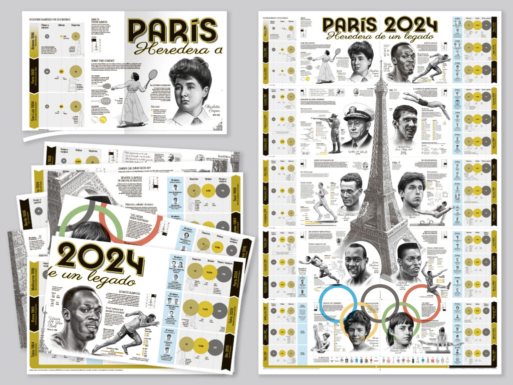
Pieces to assemble the poster
Why do you think visual representations like this infographic are important in telling the story of the Olympics?
Among the attributes that we can list for an infographic or data visualization, perhaps the main one is that it works as a summary, in which you can quickly read and understand the most relevant aspects. Whenever I am invited to give a talk on journalistic infographics, I mention that beyond the ephemeral nature of the paper or the medium where our work is published, there is the value in itself of the document we produce, with the information that will surely be useful for readers or that will arouse curiosity about that topic.
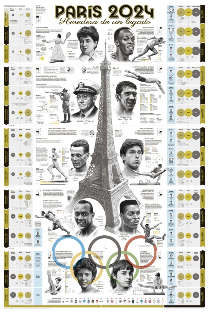
Full poster


