ARAB NEWS,MALAYALA MANORAMA,KHALEEJ TIMES,THE NATIONAL,LA REPUBLICA AND MUNDO DEPORTIVO STOLE THE LIMELIGHT
in the third newspaper design competition  conducted by www.newspaperdesign.in
BEST PAGE ONE
FIRST PLACE
Arab News (KSA)
What is Left of the Lebanese state?

Jury Comment:
This starkly beautiful illustration plays off the Lebanese flag to great effect. The tree was instantly recognizable and the message of the story conveyed perfectly without a word. Great design speaks for itself and this certainly does.
SECOND PLACE
Malayala Manorama (India)
Air Crash
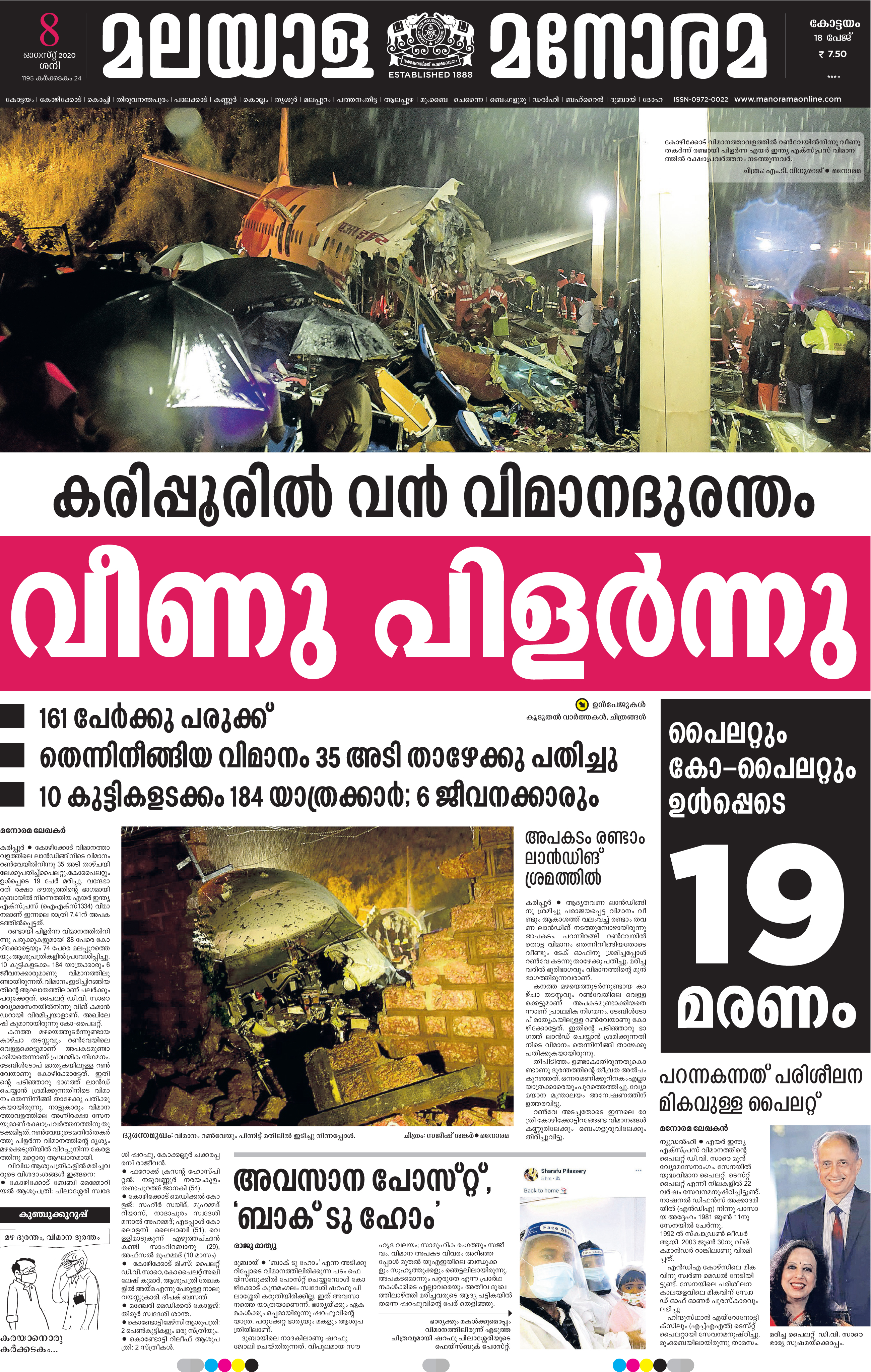
Jury Comment:
Letting the photo lead the page was a great decision here. The image speaks volumes more than any words could. The black, white and red headline treatments add to the dramatic effect of the page, drawing the reader further in. The effect is a staggering page that communicates the overwhelming feeling at the scene and the loss involved with such an event
THIRD PLACE
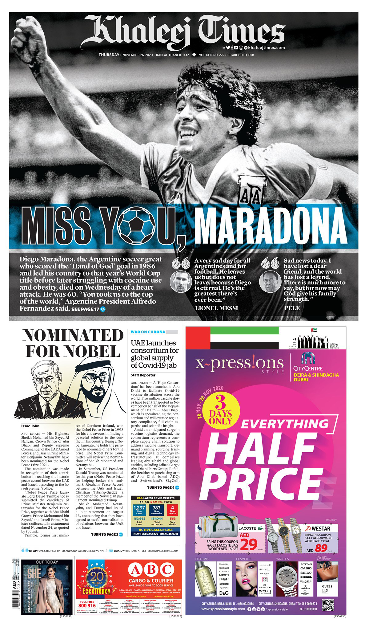
Khaleej Times (UAE)
Lebanon Blast


Jury Comment:
This page took breath away. The image would be gripping on any page, but running it at this size paired with the simple, large headline and group of four small headlines conveys so much information before readers even have to start the story. A phenomenal example of design complementing a great photograph.
HONORABLE MENTIONS
The National (UAE)
Beirut Blast
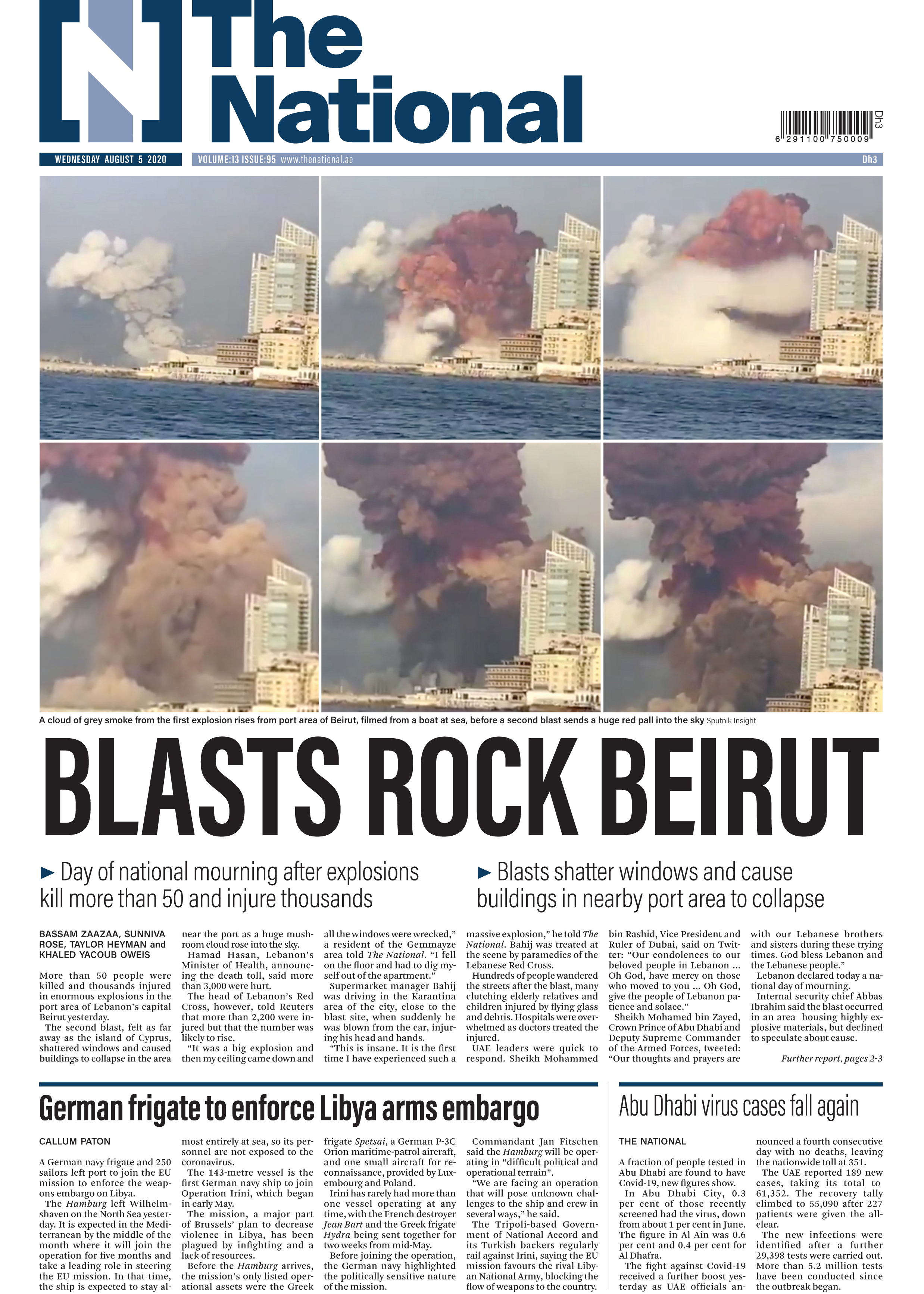
Jury Comment:
These staggering still images of the explosion in Beirut pair exceptionally well with the simple, straightforward design of the rest of the page. The design does an outstanding job of conveying the scale and horror of the blast without sensationalizing the tragedy. Excellent work.
Prabat Khabar (India)
Indian Constitution Day page
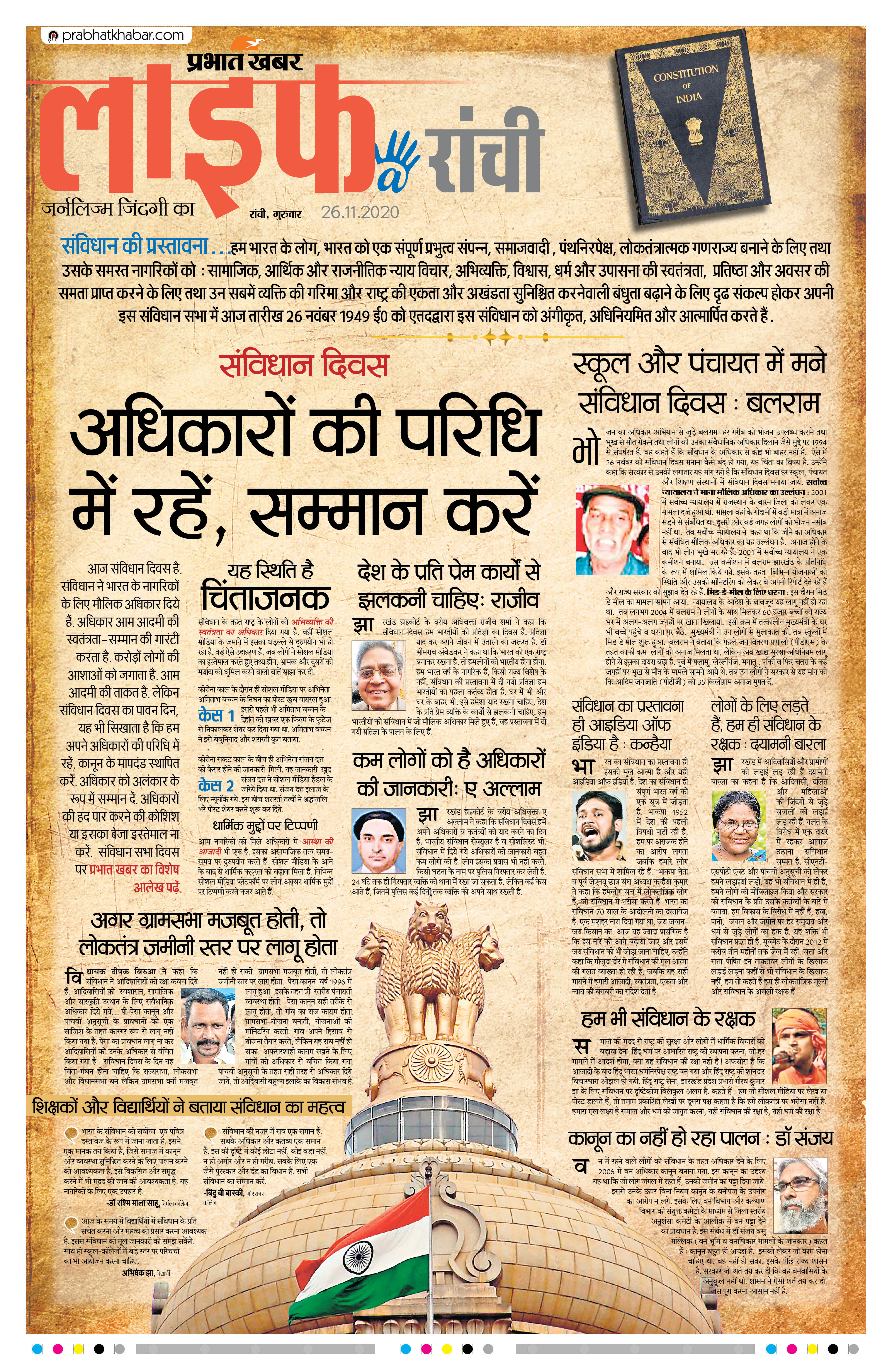
Jury Comment:
A lovely treatment for an anniversary with limited art options. The aged effect on the page is striking and the placement of the story elements draws the eye down the page for a wonderful effect.
The National (UAE)
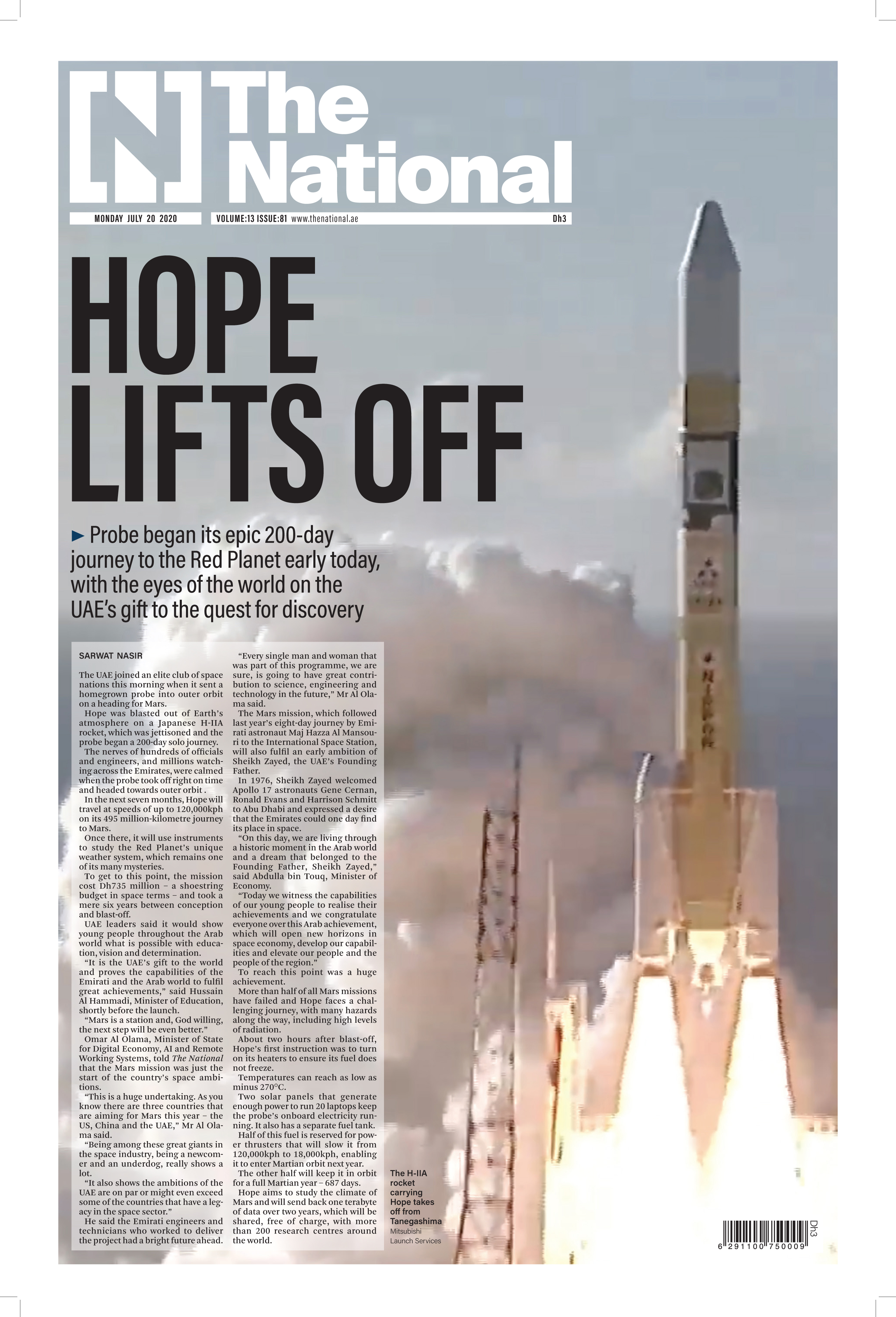
Hope Lifts Off
Jury Comment:
Excellent use of the vertical photo to lift the page. The rocket on the right of the page is well balanced by the design elements on the left.
BEST OF INFOGRAPHICS
FIRST PLACE
MUNDO DEPORTIVO  (SPAIN)
 "Rafa Nadal/20 Grand Slams"
 Graphics :Ferran Morales
Jury Comment:
Dense with information but smartly designed, prioritized. My eye knew exactly where to begin and I was intrigued and invited by the design, including a unifying use of color.
SECOND PLACE
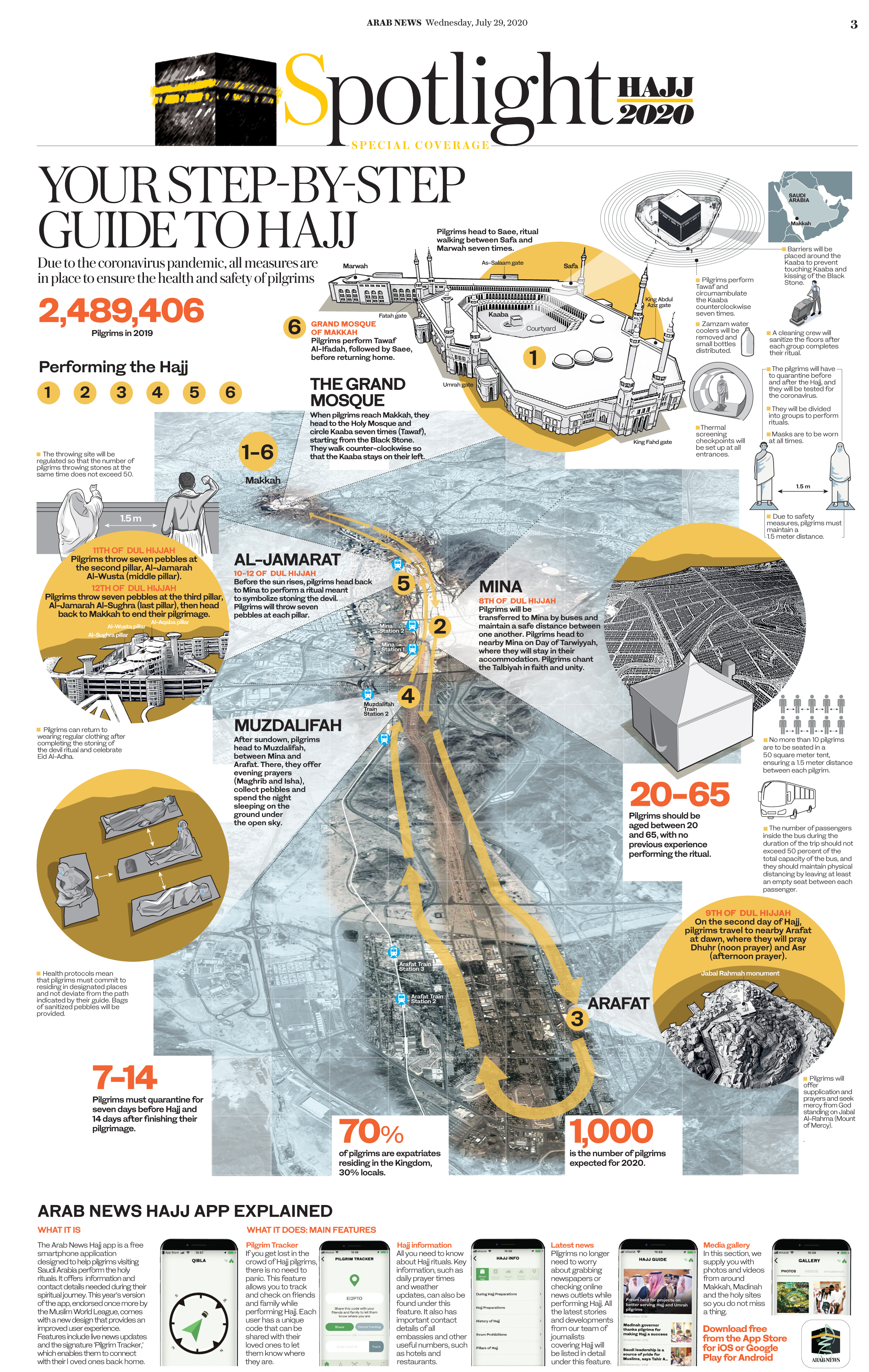
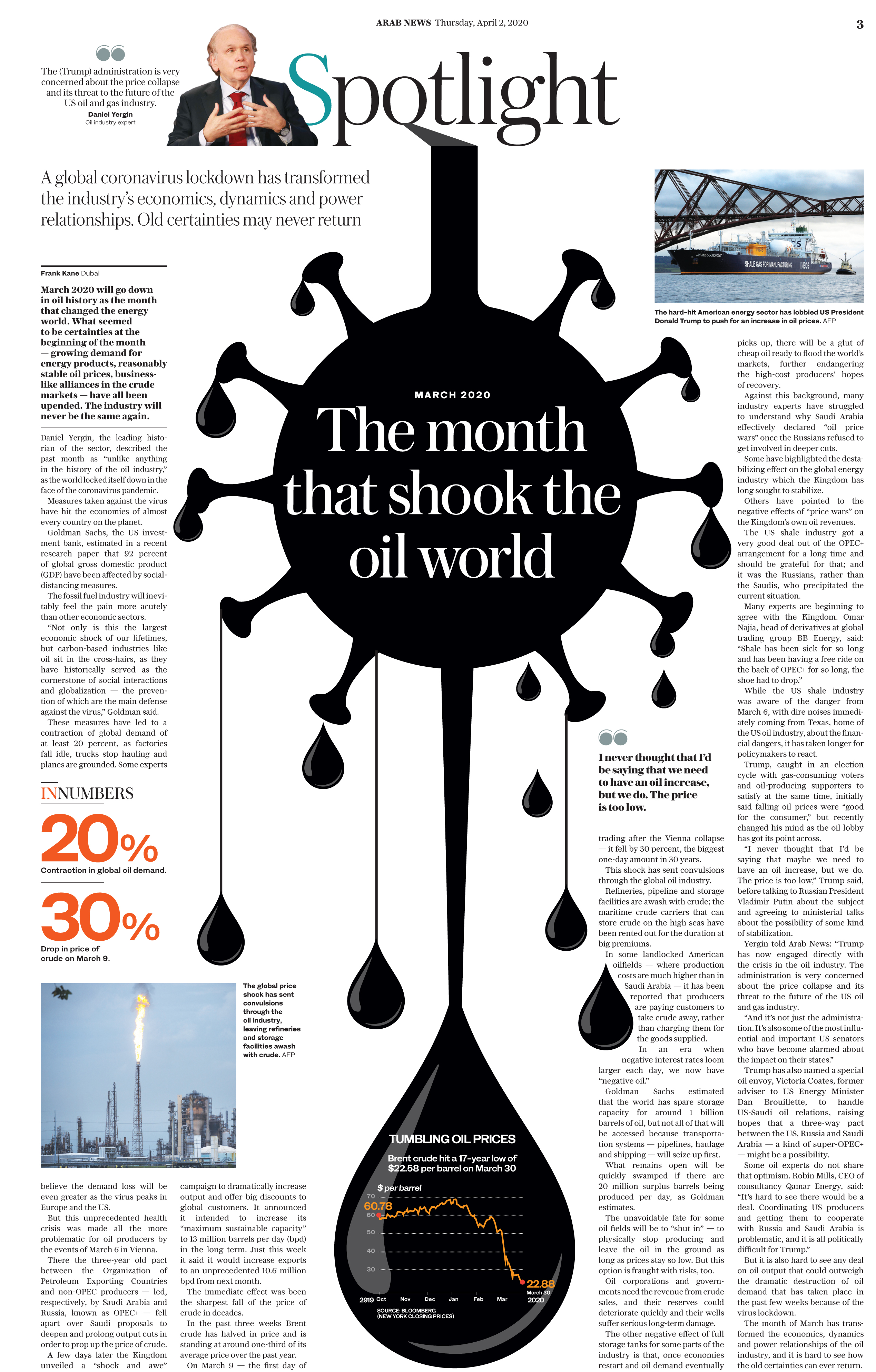
Arab News (KSA)
"Your Step-By-Step Guide to Hajj"
Jury Comment:
I would have organized this information more neatly, used a grid, spaced the information more evenly. But the clever, inviting use of satellite photography forms a spine to this graphic, organizes it, pulls me through it. An amazing amount of information and work.
THIRD PLACE
"I Am Full!"
China Daily (China)
Graphics team :Mukesh Mohanan, Yang Liu, Zhang Hui
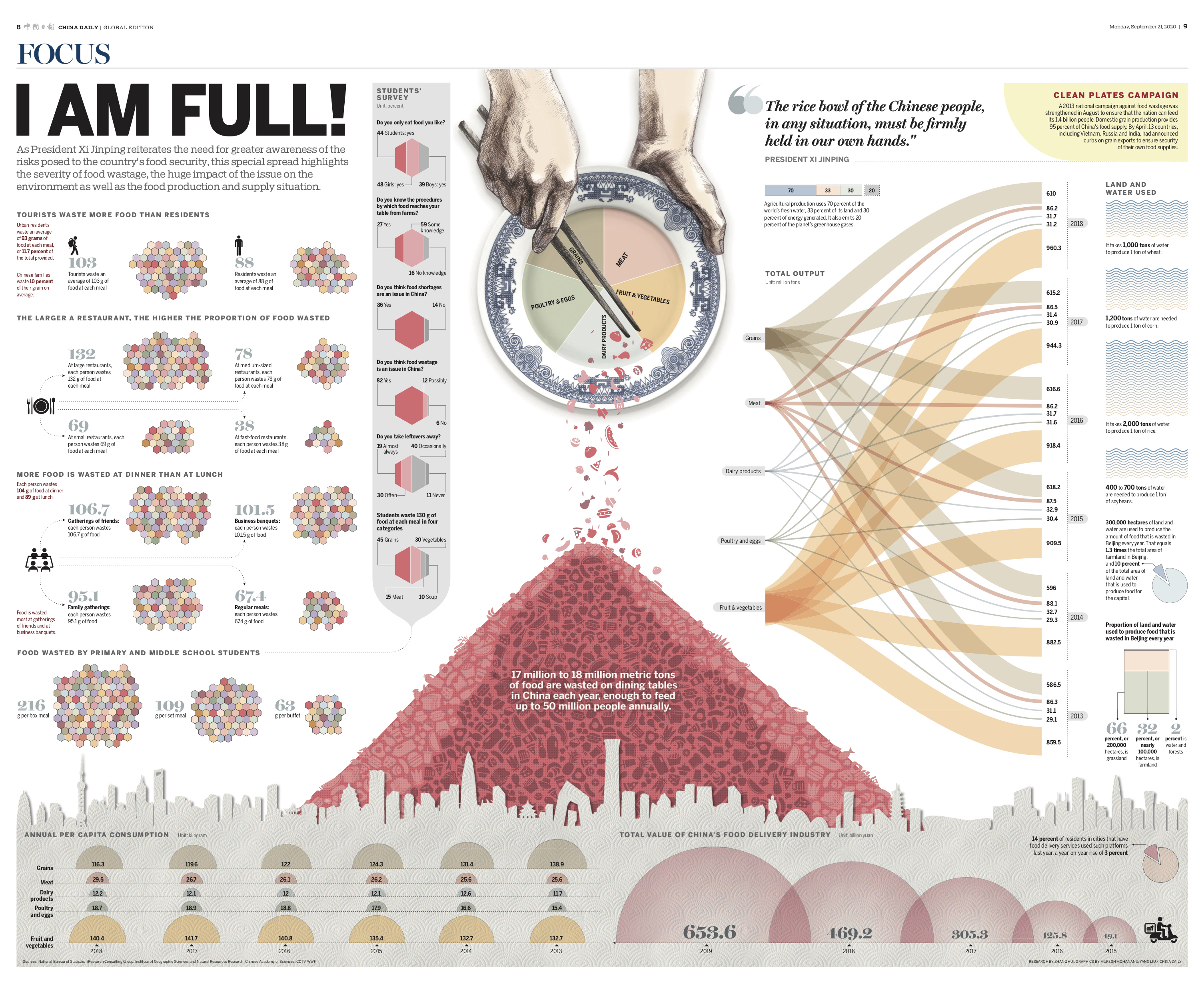
Jury Comment:
I wish the narrative line through this graphic were a little clearer. But the design is arresting, including a smart and consistent use of a restrained, tasteful color palette to help tell the story.
HONORABLE MENTIONS
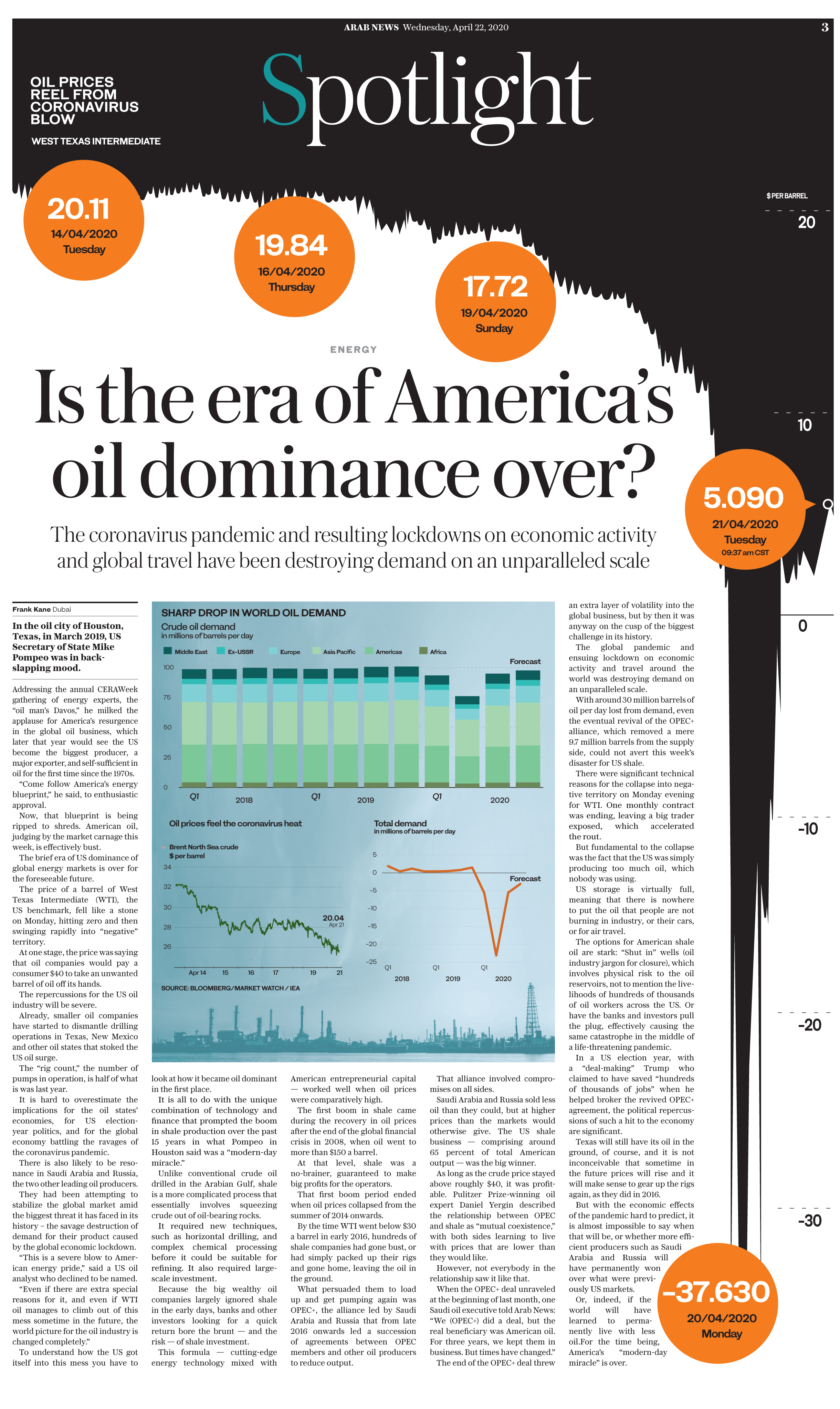
Arab News (KSA)
"Is the era of America's oil dominance over?"
Contra Replica (SPAIN)
"Año de la Rata"
Graphics:Victor Sanjinez Garcia
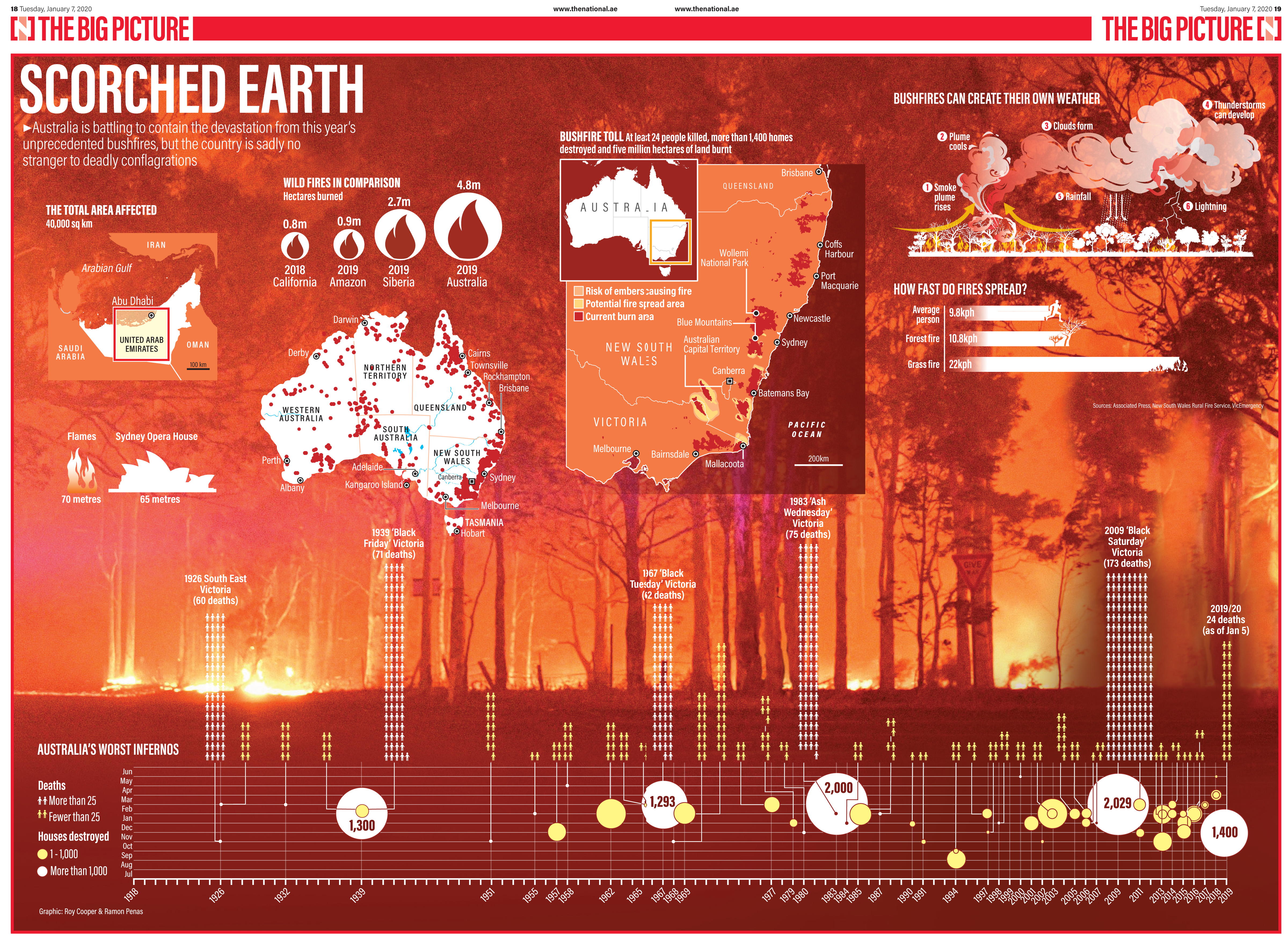
The National
"Scorched Earth”
Graphics:Roy Cooper & Ramon Penas
Jury Comment
These pieces were so bold, so clever, so fun to read. Jury wanted to give an award to each of them and to so many others.
BEST OF COVID-19
FIRST PLACE
The NATIONAL(UAE)
Corona Virus 100day Graphic: Roy Cooper
 Jury comment:
Wow, just wow. The level of reporting and the organization of all the information combine to make this such an impactful page for readers. Such a great service to readers!
SECOND PLACE
LaRepublica (PERU)
Goodbye Ritual
Photographer: Aldair Mejía
Designer :Ricardo Cervera
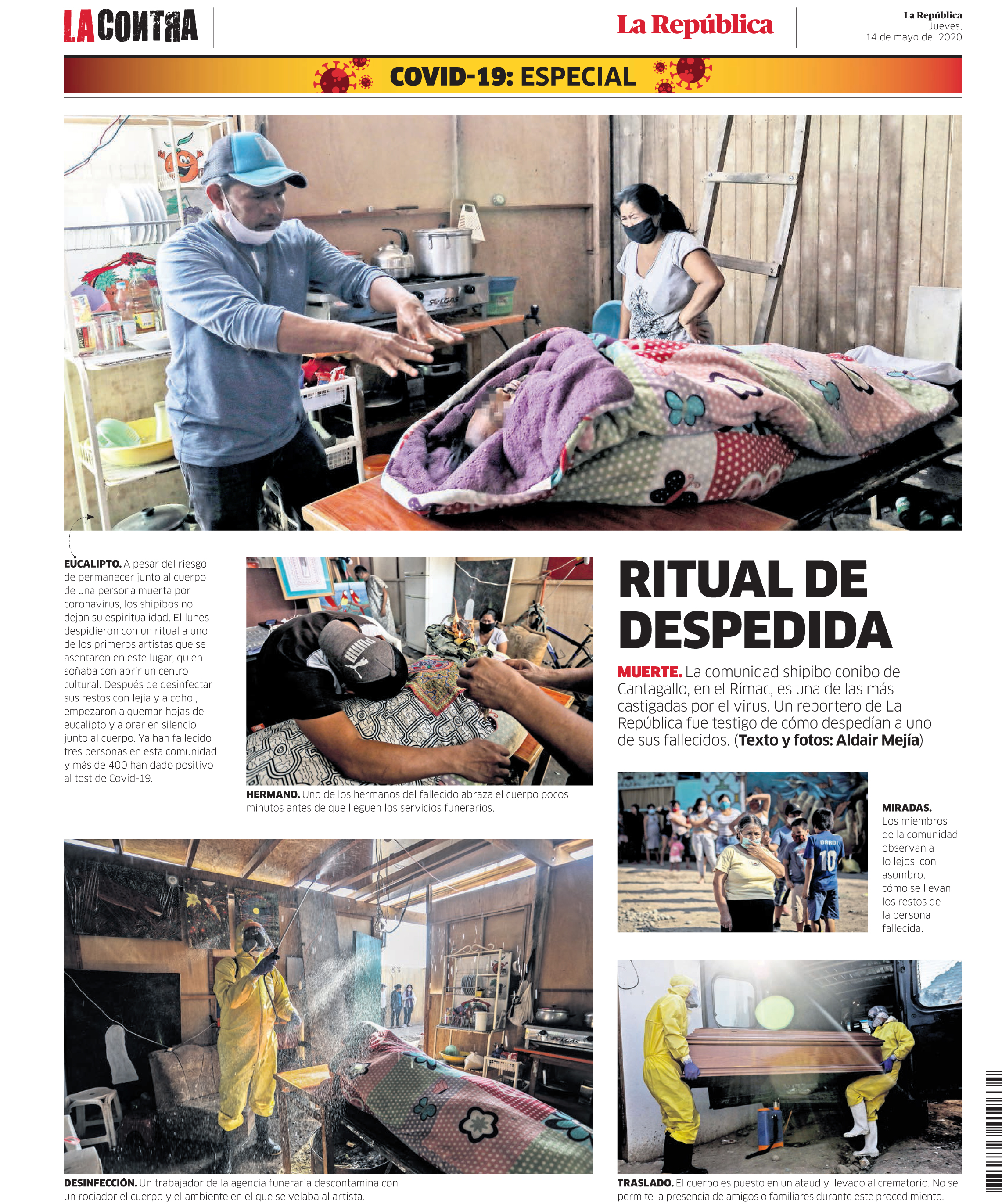
Jury comment:
Powerful visual storytelling and great commitment to design and space. Not easy to get access to photograph
THIRD PLACE
LaRepublica (PERU)
Infographics: Rocío Medina
Art Director: Ricardo Cervera
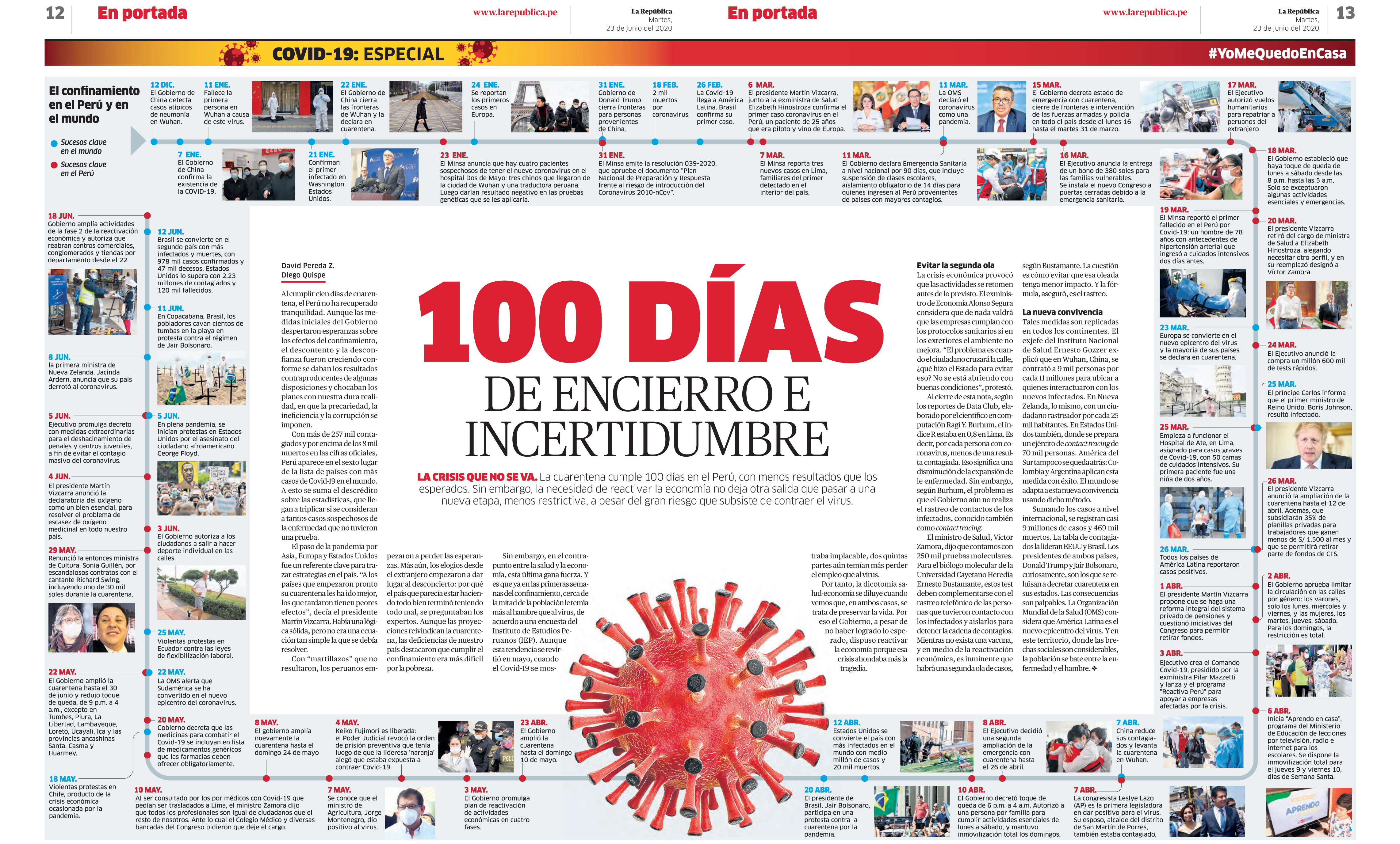
Jury comment
One hundred days of confinement. Another example of impressive graphics reporting, design and organization of the page. Good use of thumbnail photos.
HONORABLE MENTIONS
Khaleej Times (UAE)
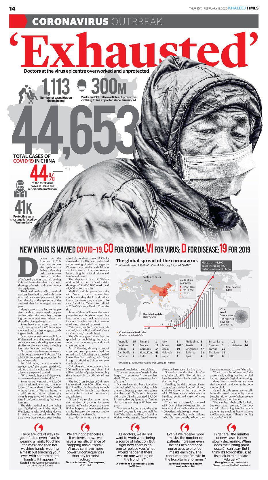
Jury comment:
Strong use of typography, powerful design that grabs a reader
Arab News (KSA)
Jury comment
Strong illustration combined with strong design. Not an easy story to illustrate
Contra Replica (SPAIN)
Designer:Victor Sanjinez Garcia  Jury comment
Page is chock full of information, nice hierarchy to the page.
Arab News (KSA)
Jury comment
Simple, but interesting way of illustrating a story that is not super-easy to illustrate. In a contest with so many strong graphics, jury still kept coming back to this page for its strong design.
BEST OF US ELECTION
FIRST PLACE
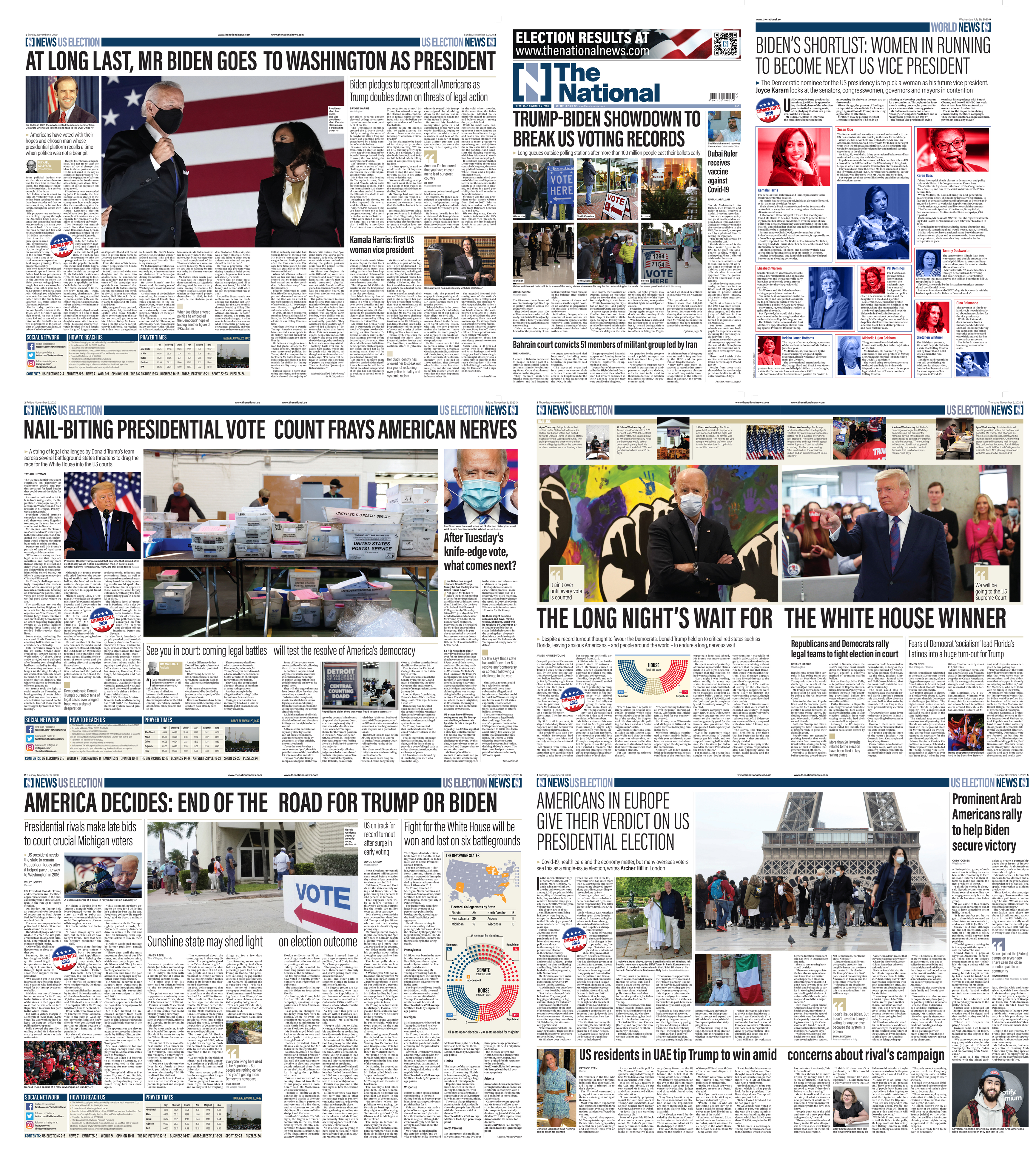
The National(UAE)
Jury comment
Comprehensive coverage that would rival some American newspapers. The design is crisp; entry points abound into the copy. Excellent reaction from Americans living in the UAE. Just well designed throughout – from election preview to post election. Jury will say it was interesting to see that The National had a reporter based at The Villages in Florida; not exactly a place where you get balanced reactions.
SECOND PLACE
Khaleej Times(UAE)
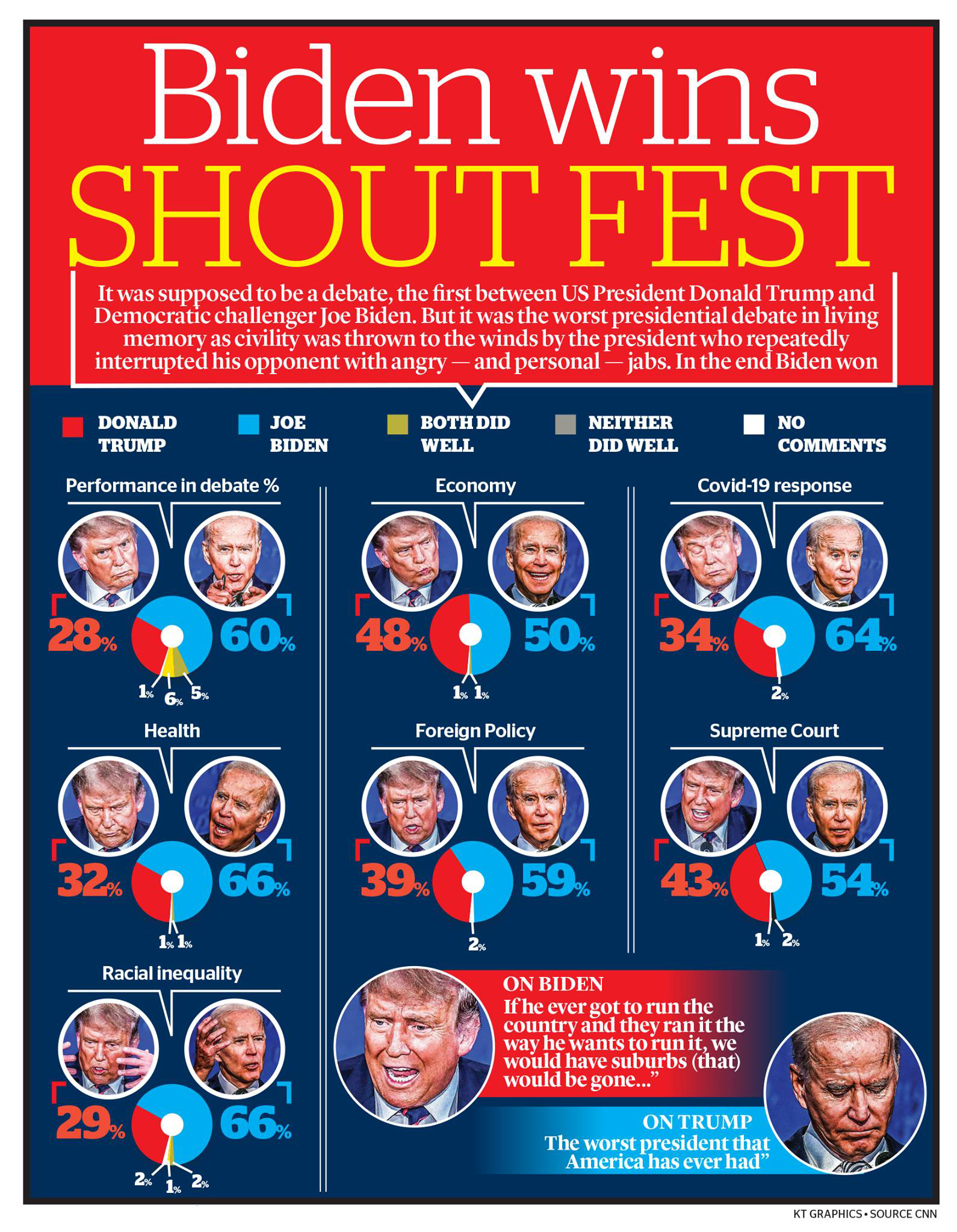
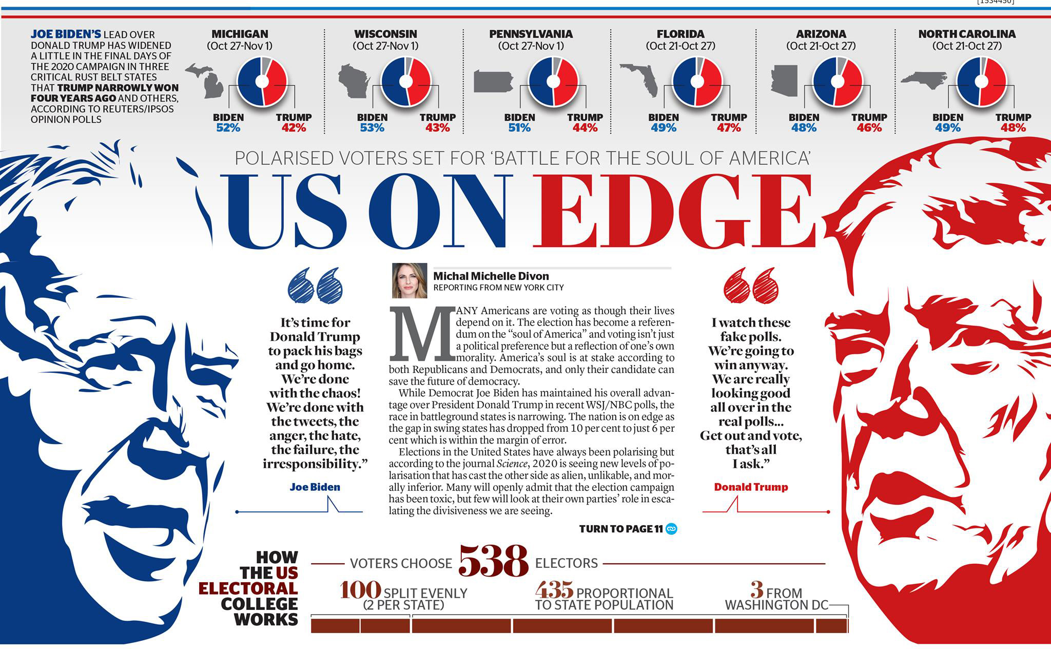
Jury comment
The information in the graphic they entered was really informative and easy to follow. Even the different photos they used in each question was impressive. And then the preview page with caricatures with pull quotes were well presented. Honestly, we could give these two a first-place tie. It’s just that the National presented 7 pages with great design throughout.
THIRD PLACE
The Hindu (INDIA)
Lots of good information, but oy vey! the caricature of Joe Biden isn’t even close and Trump’s isn’t that good either, but from a design standpoint, well executed.
HONORABLE MENTIONS
Malayala Manorama (India)
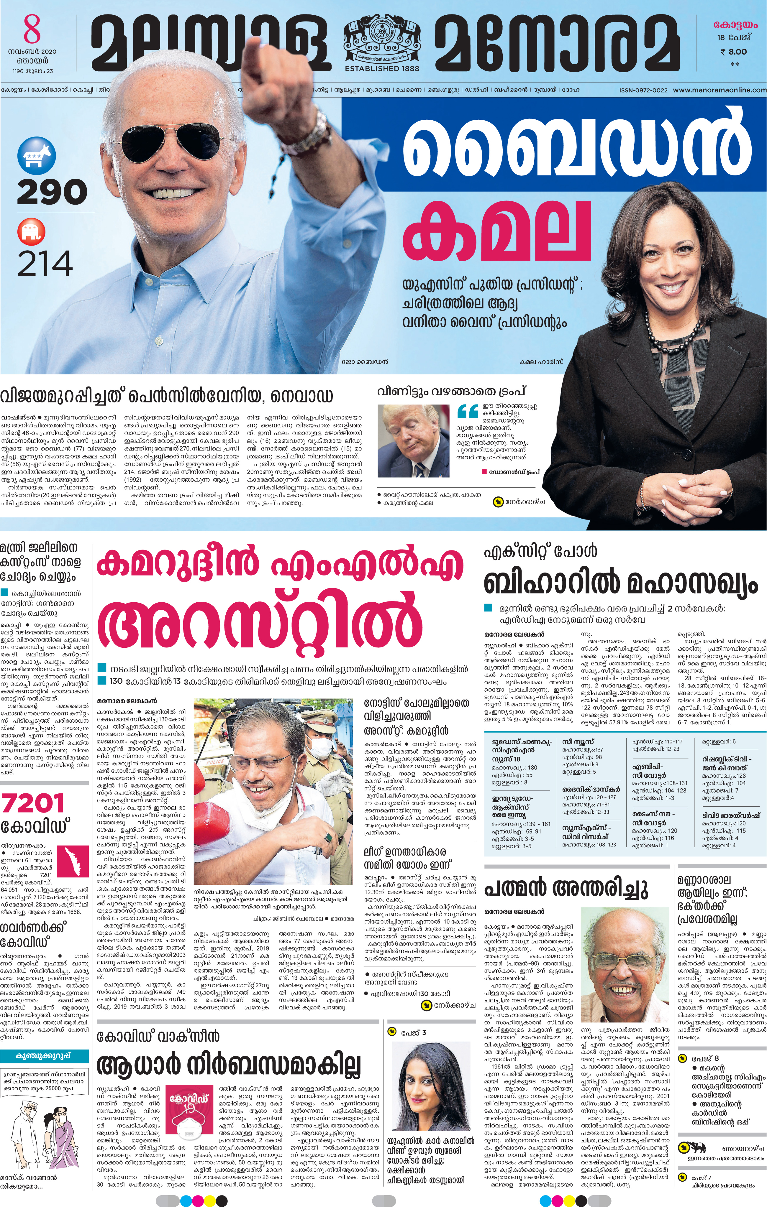
Jury comment
They offered up the Biden win page, but used file photos with a stereotypic blue background behind the story.
BEST OF MARADONA PAGE
FIRST PLACE
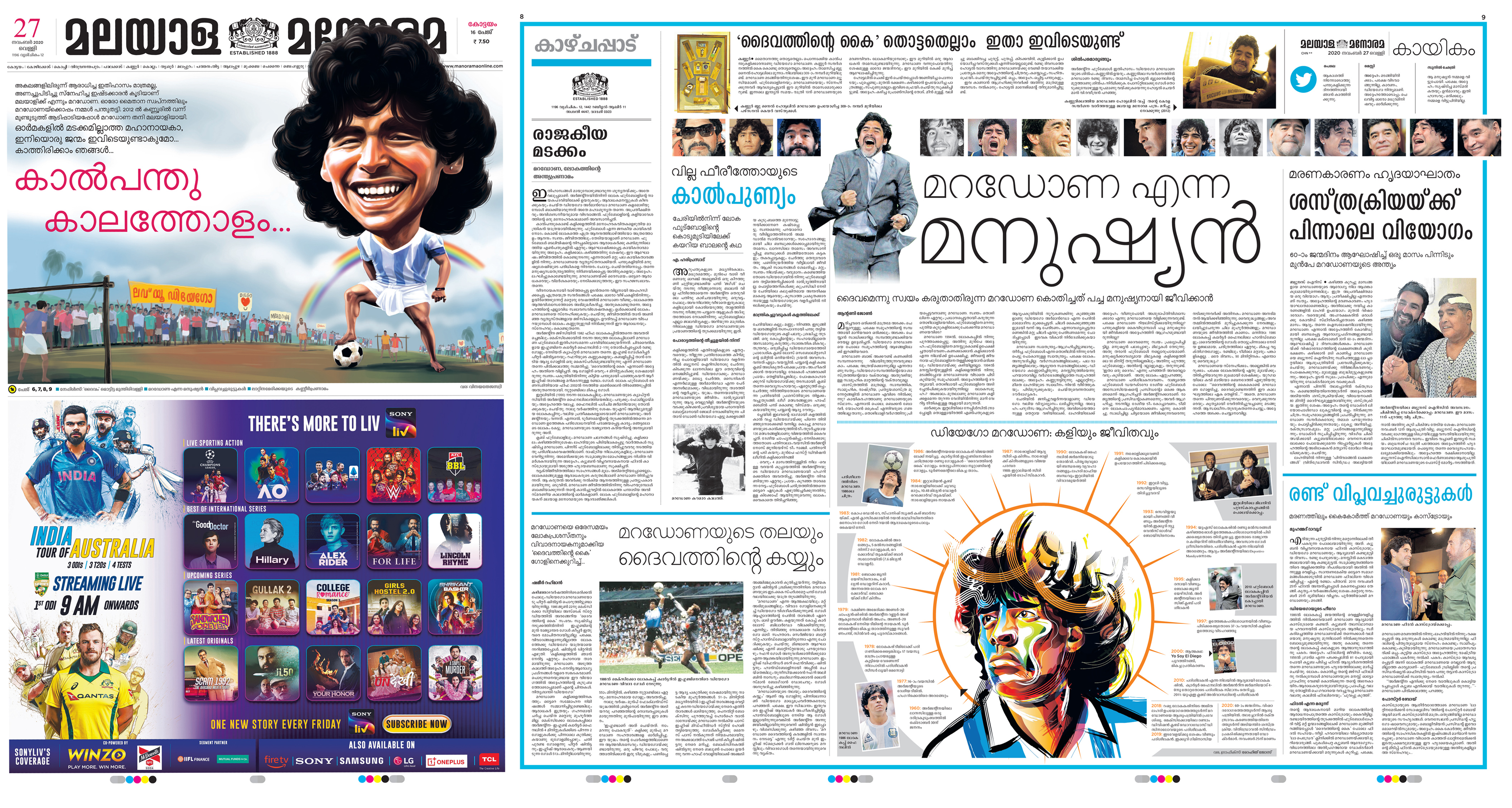
Malayala Manorama (India)
Jury comment
A wonderful page one illustration really sets the tone for the package. The inside display is well balanced with good use of white space. The faces of Maradona is a great entry point for readers into the page.
SECOND PLACE
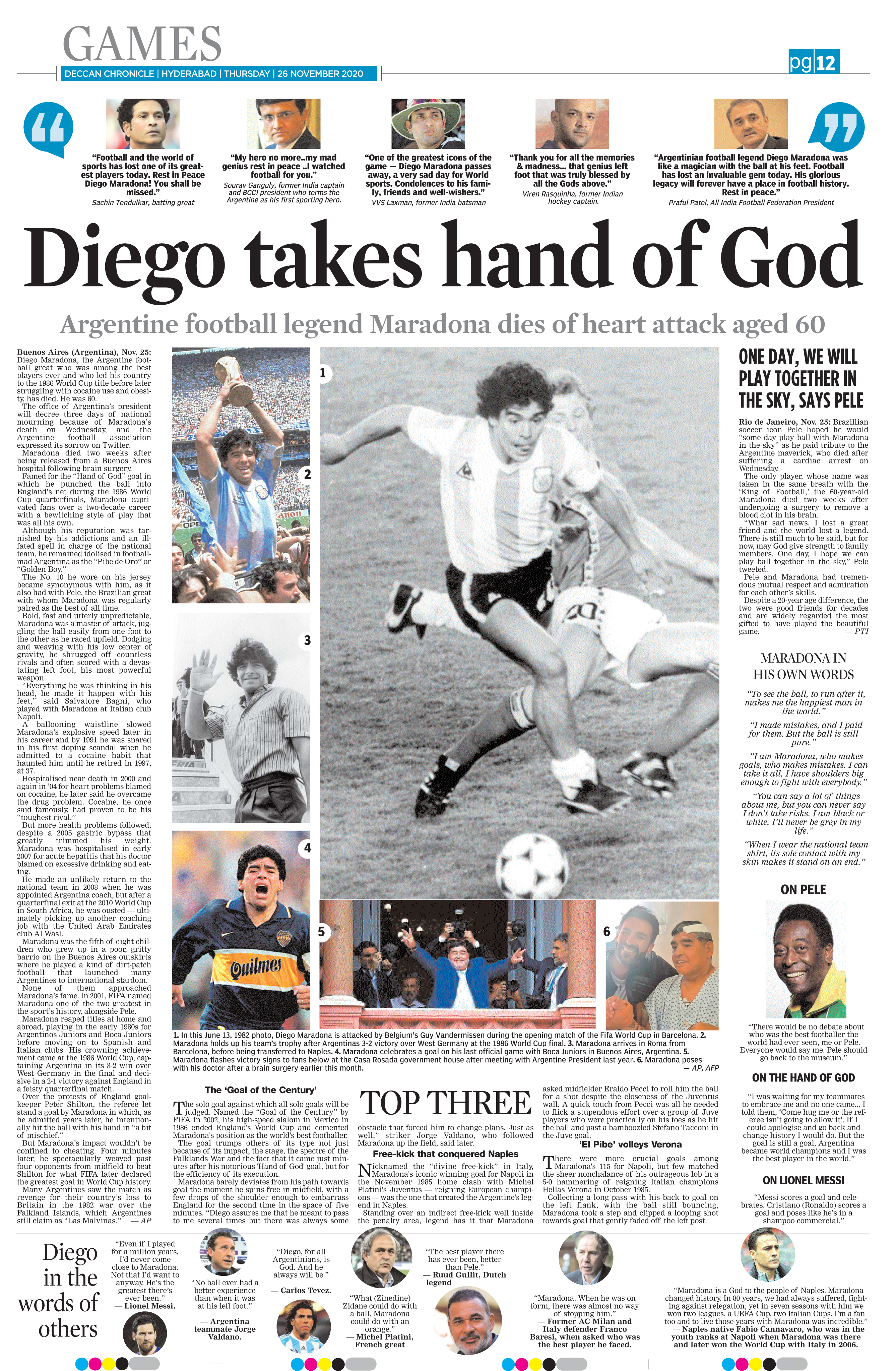
Deccan Chronicle (INDIA)
Designer: Kishore
Jury comment
Great headline and good use of photography; well captioned, too. We thought that the Pele sidebar would have been more effective in the package had it been behind a color screen, just to make it stand out.
THIRD PLACE
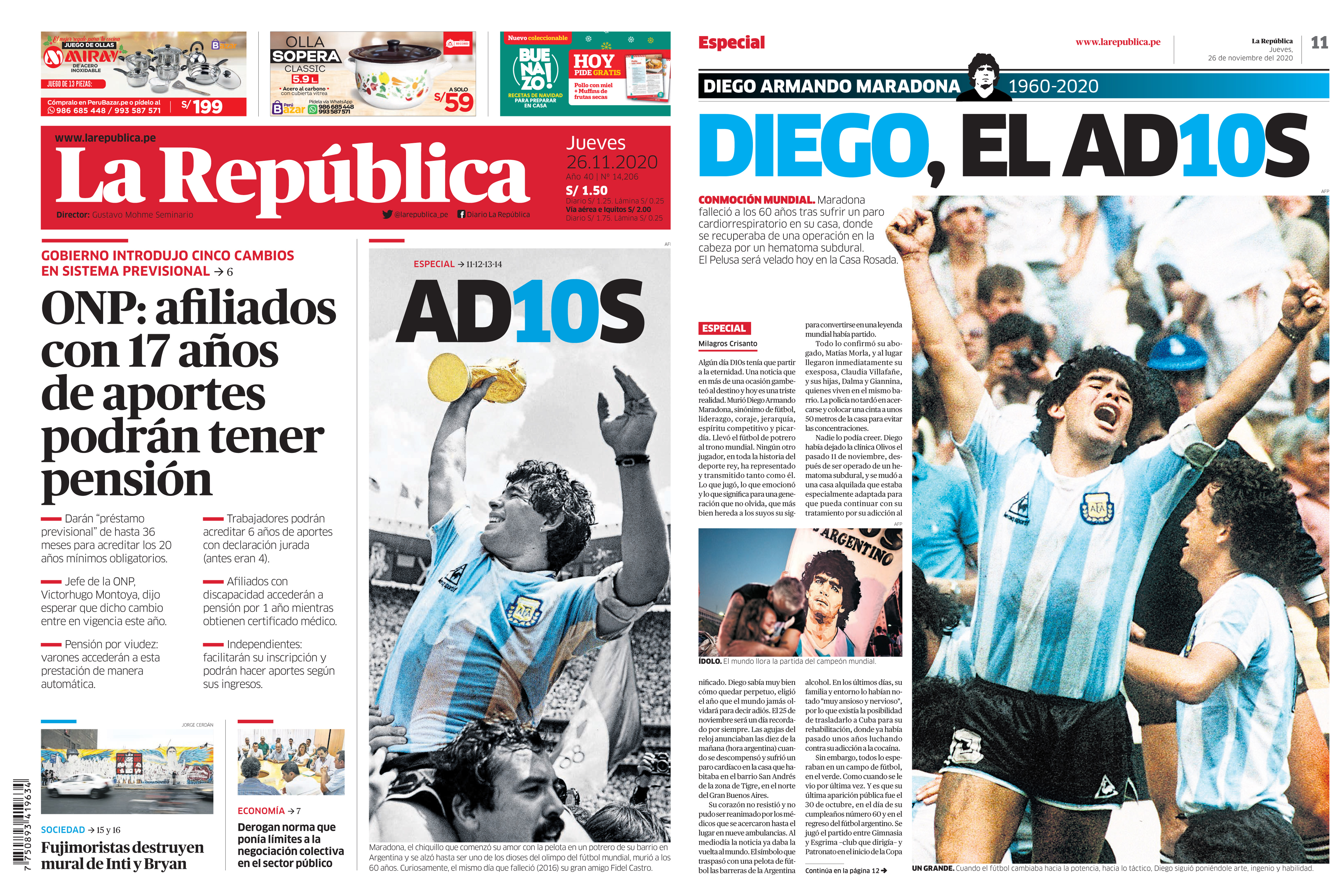
La Republica
Designer: Ricardo Cervera
Jury comment
Nice display on Page 1 and a good special cover treatment. A photo right in the middle of the story can confuse a reader (asking them to jump over a photo to continue to read the story).
HONORABLE MENTIONS
KHALEEJ TIMES & THE NATIONAL (UAE)
Jury comment
No honorable mention, but No. 4 was the Khaleej Times with a very nice front page treatment, but they never sent the inside page where the story was. No. 5 was the National, which we respect, but the design was simple and it would have been nice to have more synergy between the wonderful photo and the headline as opposed to just saying Maradona 1960-2020. How about: Maradona had a ball playing soccer. One other interesting thing we noticed that none of the papers did any graphics showing, for example, how many goals he scored in World Cup competition or how many he scored on the many teams he played for. Papers really went for reaction quotes, like from Lionel Messi or Pele.
The judging panel :
Gary Metzker
Lecturer and student media adviser California State University, Long Beach
Alicia Hoalcraft
Integrated media operations production manager Forum Communications, Fargo, N.D.
Marcia Prouse
Former visuals and storytelling coach The Tennessean, Nashville, Tenn.
William Neff
Graphics reporter The Washington Post, Washington, D.C.
Jury Head
Charles Apple
Further Review page editor The Spokesman-Review, Spokane, Wash.
results of the competitions conducted by newspaperdesign.in
Winners of India’s first International Newspaperdesign competition
Winners of World cup Soccer International Newspaperdesign competition
![]()

